During the first semester for my MA at the University of Winchester, I was assigned the criteria to develop an idea for a digital app through User Experience developments, one that would look to counter a ‘pain point’ in one’s life; specifically a frustration or worry they may have in which the app can benefit or improve upon. Being creative at heart this was certainly a fun and exciting new task, one I jumped at with excitement and I will showcase the development of the module on this page.
A renowned Communication and design author named Paul Heckel, once stated: ‘Ernest Hemingway, James Mitchener, Neil Simon, Frank Lloyd Wright and Pablo Picasso could not get it right the first time, so what makes you think you will?’ (Buxton, W, 2007, Sketching User Experiences: Getting The Design Right and The Right Design, B Morgan Kaufmann, Diane Cerra, 500 Sansome Street, San Fransicco, CA).
This quote carries true credibility for it refers to the most difficult challenge in the design process, the idea; namely how the developmental process is indeed a long path to follow and the fact that even the most brilliant minded people in the creative history face their share of challenges and struggles along the way. I took this fact very much into account before starting this assignment; being my first module on the Digital Media Practice postgraduate programme and it helped to reassure my creative mind, that I should indeed expect to face hurdles on this journey, but it will only motivate and contribute to further my strengths and capabilities.

Brain-storming
Firstly, like all ideas, there came the stage of brainstorming out concepts that would make for a good subject for the app to improve or enhance. I immediately listed two subjects that mattered to me the most; music and the outdoors, as well as a constant frustration I had, being when a bus commute ends up being late or avoiding a time slot altogether.
This latter idea was one that had a personal connection with me, since in my hometown the local bus always had a reputation for not just being late, but skipping the desired time slot I would occasionally prepare myself to catch. I was unsure whether this was a national occurrence, but felt motivated enough to consider going forward with it as my idea. I compared the idea to an app called Flush, designed to point users to the nearest lavatory in public. While this sounds funny on the surface, it does nevertheless resolve a trivial, yet somewhat common ‘pain point’ for many.
However, after a bit of research and having the matter raised by two fellow students, I found my idea was too similar to the feature used on google in which one can use the map element to determine whether the mode of transport is running on time. While my idea was less focused on whether the bus would be on time, but more on whether it was going to turn up at all, I eventually felt that this idea seemed too specific for just my area and lacked an element and sense of ‘fun’ that could appeal to a wider range of consumers, who would actually take joy in using the app rather than frustration.
I decided not to pursue the music idea, which would have been an app to help identify a song, in which users can describe the tune that they are unable to name but recognise in rhythm, since a fellow student had an idea of a similar nature. I wanted my idea to feel unique in it’s own right, so I turned my attention to my outdoors-related idea. Being originally from Suffolk, a very rural county, my general interests are very much in the outdoors; I enjoy nature trails, kayaking, cycling, rock climbing, assault courses and forestry zip lining. After listing my ideas and thoughts, I began to draw up a spider diagram with each path highlighting a key topic, such as the appeal, message, name of the app, audience and purpose, to which I then generated further thoughts on these elements to start visioning the idea.
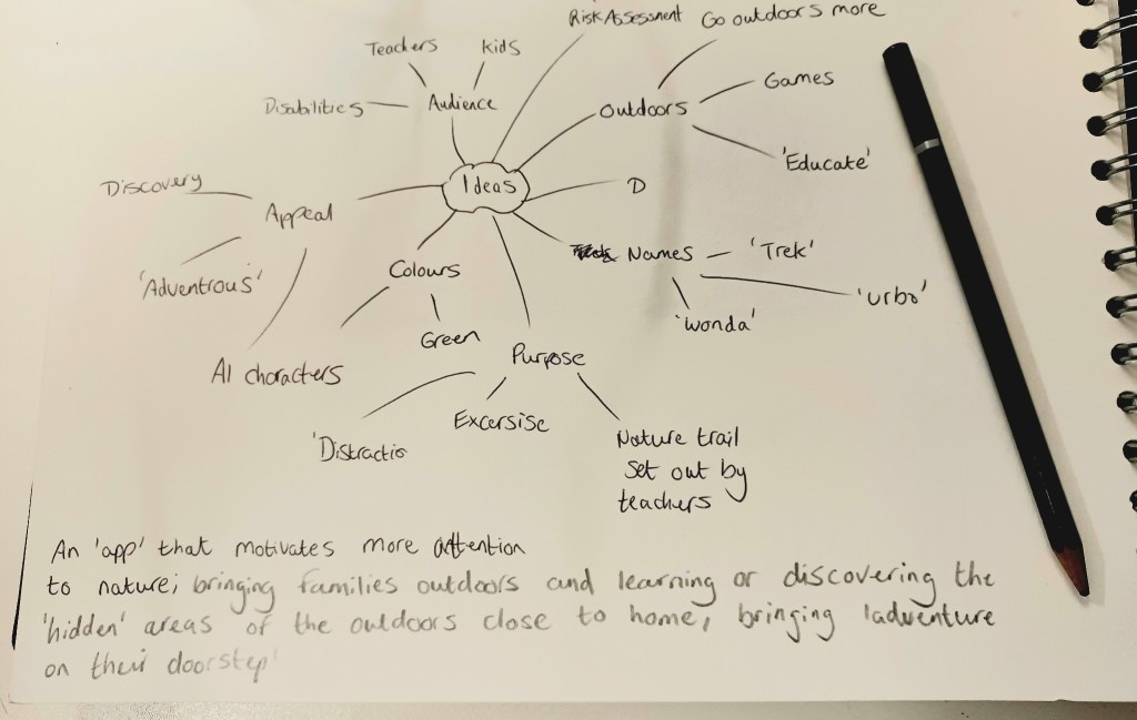
As a bit of a semi-realist on this topic, at times I found myself ‘second-guessing’ and questioning the ideas or elements that came to mind whilst brainstorming the app, mainly as to whether these could actually come to fruition, owing to either limitation in technology or even the consumers themselves. For example, I kept speculating as to whether people would be able to use the app in rural areas because of lack of Wi-fi hotspots, device data or whether children would be using the app at a young age. I was able to resolve the issue of children using it by having it be an app assigned by schools to the parents of their pupils, thus encouraging them to take outdoor adventures together as a family and learn about plants, wildlife and possibly earn ‘points’ or rewards if they can answer correct questions while on the trail.
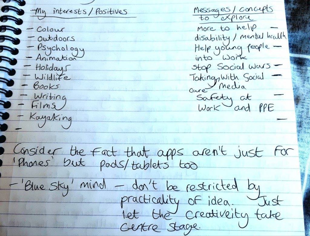
While it helped to have these inner debates, since creativity in any form has its share or challenges and obstacles, one must be reminded that in the early stages it helps to adopt a ‘Blue Sky’ approach to the initial brainstorm and conceptualisation stage, since creativity will allow the idea to go in new directions and thus can be resolved as things progress.
Being a great admirer of the outdoors, I felt that the decision to base an app around the outdoors would bring about new-found appreciation for the leisure it gives people, since I had always got a sense that most label outdoor trekking as a thing that only people of a senior age do, hence the term ‘ramblers’. I was determined to change this reputation and explore for myself what people’s impressionism on the outdoor life was and also to put out the message that this app would not only encourage more outdoor leisure, but be a strong aid in the support of mental health. Through knowing people first-hand who suffer from mental health and hearing how this is a common issue growing in the young generation, I was motivated to do some research regarding this topic. I was staggered to find that as of 2021, one in six children in our nation had a probable mental disorder, which further stretches to nearly 40% of six to 16-year-olds, making it increasingly likely that long-term support may be required if nothing is to help those at a young age (Roxby, P, 2021, Covid: Children’s mental health has not improved since lockdown – survey, BBC News, https://www.bbc.co.uk/news/health-58741536 – Accessed 3rd October 2021).
This particular exercise dealt with a lecturer trying to maintain a university through virtuality.
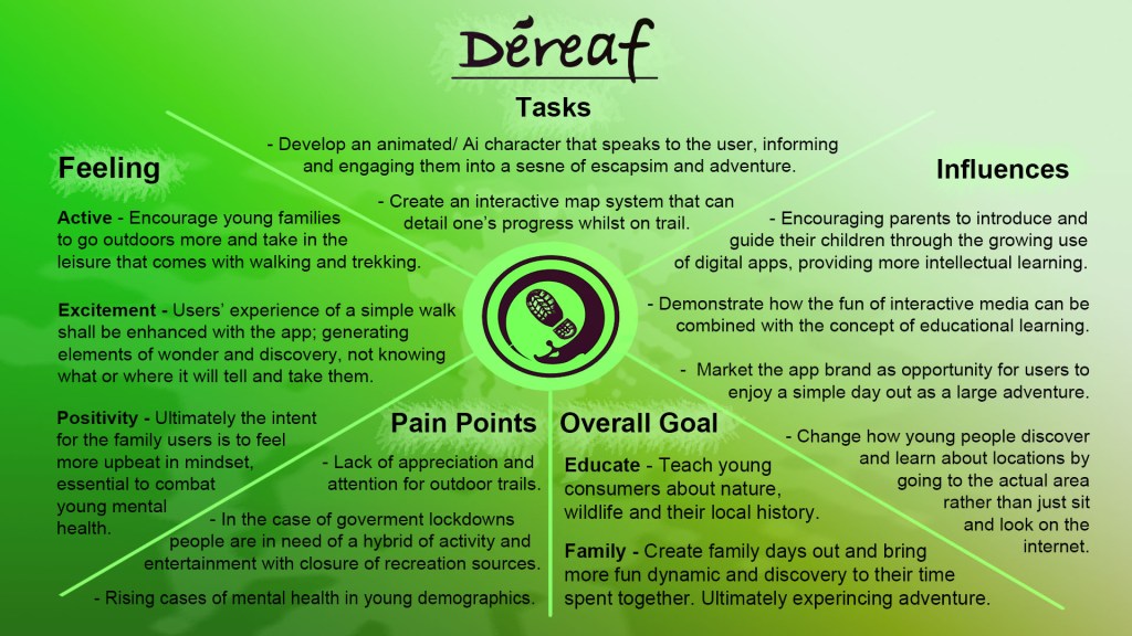
Therefore, with this context in mind, the situation made sense to me that the ‘pain point’ of my app module should be to focus on engaging young people at an early age with the outdoors, as well as their families, bringing them closer together and championing the cause for family adventures to be embraced more. Considering the limitations brought on by the covid19 pandemic last year, in which most areas of recreation were closed owing to lockdowns, our area of escape and distraction could be only for a walk, thus helping us fight off the mental struggles of being indoors constantly. This shows how the outdoors can bring great pleasure to people and is an excellent force in combating mental health issues. The app will aim to encourage young families to use it as a motivation in the prevention of children developing mental health much earlier in life than others.
I took note of how all ideas must follow a design process cycle during the initial planning, specifically the term of Iterative design: one must plan their product with care and continuously review, assess and test the functionality and relevance of the idea to ensure it covers its complete potential before releasing it to public consumption. Therefore I was careful to consider my motivation for why I wanted to pursue this idea; I highlighted my three main priorities which were Activity, Education and Family, all of which are core values for a healthy and ideal upbringing and factors I wanted my project outcome to channel a sense of all these principles. Regarding how these elements factor into the school assigning
The app market has so much potential in our continuously-evolving culture, where technology is becoming more relevant and it is only at its infancy regarding the graphical content we can receive on our mobile devices. In years to come, we may as yet reach the point where we can stream app content to a much higher and more photorealistic quality on our devices (Malhotra, M, 2020, An Overlook to the Future of Mobile Application Development, Value Coders, https://www.valuecoders.com/blog/technology-and-apps/future-of-mobile-application-development/).
Research and Development
I jumped at the opportunity to research and explore a little bit more about the theories of User Experience (UX). Using Canvas as a starting point for finding sources, I was fortunate to find two books that gave me a good insight into the topic. The Elements of User Experience by Jesse James Garrett was my starting point, which broke down the basic approach to UX Design. My initial understanding of User Experience was that it acted as the theory side to UI Design; requiring the knowledge of identifying the audience for whom the interactive design, whether that refers to a website or app, is going to appeal to and taking into account the attitude when using the product.
The author writes that User Experience ultimately represents how effective a brand is and thus must have its own identity and recognise the mood or feeling that it intends for consumers.
“One essential consideration in formulating the objectives for any site is brand identity. When most of us see the word ‘branding’ we think of things like logos, colour palettes and typography. While these visual aspects are important, the concept of brand extends far beyond the visual. Brand identity – a set of conceptual associations or emotional reactions – is important because it’s inescapable. In the minds of you users, an impression about your organisation is inevitably created by their interaction with your site” – Garrett, J J, 2002, The Elements of User Experience: User-Centred Design for the Web, American Institute of Graphic Arts, 164 Fifth Avenue, New York City, NY, USA, (Page 42 – Brand identity).
I also took to reading Sketching User Experiences: Getting The Design Right And The Right Design by Bill Buxton, a helpful source aimed at UX/ UI designers and professional practitioners with a variety of backgrounds, such as psychology, illustration, environment, architecture, product design or having dealt with web icons and menus. Buxton mentions that when it comes to UX Design, certain designers are not necessarily the strongest of illustrators artistically, but rather can take advantage of our modern computer software to put their product into visual form. The author even confesses how he is not artistically talented, but explains that he uses a tracing method, known as rotoscoping in the design, with existing products for reference to realistic size and proportions for his ideas. More than anything the author explains that imagination is the primary ingredient to making a simple sketch the beginning of a vigorous success.
However, being in the early stages of designing my app project, I specifically read the book for a starting point on how one approaches the layout process and structure of the UX design in a product. Eventually, the author demonstrated an interesting example, which proved helpful with my idea conceptualisation, in which he explained the process of sketching a product in its physical form through a series of sketches that represent an element called a ‘Wifreframe’, which convey the product’s ‘behaviour’. He mentions how in UX design it is the most important design element since it gives the ‘essence’ and ‘feel’ of the product and functions as a guide, or in his words ‘story’, for the programmers and fellow team members on the flow and functionality. This sketch can be typically presented similar to a storyboard in animation production; showcasing the stages of the product in use through multiple drawings.
Buxton also mentions that another sketch can be used known as a ‘State Transition Diagram’; presented as a ‘map’ which shows how each of the interface pages link with each other this serves as a navigation guide for the programmers. As a visual example of two of the aforementioned sketches, Buxton makes reference to Ron Bird, a professional UI designer, who produced a wireframe of a digital calendar feature that reminds consumers of engagements they made and allows them to contact through messaging the particular source should a change occur in the schedule. Bird worked in collaboration with a fellow designer named Scott Jenson, whose UX and UI design encompasses handheld digital products, in creating a State Transition Diagram to accompany each of his page designs for the product. This example demonstrates how useful and clear the product’s functionality will be and makes the navigational system easy to visualise, thus becoming clearer in UX design.
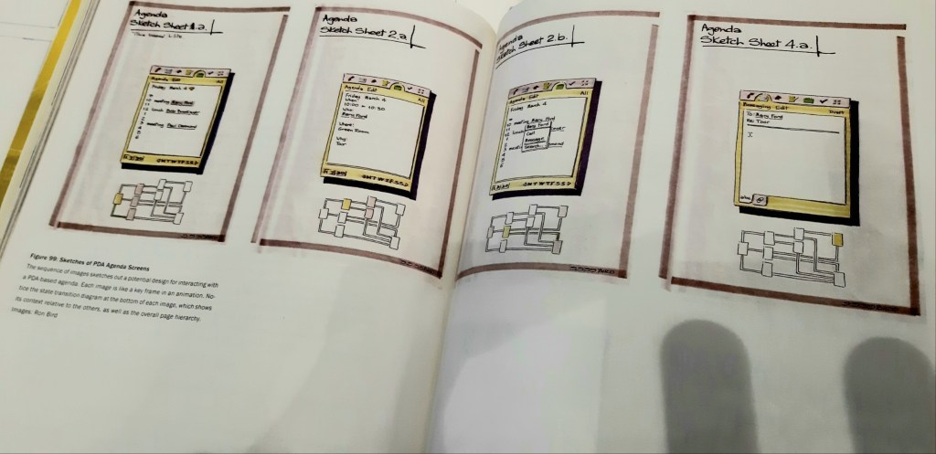
Source: Buxton, W, Sketching User Experiences: Getting The Design Right and Right Design Morgan Kaufmann, 500 Sansome Street, San Francisco, CA.
Illustration from Page 284
Moving further with the early development of my app brand idea, I decided that as well as doing some reading on the User Experience practices, I should take advantage of textbooks that cover the creative process of how to articulate my ideas in visual form. A book titled Design and the Creative Process (Moore, D.J, 2007, Thomson Delmar Learning, Florence, KY, USA) helped with brainstorming the design for potential logo and brand assets of my app ideas. I had initially experimented with some logo ideas in my app wireframes based on some brief online research I conducted of studying existing logos for inspiration on colour scheme and layout. I researched the design of app logos and how they appear on the homepage of mobile devices, analysing popular social media apps, such as Facebook, Instagram and Twitter, to discovering more obscure examples that operate under a modest share of users and downloads, taking the simple use of colour and text into consideration for each.
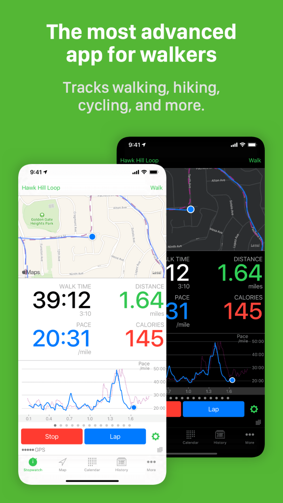
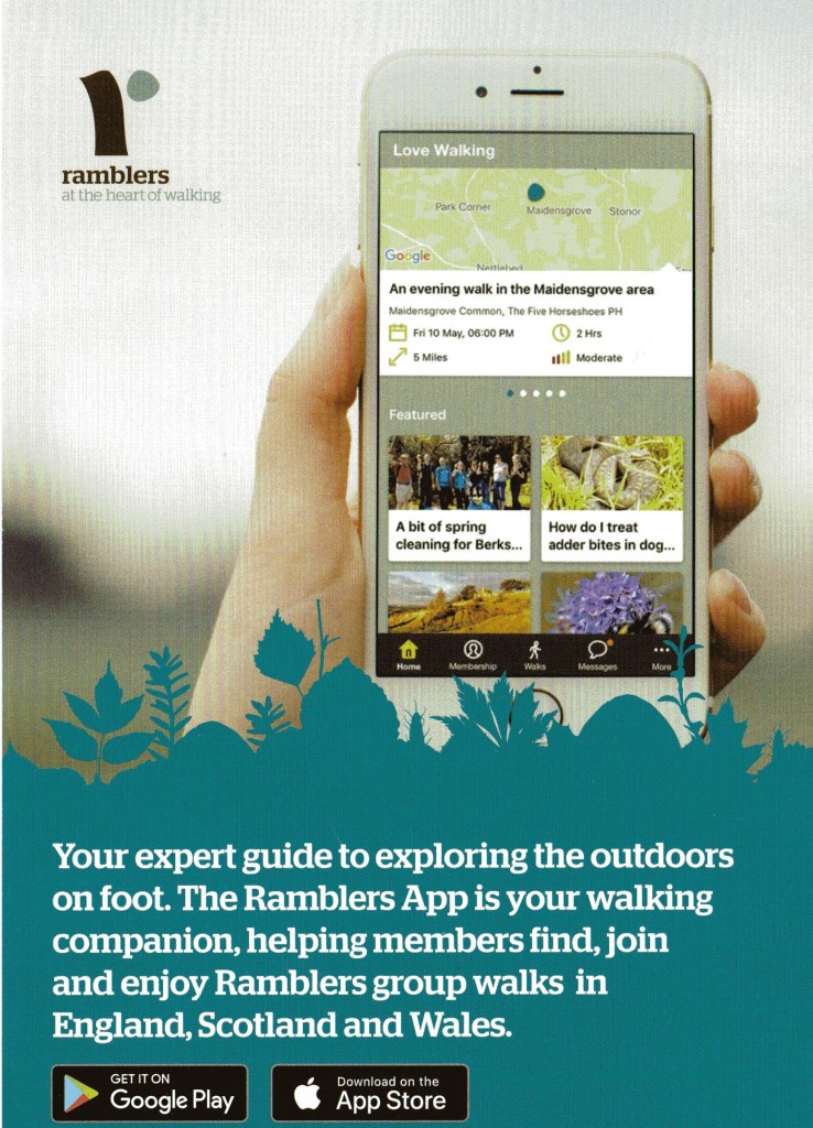
I mentioned that my app was aimed at young families to expand the appreciation for the outdoors and demonstrate to people that walking doesn’t necessarily focus strictly on the distance that one does, but rather can be enjoyed regarding the discovery that one can encounter when on a simple trail into areas hidden from the public eye. This notion was very much a winning strength so far since upon researching various existing apps in walking and outdoor leisure, such as The Ramblers App and Walkmeter (examples above) they concentrated solely on the distance angle and felt too generalised, not offering much for young minds to soak their teeth into, which I desperately wanted to convey within to make children feel more engaged. I had initially wanted to explore the possibility of the app being integrated within National Parks in the UK, but upon discovering the National Trust App, I figured that there may already be an established app team that specialise in the digital experience sector of these areas. As a substitute, I figured that I would have my app be a hybrid of both nature walks and heritage trails to expand on the education and learning element of the idea.
Having made an early start on research and my idea concept, I decided in order to explore further as to what the next stage was to apply some primary research to shift my idea into an ideal focus and strategy. I established how owing to the ongoing pandemic, young mental health is increasingly growing and that I want to confront that issue through my app idea and bring about appreciation for the outdoors to a younger generation. Therefore, I took advantage of the online resource of Google forms to create a questionnaire addressing these matters. I had never put together a survey in this form before and it was a new step for me regarding project research, meaning I had to learn a few elements about it, such as how to organise the various questions into graph or scale system, an effective means of illustrating the collected data.
Regarding the questions specifically, I first and foremost wanted to explore what people’s impression of the outdoors was and how important it was in our nation, primarily to analyse whether there is a declining interest or consistent appreciation for the leisure and joy it can bring us. Further along the survey, I went into the areas concerning mental health, young people, schools, families and the notion of digital media possibly expanding the appeal. Concerning my app, I knew that there was potential in the idea being used in primary schools to engage pupils in the learning and activity they can find in nature and also to inject the compassionate warmth of families coming together to enjoy the experience. It made sense to address this query in the questionnaire to see how people felt about digital apps being used with children and whether this could be achieved, since I myself was curious to know to what extent schools use the current trends in technology and whether apps are embraced or not. I also was curious to know how national wildlife trusts or conservationists feel about technology being used in areas of nature sanctum too.
I sent my questionnaire out to 60 different individuals, among those being professional conservationists, school admin, council representatives and various individuals who either do or do not share a taste for the outdoors. I managed to collect just over a dozen responses, after continuously sending out the questionnaire to organisations when not hearing back after certain periods. Nevertheless, I collected a substantial response on the professional angle and through careful analysis, we shall explore what the attitude was regarding the concept and structuring of the questionnaire.
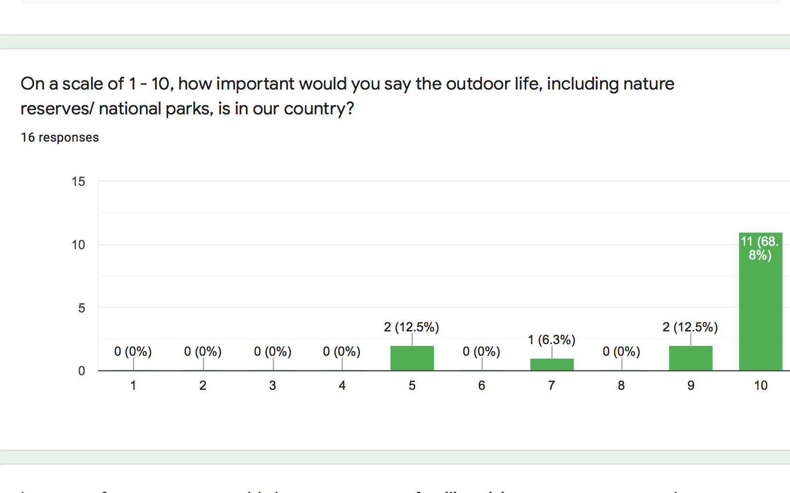
Regarding the initial feeling towards the outdoors, it was generally a strong majority of people that value the outdoor life in the UK, agreeing that it is an important source of leisure for people, while some felt more even about the area. This indicated to me that there was a somewhat mixed feeling about the topic, but mostly healthy support for the app’s area of focus. It should be noted though, that most of these responses were given by those who work in the outdoors sector.
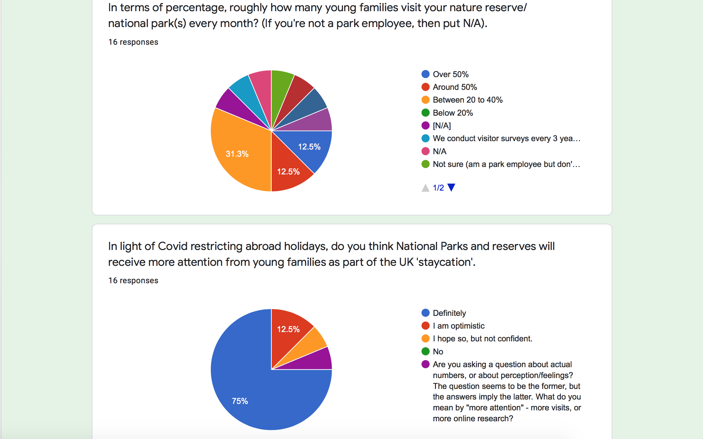
Moving on to a more specific area of focus, I asked the contacts who worked in the outdoor sector to give me a rough estimation of how many young family groups visit their parks every month, as a means of indicating whether there is a market for the app to be used in family outings a majority are in the high share or whether more needs to be done for outdoor reserves to hook young families if in the low share. Those who do not work in the outdoor environment simply could answer N/A, so regarding those who gave an answer we can see that it is roughly more in the second-lowest share of 20 – 40 percent, meaning it is somewhat even. One particular person answered how they only conduct their survey every couple of years and another even made the suggestion that such a question ought to be organised more effectively since not every employee has access to the visitor data.
This suggestion was valid since I was trying to enquire whether I could be provided with an idea of how frequent visitors come to particular parks, but possibly should have taken into account that this question can only be answered more accurately by a small minority of employees. Therefore, when conducting questions of this nature for future research, specifically looking to discover a number of consumers of a service or product, it would be more reasonable to visit a particular location myself and conduct first-hand research to find out for myself, rather than relying on limited sources.
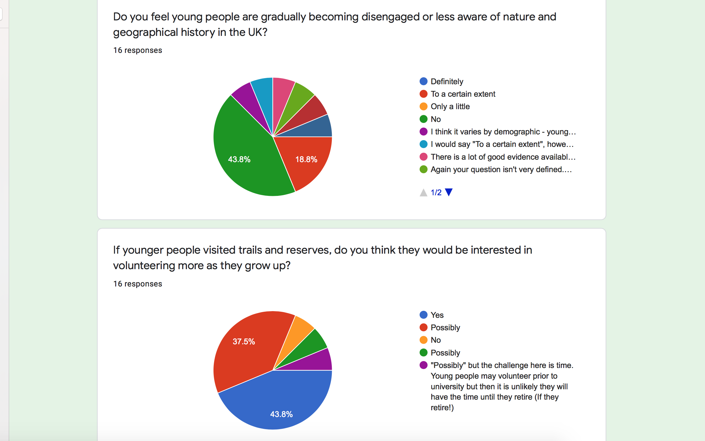
I took to enquire whether people believed that there was a sense that younger generations were becoming disillusioned with the outdoors, considering the notion that some may view outdoor treks as something only for the senior generation. Roughly half of the people asked on this matter felt strongly that there was still a strong sense of young people embracing the outdoors, but roughly a semi-quarter agreed that there was an extent that some may be gradually losing interest. On the other hand, there was an interesting fact brought to the topic; addressing how this may depend on the demographic of the young person, something that I will consider going forward.
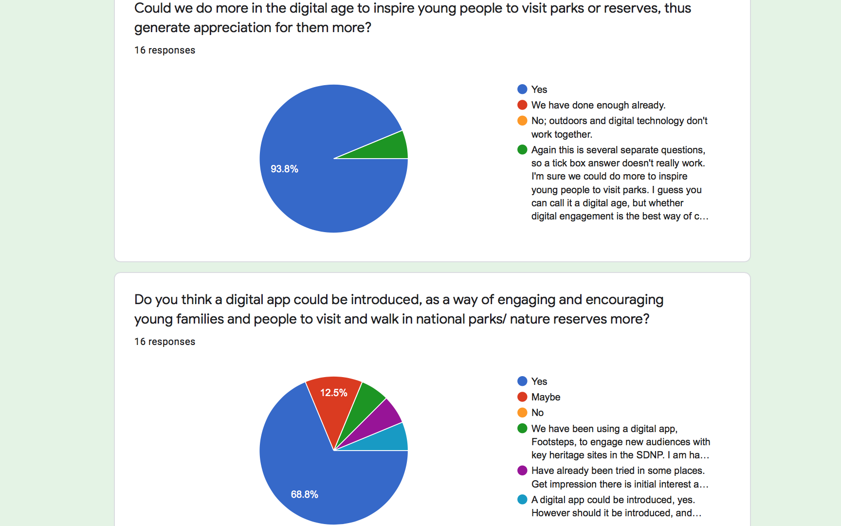
Regarding the question as to whether the idea of a digital app could be introduced to encourage more family dynamic in the outdoor environment, the majority of people strongly believed so, while some in the national park sector stressed how there have been attempts made with this strategy previously with similar apps.
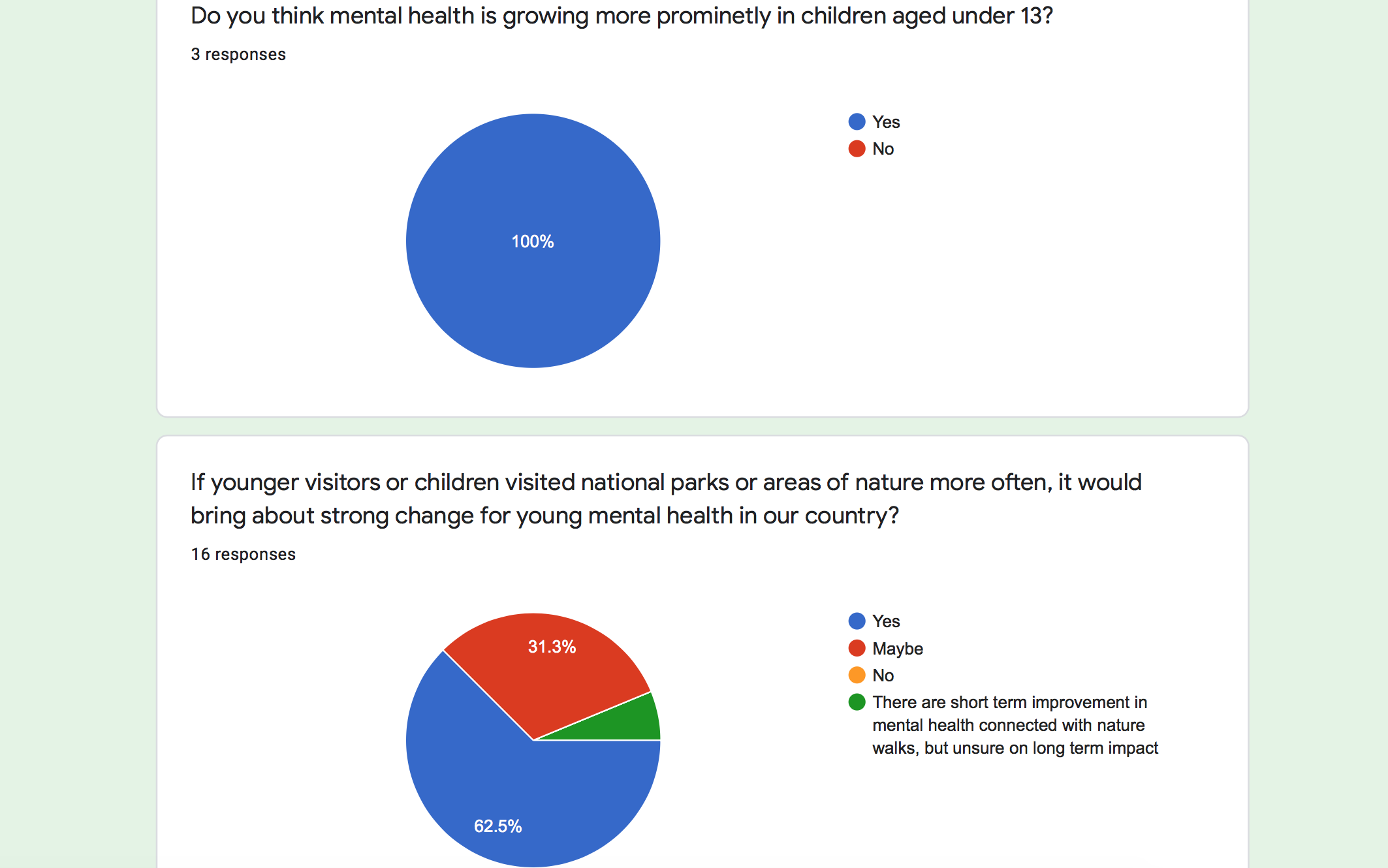
I took to adding an additional question, much later in my research, to the questionnaire that addressed the mental health angle regarding young minds and those who answered believed mental health was indeed growing more in young people, which followed up with the question of whether strong chase could be brought about for children if they visited the outdoors more regularly. Nearly two-thirds agreed that this would be the case, whilst some were more ‘on the fence’ regarding the solution, one person even stating it may not have long-term effect.
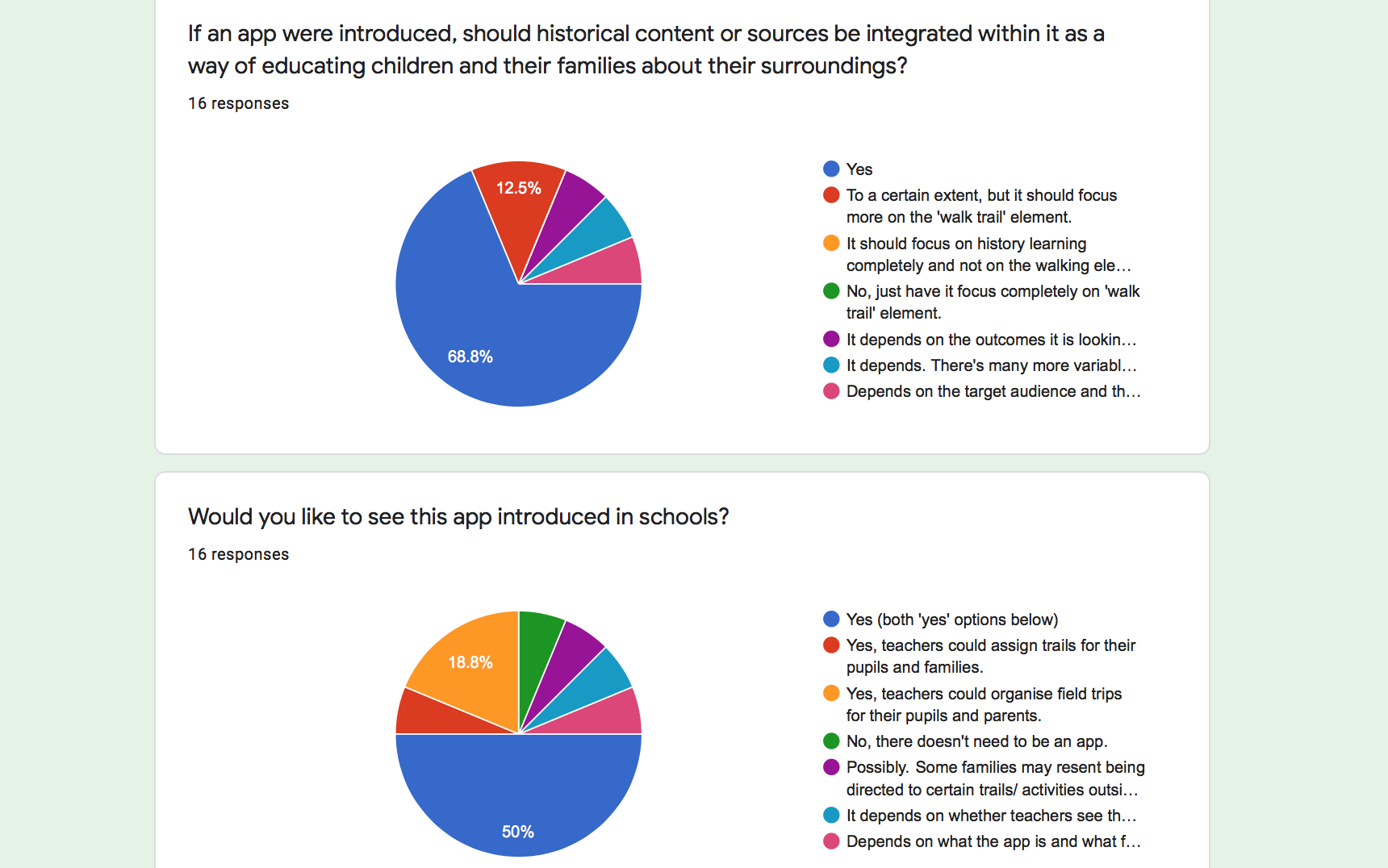
Finally, in regards as to whether more can be done to inspire young people in the outdoors, the majority answered yes, while the following question regarding if an app were created could it apply heritage learning and be introduced into schools some stated how it depended on the accessibility of pupils and the teachers. The results of the questionnaire were rather polarized, with roughly half of the questions receiving support and agreement regarding the fact of introducing an app to encourage young people into the outdoors through schools, while some were rather reserved about the ideas. I knew that I should look to speak to someone first-hand who has insight knowledge into these apps that have utilised similar strategies to understand how I could differentiate my idea and enable it to appeal in a wider and accessible manner.
Taking all this into account, I realised my priorities to take forward with the app development were ensuring that it can reach multiple family demographics and see that the product can reach a longer-term effect rather than just strictly in the minor range. During this period of research, I was fortunate enough to hear back from a contact who I submitted my questionnaire to; Amanda Elmes, leader of Learning and Outreach Strategy for the South Downs National Park team. She contacted me regarding my survey stating how she could provide me more information regarding the topic on the outdoors and widen my strategy and focus.
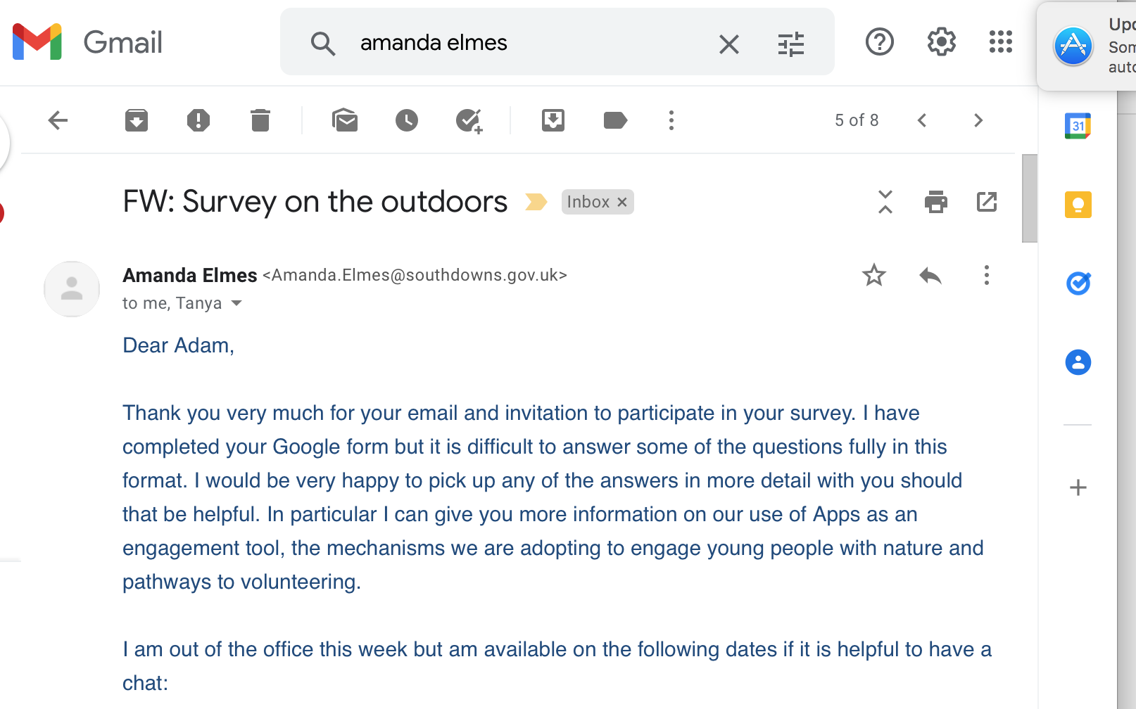
I responded to Ms Elmes’ email and arranged a one-to-one session with her to discuss areas regarding my questionnaire and it was certainly an idealistic opportunity for me to learn a bit more about the activity in outdoor apps and also what further examples to explore for reference in my development.
Permision was given for the video call to be recorded and documented for research purposes.
Ms Elmes shared information regarding the South Downs’ very own app, as well as similar products that provided some helpful factors to consider for my project as to where my idea can excel in areas better to them or consider an area of focus that they don’t cover. South Downs App uses its app to create volunteering opportunities for individuals, build networks with different organisations. Whilst my app was different in tone and usage compared to the South Downs, being more family and school-focused as opposed to network and volunteer building, I nevertheless took note of how I may want to re-work the direction of my app and avoid having it focus on the National Park element, so as to avoid the challenge of competing with a highly established team.
Another related app that was put forward to me, named In Their Footsteps, provided users the experience of taking heritage and historical trails, an element I had considered utilising in my project. It occurred to me that these apps resembled in many respects the idea I had in mind for my app, putting myself into a slight ‘pivot point’, a term I learnt regarding the design cycle process where one has to return to the idea planning and re-consider their options.
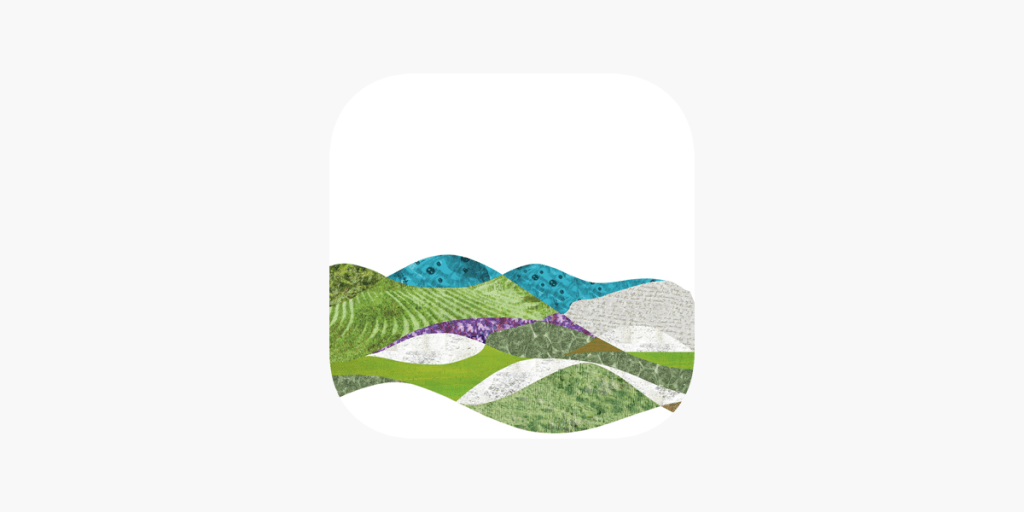
Source: https://apps.apple.com/gb/app/in-their-footsteps/id1501770485
Re-thinking my strategy I realised that my sole purpose for creating the idea was my joy in taking walking trails back home, either with family or alone. I often pursued trails that were open to the public and not part of a trust of any kind. Instead, they were fun and exciting circular walks that took one along exciting routes where the discovery of certain plantation, terrain or scenery could be found, which the average person may not have realised existed, being gradually forgotten about. In more recent times, these pathways are being lost to foliage that block the pathways due to forestry commissions possibly believing that nobody has a desire to walk down them anymore. I have found this a great shame and loss to the outdoor leisure and decided that I would have my app focus more on nature and circular country walks which seem to receive much less attention, yet they deserve it since they can lead to unexpecting areas that can serve as a highlight to one’s day. I kept my ‘pain pint’ and three priorities of family, activity and education in tact as before, but now felt that my app could be an asset in demonstrating how countryside trails can be given a new lease of life with this project.
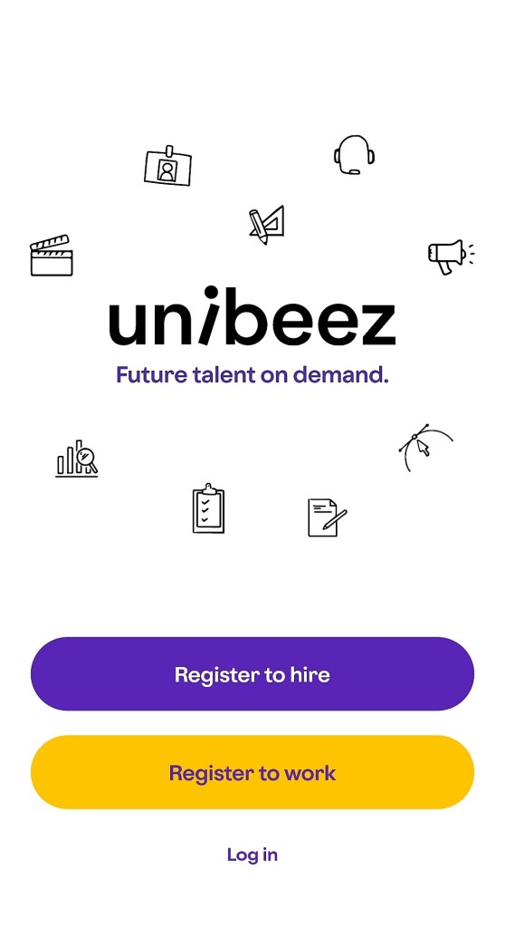
In addition to exploring apps that already explored and dealt with outdoor activity for the user, I went a step further by applying some research into apps of a different nature for UX inspiration, as well as marketing strategies utilised in products that I could embrace to ‘selling’ my particular app. One example included an app by the name of Unibeez, a relatively new product released in early 2021, which functions as a job app for graduates focusing on specific job titles that might not be advertised otherwise on regular platforms to them. I looked this example in particular because I happened to use it last year whilst looking for employment and found it’s function and layout so simple to navigate. Since it succeeded in satisfying my needs and giving a clear sense of how to navigate, I turned to it as my primary source in conceptualizing how the interface could appear and how one keeps a record of jobs applied for on their profile. This latter detail relates to my idea since a teacher will require the need to keep a record of their students and the pupil’s family maintaining track of the discoveries made on their outdoor adventure, encouraging them to pursue more areas.
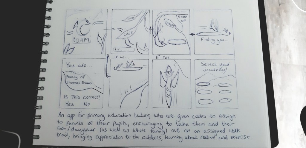
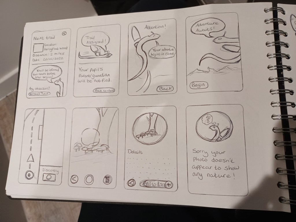
Having cited Unibeez, as my primary inspiration, in regards to how I would structure my app wireframe, specifically page layout and recorded content, I took it upon myself to begin the initial design of a low-fidelity wireframe using a simple lined paper notebook and pen, specifically suggested by my lecturer, since as mentioned earlier UX is as ‘rough and ready’ as it needs to be providing the feel and attitude is evident.

To keep the early plan to a bare minimum and prioritise the key elements, I designed this initial concept with no more than nine pages for the app, with four of them concerning how the teacher uses the product to log in, assign a trail to a pupil, assess their class and keep track of a pupil’s progress. The other pages concerned the pupil’s family home page and the interfaces of the map element they would see whilst on their trail and upon completing the journey. In addition, it was important to include a homepage that the family and teacher users will be addressed with upon opening the app and the procedure on how to register, in which security purposes must be considered. I was uncertain at this stage as to how the security system functioned with schools and made it my strategy to enquire with a school admin or educational representative who could help me as to I should prioritise this element. This is an important element to consider since an app used by a school will require important security to prevent anyone from using the app, who is neither a student or teacher at a classified school, a serious matter addressed to me by the lecturer.
Since I decided that my app was to focus more on countryside and woodland trails, in order to differ my idea from the pre-established apps set up by National Parks and to bring a sense of excitement and escapism to these types of walks, I figured an effective method would be to create an AI character who could interact with the young family and guide them through their walk, making the app feel more unique and welcoming to these hidden trails. I was rather influenced by google’s bugdroid character (see below) in terms of design and appeal, since I knew I wanted something simple to not overwhelm the young minds of the targeted group. In addition, it helped to keep the character a single colour to avoid the risk of the sprite blending into the background and interface colour scheme.

Source: https://www.digitaltrends.com/mobile/who-is-bugdroid-the-story-of-androids-mascot/
Referring back to the fact that the app market is still in its infancy, this is reminiscent of how video games once were limited with their interface during their heyday of the early 1980s, but that the consumer embraced them in larger context because of the user experience they brought. Take for example, the original pac-man from 1980 in which the interface is rather simple in motion and design, merely a simple yellow circle with a mouth that glides in four directions. However, it’s the user’s experience of playing the game, specifically one that evokes a sense of an adrenaline rush being maze-focused, which boosts the rather simple aesthetic the game has, hence why it still resonate with many to this day (Diver, M, 2020, 40 Years Later, The Original ‘Pac-Man’ Is Still Arcade Gaming Gold, Gaming Bible. Available at: https://www.gamingbible.co.uk/features/retro-gaming-in-2021-the-best-new-games-consoles-and-comebacks-20211223).
This example summarises why I wanted my design choice to also be simple in shape; it will appeal to young families and invoke a sense of humour and joy when the users encounter the character throughout their outdoor adventure, adding to the ‘discovery’ element that they will ultimately feel when using the product. At the same time, this element is embracing limitations that one must consider when designing assets for a condensed device, similar to the limit of the technology in the 1980s.
So, then came the question as to what the character could be: I knew I didn’t want to use a human figure since the users will be wanting to feel a sense of adventure when using the app. I figured that since the app would revolve around the outdoors and aim to make young people appreciate the activity it brought, I should create a woodland type creature who may virtually guide them around their destination and really convince them as if they were in an area of unknown.
Therefore, I realised it made sense to use an insect creature since it would be easy to bring to life and users would be able to endure the character more with its simple design. At first, I considered realistic insects such as beetles or ladybirds, but felt that this approach seemed too generic and didn’t emphasise the adventurous tone that the app needed. It made sense to take the opportunity in designing a fictional being in that would add excitement to a young family’s adventurous walk into unknown areas, much in the vein of how Google’s bug droid character symbolises a sense of imagination (Hill, S, 2018, Who’s Bugdroid? Meet the cute mascot of Android, Digitaltrends. Available at: https://www.digitaltrends.com/mobile/who-is-bugdroid-the-story-of-androids-mascot/).
Equipped with my sketchbook, I drew out a very rough and somewhat blind visualisation of how I envisioned the character could appear on screen, channelling the tone of exciting exploration into the visuals. I based the character on a dragonfly since it would be easy to design with a simple cylindrical body and the use of wings to apply the ‘gliding’ motion I mentioned.
Choosing a name for the app was one of my first challenges in the design process; I had initially used the temporary names ‘Roam’ or ‘Trek’ when brainstorming the features that the product could provide to the User Experience, naturally since these were casual terms that described it’s purpose. However, I wanted a name that could encapsulate a sense of mystery and wonder, both of the app would bring and enhance one’s simple walk in the outdoors.
Following a lecture in week 3, whilst sharing ideas and bouncing thoughts off each other, fellow student Bethany Tompkins, being an art graduate and having a casual interest for historical terms, shared a couple of words of European origin that referred to journey and movement. One particular word struck a chord with my creative thinking; she introduced to me the word ‘dérive’ (pronounced “dereev”), it originates from the mind of French philosopher Guy Debord in 1956 and translates closest in English to the word drift. However, it more specific definition it refers to a landscape journey or in a longer context as it’s creator states: “motives for movement and action, and let themselves be drawn by the attractions of the terrain and the encounters they find there” (Debord, G, 1956, Les Lèvres Nues #9, Theory of the Dérive. Available at: https://www.cddc.vt.edu/sionline/si/theory.html).
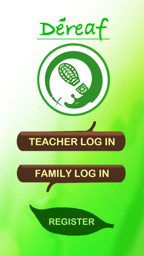
I considered the term ‘drift’ too basic to use, but the original french word gave me a sense of mystery and I even felt a slight ‘fantastical’ tone in the word, instantly loving how it sounded. I decided in order to draw it away from its original context, particularly given its association with someone of extreme politics, I would alter it slightly to a more casual and English-friendly pronunciation. I changed it to ‘Dereaf’; still maintaining that awe of escapism, but now with slight reference to its woodland association, rhyming with ‘leaf’.
I created a Gantt chart on Canva to keep track of my progress so far in the module and to strategise where I would go further with the weeks ahead. My main priority was in regards to covering primary research; I strongly aimed to have a one-tone with a school representative
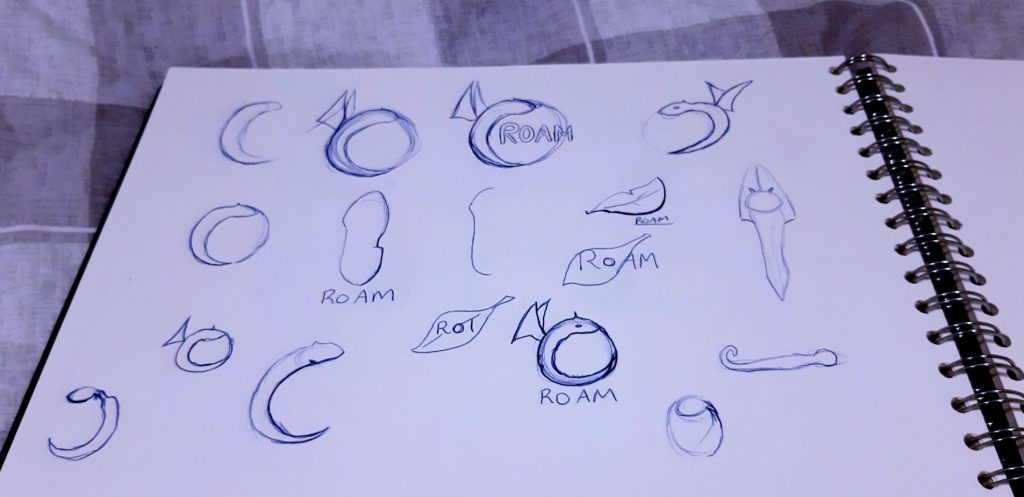
Having now settled on the app’s name and after some initial research and consideration on what I aimed to achieve with my idea, such as how it would benefit the user and what sets it apart from existing apps of similar nature, the next step was to start breathing visual life into the idea. I decided the best step would be to do rough planning on how the logo would appear. It is important for any brand image to convey a unique choice of colour palette to engage the audience, as well provide a sense to them as to what the app is about, both of which would pave the way for the idea to evolve further.
I decided that I would design the character idea for the app within the logo to give an identity and have the character represent the intended fantastical tone of the app.


The idea was now beginning to evolve in my mind’s eye and with some helpful sources to support the concept and directions it could go, it made sense to start fully developing the concept into visual form.
I had already drawn out some rough ideas for how the logo could appear, incorporating the idea for the app’s AI character mascot into the logo, but it was still unclear how the figure would be positioned and what colour scheme I would use. I drew a refined version of my favourite sketch in which the character appeared to be swirling around the circular diameter and I came up with the idea of using the ‘wing’ to spell out the letter D in a subtle manner, similar in vein as to how popular social media platform Facebook, often uses a simple white F to simplify its trademark.
Following a showing of the logo and these different variations to my lecturer and fellow students, it was felt that it was unclear exactly what the logo showed concerning the character, some unsure if it was an animal or an object. I justified my reasoning for using the symbol, explaining how it was a fictional creature to invoke the sense of mystery and escapism as a symbolisation for the app’s escapism for the user. However, it was suggested that that creature be refined more in shape and given a clearer context as to what it’s relevance was to the app’s experience.

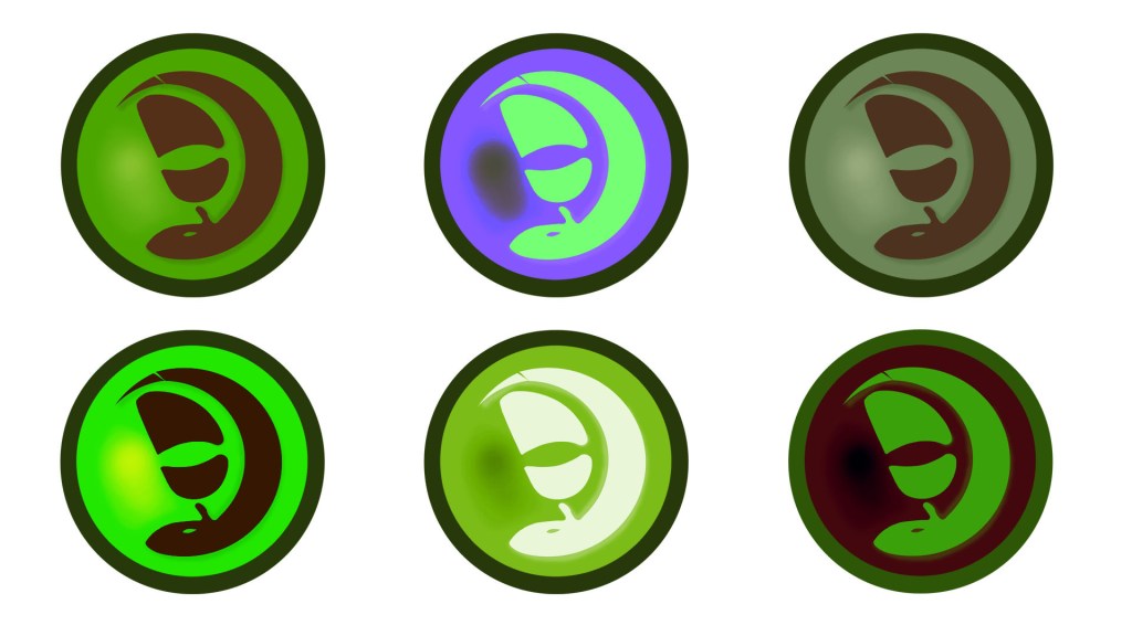
Following this feedback, I took to streamlining the character in the logo, applying crisper edges and a more standard choice of colour theory, using a dark and light shade of green in order for the character to be identified clearer and using no lighting effect. I also applied a subtle detail feature to the character by making the character’s wing resemble the appearance of a shoe footprint to symbolise and showcase to the audience how this app is focused on walk trails. I even at one point considered adding a cross shape to the end the character\s tail to convey the notion that the app focused on circular walks, thus explaining why the character was forming a loop pattern but decided that the idea seemed too distracting. I even gave the character a name at this stage, Bishy Barnaby, a trivial term that refers to what locals would call ladybirds during past times in East Anglia, my home region (Anderson, S, 2018, Do you speak Norfolk? East Anglian words Bishy barnabee and billywitch added to dictionary, Eastern Daily Press. Available at: https://www.edp24.co.uk/lifestyle/heritage/east-anglian-words-bishy-barnabee-and-billywitch-to-be-added-1214842).

Wireframe
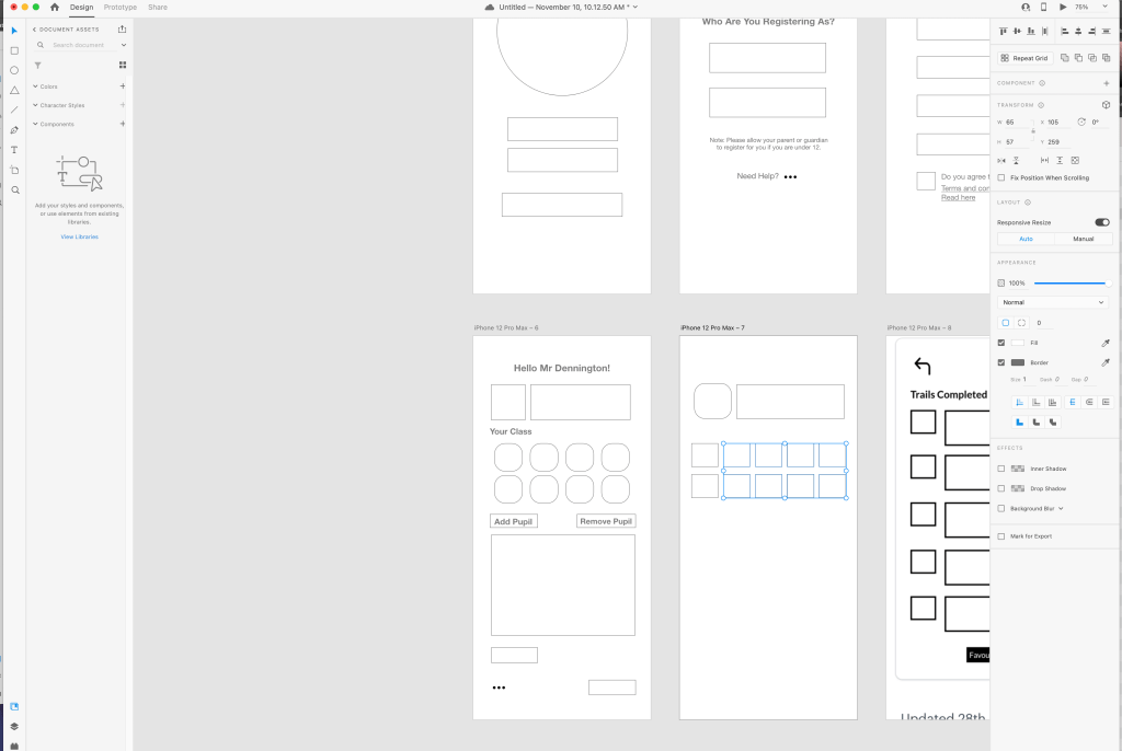
My design basics moved closer to fruition with the process of developing a wireframe. As previously researched, wireframes in general function as the ‘blueprint’ and barebones of a UX product. The wireframe has become more of a necessity with the advent of interactivity growing in products, particularly since the designers and programmers work together more to ensure the functionality and experience are strongly consistent. They must also be kept simple to ensure they communicate well and provide a clear overview of the product structure to fellow team members. Having already created a low-fidelity wireframe, drawing inspiration from the Unibeez layout and experience, I here evolved the idea into a mid-fidelity form and began to work out how I would apply a means to widen the appeal of my app and draw on how the app would be accessible to teachers and young families.
This type of wireframe shall be the first design where I shall apply ideas based on my research and will keep in mind my own motto ‘functionality first, aesthetics second’. It is important to remember that my project shall be a ‘native app’, being that it is not a ‘spin-off’ or subsidiary feature of an established website or domain name, where it would be known as a ‘web app’. Therefore, this will allow for a free approach to creativity, since I will not need to take into account or keep track of how the features will be able to translate from webpages, where screen space is wider, to the more compact view on a mobile device.
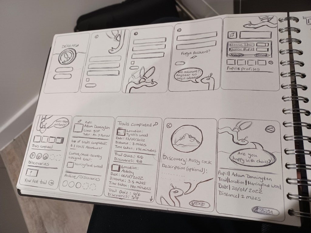
I was introduced to a wireframe developing platform called Pop by a fellow student in my class, Maryam Davar, who showed me the basics of how the platform can be a helpful tool in building a framework for an app. I decided to utilise this platform to create my mid-fidelity wireframe, as a means of broadening my skillset and applying a more detailed layout based on my earlier design. I began to flesh out the app’s narrative more thoroughly here, creating pages that provided help and support for the user regarding navigation.


I began experimenting with how the actual interface could appear colour-wise; I had always envisioned using green to simulate the essence that the user is going on a deep adventure when they open the app, but I could only experiment with block colours and had thought about applying a more gradient colour scheme.
Whilst creating the mid-fidelity, I experimented briefly with another wireframe builder, Figma. This was a platform that was being strongly suggested as an area to practice by my lecturer and I decided to take a look and apply some early experimentation.


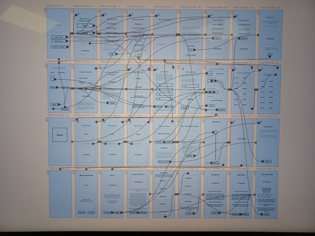
Having refined the logo, plotted out my mid-fidelity wireframe and I began to plan out my own state transition diagram in my sketchbook to provide a context of how each page of the user experience would function, ensuring easy navigation for the target consumers. Around this time I needed to prepare a presentation to showcase where I was in the module and what my next developments were.
I also adapted my rough sketches of the state transition diagram into digital form to demonstrate to the class and lecturer how the app would effectively function with two pathways through the teacher and the family profiles.


I created my own design process chart to prepare for my presentation in the seventh week of the semester. Here I assessed that I was moving into the prototype stage in regards to the process.
App Assets
At this stage of the development, I started to flesh out the app’s identity more in the form of trademark colours, the product’s core values and goals, as well as animated gifs to give a sense of how the AI would move and function as the user encounters the character transition between pages and whilst on their trail.


Around this time, as the app began to find its identity, I got in contact with Ben Brittan Dodd, who was suggested to me by Amanda Elmes, during my previous video call wither her. I arranged a one to one session with him for early December, a fitting time as my wireframe began to reach its final stage of design and the additional elements such as an interface and character UI began to be designed for the app, perfectly setting up a presentation to an industry professional who deals with outdoor education and could provide me with valuable insight for what to consider for a product aimed at schools.


Proto-typing
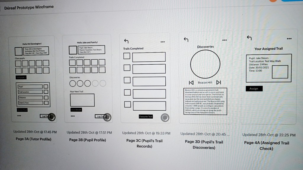
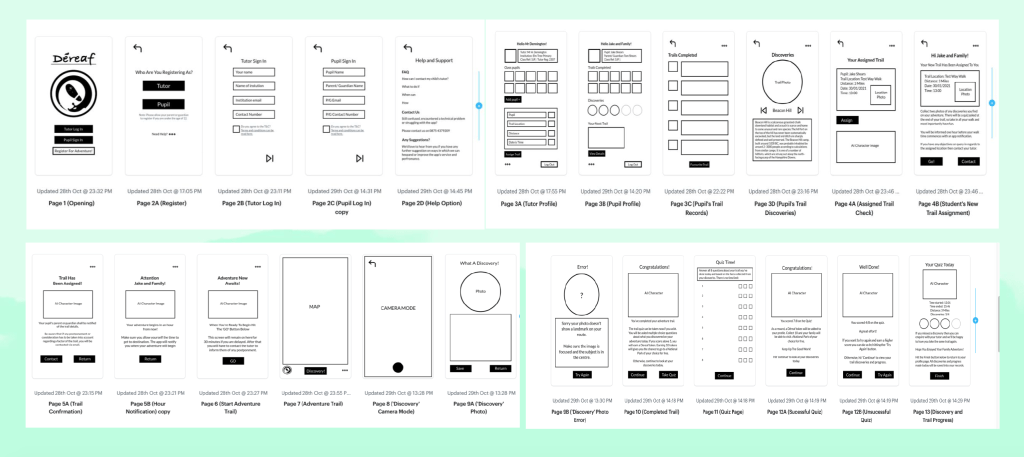
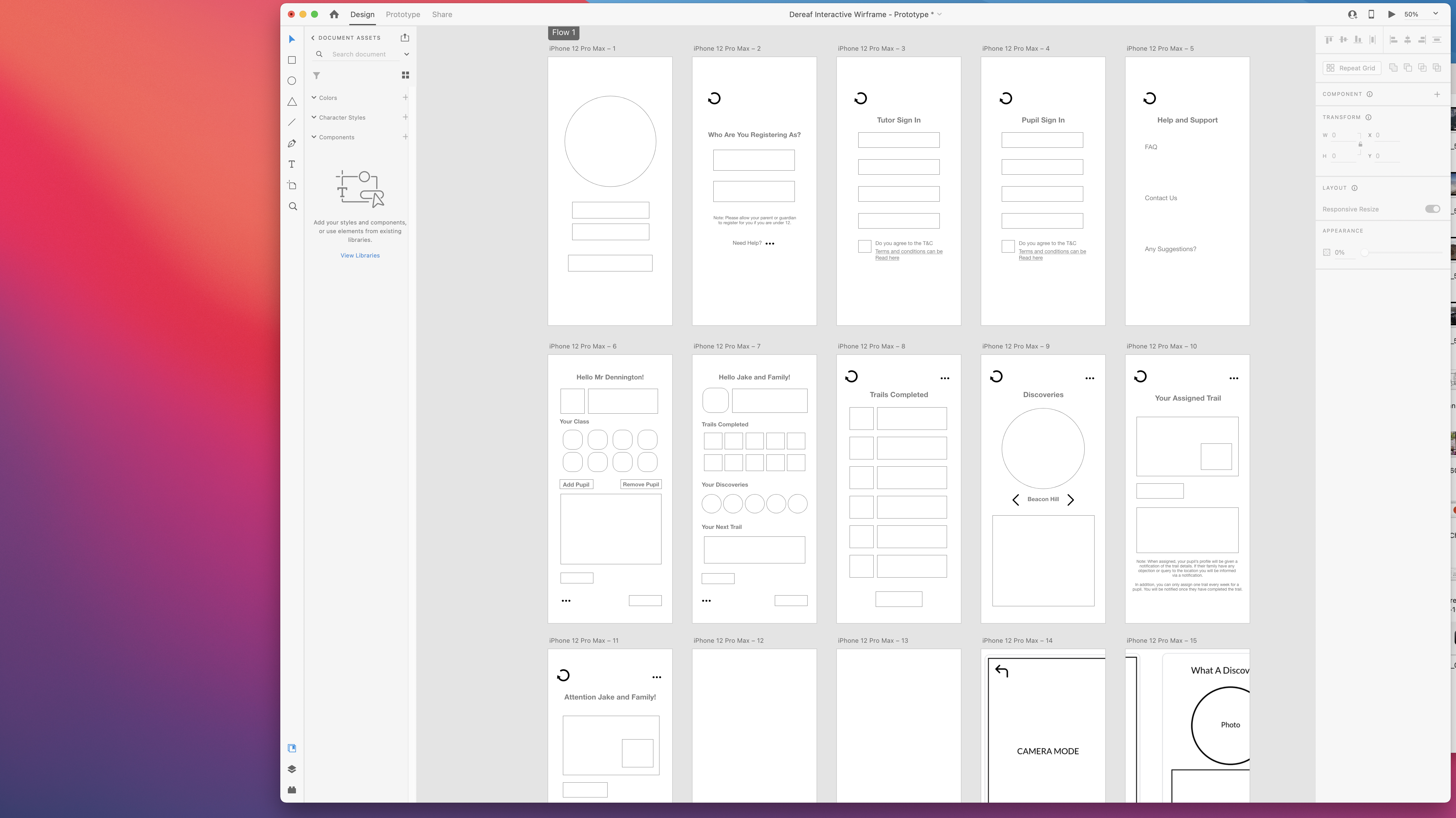
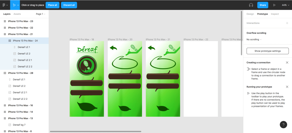
I had now arrived at the final stretch regarding the UX design process; having fleshed out the app wireframe more fully through the mid-fidelity stage and now formed a narrative for how the app will function with its navigation. I decided to use Adobe XD to bridge the stage between the mid-fidelity to what would eventually represent my final prototype in the form of a high-fidelity wireframe.
I would refer to my mid-fidelity detail for reference on how the app layout would be applied and how the narrative would function for the target users.
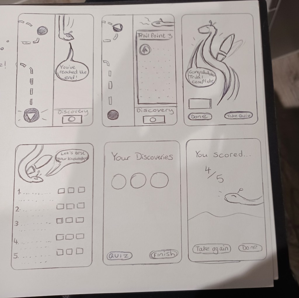
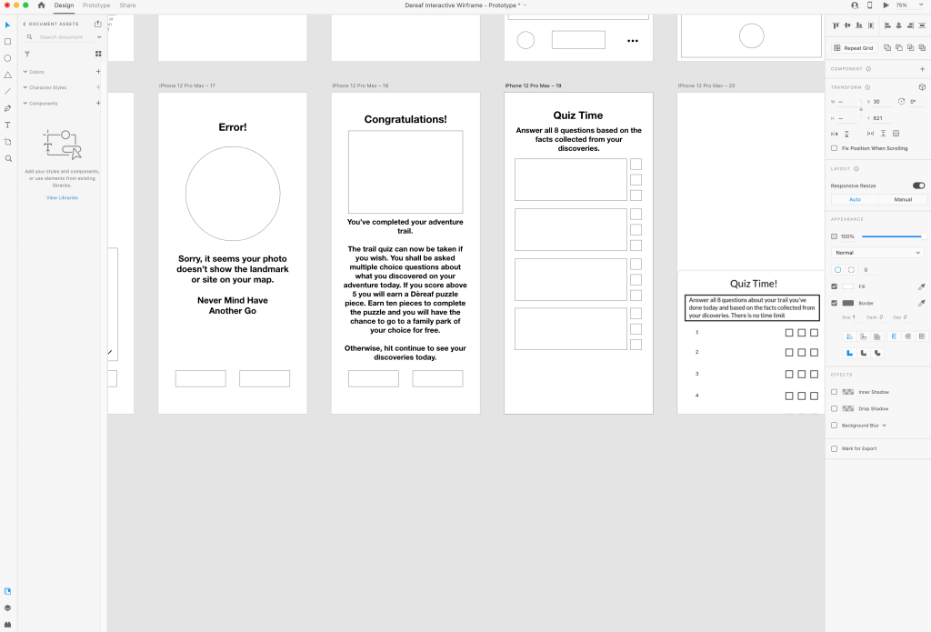
During this stage of the development process, I felt that more needed to be applied to the wireframe regarding its educational element and to make the notion of learning about the outdoors ‘fun’. I began to work in the idea of a quiz, whereupon completing the trail, the pupil is tested on what they have learnt or discovered on their adventure. I originally planned for the quiz to consist of ten questions and for it to be taken only once, but eventually narrowed it down to six to avoid over-whelming the young target group, plus to encourage more support and avoid a competitive nature among pupils, I would eventually re-work the experience so that the pupil could take the quiz again if they were unsuccessful. In addition, I added the element of the young user collecting tokens, in which they are awarded a single ‘token’ upon answering a considerable amount of quiz questions correctly and collecting around ten enables their family and themselves to visit a national park-type location of their choice as a free-day visit.

First Wireframe Draft: https://xd.adobe.com/view/45466e6a-39d7-4f10-a835-4e478faaff6f-1015/?fbclid=IwAR3t3HIRxr3K6i2FBln2M0i9ZvbsMSnvaKRGToXO8Rb9Kclwo9fWCi14CiA

I began to expand my app’s narrative and decided to change the ‘token’ rewards as part of the quiz, to a ‘puzzle’ element instead, where the user is now awarded a puzzle piece after each quiz and must make up the puzzle to earn their free park visit reward. While my app narrative began to form into a greater shape, I had one particular issue regarding how to simulate how the product’s experience, specifically how the teacher user would notify the family user, as well as ensure that they arrive at the appropriate location. I decided that I would showcase my current draft of the wireframe to the class to collect some feedback on how to resolve this issue.
Second Wireframe Draft via this link:
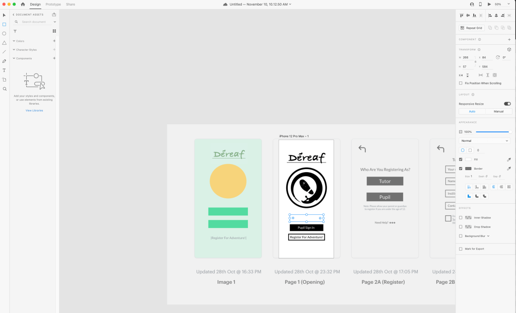
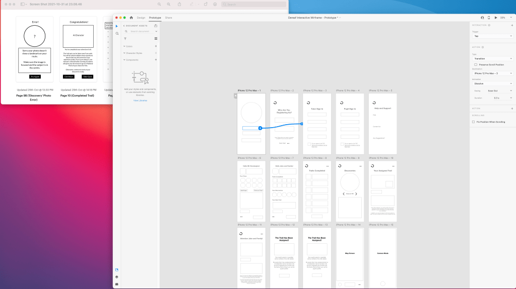
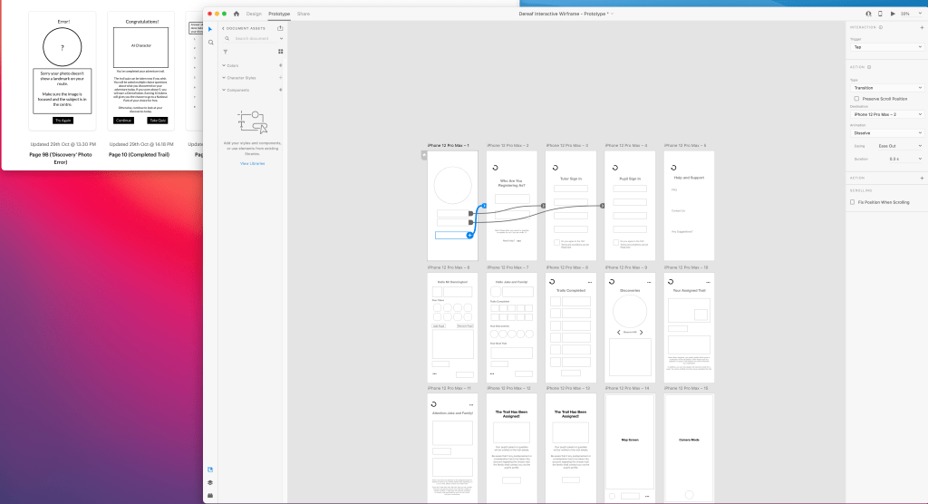
As the middle of December rolled around, the opportunity came to showcase the wireframe for our ideas to the class for a final time before the holiday break, so it helped that I got my Déreaf prototype to the desired standard that could demonstrate its functionality and potential. I presented my wireframe in the form of the link above; this version had been carefully organised after many hours spent on Adobe XD ensuring each button and function took the user to the correct page and was navigatable to all who used it. It also was important that it channelled a sense of security for both the teacher and family of the pupil ensuring that no breach of security could occur. As mentioned in my previous version, this was why it was important for me to work out a system of how a teacher would access the app to assign trails and for the pupil’s family to feel their child’s movement was protected.
Upon showcasing and explaining the wireframe, as well as the updated state transition diagram showing how each page function linked one to another, to my fellow class, it was generally well-received. However, there was a sense that my app focused too specifically on the profile functions and less on the actual experience element of the app. I stressed the struggle that I previously alluded to in which I was unsure how to showcase the trail element of the wireframe since I had initially conceived the notion that the user wouldn’t be able to begin the trail until they had arrived at the assigned location.
In addition, this version of the wireframe gave the young family the option of taking a quiz to educate them on what they learned on their walk when they had finished their trail. It was suggested by the class, that this element should be re-worked and instead the quiz element should be spread out sporadically through the trail; to progress to the next stages of the trail the user must answer the question regarding the area they have now arrived into progress further, ensuring that they don’t avoid taking the quiz at the end of the trail and manage to learn about their discoveries and what they encounter.

I agreed that having the user not able to begin the quiz until their destination arrival seemed rather trivial and restrictive for the user’s navigation. In addition, I realised that embracing the change of having the quiz be ‘spread out’ through the trail would enable me to showcase the adventurous experience of the idea more thoroughly in the wireframe. I re-worked the wireframe to have the quiz no longer be an optional feature at the end of the trail and in the process allowing the user to click on the ‘assigned trail’ feature, via the Family profile page suggestion greatly benefited my Wireframe.
In order to create the sense of progressing through the adventure trail in the wireframe, I created a static dot and line system where one must click the black dot representing the point of interest in the trail.

I was able to finally have a one-to-one session with Ben Brittan-Dodd, the Outdoor Education Advisor for the Hampshire County Council. I showcased my most recent version of the wireframe to Mr Brittan-Dodd and let him browse through it as a means to collect feedback and suggestion as to whether it felt accessible enough to a young family demographic. Further to this, since he is an expert in young education and the requirements one must take for interactive learning, I listened to what suggestions he had with regard to how the app could be enhanced in experience and what additional assets could be brought to it, should it evolve into a more widely-available product with commercial appeal.
I enquired with him as to whether primary schools actually use digital apps for educational purposes, thus ensuring for the safety of minors that this app was accessible and appropriate enough for them to view and use, to which he assured that, provided they were under the correct supervision, children around the age of 7 to 13 could use the product. I also queried as to whether the security functions on the home page to ensure the rightful user logs in, to which he determined that the measures I had put in looked safe and supported my initiative in requiring an individual, who joins as a teacher, to be approved by the school admin and headteacher via confirmation email, before being allowed to join. He praised the effort I took to make the prototype and made some recommendations to take into account and provide to fellow team members should the idea evolve further to an interface stage of development; tweak some words for the younger demographic to better understand such as using ‘teacher’ instead of ‘tutor’ and channel more excitement into the language to engage in excitement for the family.
Following this assessment from a professional, I can conclude that my wireframe is now representative of the Déreaf app in its current prototype form. There is room for improvement regarding language to ensure it is more accessible for a younger generation, as well as the fact that it could include further features, such as a mode to measure water, as suggested by Mr Brittan-Dodd, but for its initial version it fulfils it minimum requirement for a teacher and pupil’s family.
The final Wireframe can be viewed via this linked below:

Another area of the User Experience that was important to consider was in regard to how the user may experience the odd flaw in the navigation either owing to a technical error which incidentally would need to be assessed and improved upon in an updated version of the app, as specified earlier in the Iterative Design cycle. Therefore I created this icon to indicate to the user of when the app was temporarily in the process of either recalibrating or setting up its next action.
Having completed the final proof of concept regarding the User Experience of the app idea, I took it upon myself to experiment with how the product would likely appear in a fully-realised Interface form. I knew that I wanted to utilise a colour theory concerning a woodland palette, notably with the use of a brown and green scheme, naturally since this was what reflected the app’s primary focus was, as well as keeping in line with the brand’s AI trademark. I experimented with photoshop to create a rough template of the interface, utilising a gradient backdrop to evoke the fantastical tone of the app and utilising leaf and log shapes to represent the interactive elements of the page interface. The inspiration for the colour scheme came from a similar app called Audio Trails which uses a dark green text and header as its corporate image.
Regarding the desired user interface for the app, I would create it with Figma, since the platform is greatly admired by industry professionals and would enable me to push my UX skills further from Adobe XD and Pop. However, I have yet to learn how exactly one uses the app to apply interface assets; I tried practising it myself but found that I was unable to apply interactive elements to the pages allowing the user to progress between pages. I shall therefore look to keep practising this in my spare time for User Experience does fascinate and I feel I owe it to myself to try harder with the practicality of the trade, thus improving my craft.

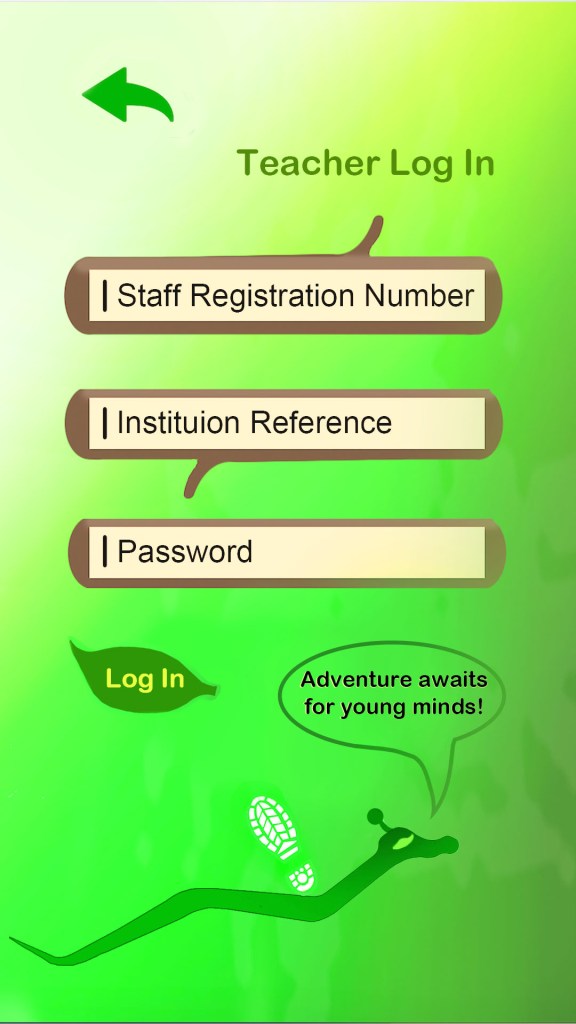
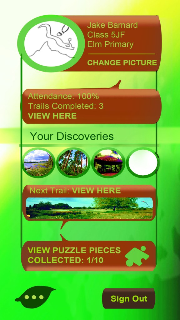
I created a second draft of the Interface having re-considered some design choices I made in the initial version, such as toning the brown log features down in brightness levels, using a bright choice of text in order for the user to establish much clearer which features on the page takes the user to their desired section. However, I encountered a problem regarding the colour choice in that the Bishy Barnaby, the AI character, began to camouflage into the background and it proved a problem on how to showcase him, compromising the experience in the process. I realised that the app should embrace a more solid colour scheme in future to avoid this issue, keeping in accordance with the simple interface approach that I referenced earlier and letting the experience drive the appeal. I figured that I ought to use the brown colour more thoroughly on the pages, such as making the boxes more to give the text more surrounding space since it appeared rather ‘condensed’ within, plus this would allow the Bishy character more freedom to glide across the screen without being restricted from the issue of camouflaging into the green gradient background. I decided to create a piece of test footage showing the app in simulated action on a phone using this new design consideration and determining whether the features would appear clear enough when viewed in an environment (see bottom of page).
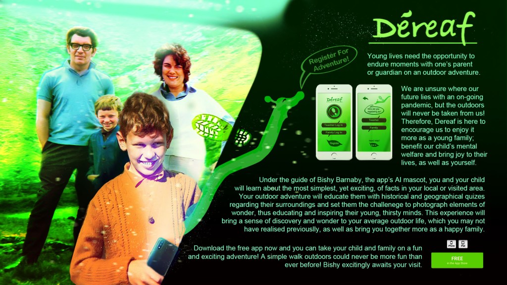
To provide a final summarising of the app’s brand potential and assets, I created this poster using my design and composting skills on Adobe Photoshop with images sourced from my own private photos. My main priority was to showcase more than anything the warm family adventure and dynamic that this app will bring to its target consumers. In addition, the app’s intended tone of escapism and mystery for the user is conveyed much more clearly through the appropriate use of a mystical green and dark olive colour scheme. I came to the decision that this would represent the final colour theory for my Interface of the app and I shall apply this two colour rule to the next draft should the product evolve further to the next stage beyond its current prototype phase. I researched various existing app landing pages where one can download apps and based the layout of this promotional content on the structure seen there, including the addition of a download button to address how this app is free to use (https://clevertap.com/blog/mobile-app-landing-page/)
It would be worth a mention that regarding the app’s stakeholders, who will determine whether the product is successful or not, this will be the school and teacher groups since the product will be utilised for school and educational purposes first and foremost, despite the promotional consensus leading one to believe it is the family consumers. After all, for the school pupil and their family to set out on their adventure and consume the efforts of the app’s impeccable research team, who will provide the accurate information for the quiz and ‘discovery’ features, schools employing the aforementioned teachers will need to encourage them to see that the product is utilised.
As we near the conclusion of the Déreaf app development, I will state that regarding the final outcome I would like to see this app ultimately achieve the three goals I set out at the beginning of this development narrative; bring families together more, encourage outdoor activity to fight mental health in young people, as well as preventing it from manifesting and finally educate young minds as well as their families, regarding nature and their local history.
In future, having gained practice with Adobe XD and POP for creating wireframe practices, I shall look to learn and utilise fellow platform Figma more thoroughly. I have heard in my various lectures and through secondary research, that Figma is the more favoured tool for industry purposes. It would be in my best interest to pay close attention to the importance and relevance it has for UX and possible UI Design. In addition, I was fortunate to meet an industry professional by the name of Eddie Rich, UX leader for a company named Efficio, during a professional visit to the University, along with Winchester Creatives. Through brief communication regarding industry software in UX Design, Mr Rich directed me to two further platforms, Axure and UXPin, one of which his company happens to use.
UXPin – https://www.uxpin.com/
As a result, these platforms I shall also keep in mind to expand my UX practices and explore them at a later date should I wish to apply User Experience when appropriate in future opportunities or projects.
Conclusion
I thoroughly enjoyed my experience working on this module; I had no prior experience or broad knowledge on the concept of User Experience or User Interface and so this was the perfect exercise to introduce me to new skills and move my passion and experience for digital media into new territory, enabling me to widen my knowledge.
I am most proud of the fact that I delved into a subject that means a lot to me and one that certainly carries relevance within it. I previously alluded to the fact of how Covid Lockdowns throughout 2020 and 2021 taught us that in life sometimes we need to enjoy the more simple things in life and a simple walk can sometimes be a highlight in one’s day. In addition, mental health is a growing concern in the United Kingdom particularly among young people and I strongly believe that I prioritised my target audience appropriately by identifying young families and, in the process, minors as to who the app is designed to appeal to.
The strength of the app will ensure that more family time is spent to encourage young individuals to gain the activity, education and influence, both in using the app and what they discover or take in on their adventure, as the ultimate defenders in combating mental health in their young mindset. I also believe that this app has ‘legs’ as what it has as opposed to the various other apps in the outdoors environment is a more personal-themed message of bringing families together, as opposed to the exact distance the user has walked, ultimately putting compassion before the competitive nature of determination.
Regarding what I would consider improving if given more time or what I would do differently next time, I would certainly want to focus on getting the final User Interface to a more finalised standard and actually utilising the interactive element within it. My final interface drafts provide a solid visual sense of how the app would appear when used as a whole product, with the interaction element being simulated through the final wireframe.
Further to this, I certainly pushed myself with my research; putting together a questionnaire and collecting responsive data regarding people’s attitudes or opinions towards the core message of the app is and what procedures to take in order for it to appeal to the ideal consumers. However, regarding future research, I will look to take things further by putting together a focus group to think about what considerations to explore more thoroughly, as well as work harder to ensure that when putting together a questionnaire my questions are organised effectively. In addition, despite sending my questionnaire to a public school admin and speaking with an outdoor education professional, I didn’t quite get the response from teachers, who certainly would have helped in the development of the app being accessible to children. Therefore, I will look to double my efforts to get in touch with professional institutions for future modules, ensuring more efficient data is collected in my projects.
Overall, this has been a fun new experience for my skills and reputation and I can gladly say that I can now apply User Experience practice to my continuously growing portfolio with an acquired working knowledge for Adobe XD and a modest start in using Figma and Pop. I end this study and analysis with a demonstration of how the app’s trail and quiz element would function during a walk in the ideal environment. This interface was designed with Adobe Photoshop and After Effects was used to compost the map to the phone for compositing.
Thank you for reading.
Additional research pieces at:
