I present to you a case study that analyses and documents the development of a module taken during my first MA semester at the University of Winchester. I was assigned the criteria to develop a project for the Student Design Awards, courtesy of the Royal Society of Arts, in which the project must convey a campaign or method to strongly improve health, transport and social life in our communities with the use of creative skills. The institution gave the aspiring creator a choice of nine different tasks to undertake as part of their entry for the awards body.
I was most intrigued by this module since I had been unaware of this annual event and believed it to be an admirable source, one where creativity and activism, two elements that matter most to me, could be juxtaposed to create an engaging and effective movement to campaign and raise awareness of areas that are deserving of strong change.
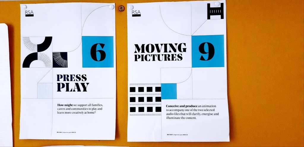
During my introduction to the module, in a task group of three, we were given the sixth project of choice titled Press Play. This was a good warm-up for what to expect in this particular module; we worked together to explore what keywords to convey in our idea and message. It was decided in the exercise, that we would concentrate on merging the education and family factors of a child’s life together so that they could experience a fun sensibility in the information they took in, either by presenting it through an interactive app or streaming channel. I liked this idea and felt I should pursue this particular project as my concentrated piece, building on the concept we developed during this group exercise.
However, I felt that the project was too familiar with the Design Practice module that I was doing simultaneously; creating an app called Déreaf, which explored and addressed the concept of motivating young families to explore the outdoors together, thus learning and gaining activity in the process. Therefore, I longed for a different challenge and one that could bring more variety to my portfolio. My primary interest and background is animation and motion graphics with creative storytelling; I was interested as to whether there was an item where I could apply this passion to emphasise the need for improvement to our societies and work an emotional element into it through my vision.
To my delight, there was indeed another project that specified criteria in this field called Moving Pictures, in which one was expected to create a short animated piece that would accompany two particular audio files and add visual context to the narration, thus bringing a good deal of momentum to the message.
I was instantly hooked on this concept since I have always enjoyed bringing my efforts to a pre-conceived notion and enhancing the point of the idea through visual narrative. I felt this would be the ideal opportunity to play to my strengths whilst showcasing my true passion in my Master’s degree. Regarding the two audio options, Building Cities and Act Together, I didn’t quite understand the message in the former since I was inexperienced or unaware in the developments of business and transport in city regions. The latter on the other hand, felt more important in message to the audience, being that it aimed to encourage people to accept each other more in our continuously-growing diverse culture, something which I champion and strongly support.
However, more than anything for myself, I wanted to pursue the idea for it carried a message that resonated with me, specifically concerning how divided society has become over time. I found in my previous life experience people can judge background and social views over the personality of an individual and not consider what professional asset they can bring. Before pursuing my degree, I worked as a Print Finisher in the Print industry for 4 years; during that time I experienced an alarming amount of colleagues with views that are very prejudiced regarding one’s orientation, gender, background and ethnicity. Working in a town and area of the UK with a low amount of diversity compared to the larger metropolitan areas, many of these people were shockingly open about these views much to my astonishment. It seemed inconceivable to me how these individuals can speak so socially controversial, yet not be challenged or held to account.
Therefore, I was determined to take this project and address those who are socially prejudiced, highlighting the fact that ‘labelling’ towards others in life needs to stop. When global incidents like the ongoing pandemic occur and we now suddenly depend more on others to help us through health or financial concerns, we can’t hold grudges any longer or put one’s background before their duty to help another. However, it is also worth noting how I have found in life that there are those on the other extreme who may seek to label people with a ‘witch-hunt’ mentality, simply based on a figure of speech or phrase being misquoted, believing they will achieve social justice based on second-hand reference. This may inadvertently cause social friction even though the person has not explored the situation first-hand. So my target groups are those on both the extreme left and right; using subjective elements to portray the dynamic in social groups, I will make it clear that objective elements representing actual fact they have heard on first-hand must be what people should embrace, rather people’s judgement.
Brainstorming

I began development with the always necessary brainstorm process, addressing what factors and elements I needed to address: I wanted to make it clear how the theory of change must be embraced as the world is changing in culture and economy and as a result we can’t live in times of prejudice in working life, especially considering the change in social attitude and the wider classes now among us.
In addition, I support the notion that positivity among people must be promoted more to encourage others to embrace teamwork, thus ensuring a smooth and healthy working relationship to build to a better social and economic future, as well as preparing for times of desperate co-operation where change is inevitable, akin to the challenging times we’ve faced from the pandemic.
Therefore, I noted how social classes needed to be identified, regarding wealth, occupation and skill status, for the message of unity to be conveyed visually within the animated sequences. I set about three important lessons to showcase in the project:
- The prevention of potential division in social life following the Covid19 pandemic.
- Dealing with political and social views ‘over-shadowing’ the chance for unity and co-operation to rebuild for the future.
- Address the lack of understanding in people’s mental welfare at work and in social abilties.
My ultimate outcome for the project is to engage the attention of these particular extremes and have them re-consider both sides of the argument and realise that they need to reach a balanced centre-ground for life to move forward and to drop all sense of wallowing in a past-tense, reaching a sense of greener pastures regarding society. Much like all attempts for change, there is no guarantee that the message will get through or achieve its full aim, but there can at least be an alternative presented before the two extremes to make them consider one another’s side and reach a compromise.
Research and Development
I realised that the RSA was in favour of the theory of change and considering my somewhat negative experience with poor social relationships in my previous job, I figured that I should start by taking a read of sources that covered the working-class dynamics and explore what areas could be focused on to improve the experience in working relationships.
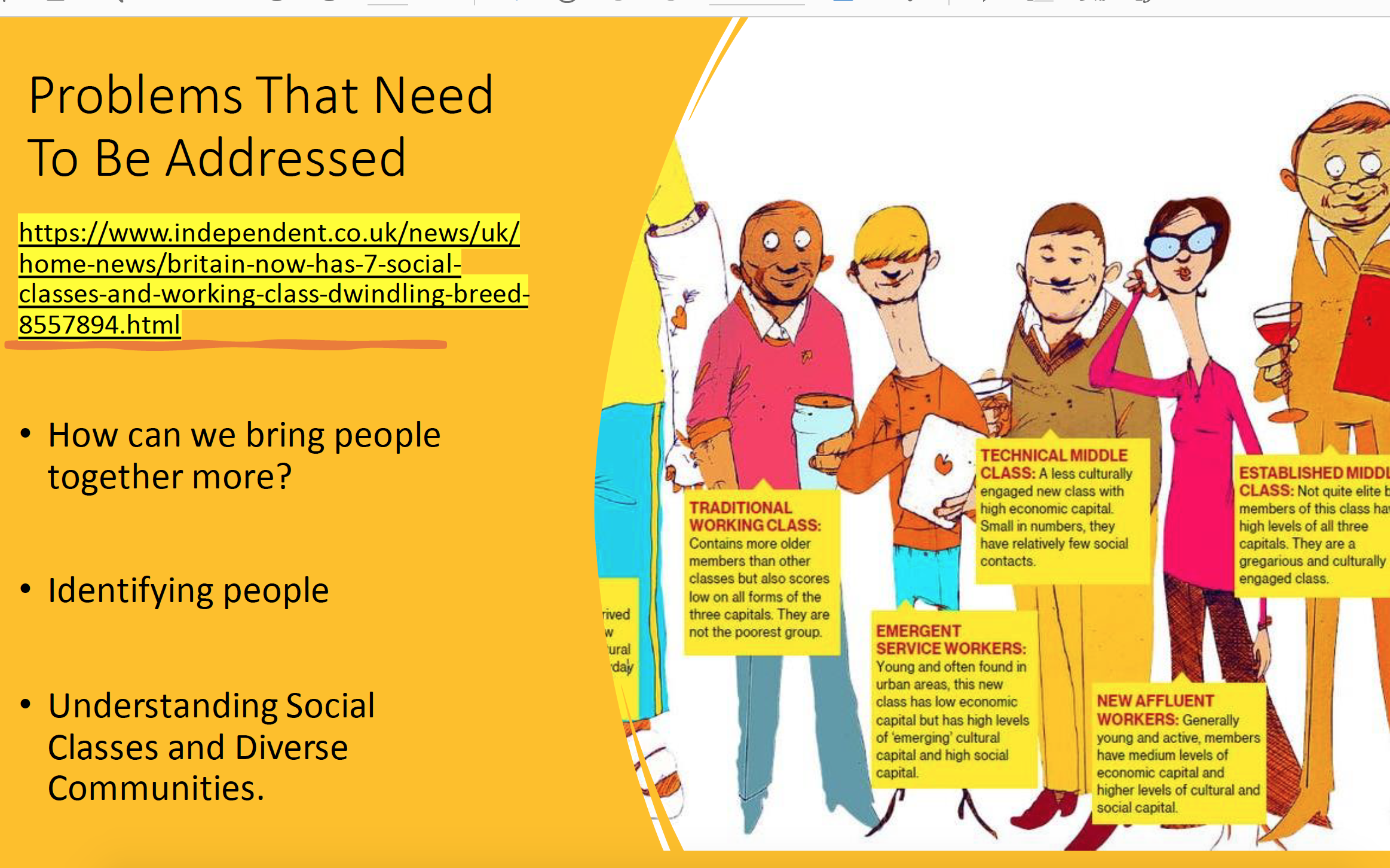
I took to further my research on social classes through online resources and came across a BBC news report from former journalist Nick Higham, which addressed the fact, much to my learning, that we no longer have a simple three-class system in our nation, namely working, middle and upper class, but rather seven different groups. While there is a slight blurring of the lines, these classes are no longer determined by wealth or occupation as previously the case, but now on skillset, residence, social resources, interest and tastes in life.
This aforementioned detail specifically refers to one’s amount of ‘capital’ in each of their life values; social, wealth and culture, wherein it determines who they are morally and personally and thus their social class. Economic obviously refers to wealth, but culture capital measures what kind of recreation, skills or education they have, whereas social capital is determined by the individual quantity of friendship (Raskoff, S, 2014, Social and Cultural Capital at School, Everyday Sociology – https://www.everydaysociologyblog.com/2014/11/social-and-cultural-capital-at-school.html).
Higham, N, NewsInWorldNow, 2013, UK Now Has Seven Social Classes, 3rd April.
Source: https://www.youtube.com/watch?v=5QWmi3WRT6o
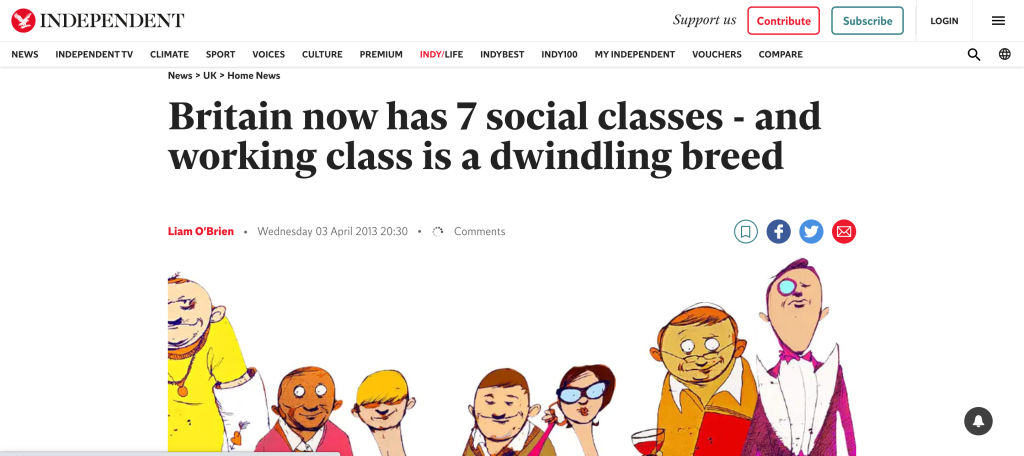
O’Brien, L (2013) Britain now has 7 social classes – and working class is a dwindling breed, The Independent. Accessed 12th October 2021
Source: https://www.independent.co.uk/news/uk/home-news/britain-now-has-7-social-classes-and-working-class-is-a-dwindling-breed-8557894.html
So what exactly are these seven respective social classes? Firstly, the traditional working-class from the previous three-tier system remains unchanged, generally nowadays consisting of more mature members of the seven groups, these particular members easily belonging to the aforementioned people I worked with in my previous role. This group has the modest economic and social capital, being economically left, but socially right. Although not the poorest class, that particular criteria belonging to the Precariat class who represent the deprived and consist of low economic, culture and social capital, the working class now has two additional groups. These said groups reflect the change in youth culture, city-dwelling lifestyle and roles in the digital-related trade, namely the New-Affluent Worker and the Emergent Service Worker groups. The two are generally the same since they both consist of high social and cultural capital, but the former generally consist of low capital in a metropolitan ‘bubble’ and would live in property not owned by themselves as a result, whilst the latter typically resides in a modest working lifestyle, but with high economic capital and thus in a higher likelihood of owning one’s home.
While the middle class has in past times had its share of blurriness, it is generally divided between that of the Established and Technical groups in modern times. This has been the most interesting fact in my research since I could never quite place what defines a middle class; some members consisting of high capital can often find themselves in white-collar positions but choose to live a modest or low cultured lifestyle, while others can be classified as working but have a high economic and cultural attitude. This confusion is generally justified with these two classes, being that they both have high capital, but that the established class can range from a modest to high level of social and cultured capital, while the technical have low level of the two, being committed to their demanding trade. Finally, regarding the higher end, the upper-class of the past have somewhat evolved into the Elite, who excel in all three levels of capital and are generalised as being ‘well-off’.
McCord, P, 2021, 4 lessons the pandemic taught us about work, life and balance, TED, 6th April (https://www.youtube.com/watch?v=yuy9yQlFZAU).
I turned my attention to this TED talk addressing what I could consider showcasing visually in my animatic; it explained a few factors that one must take on board with more heart now regarding the somewhat reduced circumstance we lived through in 2020 and still to some extent do with the ongoing threat of the coronavirus. It may seem that the pandemic is a convenient justification as to why I am making these decisions, but in actual fact there is much ground to support these theories and how to emphasise further that in times of economic and social deprivement we need to consider these more seriously from family to one’s own health.
Referring back to the theory of change being showcased in the project, I also researched what impact causes needed to be addressed in the project or what we can do to also help improve the prevention or damage to the environment and climate change, which the transcript addressed. One particular element is the factor of our industry becoming more greener with the push to have transportation become entirely electrically powered in our future, achieving long-term impact; not just aiding with the prevention of air pollution, but also being that the vehicles will be more cost-effective to construct as opposed to combustible engines. Therefore, it will give more opportunity for money to be invested in new ways to benefit those on the lower economic capital and social spectrum and see an improvement in social unity as a result (Bateman, T, 2021, Gearing up to go green: When are Europe’s carmakers making the switch to electric cars, Euronews.next – https://www.euronews.com/next/2021/09/16/when-will-cars-go-fully-electric-the-europe-based-carmakers-dropping-petrol).
Another area of contention for the project, particularly since I am addressing people of different roles and backgrounds is what activities can I showcase in the project, specifically regarding what acts of noble cause can be addressed by the individuals. I am a strong believer in volunteering to help support communities or organisations that give people a voice, such as charities or universities, particularly being a Student Representative myself. I will showcase volunteering among the social classes in the video to evoke a sense one building a social capital for themselves and to illustrate how some in life will go the extra route to benefit their moral stance.
During the initial stages of development and discussion in my early lectures, the first challenge I needed to overcome was how exactly I would portray the context on-screen to the words of the spoken audio. It was a tricky hurdle to cross, since the audio spoke of various heavy-related topics and I knew these would need to be addressed in the most subtle of methods through either restricted storytelling or softened visual elements.

I began to brainstorm and experiment with different ideas on what visuals could be utilised either metaphorically or internally to convey the message of people coming together, regardless of background, to work more fluently. One particular idea I had in the early stages was to possibly represent the individuals in the video as guinea pigs, with each creature being of a different colour and place of origin, thus symbolising the diverse angle I wanted to show. I also considered having the individuals, in this manner, thrown into boxes in a lab to metaphorically justify how people can’t ‘be thrown together’, as stated in the transcript.
However, I soon realised that I would have trouble addressing the factor of climate change and social and economic unity through the animals. I could have possibly portrayed the creatures in an anthropomorphic sensibility, but I wanted to ensure the audience would be able to identify with the context much clearer, thus having humans be represented would make the message stronger.
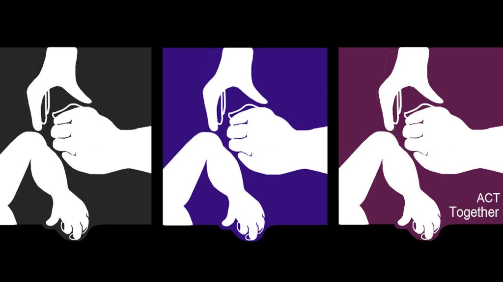
I looked at various corporate and charity videos to explore how humans can be portrayed to represent different social classes in animated aesthetic, but I found nothing substantial, so I went back to the brainstorming process. I drew a concept logo (image above) consisting of human silhouette figures using different hand actions to symbolise the difference of one’s personality and way of greeting as a potential starting focus, but the design felt too generic and didn’t give a sense of personality. During our second lecture, one of the key pieces of advice addressed to us was to apply one’s own particular interest to give the idea to generate more personality and to channel a sense of passion. I immediately thought about my favourite interests and almost suddenly came to the realisation that my passion for the arts could be utilised as the visual element in the project.
“Art binds. Culture generates social capital and strengthens a community’s character. Art brings people together physically — at galleries, museums, performance spaces — and culturally, through its capacity to tell a community’s shared story, to inspire reflection, and form connections that transcend differences.” – Ibarguen, A, 2018, Art Binds People to Place and to Each Other, Knight Foundation, https://knightfoundation.org/speeches/art-binds-people-to-place-and-to-each-other/
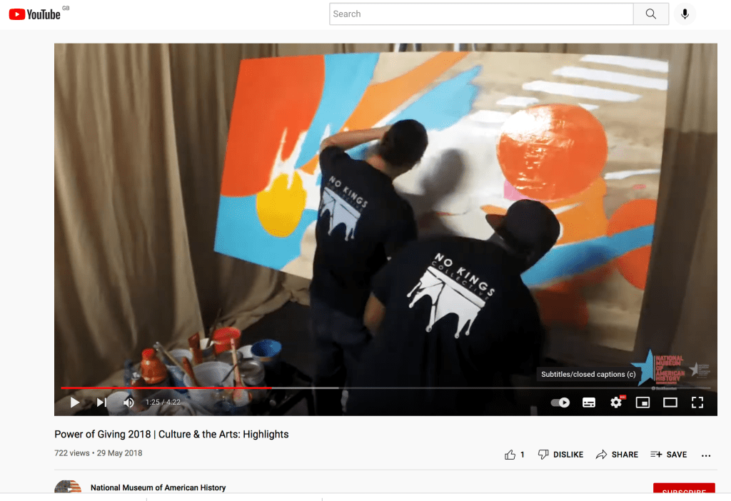
Power of Giving 2018 | Culture & the Arts: Highlights, 2018, National Museum of American History, 29th May.
Source: https://www.youtube.com/watch?v=xFL3X3bnfWM
As suggested by the previous quote, I realised that art was a good catalyst to carry the project’s subject matter since it is a medium that every individual has admiration for, whatever the particular style happens to be. In addition, everybody is entitled to their own taste in the medium and what preference or interpretation they have within it, very much symbolising how all individuals should feel in their own right to live their lives in this world and share it with others. I came to the realisation that I could portray the seven social classes I cited in my earlier research in the form of different art styles and allow their appearance, specifically colour scheme and design, to be dictated by the style they are a homage to, as opposed to being a figure of a certain ethnicity or orientation.
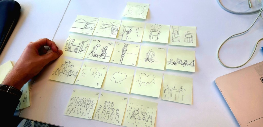
I was slightly concerned in the early stages of the storyboarding and visual development upon reading the transcript, as it mentioned how racism is also an issue in our current social developments. I had no intention of portraying negativity or signs of social discarding within the visual context, since the project was to convey positive messaging and to enlighten people of the situations everyone can find themselves in no matter what your position or background.
I was also conscious of the fact that one must avoid stereotyping individuals, which the project brief made clear to me, specifically how one needed to take care in the way people’s skin or choice of garments can factor into these issues, thus avoiding the visuals inadvertently appearing to contradict the narration. Therefore, the decision to use figures of art movements to represent the range of different socials in society and workforce, each with their own set of skills and principles, ultimately proved to be an asset in softening the depiction of diverse individuals and also made for excellent use of metaphorically making social commentary on differing cultures and backgrounds.
I realised that I would need to undertake some visual research on what different art styles to consider for character representation and explore more about their context and origin, as well as any considerations that ought to be made if the art might originate from a controversial background. At this stage, I was excited at the possibilities in research that followed and confident in the direction that I was taking with this assignment, in that I had a passion motivating me to convey a message I believed in.
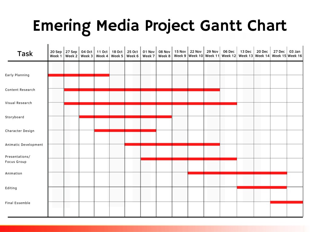
Created in Canva it provided a valuable asset to a professional approach in the planning and preparation for my aspiring pathway to a professional level.
Realising this would be a project of huge responsibility and prioritisation, I set out to create a Gantt Chart, documenting the progress made so far and to schedule my further weeks and the time that I would need throughout the semester, taking into account the other modules I was studying simultaneously. Known as Sequencing, the ‘leap of faith’ that came with pursuing this project, specifically covering sensitive topics and producing an animated message contained with a given time length and channelling meaning, requiring the need to be broken down into weekly items.
For me the biggest priority in my project development was the research, the reason being that I wanted to ensure the areas I explored were conveyed and acknowledged accordingly. However, I also set out to apply my own interpretation on how these social representations should channel a deal of positivity and not just seem stereotypical in behaviour.
Visual Aesthetic
Having now established my schedule and the approach I would take in my choice of aesthetic and tone, the next step was to explore what visual resources could influence my vision and narrative, ensuring that the notion of differing social groups unifying and working together came across. However, at this stage, I still had yet to resolve the question: How do you make multiple art variations appear to feel in the same and consistent environment as each other?.
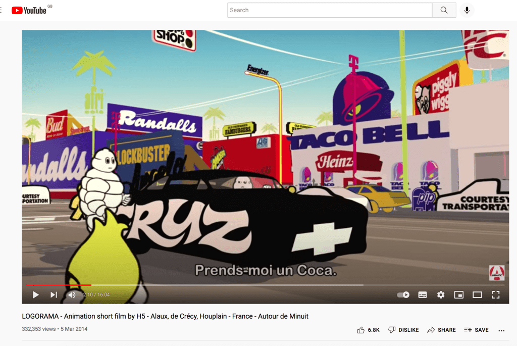
Regarding inspiration on bringing multiple styles together, I explored various animated short films and advertisements of the past and one particular piece stood out to me. I watched an oscar-winning French short film titled Logorama (Alaux, Crécy and Houplain, 2008) which grabbed my attention for it’s strong use of stylistic variety. The short took familiar global brands and mascots and played with the notion of them representing individuals in real-life scenarios, never addressing them by name, but relying on the audience’s familiarity and interpretation. This concept of taking familiar designs in culture and giving them everyday roles fuelled my desire in wanting to pursue this concept of using individuals representing classical figures of art, but in a more current trend by addressing the issues of a pandemic, climate change and the lack of social unity.
This particular example was created with 3D animation and I began to consider the possibility as to whether I could create a hybrid blend of motion graphics and 3D visuals to emphasise the diverse angle more thoroughly. However, I decided for the meantime to keep everything motion graphics focused so as to avoid overwhelming my schedule and practice, plus I knew that before even testing the idea I would need to look at examples of where this juxtaposition of mediums has been utilised effectively.

Whilst exploring animated works, I took to citing art styles from the past which I could utilise as a means to demonstrate a diverse community in the project. I drew my attention to the Google Arts and Culture home page and took note of various styles that appealed to me and I felt would give a great sense of visual presence. Among them were Pop art, Surrealism, Abstract, Renaissance and Contemporary/ Modern Art, each of these channelling a unique visual representation that I knew would work well together as an example of a diverse representation.
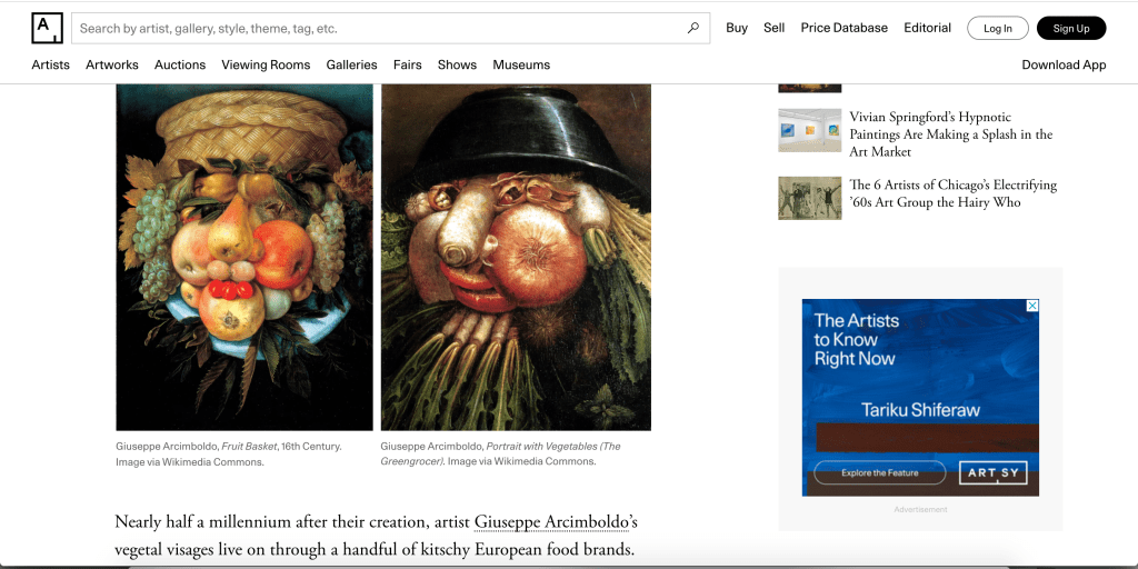
Shank, I, 2017, The Renaissance Artist Whose Fruit-Faced Portraits Inspired the Surrealists, Artsy
(https://www.artsy.net/article/artsy-editorial-renaissance-artist-fruit-faced-portraits-inspired-surrealists)
I realised the hardest style to capture would be the renaissance movement given its high level of detail and considering the time it would take to animate, so I searched for a particular movement of this style where elements could be pulled to give the impression of the individual being reminiscent of the art. One particular style of this era that stood out to me was the work of Italian artist Giuseppe Arcimboldo, who had a very iconic and imaginative approach to portrait painting by using fruits, vegetables and plantations to create the illusion of a face. I decided that this style would be useful to apply in a contemporary fashion as it would subtly convey how someone has a particular facial structure and image that they were born with and as a result showcase a particular background in the social art community.
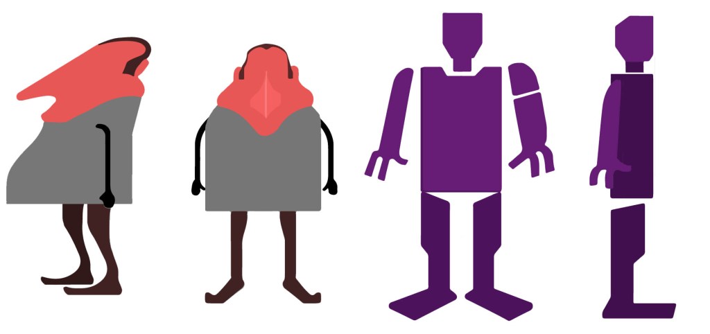
Upon this realisation, it became evident to me that the charm of this project was bringing the historical movements into a more modern fashion to demonstrate how background in people should be accepted regardless of origin in individuals. I then took to cite further examples, including a commercial art movement from the 1950s popularised by a now-defunct studio called UPA (United Productions of America) that utilised an abstract style in character animation, where human figures were portrayed with a flat, sharp-edged and angular design, much less streamlined than the more mainstream media of the time. I figured that these features would best suit the traditional working-class representative.

Source: https://www.awn.com/genedeitch/chapter-twelve-the-upa-experience

Saul Bass, a popular American graphic designer famous for the pioneering of movie titles in Hollywood utilising his geometric silhouette style.
Source: https://kpressburger.com/designer-magazine-layouts
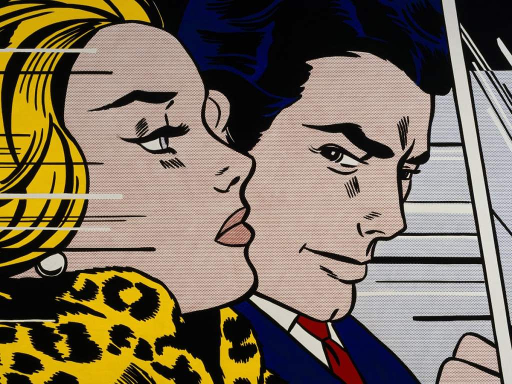
Regarding the pop art style, this can generally vary as to what elements of culture the artist chooses to encapsulate in their work. For me, I decided that the artist I would generally pay homage to was the work of Roy Lichtenstein, who had a comic-book esque style which I almost immediately decided would work ideally as the design for the elite representative given the cultured appearance of the art and the elite having high levels of it.
Production
Theory and visual research now in place, I set about starting the animation production. Firstly I began with creating the animatic, which consisted basically of rough sketches I made, based visually on the research and notes I collected as ideas to with accompany the audio. I digitally transferred the sketches and edited them in synchronisation to the narration on Adobe After Effects, creating a rough idea of how the narrative structure will unfold.
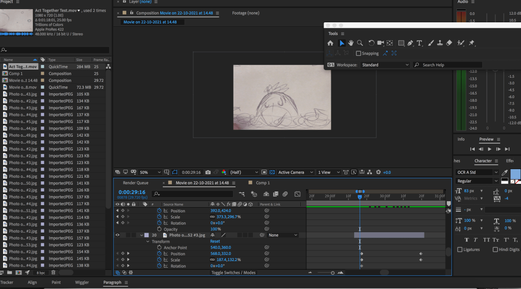
Upon showcasing the animatic in my lecture during the fourth week of the semester and explaining my intention with the aesthetic, it was felt among the class that my animatic was visually unclear regarding the decision to use art movements. While this comment was valid, it was also acknowledged that at this stage it was an initial draft to showcase the narrative structure and shot composition. In addition, I felt that the decision to provide text at the beginning beside each character to clarify what they represent was too specific and could potentially be classified as ‘labelling’ and thus stereotyping them slightly. Therefore, I decided to not specify what class each character belonged to, but rather let the audience interpret and decide for themselves where they think they belong. This made sense since I was going to portray the seven characters ultimately working together
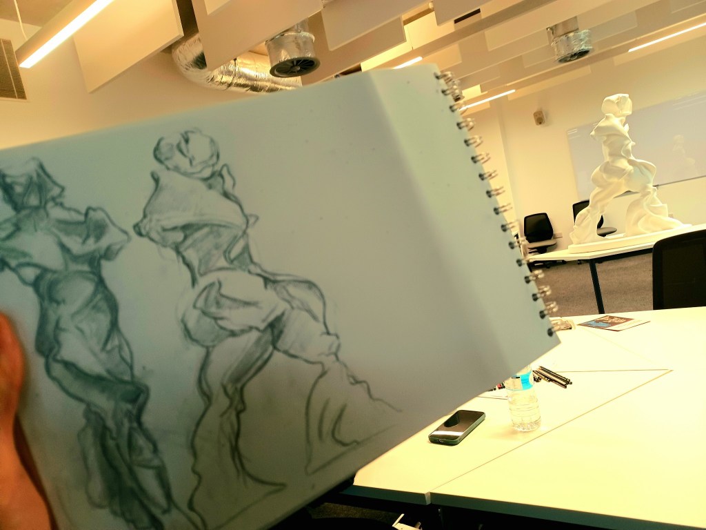
Nevertheless, I realised that the next stage would be to add ‘meat to the bones’ by fleshing out the visuals more and showcasing colour and the various artistic styles to symbolise the characters representing different art movements. Therefore, I took advantage of a sketching session at University, where we studied the work of a futuristic figure, another art movement I had not heard of before. I quickly warmed up to my artistic abilities again and took note of the futurism art movement and even considered applying it to my animation as either a class representative or additional element to drive the story.
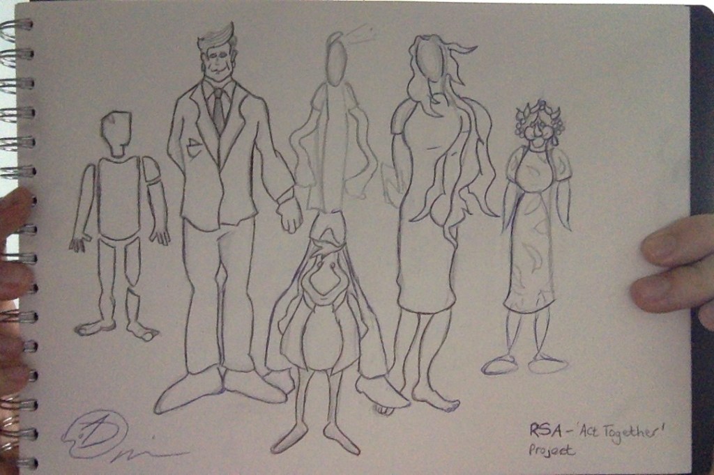
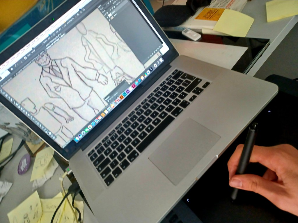

Now with the social representatives put into character designs, utilising the various art styles chosen and ensuring that no stereotyping was breached, I began to work out how these models could be used in the narrative. I began by creating these initial concepts of how my ‘Hero’ image for the RSA submission could appear; I made sure to address the notion of differing social classes coming together.
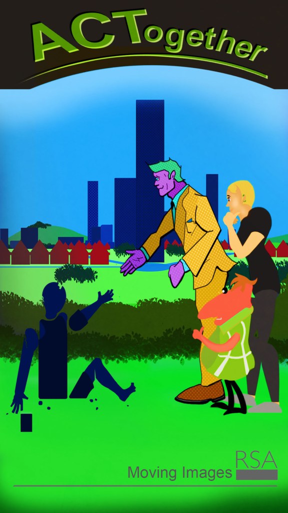
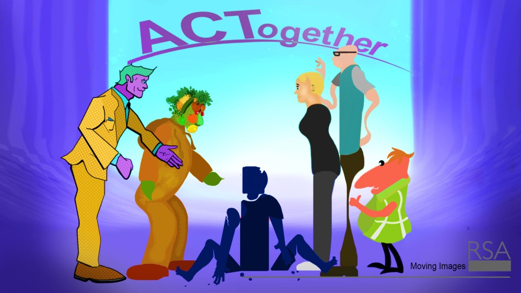
I drew my attention as to how I would tackle the environment in my piece to ‘sell’ to the audience how these different visual representations can exist in the same community as each other. I felt the best approach would be to construct a world where various elements from different artistic styles could be applied to different assets of the environment, such as buildings, the sky, the ground or interior design, thus creating a multi-layered community that shows how different cultures or lifestyles can co-exist geographically and thus socially too. I decided at this point that I would keep the entire medium motion graphics focused.

I happened to discover the works of a British pop artist named Peter Blake, famed for designing artwork for album covers in the 1960s such as the Beatles, I even decided to name the Elite character after the artist. Blake had a style different from the likes of Roy Lichtenstein, as he used a cut-out style composition in his work as opposed to a comic-esque graphic style. While I had no intention of using tangible assets in the design work, I took note from how the work had a ‘layered’ aesthetic which I felt would work to my advantage; subtly demonstrating how each social representative resides or operates in different areas of the community which would be a different layer. I realised that using the digital layer system in Adobe Photoshop, Illustrator and After Effects would create the effect of the camera moving through the community and taking the viewer to different locations, which would factor into the notion of classes being distant and ultimately coming together.
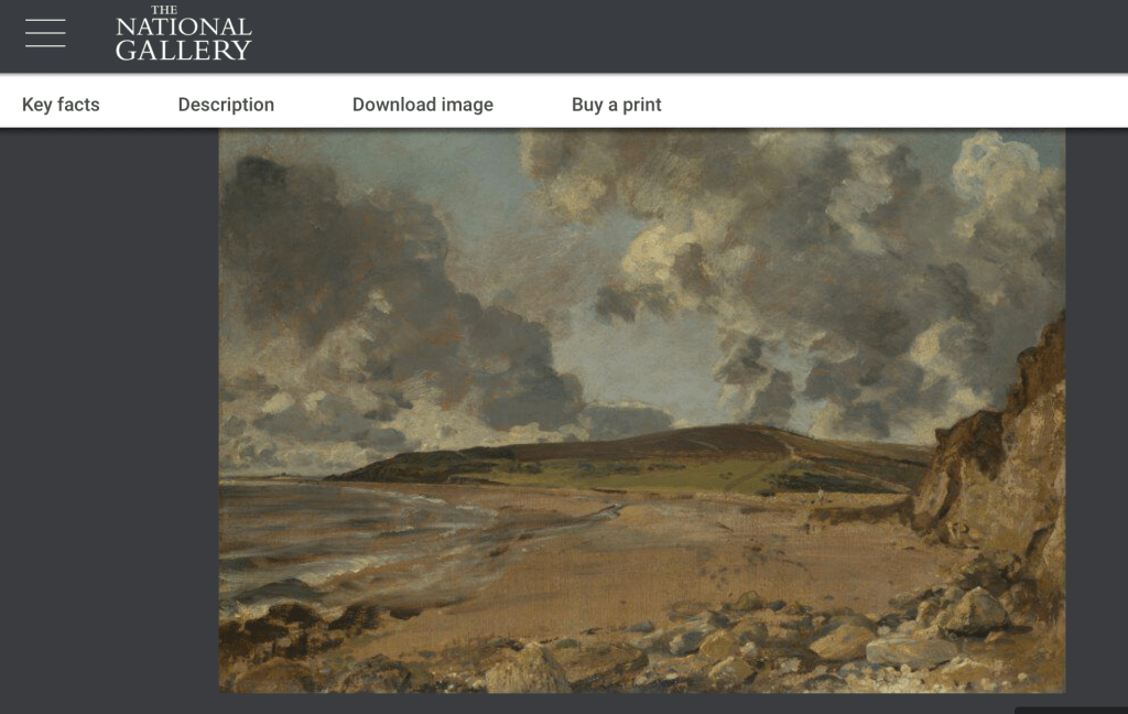
Constable, J, 1816, Weymouth Bay: Bowleaze Cove and Jordon Hill, The National Gallery https://www.nationalgallery.org.uk/paintings/john-constable-weymouth-bay-bowleaze-cove-and-jordon-hill
The decision to adopt a ‘layered’ approach to the work gave me the slight freedom to determine where each detail should be placed accordingly. However, I decided that the layers must maintain a slight consistency so as to not distract or throw the audience’s attention off the narrative. Therefore, I made the decision to utilise a pop-art approach with oversized shapes resembling cans and bottles that artists such as Warhol and Lichtenstein famously painted, as a means to represent the elite and established middle-class areas that have high cultural and economic capital. Meanwhile, the suburban areas where the traditional and lower economic capital individuals reside, and where we would begin the narrative, would have a more simple art style. To add more depth to the video’s atmosphere, I also took elements from various landscape paintings such as the work of John Constable (see image above) and took note of the use of clouds which gave a sense of dominance to the scenery and I knew would make for a good visual representation for the area of climate change in the project.
Around this period, following character designing and background referencing, I began to create a presentation to showcase my idea to the class with a realised structure, identity and visual meaning. The presentation ultimately conveyed why I chose this project as I stated at the start of this blog, that I am passionate about social unity, culture and the arts, as well as the fact that I see a merging of these areas as a unique and healthy balance of visually advocating change.
I also showed a second and more refined version of my animatic, though I still had not fully worked out the ending at this point. I knew I wanted to show a sense of all individuals coming together to ensure the title resonated with people and for the narrative to have a powerful closure. However, I was still trying to work out how to visually explain the notion of all the individuals having achieved good for their community and improvement to their lives, a powerful yet simple character development. In the meantime, I kept my original ending from the first draft, of people spelling out the word act when they all come together and left suggestions open as to how this ending could be re-worked.
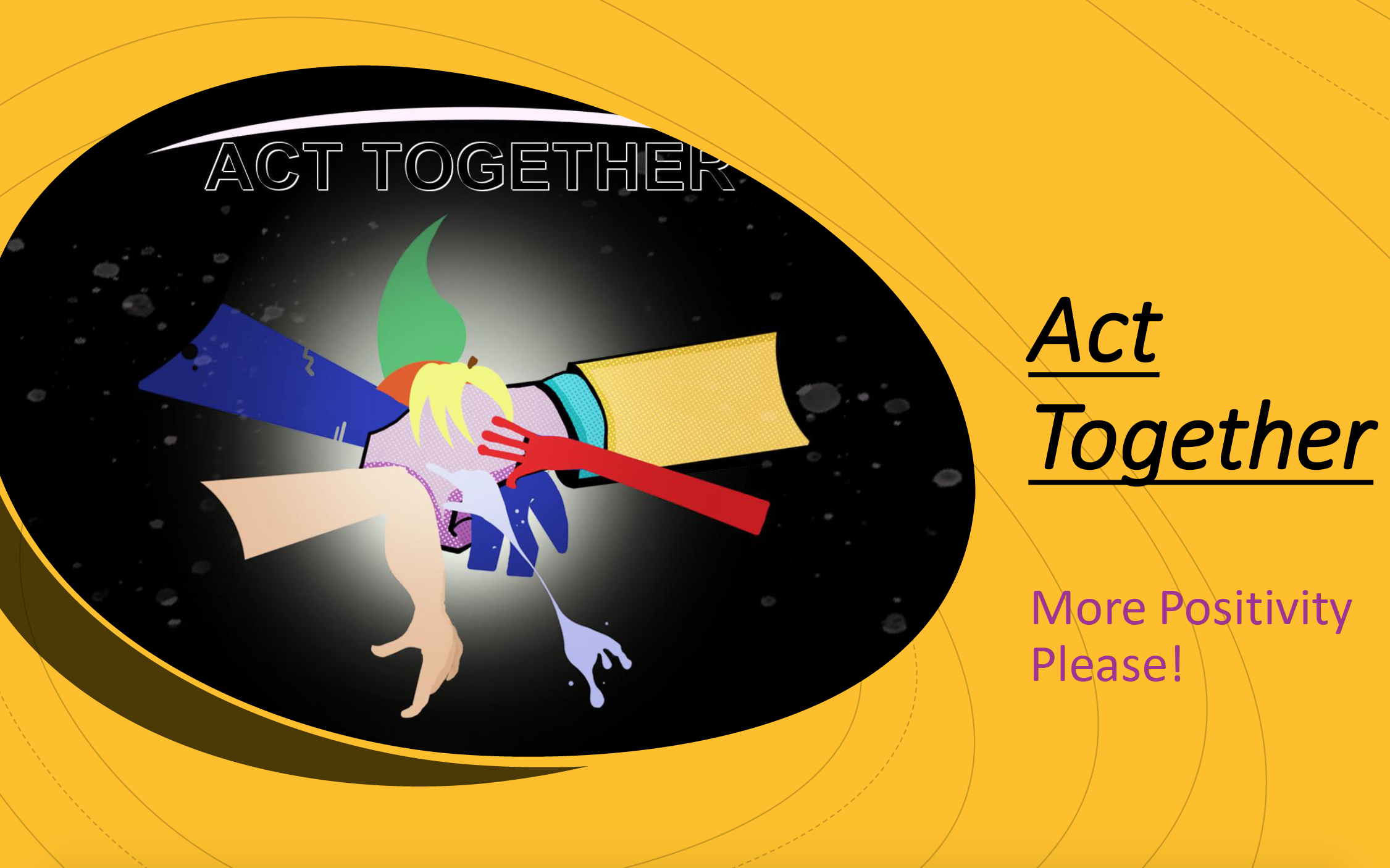
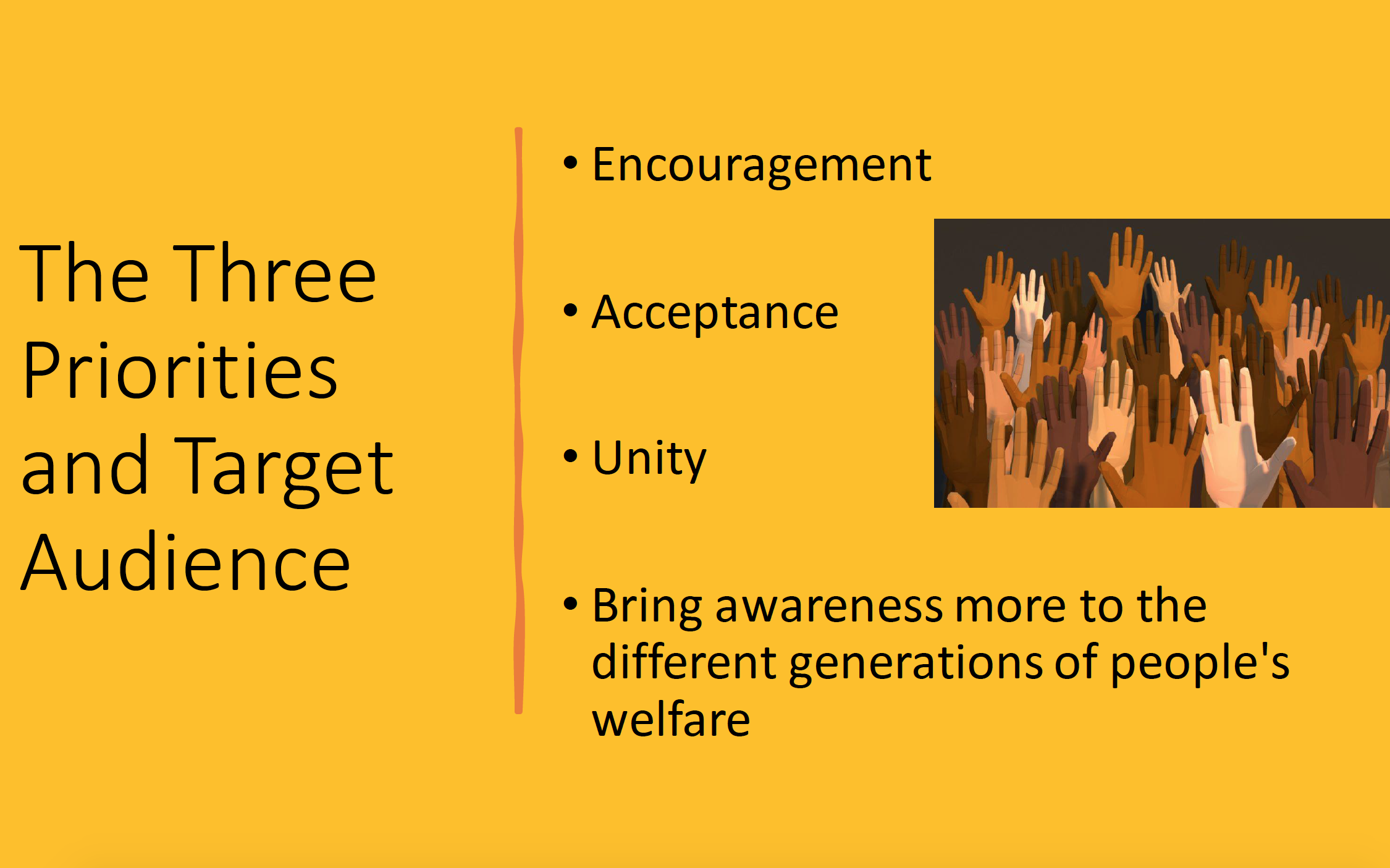
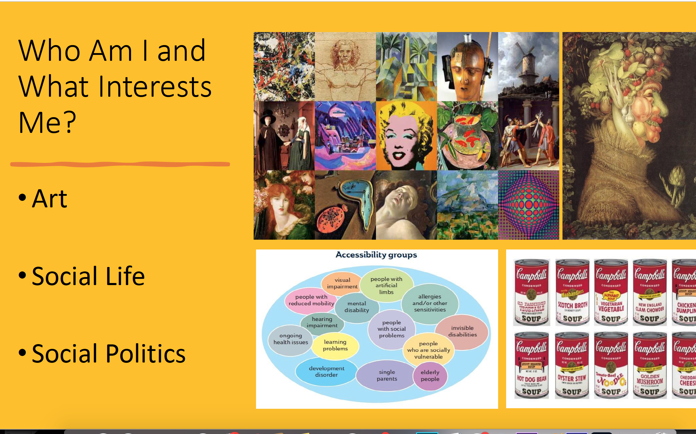
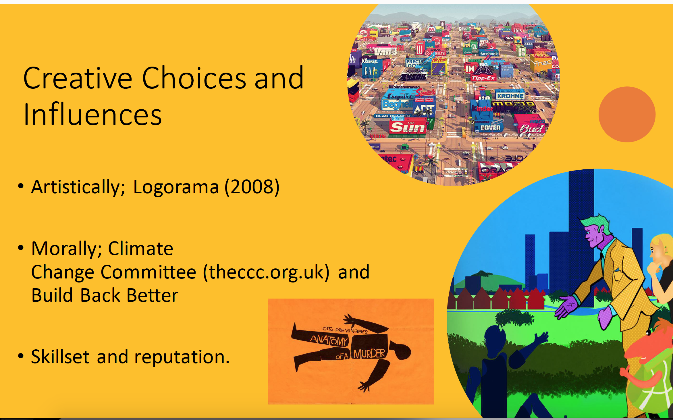
The presentation received strong praise from the lecturer and fellow students regarding: the meaning, the target groups and how the visual storytelling would solve the problem of portraying different social groups effectively, but no suggestion was given regarding the ending, so I continued to think hard about how to resolve this. However, I was queried as to whether I was going to address the fact of which character represents a particular social class. I said how I had initially provided an annotation of this matter in my first animatic, but decided that to avoid ‘labelling’ I would allow interpretation, always a giving in art, to determine who the seven individuals were, but that I myself had a principle on who they were.
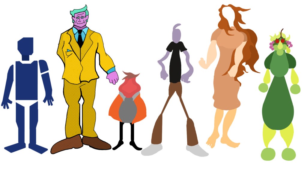
I began to now develop the social representatives into their final character designs, ready for animation purposes. The characters were each given specific colours and design features to differentiate them from one another and to also symbolise what class they may belong to from an audience interpretation. I previously stressed how I would not label each character in the video as to what group they belonged to, but I designed each figure with elements that could metaphorically determine values seen in the various classes.
For example, the character I dubbed ‘Bass’, as a reference to Saul Bass whose style he was modelled after, is portrayed with disjointed limbs and with a purple colour scheme, which opens the possibility that he could fall into the Precariat group, with purple being a colour that represents disability. His lack of flexibility and being geometrically shaped also contribute to this notion. Another character, dubbed ‘Hubley’ after John Hubley who was an animation pioneer of the UPA era, is given a sharp edge, small height and peach colour design, features which represent an aggressive or frustrative nature and could be interpreted as that of a traditional working-class member.
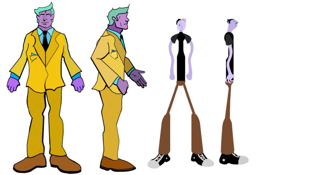
Named after artists of their backgrounds: Peter Blake and Man Ray.
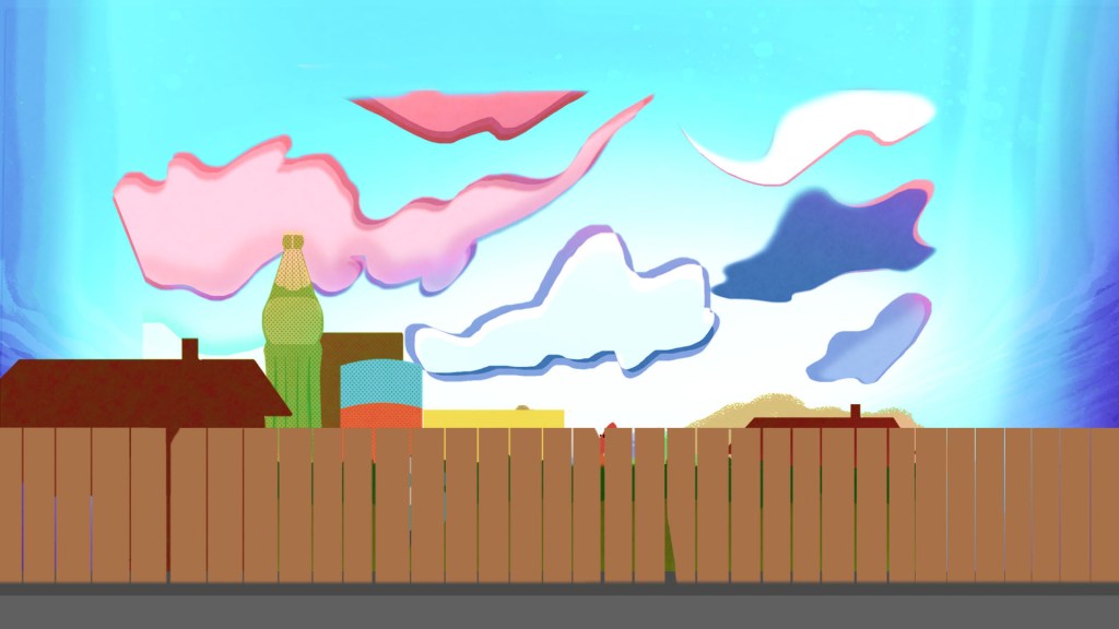
I began to create the background environment for the project and as specified earlier, applied a layered aesthetic to represent the different dwellings for each of the respective representatives. As evident in these Adobe Photoshop screenshots, I have set about utilising a blend of commercial art through the use of buildings resembling bottled and tin products, in the vein of pop artist Andy Warhol, whilst utilising an abstract cloud backdrop to add a sense of depth to the scenery. I am pleased wth how the result has a healthy balance of both the classic and more contemporary styles.


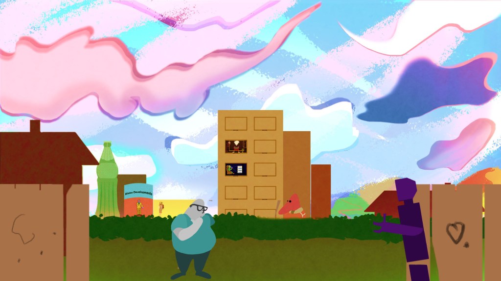
An important element to note regarding this particular key visual is that I realised at this stage that I hadn’t yet created a character representation for the technical middle class. The character seen in this visual was my initial design for the figure, utilising a rather dull and grey colour theory to symbolise the low social capital of the class. However, I felt that this depiction seemed rather negative so I applied a more engaging style; I based the character on the modern and contemporary movement of art, in which pioneers of this movement can generally use electrical props to convey their message, such as Yayoi Kusama and Glen Ligon, who apply objects of light in their work to create a sense of space environment with an illusion of 3D (Lebotitz, R, 2017, From Yayoi Kusama to Glenn Ligon, 7 Artists Using Light in Radical Ways, Artsy.net – https://www.artsy.net/article/artsy-editorial-7-artists-light-radical-ways). I decided to apply reference to this style in the character by having his short glow and project illusional or holographic ripples around him, thus symbolising his technical knowledge and skill.


Having now made modest progress into the animation production of my Act Together project, I decided that it might be worth collecting responses from those outside my class group and who could provide adequate commentary and thoughts on the design choices made regarding how the social groups would be portrayed. I put together a small panel consisting of Sean Burchett, a political student at the University who I realised would provide good insight and thoughts about the concept, as well as Bear Reed, who has vast knowledge on social groups and political societies. They were shown my second animatic draft, the character designs and the first few seconds of the animation with a set of descriptions of what I was setting out to achieve. I collected some helpful responses and Bear specifically gave helpful pointers regarding how the characters, despite not being labelled as such, channelled levels of social, economic and cultural capital through the choice of colour, attire and placement in the narrative.
One of my motivators to pursue this area of primary research was an attempt to tackle any enabling factors regarding the project, specifically ‘variables’ in the political or social spectrum that may ‘make or break’ it. I had to consider these areas since they are out of one’s own control and must be abided for the sake of all individuals, especially considering how I was dealing with characters representing social types. I made sure to put this across to the panel and enquire if there was any bone of contention that made them uncomfortable or objective regarding what they took in and made it clear that there were no right or wrong answers to any question I asked or fact they stated, respecting their own background, ideologies and social stance.
It would be worth a mention that regarding all projects that seek the theory of change there will always be those who fall under the term ‘Assumptions‘, regarding audience members who are always in a position to ‘pick holes’ and this is certainly no exception for my Act Together project. Not entirely perfect in execution, there is the chance some may argue that pandemics or climate change, topics in the video, are not everyday situations in normal times. So how can one justify the means of working together when these are not of a regular occurrence, might be considered weak in motivation and message. However, at this time we are unsure how our economy will pan out and there will certainly be the need for change going forward so it certainly has relevance in the long-term and climate change or pandemics will continue to linger in the background.
We ought to consider in mind the message of keeping our community close for when unprecedented moments occur. Furthermore, Sean pointed out how some may read too deeply into elements sometimes regarding the choice of art styles, such as noting how Futurism has its connection to communism movements in European past times. It is indeed an area that could always happen, but generally contemporary audience take in works of art more for the historical material value and uniqueness that they convey, generating interest for people from all walks of life, so the art angle is mostly covered regarding these queries.
However, I can whole-heartedly say upon presenting the idea to the group that there is indeed a blessing and support for the project, since the group felt it reached the ideal balance of engaging the audience with its imaginative context, yet very much addressed real-life facts that are comparable to our current situation in the pandemic crisis.
From this point onwards my priority lay practical-wise, using Adobe software to create the visuals for my project and breathe life into the narrative. Adobe Photoshop has always been my natural strength, having used it from a young age and it helped in compositing the various character and background assets together.
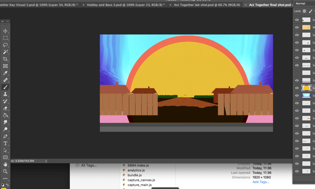
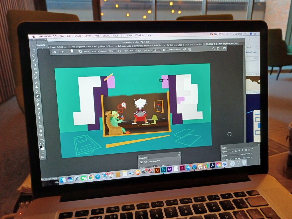

Throughout the production, I would regularly check that the visuals kept consistent with the narration, since the brief specified that no cuts or edits were to be made to the audio, meaning that the visuals had to be driven strictly by the voice-over. It was certainly a challenge to establish everything within the given time for each element specified and I found at times my timing in the animatic stage was slightly ‘off’; specifically the shot showcasing the family gathering by the bonfire. I had timed the shot in the animatic slightly too long and thus didn’t give myself much opportunity to wrap up the video with the final shot. Also, the opening shot with the characters solidifying into their bodies ran too short in the animatic and I had to take the opportunity to establish a couple of extra seconds for the benefit of the audience, which worked out since the brief stated we could use an extra second or two in our timeline.
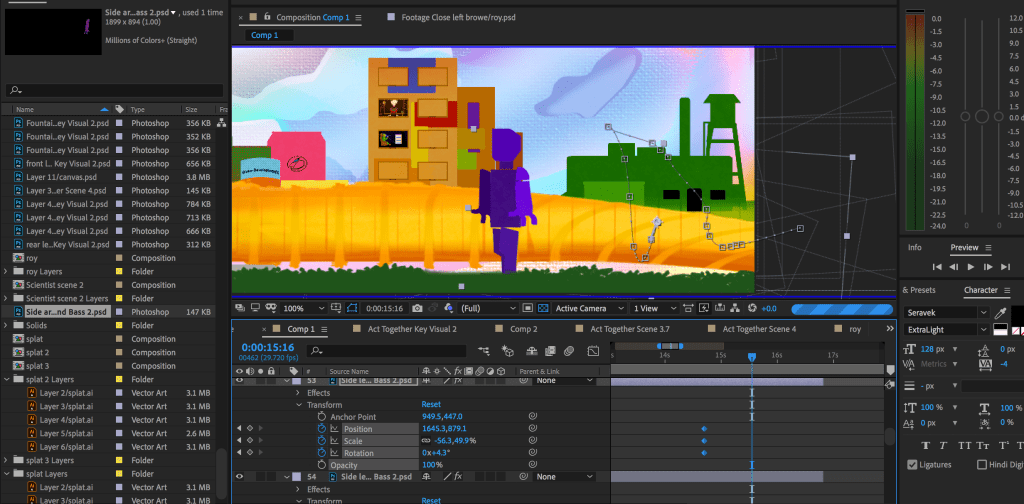
Adobe After Effects has been a strength of mine for many years and it made sense to produce the project with this tool, since I am familiar with many of the functions that one can use when working with multiple layers and the use of motion graphics. For example, the puppet pin tool was a useful tool for the articulation of character action and body language, since I always strive for fluidity in my animation and apply a high level of attention-to-detail to ensure that not one layer asset shows inconsistency or ‘bleeds’ into areas where not required. I also take great advantage of the Creative Cloud simulation effects that come with the programme, such as applying particle systems for fire and water effects and ripples to create the effect of the technical representative’s ‘gadgetry’. Another effect was using a mesh tool to simulate the fence appearing to ‘melt’ as seen in the image above.
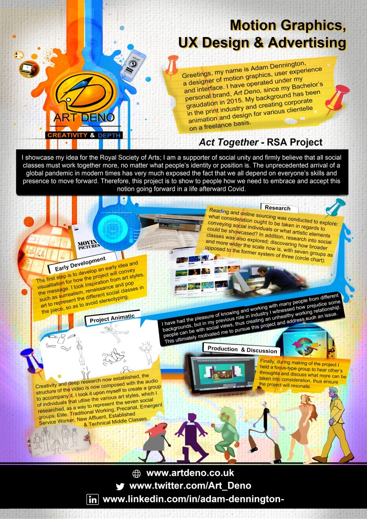
As I moved closer to the production being halfway through completion, I decided to take the opportunity to promote my project and flesh out its potential by showcasing it within a poster, along with my development process, as part of the Christmas exhibition at my university.
Analysis
Regarding the research I’ve conducted on social values, artistic movements and the utilisation of software, how do they all merge into one collective body and medium in the animated project? To explore this it would be worth a careful analysis of the various scenes and context within the video to justify the meaning and decision-making I have taken.
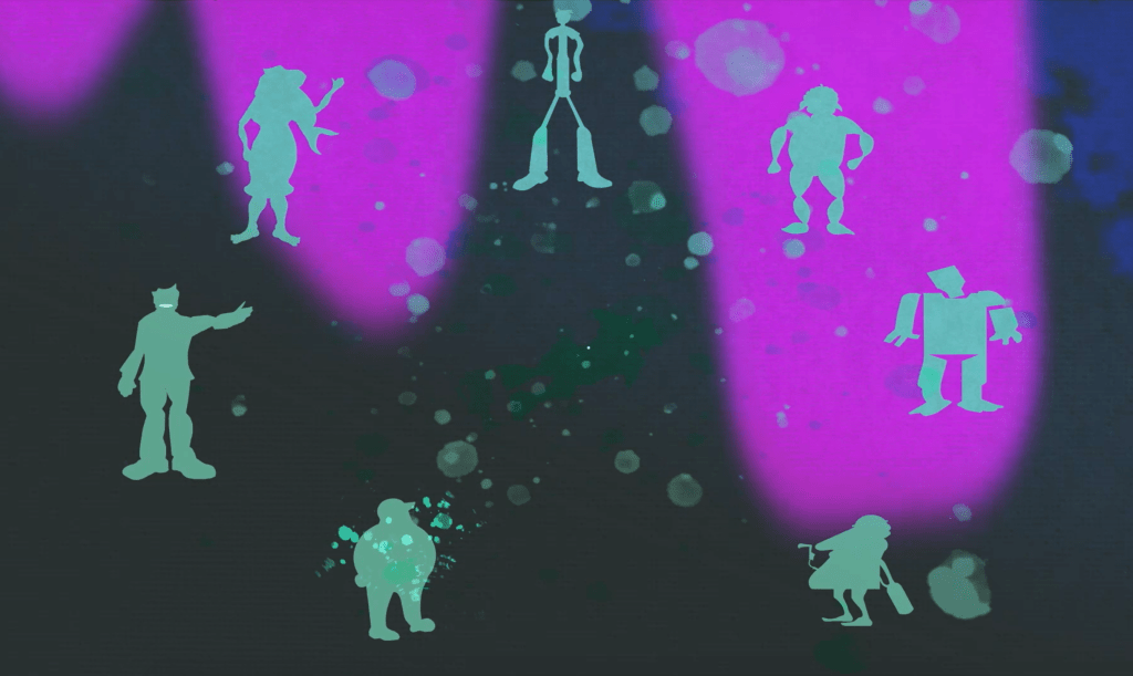
The opening shot of the video was essential since it needed to establish how each of the various representatives, despite their difference in appearance and class, all ultimately originate the same, which in this case is the paint from a brush, akin to all us humans born the same way but evolve into our own identity. I symbolised this through a paint blob dropping onto a canvas surface and separating into different patches which then solidify into the characters. In addition, the use of paint spots and running purple against a dark background was to symbolise a star consolation and demonstrate how we are all connected astrologically, as well as give a sense of how the world of the characters was formed through a ‘big bang’ of some kind.

The following shot pans from the bottom as the different characters are ‘dropped’ into the world they reside in, whilst we follow Bass and establish him potentially as a struggling Precariat individual longing to help. This choice of transition was to symbolise how all individuals are put on this world for a reason and must discover themselves, as well as the fact of how far and divided different class individuals can be from each other. Regarding the mentioning of a pandemic in the narration, I decided to avoid specifically making a visual reference to Covid19, as I had originally done so with the statue character wearing a face mask in the animatic. Instead, I decided to have the pandemic be a fictional virus where the various art figures can degrade, such as growing moss and mildew on their surface. It was important to also make subtle reference, via a poster, as to how volunteers were needed to help in developing a vaccine, thus hinting at the need for individuals acting together. Also, note the distorted edge around the side of the frame to simulate the feel of the world taking place on a sheet of canvas.
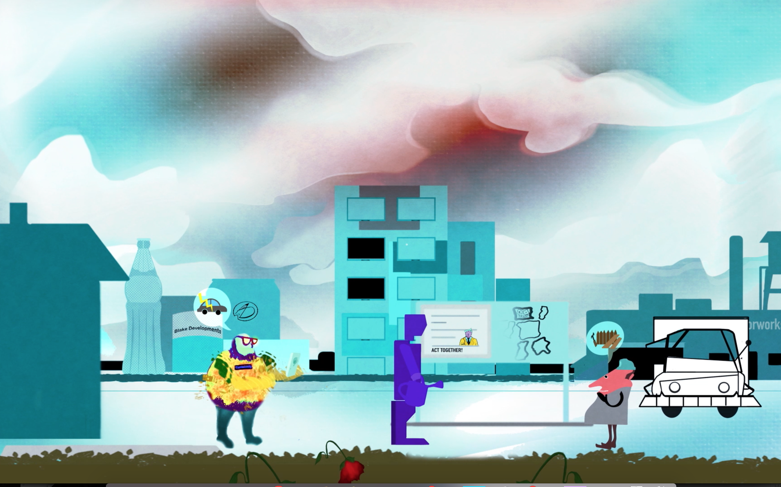
Further demonstrating my visual storytelling skill, I managed to avoid causing controversy and portraying negativity in the characters by having the reference to the racism issue, spoken in the narration, be represented by a derogatory doodle in the background. The graffiti doodle, denouncing the fact that Bass is not ‘true art’, represents a subtle symbolisation of how some social groups or people regarding background are sadly made to feel they have no place in society or even to be considered human. This was an achievement on my part since I had struggled with how I could counteract this area of context and indeed I originally showcased in my animatic a passer-by exchanging verbal language at Bass, possibly of a prejudice nature. However, I felt it was necessary to remove this idea to avoid promoting negativity, plus the idea of a simple art style being labelled ‘not art’ was quite a unique concept that people could be interpreted as prejudice from a creative stance.
I also demonstrated here how the three individuals; different strengths and abilities can build improvement social and cultural capital when they work together, such as the technical middle class being able to help evolve the traditional working class’s truck, that runs on gas, to a more environment-friendly electric motor. The Precariat also shows the determination to help re-grow the community’s plantation, which matter strongly to the two advanced classes, plus I also made the subtle reference through a poster, on the notice board, how the Elite class is looking to use his iconic and cultural capital to advocate the selfless cause for social change. Another unique element was the choice to have the colour drain and fade out of the canvas atmosphere to symbolise a temperature change and thus a time of darkness for the community, championing and the need for working together to overcome times of struggle. The fence that stood behind Bass was a metaphor for stating how ‘closed-off’ people of different are classes can be with each other. However, owing to unpredicted events, such as the fence surrealistically melting from the change in climate, all individuals are suddenly on the same personal ground as each other and must be open to the idea of coming together more.
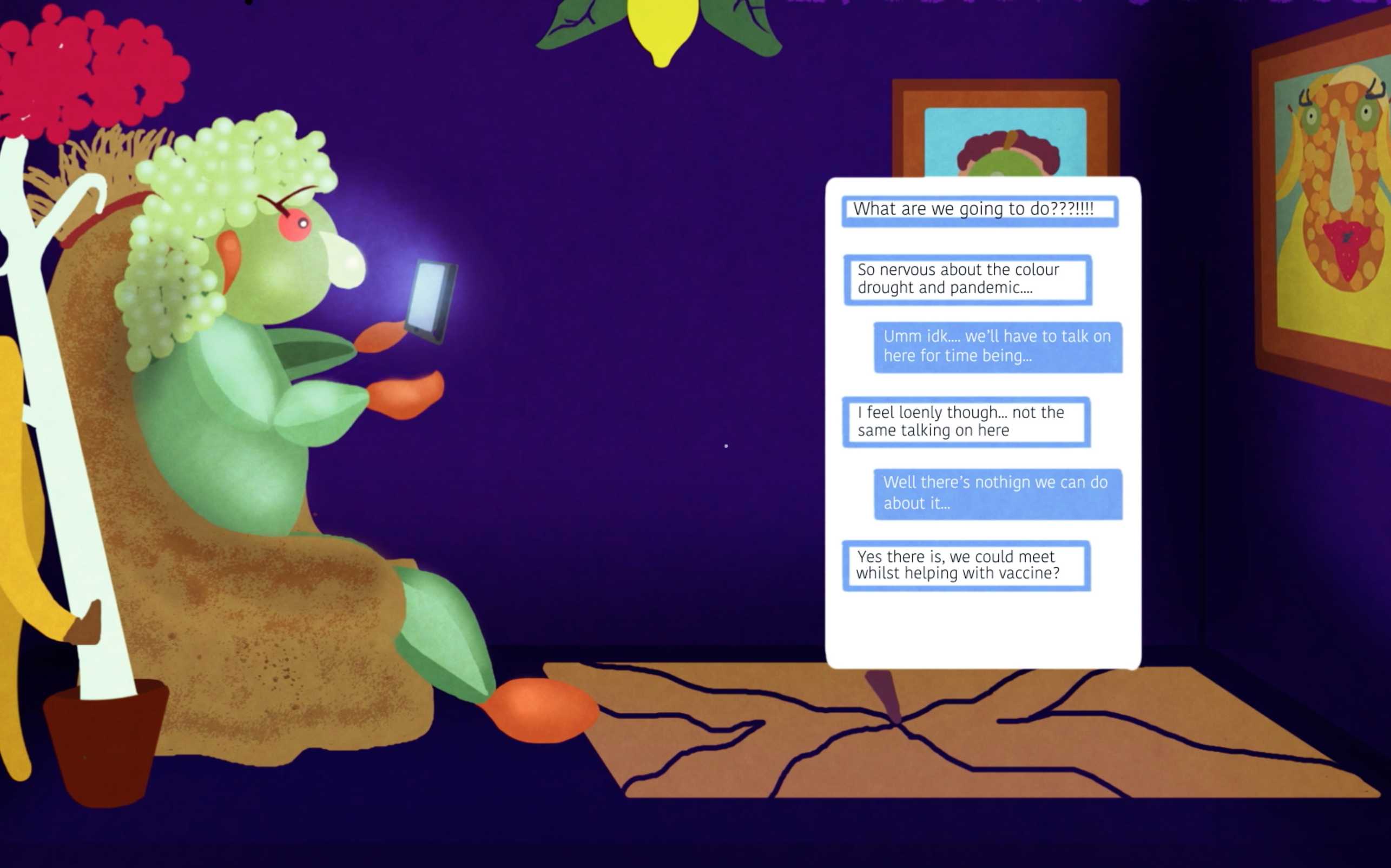
After establishing the situation the community was in and the idea that different social groups should work together to overcome the obstacle, it was fitting to pan inside the building in the background to establish how not all individuals are confident enough to work up the courage or to open up and approach people. This can be either owing to how they may be judged in appearance or being too clingy to social media as noted by the accompanying narration.
I decided to show this through the character of Reneé, who is of a Renaissance-type background and quite isolated in personality because of her appearance and reliance on social media. This character may represent the emergent service worker being someone who works from home and in more urban areas as demonstrated with an apartment. I wanted to make it clear how social media, while useful for basic communication and cultural capital, was not the ideal way of moving forward to keep social and economic capital consistent, thus showing the dilemma the character is in with her friend Ray. Another extra detail was how the window frames for the apartment were in fact picture frames to symbolise that each floor in the building may actually represent a scenario in a painting or work of art.
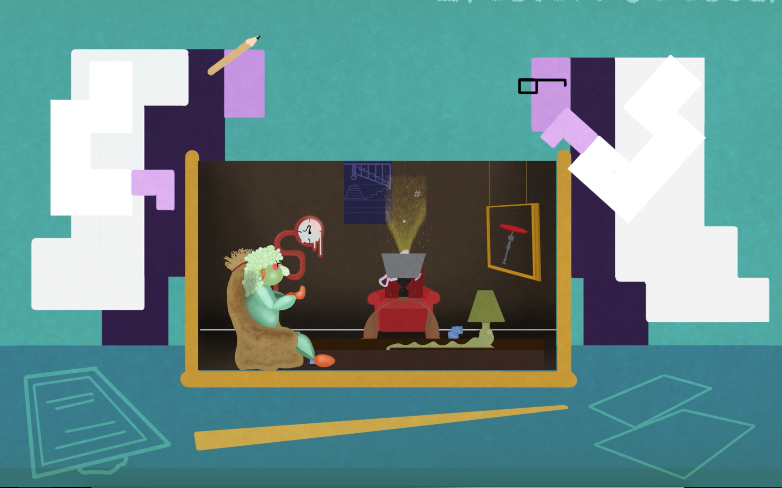
The scene above originates from my original brainstormed idea of using guinea pigs to represent the social groups and have them put into a box together randomly by scientists, demonstrating how forcing relationships is the unhealthy approach to take. While I didn’t pursue this idea, I felt the metaphorical concept of having individuals being thrown together in a box would make a strong addition to the theme of the video. It seemed appropriate considering how this particular scene covered Ray, who comes from a surrealistic background, is in his apartment from being anxious of the drought and pandemic, thus when surrealistically having others dropped into one’s own comfort space would set of panic or meltdown in his mind. In addition, the scientists were designed with square features to channel the fact that this approach to social science is very narrow-minded and without a ’rounded’ view of society people will struggle to build trust and rapport.
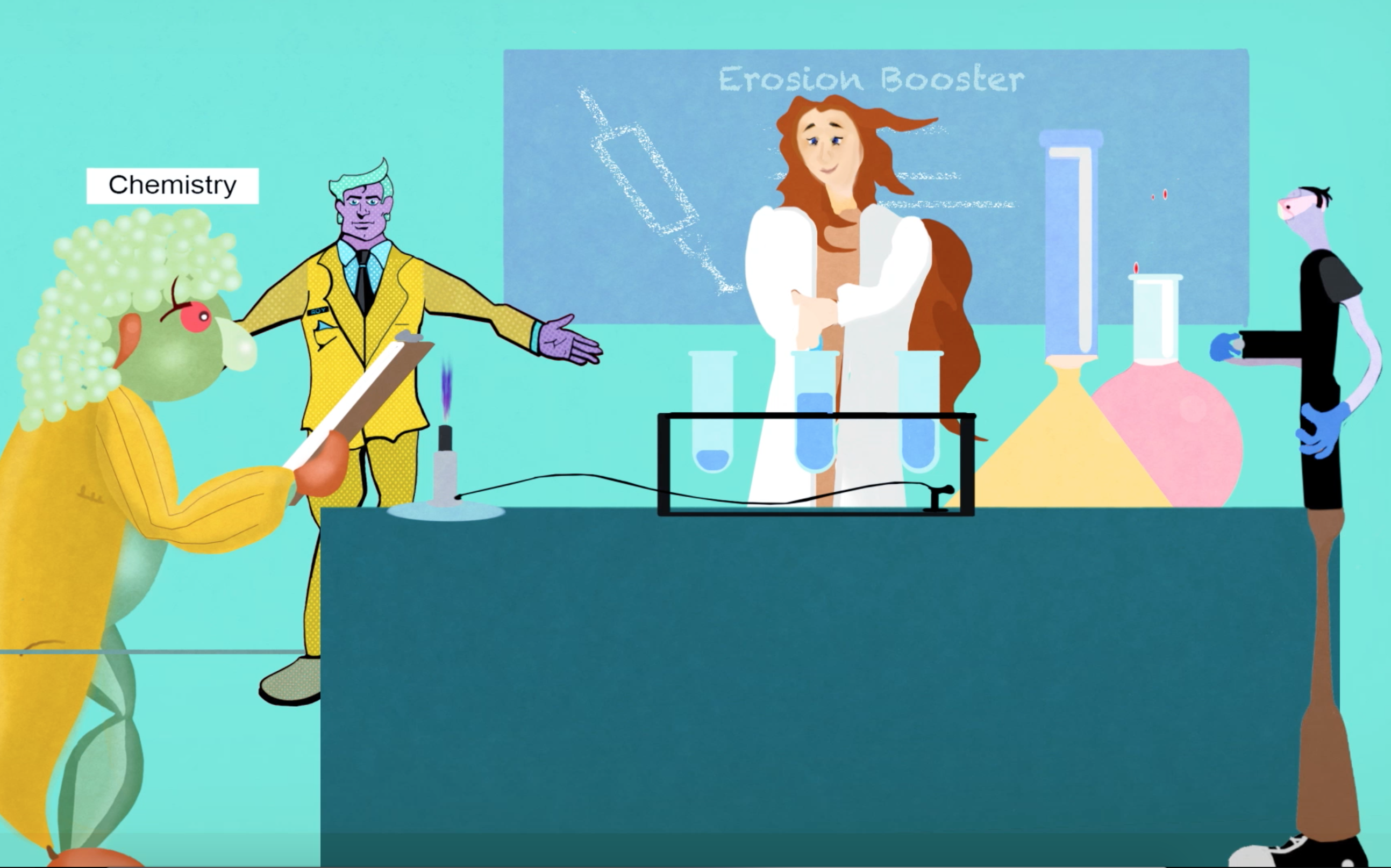
This shot establishes a ‘coming-together’ from the younger representatives in helping the established middle-class representative, a healthcare professional, with the development of her vaccine. From a technical standard, I used simulation effects when necessary, through Adobe After Effects, to create elements such as fire, water and ripples in the scenes. This scene proved a good opportunity to utlise the CC Particle System to create the effect of the bunsen burner in the laboratory, which nicely set up the following scene in which a family weekend was spent beside a campfire.
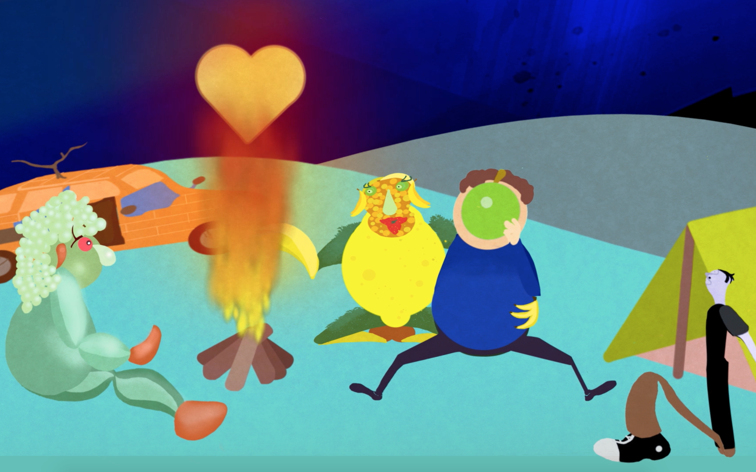
Concerning the element of family members sometimes having differing views from us, but that we are still able to accept and love them for who they are, I created the scene of Reneè sitting with her family, who I referenced in the earlier apartment scene through family paintings. This scene was another benefit of visual storytelling in that I applied the notion that the parents were actually differing art styles which address how families can be diverse and no matter what the background or appearance of a person, relationships can grow among two differing individuals. I placed Ray, the surrealistic individual, in this scene as an interpretation that he could be welcomed into the family, which built up nicely to the final scene of all the individuals coming together to create a diverse working force.
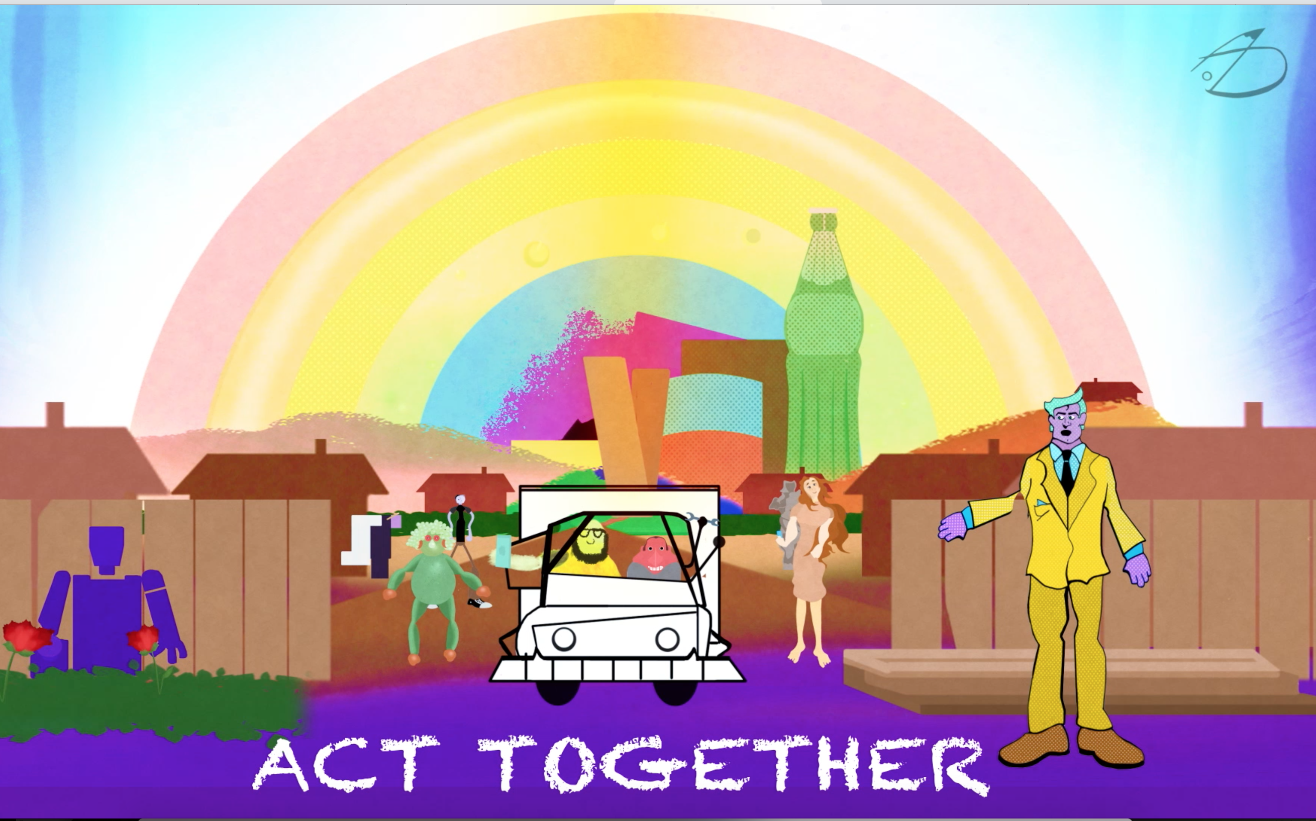
The final scene for any animated project is the most important for me, given my experience with the medium, since it is ultimately the closure and resolution for the message and what the audience ultimately take away from the work. I eventually resolved the issue of the ending by having all the social classes come together to drive the meaning of the project title deep into the audience. I had originally conceived that the different social groups would come together as a group, arm in arm, then following a pan out from the scenery the visuals would transition to spell out the word ‘act’. However, owing to time constraints and the challenge that came with achieving that shot, I re-worked the scene to a better composition, in which the characters come together but show how they have now achieved something for themselves and to better the community following the pandemic and drought. For example, the traditional and technical have come together to try and improve transportation in the environment by modifying vehicles electrically, the Precariat volunteering with the plantation and on the path to improving his social and economical capital. The Elite and Established Middle Class have successfully used their economic and social capital to successfully build campaigns to synergise strengths in people and work towards a cure for the virus. The new affluent and emergent worker types, having displayed the courage to help with the vaccination process and as a result built social capital that could lead to new areas in life and even a union between each other.
As a final touch of authorship and keeping in line with the artistic sensibility in the project, I added my personal brand signature logo in the top corner as most artists do to their piece of work and applied a rainbow to symbolise the coming of a ‘new dawn’ in the community, with each colour representing the main colour of each of the characters. Having carefully applied research, visual development and valid analysation to the evolution of my design awards project, the final task was to finish the animation on time and to the appropriate standard. After a hard effort and a dedicated number of hours, spanning most of my Christmas holiday break, I can proudly say I have finished the final product and eagerly await the response of my target audience, as well as the possibility of improving the video with potential sound and music, enhancing the simple, yet meaningful, narration.
Conclusion
In conclusion, I am very proud of myself and my ultimate outcome in this module; I choose this project because there laid a message within it that I strongly desired to convey and address, being a strong supporter of social unity and promoter of positivity.
I strongly believe that the decision to utilize art movements and styles for representing the various social classes I explored was one of both depth and uniqueness; the former being that it tapped into the element that art is a diverse medium and can resonate with people of all cultures and tastes, thus symbolising the element of unity. The latter element on the other hand allowed this film to showcase its own identity.
In regards to potential improvement for the project, specifically what I would improve or have done differently if given more time, I would certainly wish to apply more dynamic movement to each of the specific social representatives to give a stronger sense of personality. I set out to showcase the tricks of the animation trade within the project, such as walk cycles, character expressions and dynamic movement. I managed to achieve a modest representation of each, especially considering the time limit and busy schedule I had, but next time would keep it to a limit within a certain number of individuals, so that the engaging moments shine through more clearly in the individuals’ personality.
However, I am overall pleased with my achievement and excitingly confident to explore the new challenges that lay ahead in the following semester and what creative avenues I can endeavour in. This fact couldn’t be further from the truth in that I began this module being completely unaware of what the RSA Student Design Awards represented and initially felt overwhelmed with the challenge of how one can convey a pre-determined message addressing the issues of racism, climate change and social unity. I was also conscious of how I could achieve this within the time span of a minute and fifteen seconds, but I feel the video’s biggest strength more than anything is how it tells a brief but deep narrative; all classes originate the same way and realise that owing to unprecedented disaster, they must combine all their strengths and dedication to rebuild their community for the better.
Additional research at:

