4925 Words
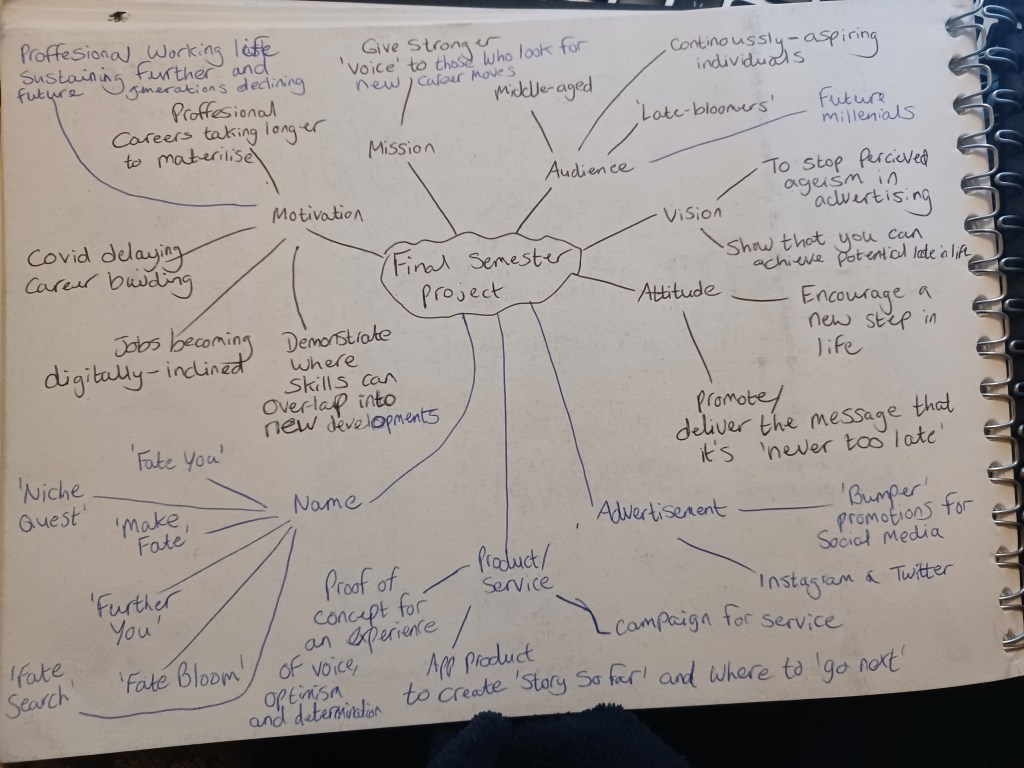
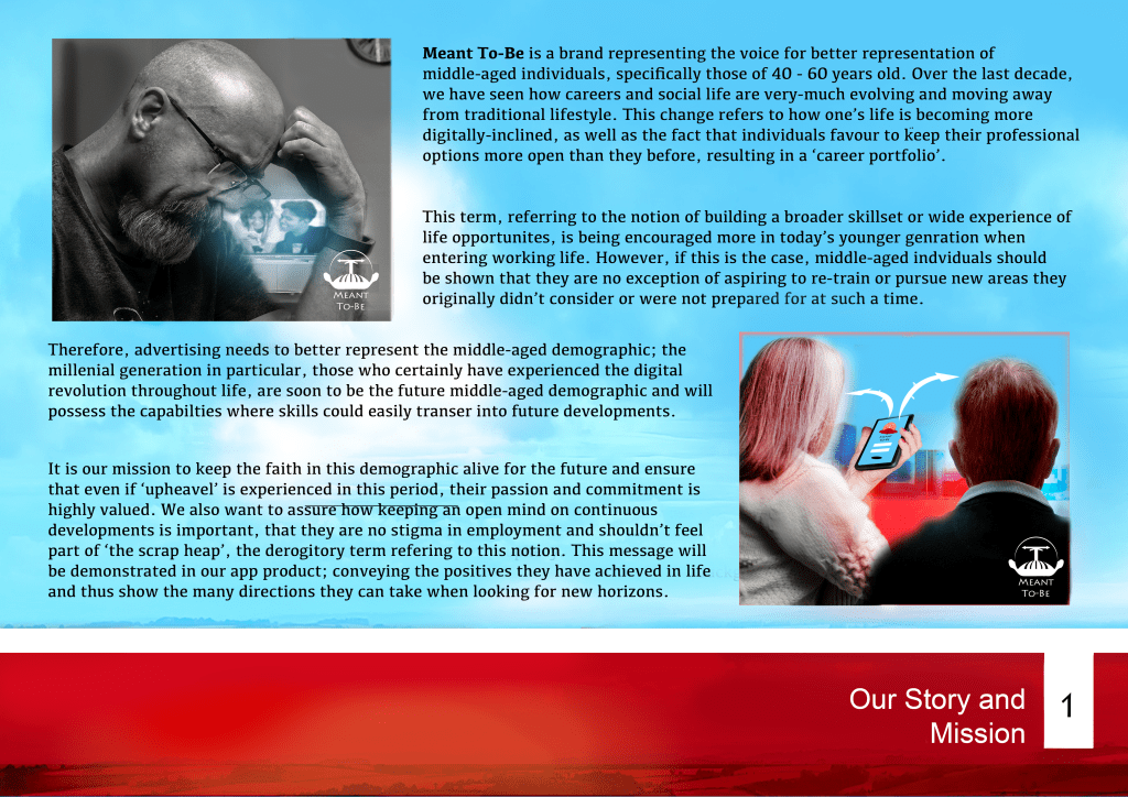
My final module at the University of Winchester: my proposal explored the question of whether advertising strongly reflects the middle-age demographic positively. I found how many people moving through life at present are expected to prepare for a portfolio career; adapting skills into new fields, as opposed to a ‘career for life’ of past times (HR Voices, 2018). Therefore, more positivity should be shown for those at such an age in this situation. I took it upon myself to develop a brand advocating a product that offers an alternative for this group of stakeholders, giving them a voice and diversifying our digital culture for future generations.
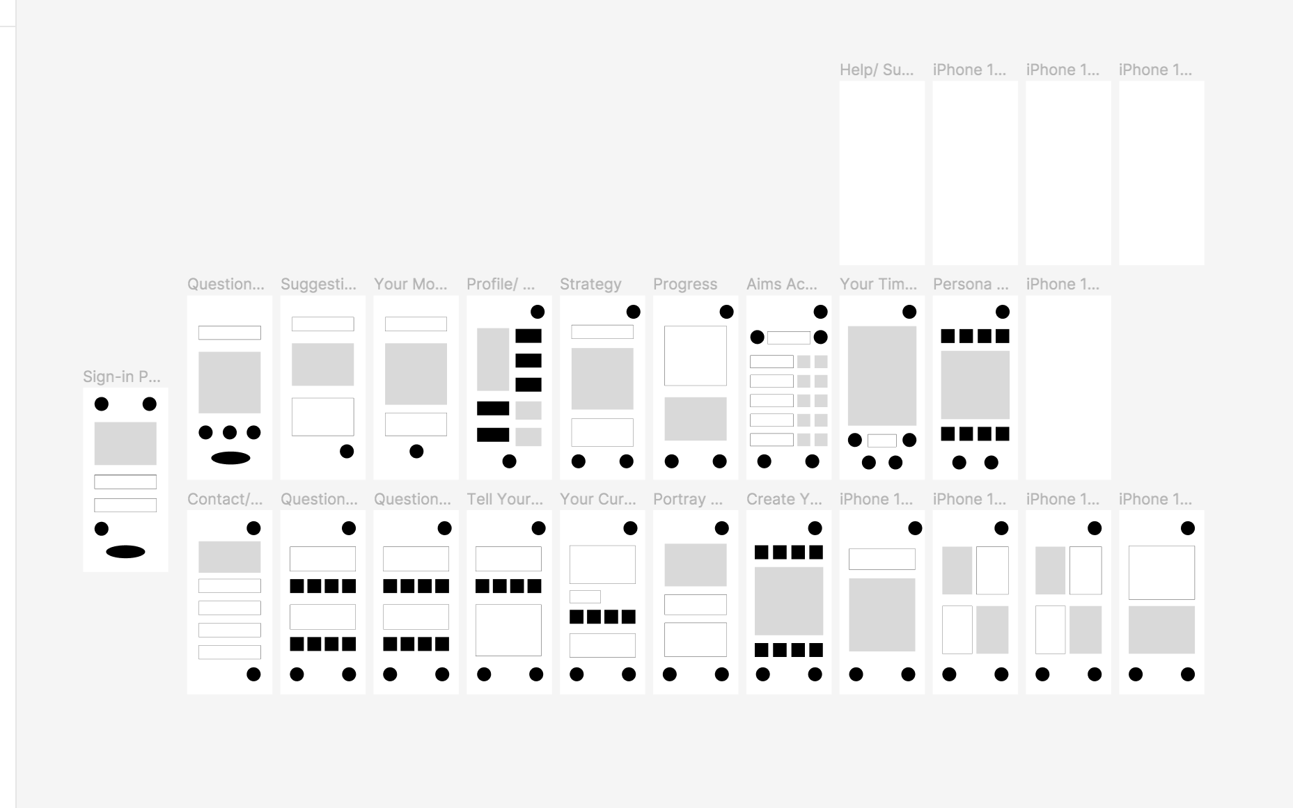
Meant To-Be Wireframe:

assets to promote and ‘sell’ the product at an investment pitch or conference.
“Marketing and UX design are really both about making a product as desirable to the customer as possible. In both fields, psychology plays a significant role” – – Teo, Yu Sheng, 2020, Interaction Design Foundation. Available at: https://www.interaction-design.org/literature/article/how-to-change-your-career-from-marketing-to-ux-design
This quote is true for me: as a people’s-person, I take pride in identifying the needs of target groups and offering a solution through the appropriate design, strategy and message. Therefore, I used this semester to utilise UX and Advertising in my practical piece, thus showing my potential to pursue a career as a digital content designer in the user-experience or commercial industry.
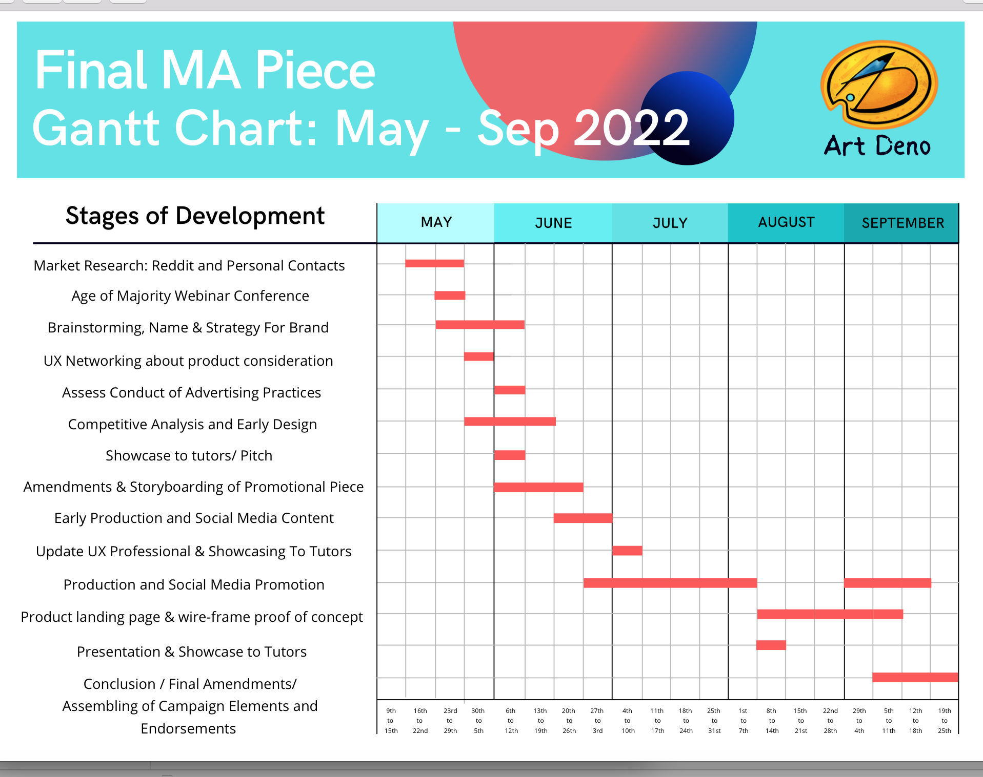
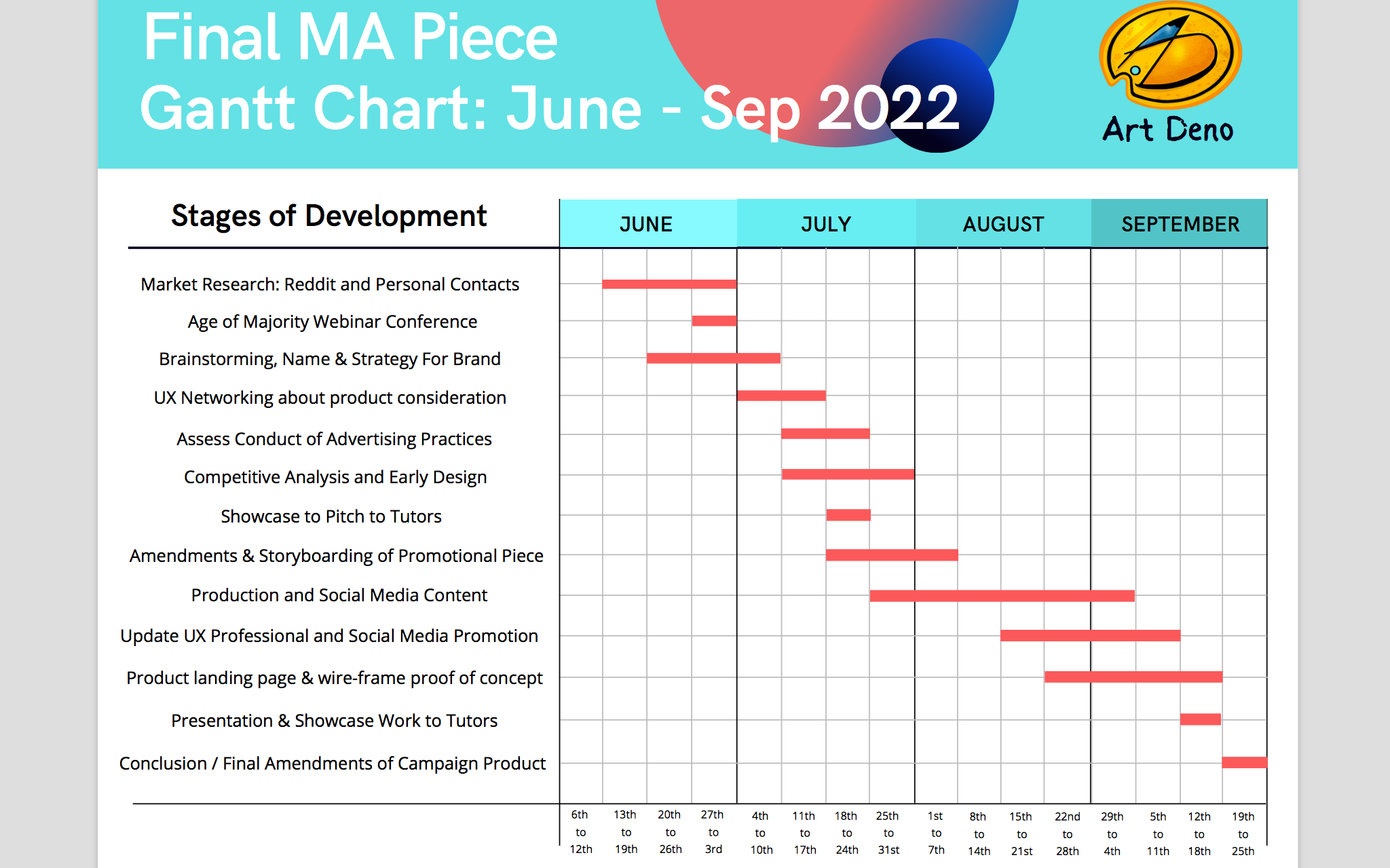
for how the semester would be used to prioritise the stages of production.
Early Research and Contextual Summary
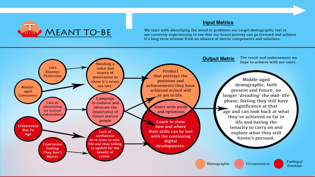
I researched how the intended audience upon such an age feel they start to ‘wane’ or feel ‘sandwiched’ on a psychological level (Brooks, 2022); creating circumstances where they subsequently feel they don’t matter or are unsure what avenues their established skills can lend themselves to in the event of sudden change, particularly in an unprecedented event as the Covid pandemic (Centre-For-Ageing-Better, 2020).
My proposal identified how the millennial generation, who will soon embody the middle-aged demographic, are increasingly embracing online developments (GOF, 2019), but there comes the question as to whether they will be strongly represented in future advertising; having opportunity to explore with future learning and developments.
Kurtcu, E, 2019, Initiatives and obstacles to reaching SDG4, Social Innovation and Inclusion of Sustainable Development Goals Available at: http://socisdg.com/en/blog/initiatives-and-obstacles-to-reaching-sdg4/ (Accessed 26th May 2022).
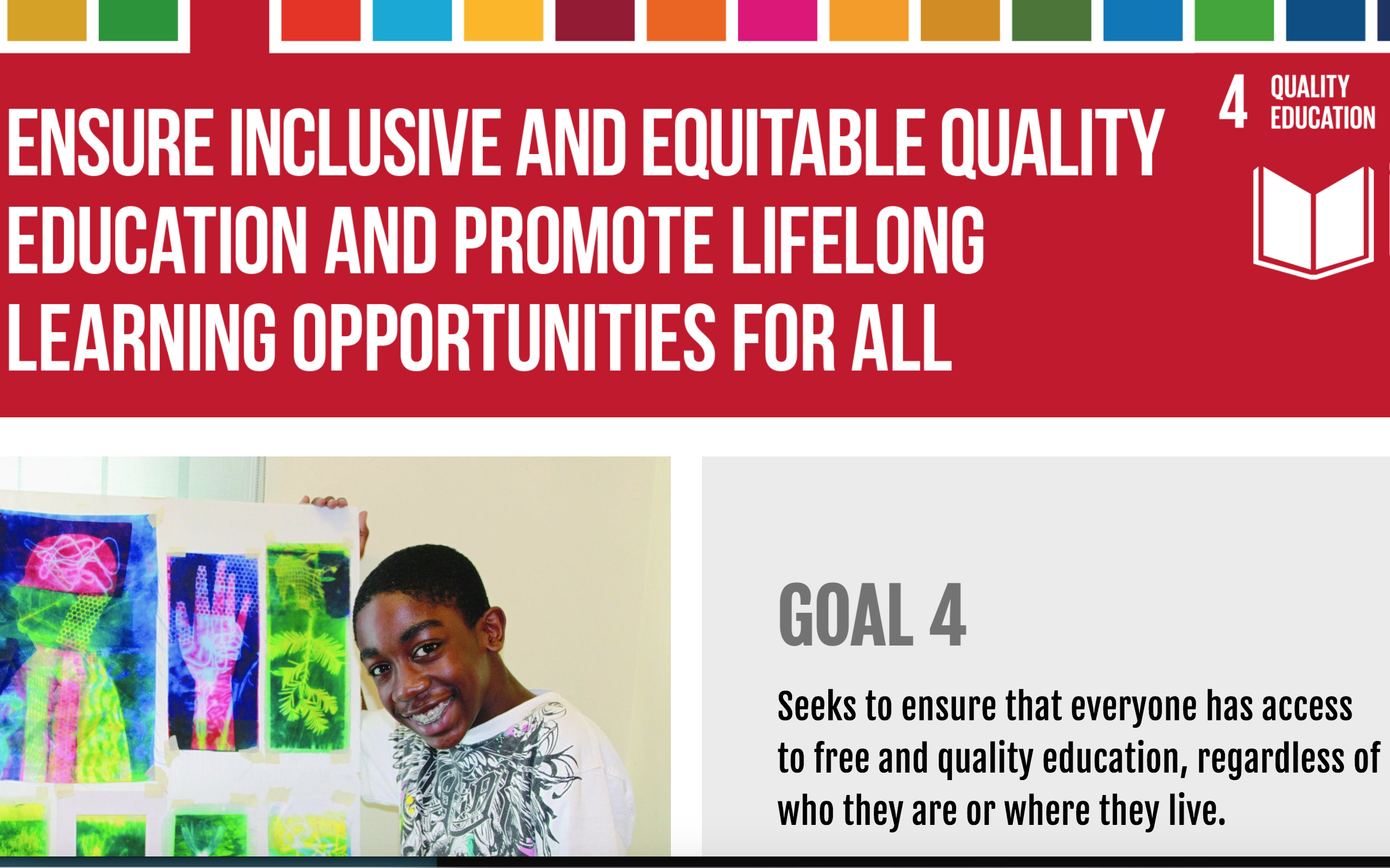
Both these circumstances ultimately motivated me to change the reputation of the present and future middle-aged demographic. This goal would even be beneficial in supporting the United Nation’s Fourth Sustainable Development Goal; pushing for improved equal learning on an inclusive level (Figure 5), since it advocates how one should feel proud and motivated to learn new skills regardless of their age . The greater level of individuals we have adapting to new techniques throughout a prolonged generation, ultimately benefiting environment and social matters, the stronger we can provide a positive future for all.
the work can go next, all of which I considered for my product.
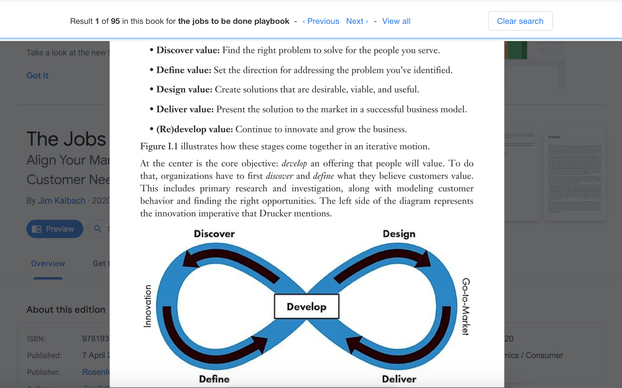
Kalbach, J, 2020, The Jobs To Be Done Playbook
Align Your Markets, Organization, and Strategy Around Customer Need, (Page 6). Available at: https://www.google.co.uk/books/edition/The_Jobs_To_Be_Done_Playbook/1vHRDwAAQBAJ?hl=en&gbpv=1 (Accessed 26th May 2022)
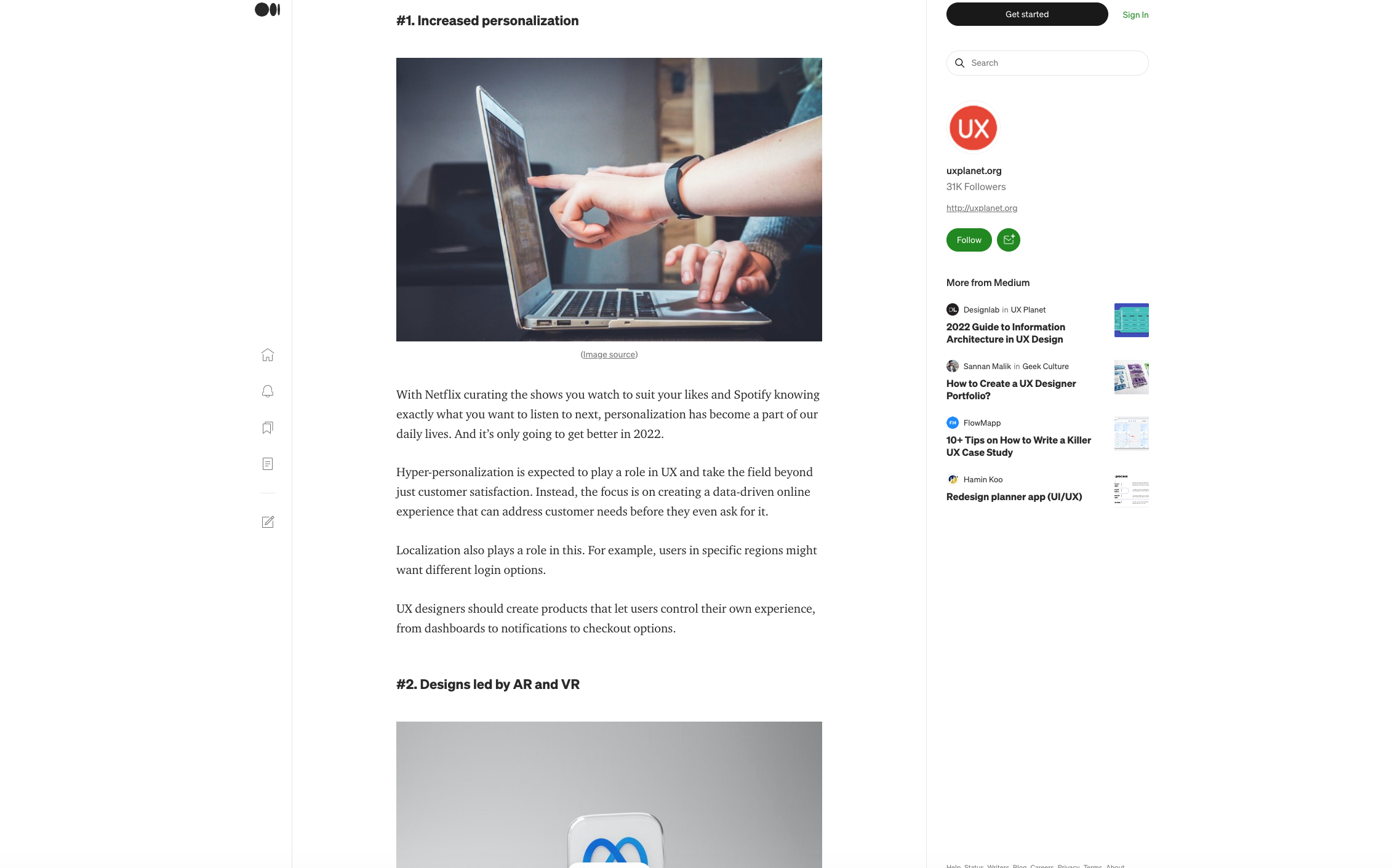
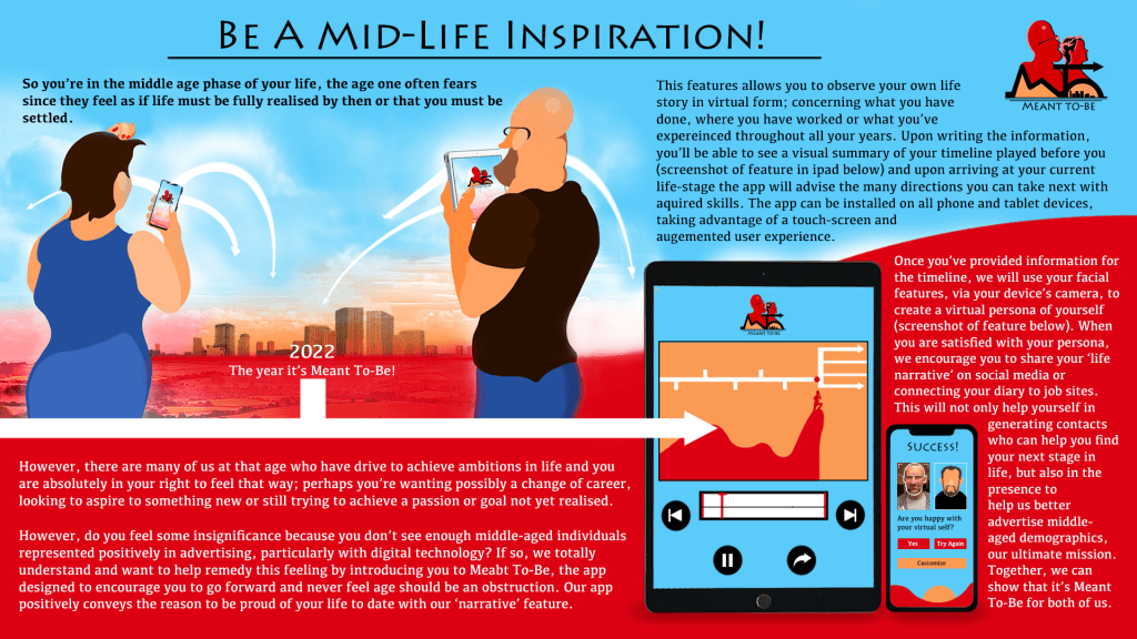
The brand needed to be relevant with current trends of UX and marketing; my proposal found device apps were expected to grow in our digital revolution, benefiting economical and psychological matters (Quilliam, 2022). It was from this research, as well as a focus group conducted in the proposal, that I realised my campaign could devise an app that would endorse the digital awareness for the demographic. To ensure sustainability, I addressed how the millennial generation, who enter mid-life in the coming decade, would help the product surge in the long-run by feeling a sense of personal value with the product. Personal appeal would strengthen the product as well as the addition of visual components to define the app’s data and the feature of Augmented-Reality to enable the user to feel part of the experience (Figure 7).
UX.org, 2022, The Top 7 UX Design Trends for 2022, Official Site. Available at: https://uxplanet.org/the-top-7-ux-design-trends-for-2022-1c1ad67b2bdb
(Accessed 26th May 2022)
My product would be a micro or small brand regarding its revenue or popularity, so research was taken on methods that could be utilised to ensure its niche resonates with the consumer. It would utilise a psychological hook and convey a sense of inspiration for them to feel proud of their life story in the product experience and that they could inspire others to pursue new avenues in the middle of their lives (Figure 8). In addition, I would apply the method known as FOMO (Fear-of-missing-out) to ensure such consumers embrace the product out of fear that they might feel ‘left behind’ concerning the new chapters they are told to embrace in an ‘open-ended’ career.
Forbes Council Member, 2021, 12 Ways To Grab Attention With Content, Forbes.com. Available at: https://www.forbes.com/sites/forbesbusinesscouncil/2021/04/27/12-ways-to-grab-attention-with-content/?sh=59d35621445b (Accessed 22nd May 2022)
Since the previous semester, I have volunteered with Hampshire Constabulary and Heritage Trust’s design team; creating much of their communication content. Intending to build from this experience, I applied for positions in digital design and marketing, proving to be my biggest strengths in the course.
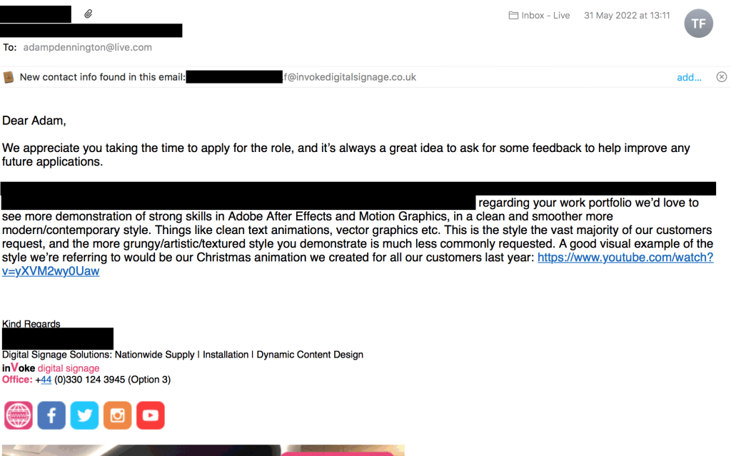
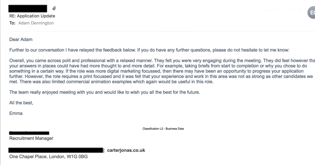
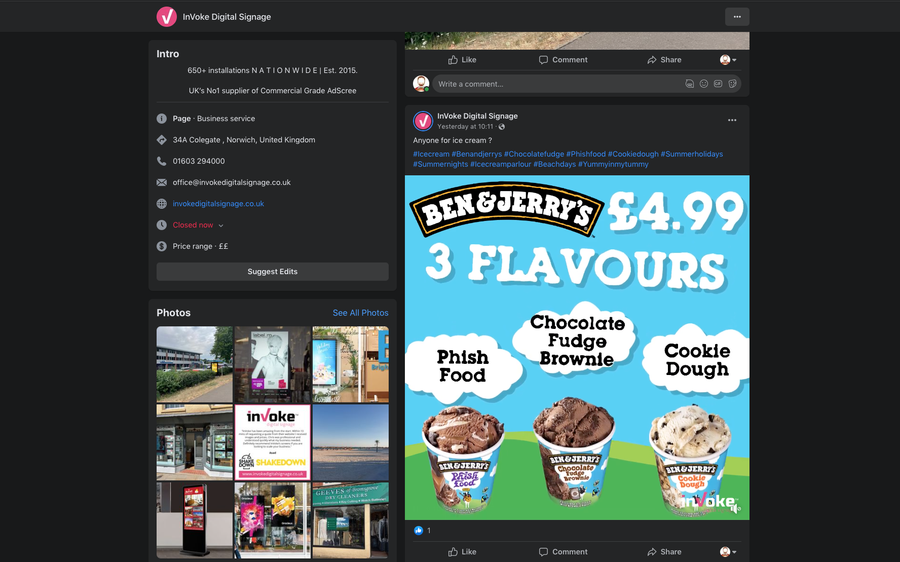
Two positions I applied for were at the companies of Carter Jonas and inVoke Digital Signage, who specialise in content for both print and the contemporary promotion of digital-screening. These companies ‘shaped’ my vision for how I should present the assets to promote my final project. The feedback from the companies mentioned how my portfolio content relied on an overabundance of texture and lacked a contemporary design and use of typography, often requested from their clientele (Gallery 1), as well as requiring examples of print work. I therefore made the decision to mirror a corporate approach and showcase print work, ensuring I would be worthy of such companies’ recruitment.
To devise the product’s experience, I looked at the structuring of such products; understanding the core values they utilise to communicate the mission for their target-consumers. My proposal stated my brand would be competing with contemporary app, Day One (Figure 10); functioning as a personal diary, this product’s audience was more general rather than specific. In addition, the app portrays a literature-driven approach to it’s UX, helpful to create anecdotes of one’s life, but lacking somewhat in identifying and motivating one to move forward.
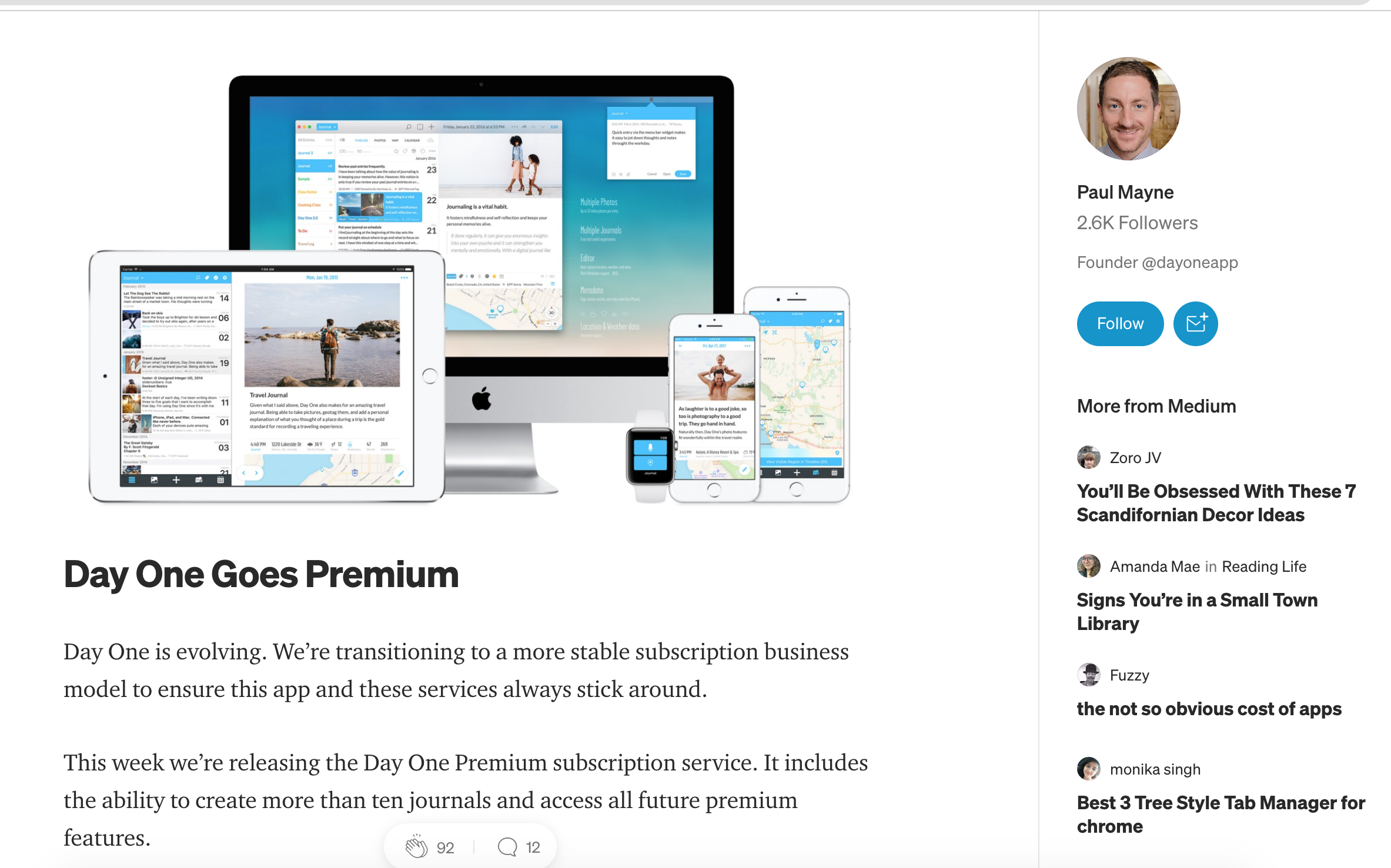
Mayne, P, 2017, DayOne Landing Page Promo, Twitter.
Available at: https://medium.com/day-one/day-one-goes-premium-424492fd0a5b (Accessed 2nd June 2022)
My product would utilise themes of self-confidence and the pursuing of one’s destiny, improving upon the UX of Day One. Users would feel their life is something to feel proud of and remind them how they encountered many learning curves that improved and furthered their journey in the process.
Another similar app was Tenacity Flow (Figure 11); aiding users with over-coming mental health. Relying heavily on virtual features, such as users creating a creature to act as their ‘comfort’ on their personal journey, the product helped me realise how one would resonate with the addition of a virtual personification. Rather than creating a creature, my product would benefit the user on a more personal-level in creating a graphic representation of themselves through augmented data provided in the form of a photo.
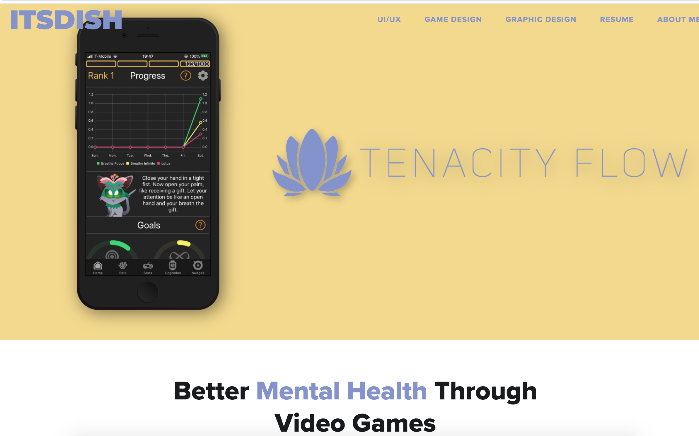
ItsDish, Tenacity Flow, Better Mental Health Through Video Games, official website.Available at: https://www.itsdish.com/game-design-projects/tenacity-flow (Accessed 3rd June 2022)
Tenacity Flow made effective use of statistics to help the user through their ‘journey’ and providing an understanding of what they will face in life going forward. I realised that users of my app would need to know where and how they sit regarding their goals. It would therefore act as a ‘coach’ to give them the confidence to pursue new challenges and to keep track of their life progress.
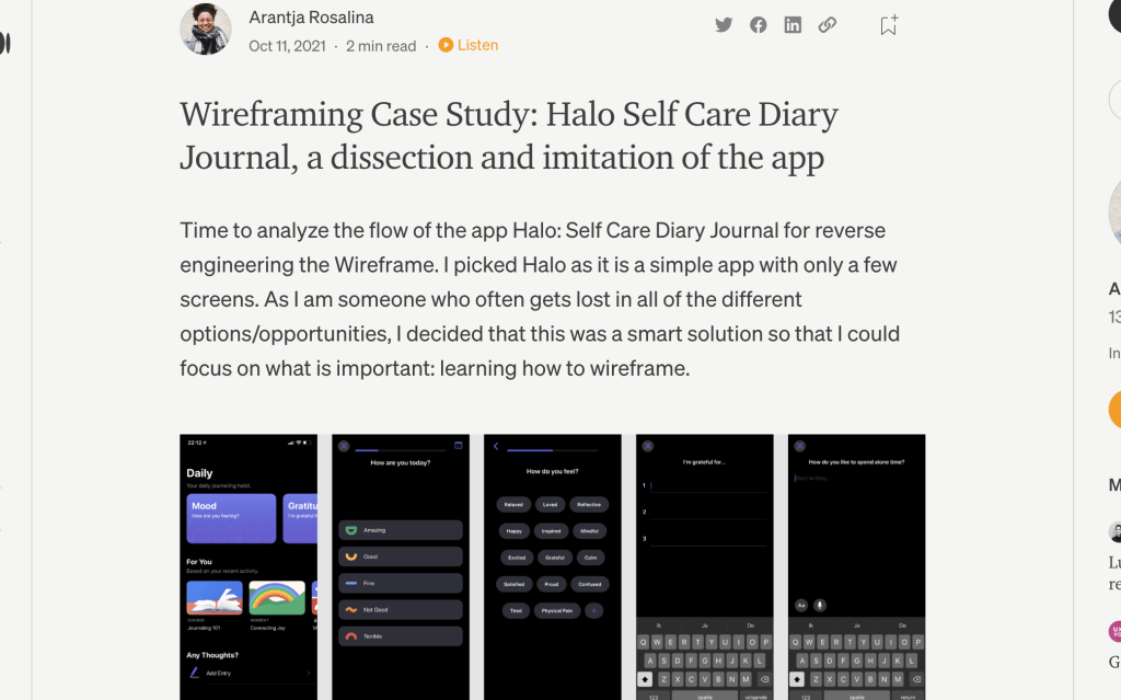
Rosalina, A, Wireframing Case Study: Halo Self Care Diary Journal, a dissection and imitation of the app, Medium.com.
Available at: https://medium.com/@arantjarosalina/wireframing-halo-self-care-diary-journal-9a603bc933b6 (Accessed 4th July 2022).
One final consideration came from the development blog of Halo Self-Care (Gallery 2); summarising the app’s ‘bare bones’, the source showed how it is essential to ensure that the user is asked how they are feeling on that particular day when ‘opening’ their diary. This feature determines what the app can provide for them in the way of a positive user experience and I realised this addition would help the user ‘explore’ their directions to take or how to overcome what obstacles may prevent them from pursuing new chapters.
Design Research and Brand Development
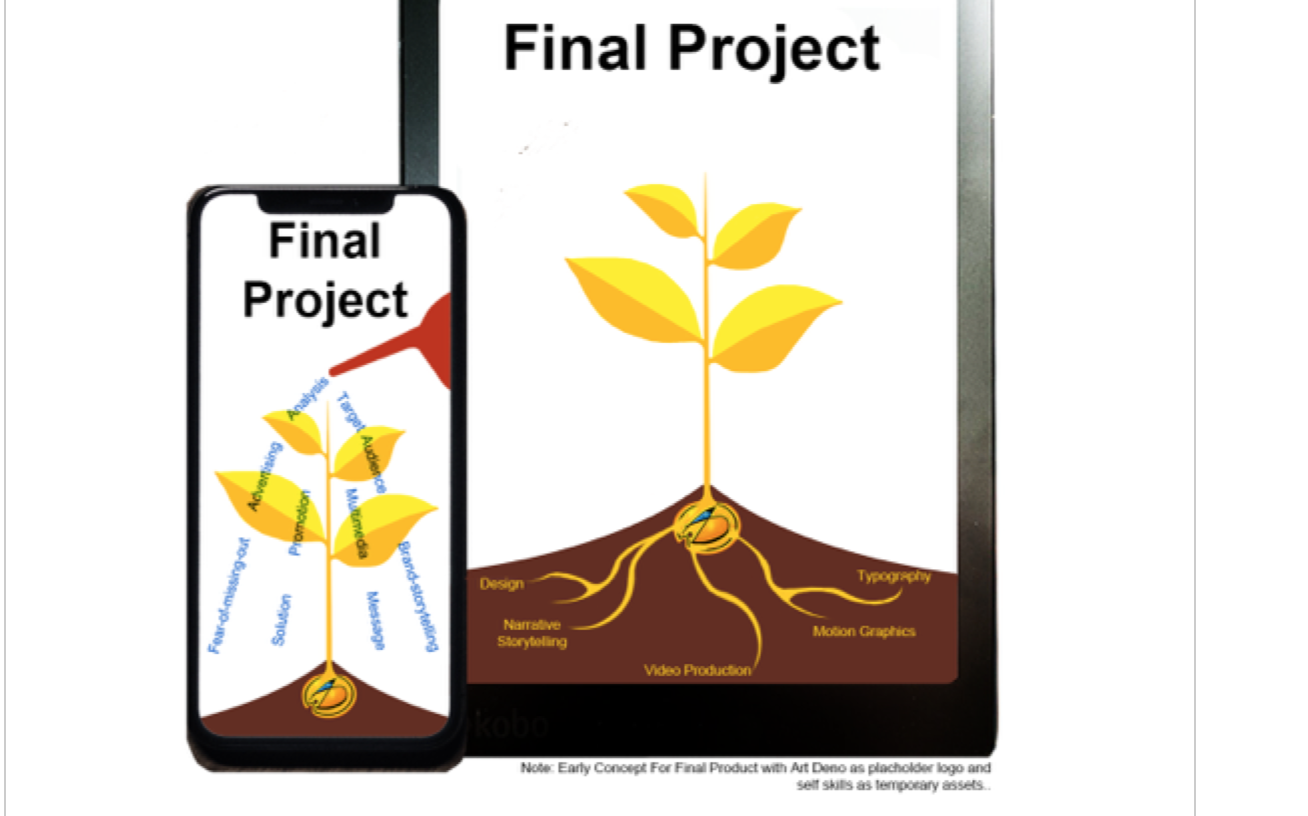
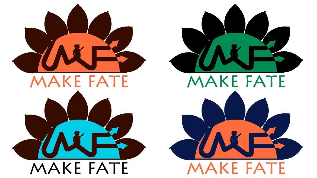
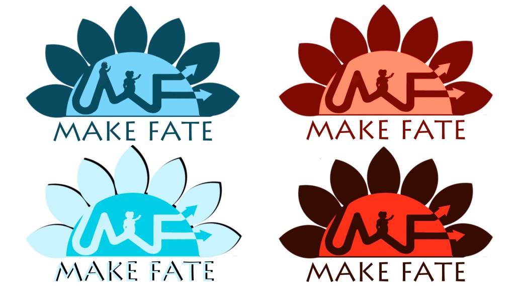
I considered a plant motif for the brand’s marketing and communication during my proposal and early designs (Gallery 5); basing my app on the idea of ‘growing’ further in life and ‘sprouting’ new branches, thus becoming taller and proud in one’s personal attributes. However, I soon regarded this as inaccurate to the themes of destiny and ambition, key essentials in changing the reputation of the middle-aged demographic.
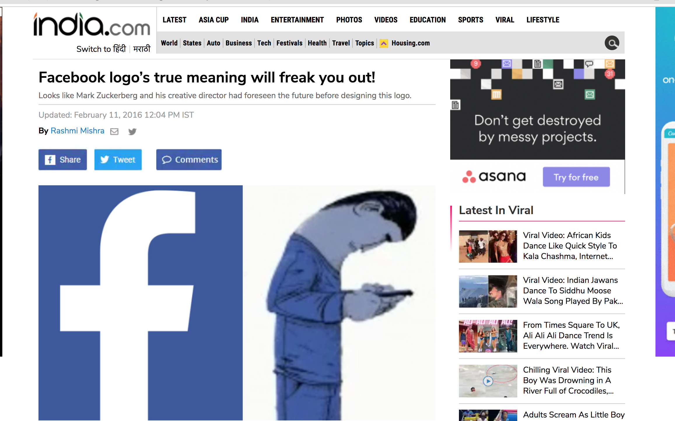
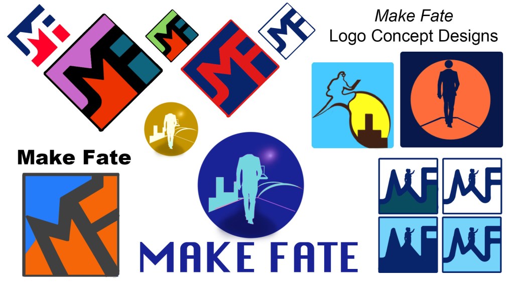
I was intent on ensuring the logo and typography carried relevance or a subtle detail that represented the product as a whole. For example, the logo for Facebook actually uses the F letter in the typography to portray a user as embracing the product on their device (Gallery 3).
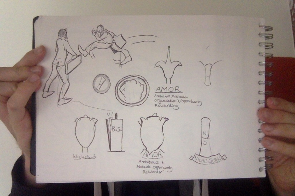

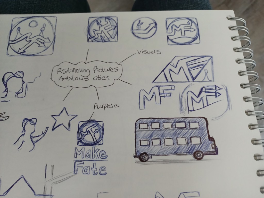
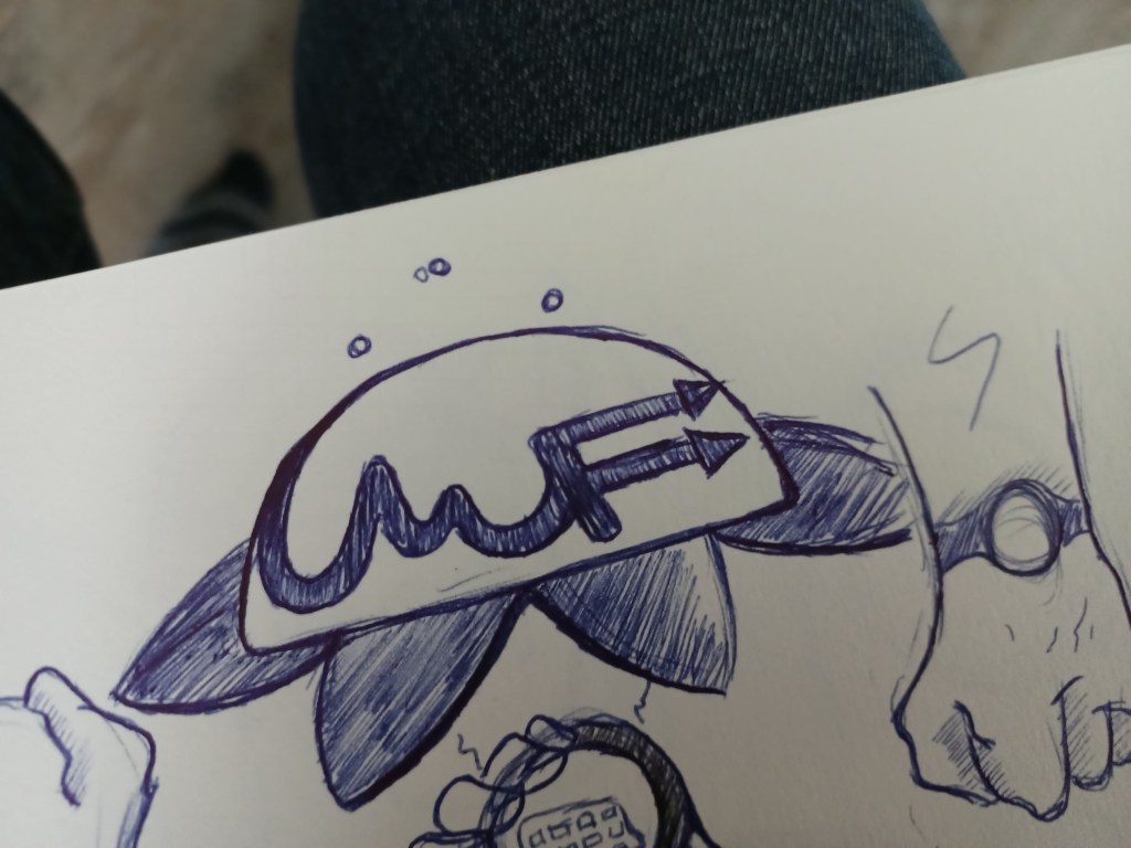
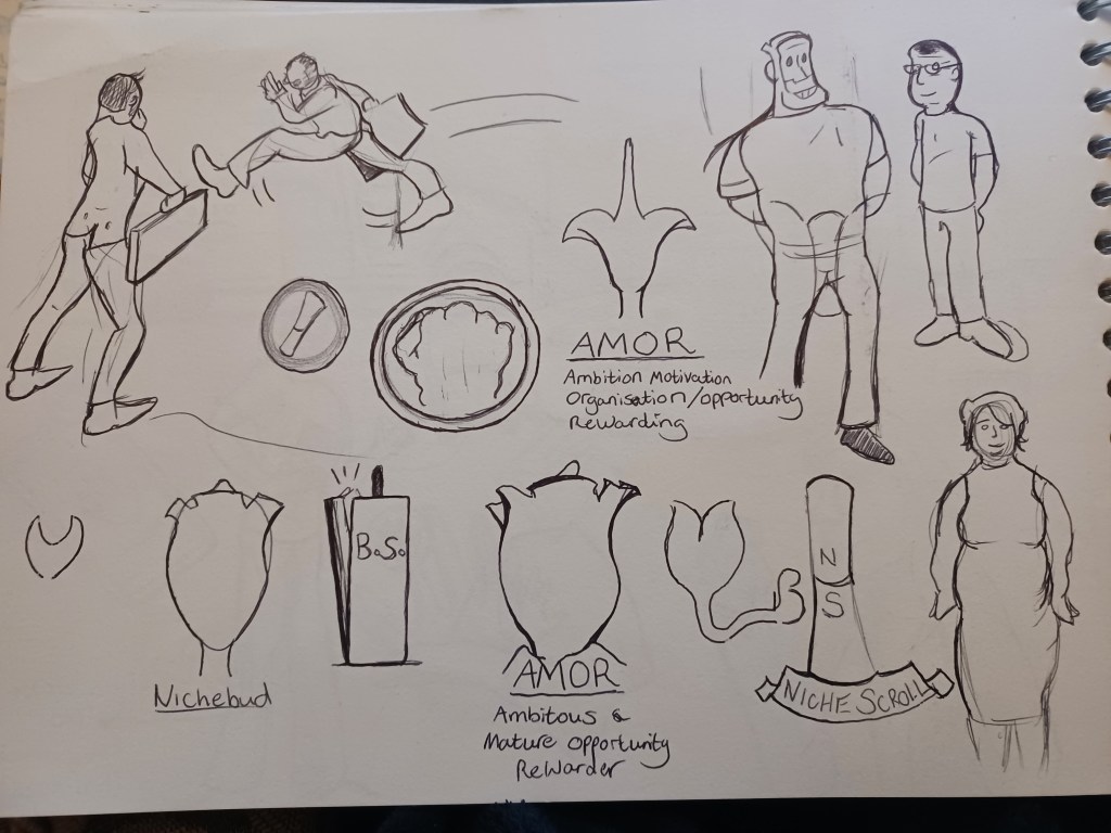
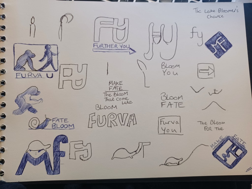
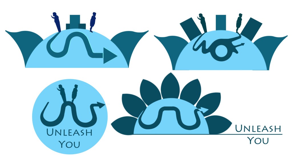
The name for the brand proved to be the biggest challenge; I found how a brand name is effective when short, speech-appropriate and that one can utter within two or three syllables, yet stay true to what it offers (Figure 12). Among the many names I considered included: ‘Find You’, ‘Niche Bud’, ‘Unleash You’ and ’Scroll’, all playing to the plant motif I originally considered. After much experimentation, I realised the product allowed the user to be the decider of their own fate, so I decided on ‘Make Fate’.
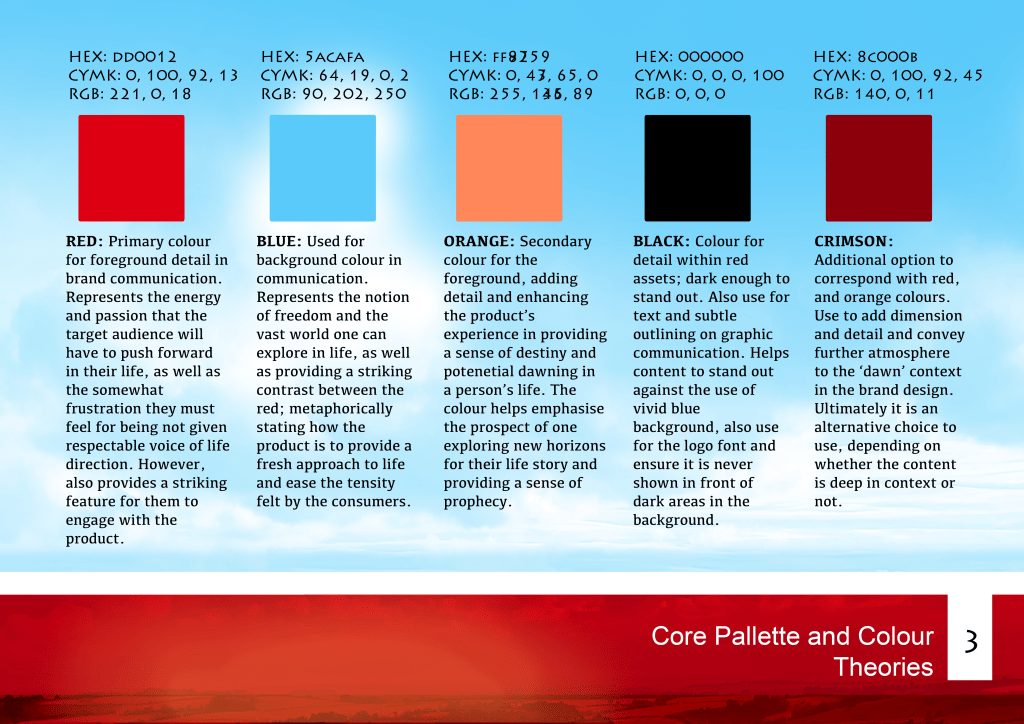
Brands currently follow a vectorised and minimalistic design trend, as well as using no more than three colours in communication. I was aware that blue was associated with a sense of freshness and depth, following colour research in the previous semester, perfectly conveying the brand mission (Rodin, 2015).
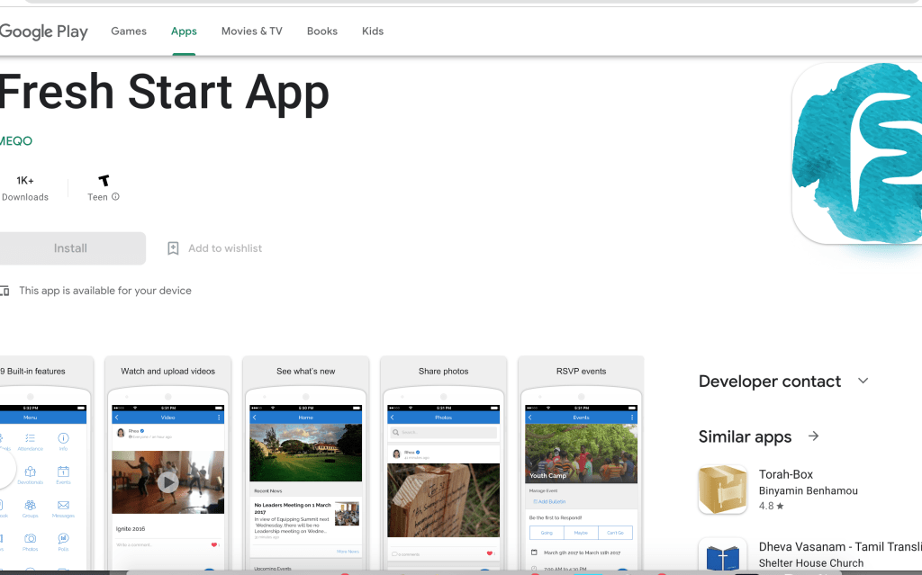
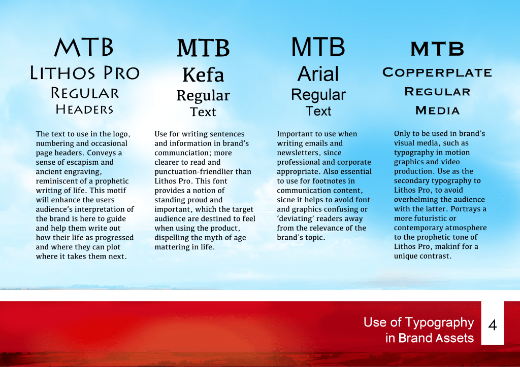
The notion of becoming an inspiration in finding one’s ideal nature or exploring new avenues, ought to be conveyed through a sense of ‘escapism’; having looked at the ‘Fresh Start’ app (Gallery 3), I was inspired by the ‘ancient’ cave aesthetic that I interpreted from the logo. This gave me the idea of having the brand’s motif ‘play’ on the fact that everything that happens in life is for a reason, or has ‘already ‘been written’ as somewhat of a prophecy which the user must discover for themselves. It also lead to my choice of using Lithos Pro for the brand’s key typography, which gave a sense of writing from an ancient and cosmetic setting, but keeping within a vector-friendly design.
such as plantation, futuristic or pathways.
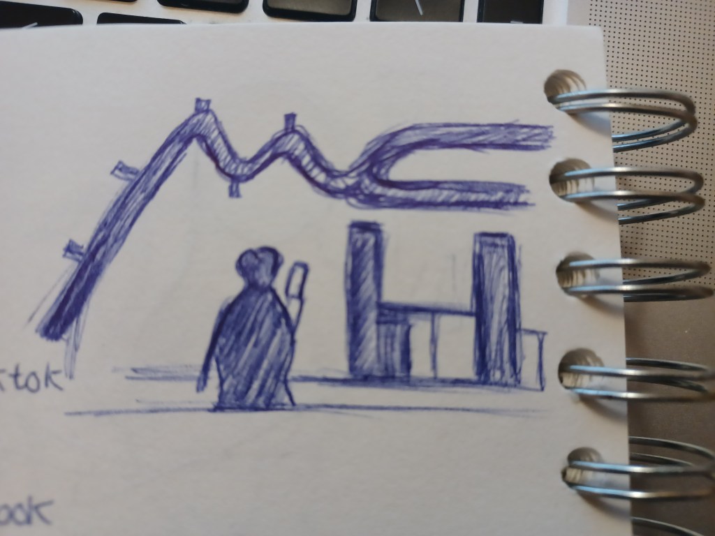
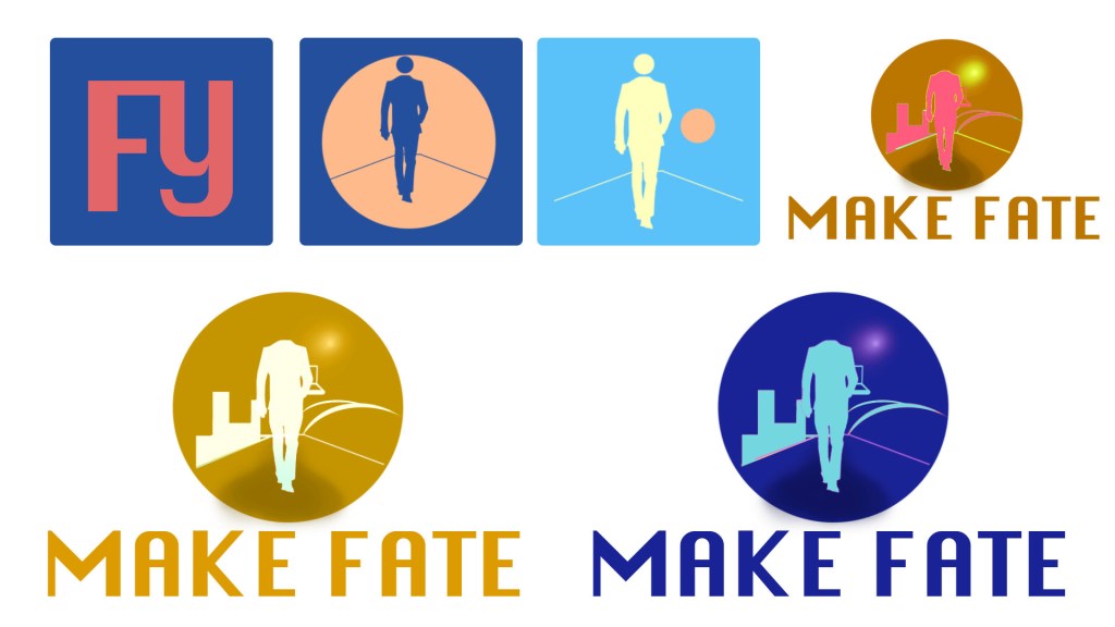
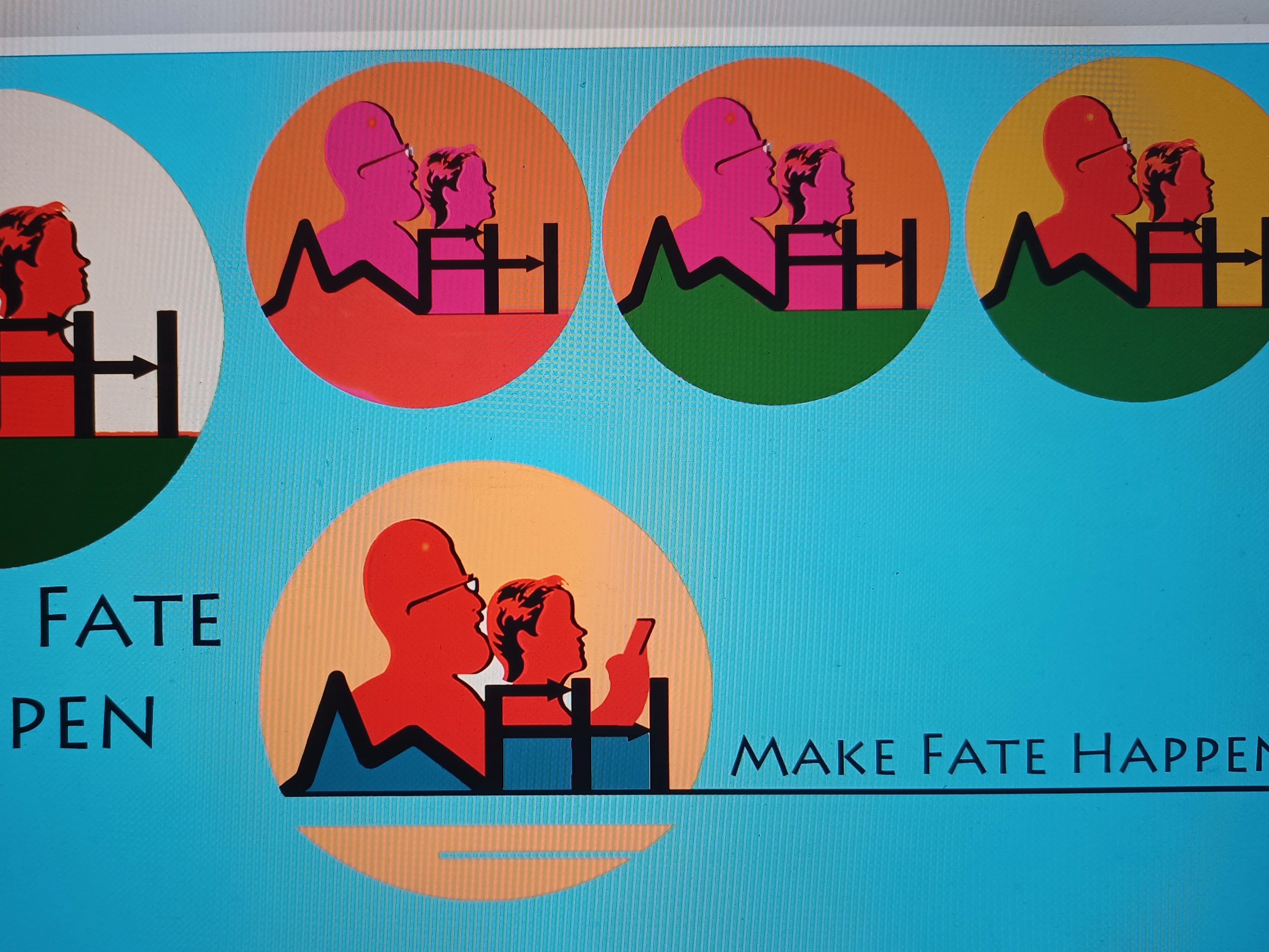
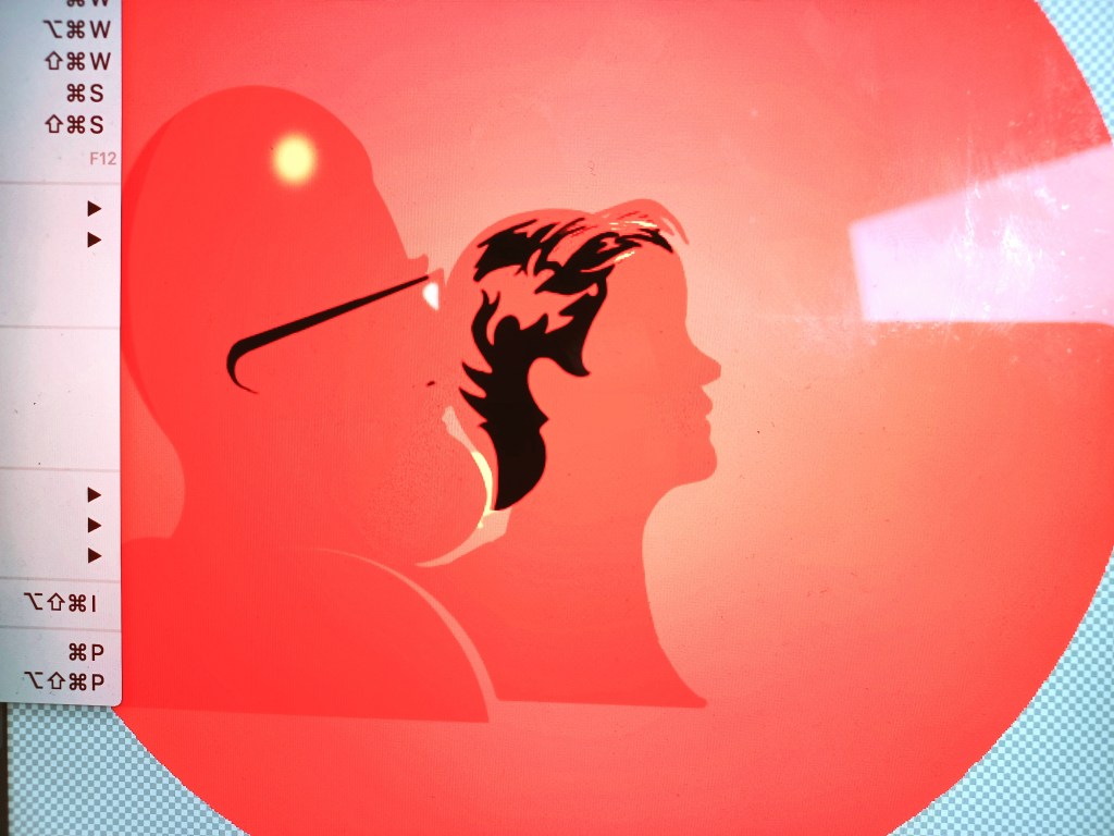
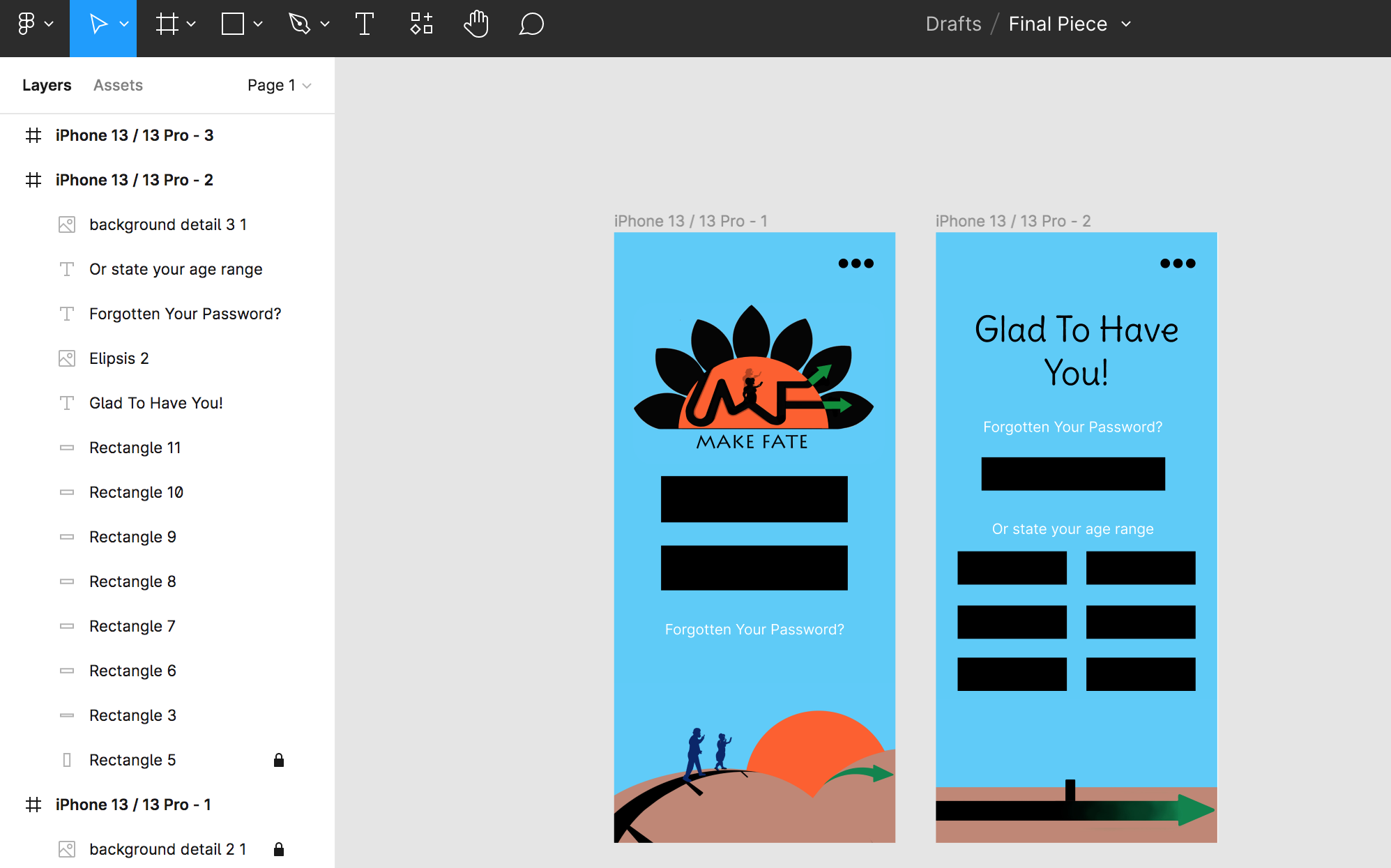
However, there was still the question of how one would identify who the product was aimed at, so I applied various methods; such as the silhouettes of a middle-aged man and woman in the centre of the logo on a ‘life path’, spelled out by the brand initials (Figure 13).

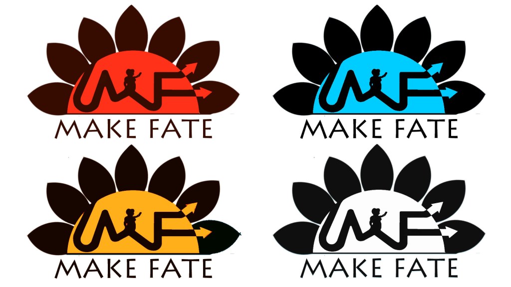
Producing colour variations (Gallery 6), I asked a designer for their opinion regarding choices made. They generally agreed that blue stood out and worked best in portraying the ‘fresh’ intention, but recommended loosing the petal motif, a choice I made to enhance the feel of the user’s life ‘blooming’.
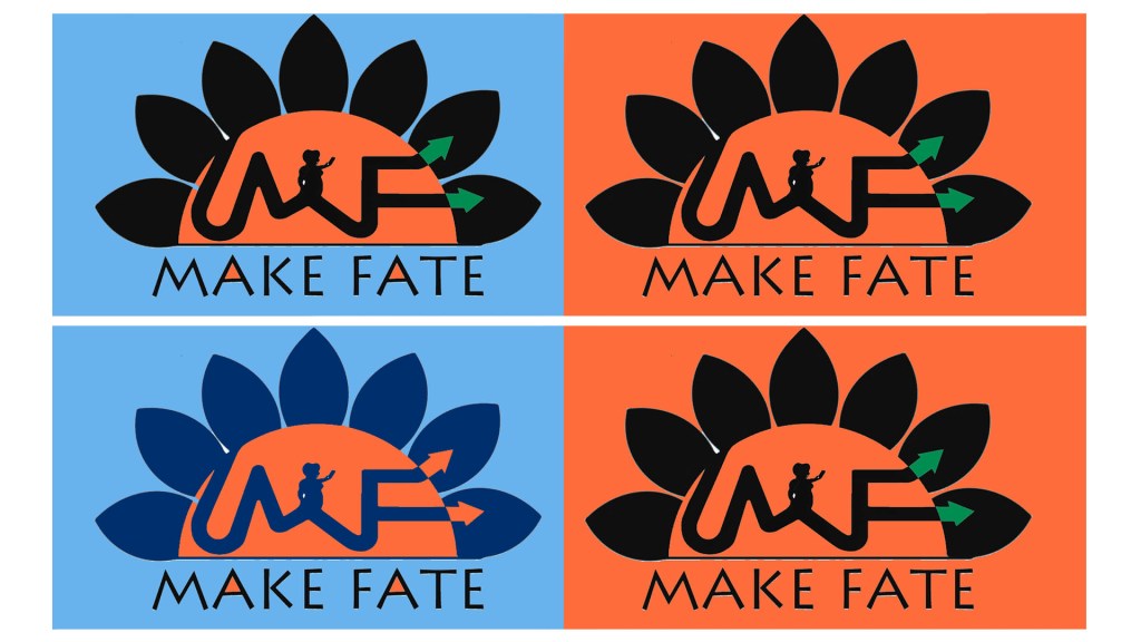
We agreed orange would best symbolise how the user was about to start a new chapter in their life, given the colour’s meaning of uniqueness and conveying the dawn of a new era, but red was also suggested to express passion; the motivator for the intended user to use the brand. This would also provide a unique contrast with blue, as it would communicate that the brand is providing fresh direction for the frustration felt by middle-aged users. Taking note from this, I looked at the brand scheme of Wall’s as comparison for how the colours could juxtapose within the design (Figure 14).
Wall’s Ice Cream Brochure, 2022, Consort Frozen Foods. Available at: https://consortfrozenfoods.co.uk/download/walls-ice-cream-brochure-2022/ (Accessed 12h July 2022).
Convinced with the colour contrast, I temporarily settled on a design that utilised the profile silhouettes of the intended stakeholder with the brand initials portraying a sense of the user going on a journey and pursuing a new horizon. The ‘M’ symbolises the many mountains one has climbed, the ’T’ as a sign post for new direction and the ‘b’ merged with the former, showing the ‘dawn’ motif (Gallery 8).
Product Wireframe and User Experience
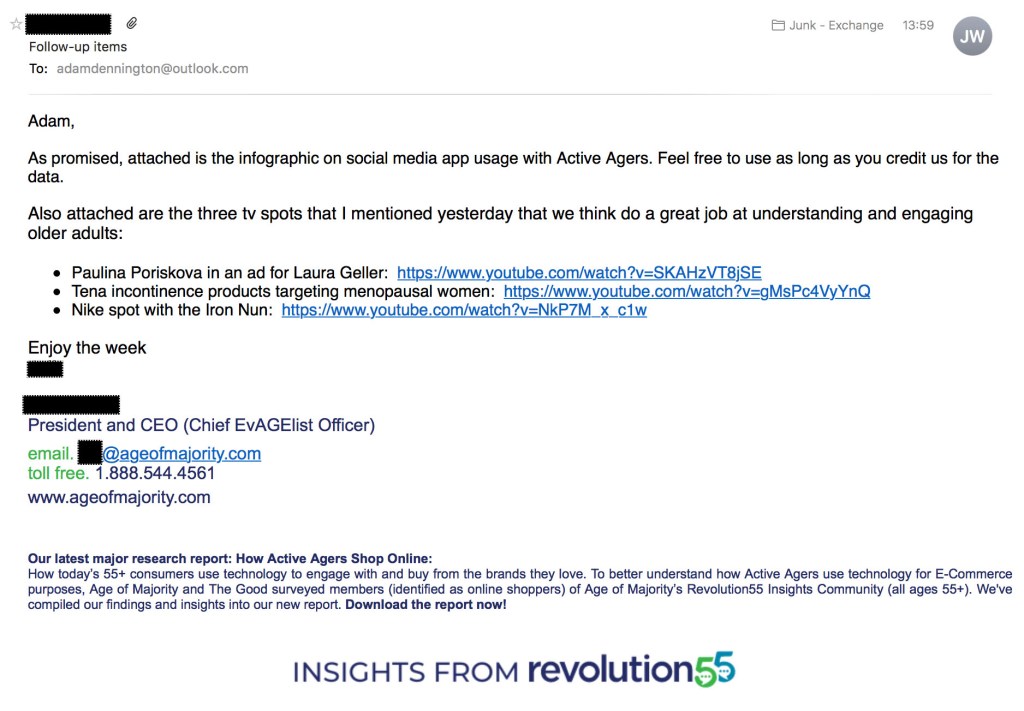
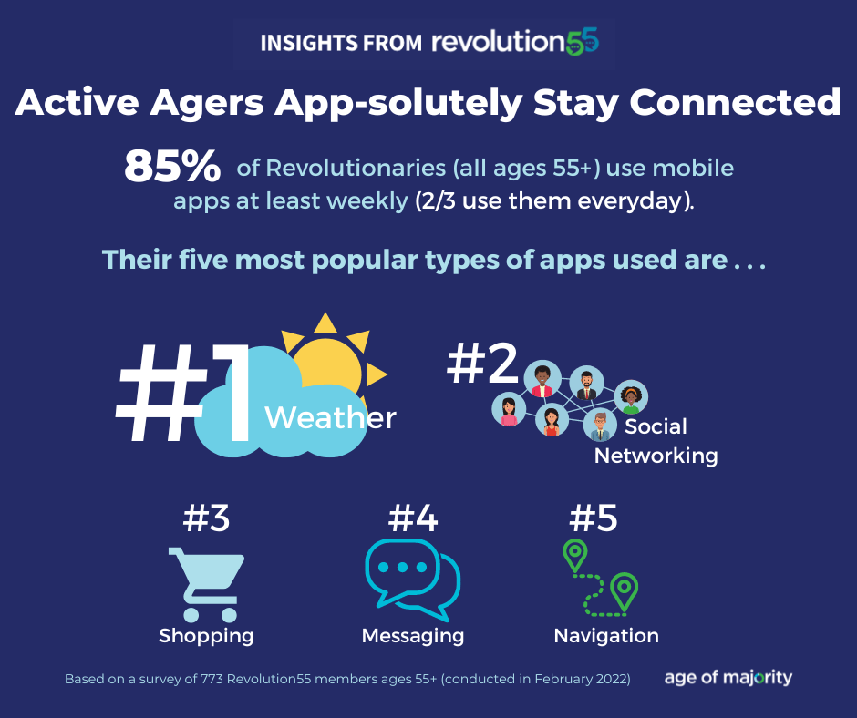
During my proposal, I discovered Age of Majority, who were advocatory of digital endorsement for the lives of mature individuals, known as Active-Ageing Consumers. I spoke to the CEO to collect further notes on this stakeholder regarding app products and their opinion of my idea. They stated how the app trend was indeed a growing predominance in the middle-aged demographic and allowed me the permission to use one of their infographics as evidence of this fact (Gallery 11).
The source states how 85% of those aged in their mid 50s use apps in the USA alone, but added how it was mostly relating to the weather, over-ruling those for the benefit of social networking. This identified how such a campaign needed to shift this reputation and ensure that the Active Ageing-Consumers of the future, who will surely increase the networking apps greatly, are properly represented.
The source stated how 96% of this demographic actually use social media with Facebook, Twitter and Youtube being the highest candidates, a fact I took note of to possibly promote my brand and product in the long-run.

Research and Survey Team, 2022, Age of Majority, permission given by the source to use the data.
The source provided examples of advertising efforts to provide a clear idea of how such a campaign should represent the individuals in an inspiring perspective; one of which titled The Iron Nun challenged the stereotype perceived by people based on their age and background, an area I was keen to demonstrate in my advertising campaign (Figure 15).
Dievart, T, 2016, Unlimited Youth The Iron Nun Nike AD, Youtube. Available at: https://www.youtube.com/watch?v=anbpHZbk8aM (Accessed on 27th July 2022)
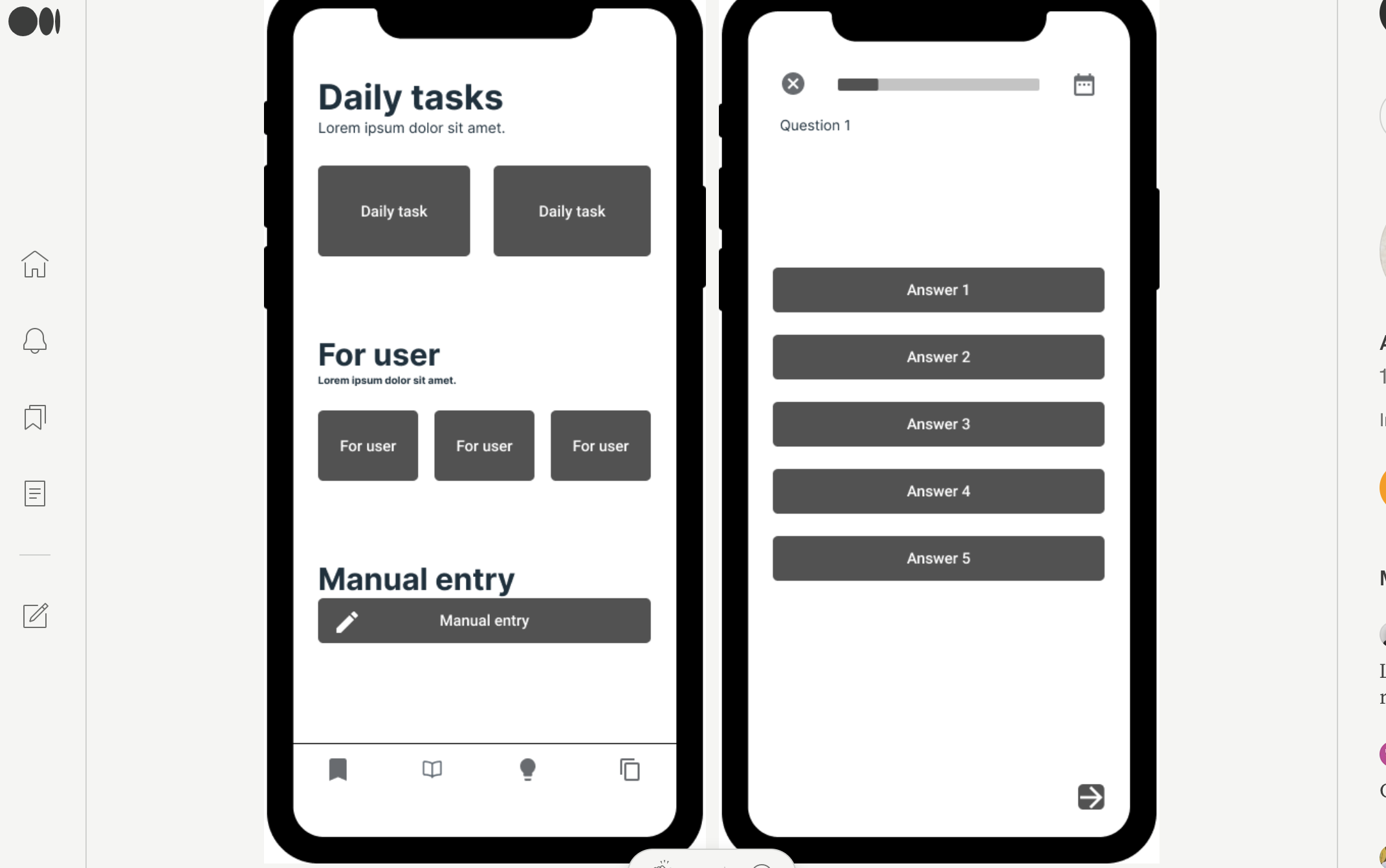
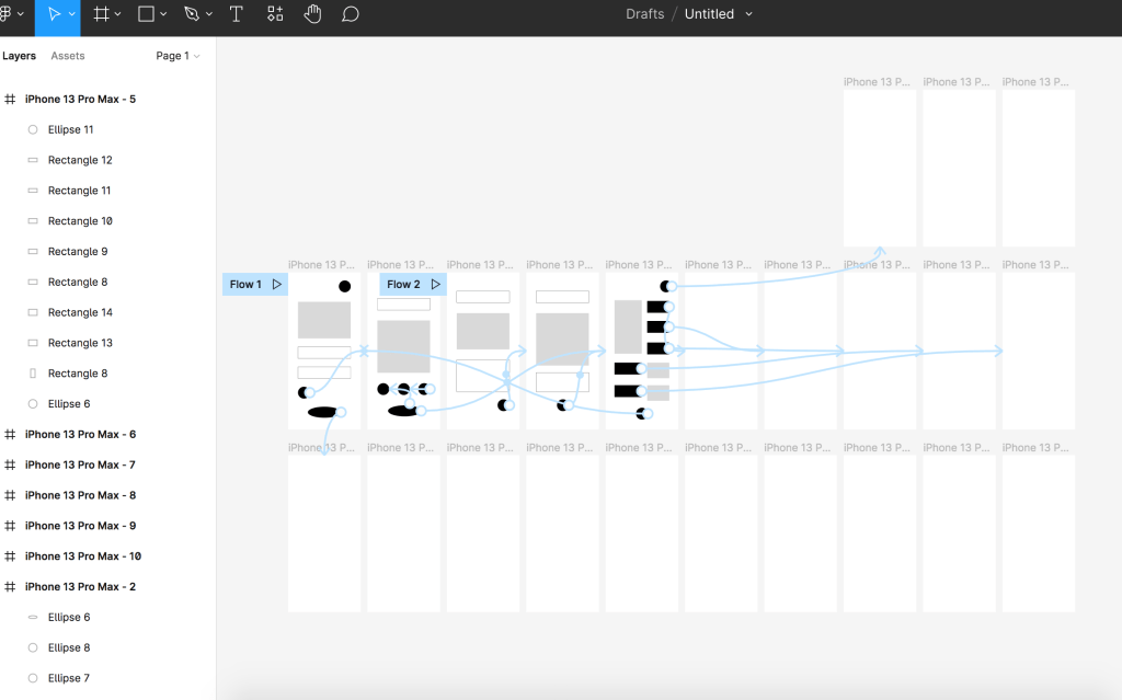
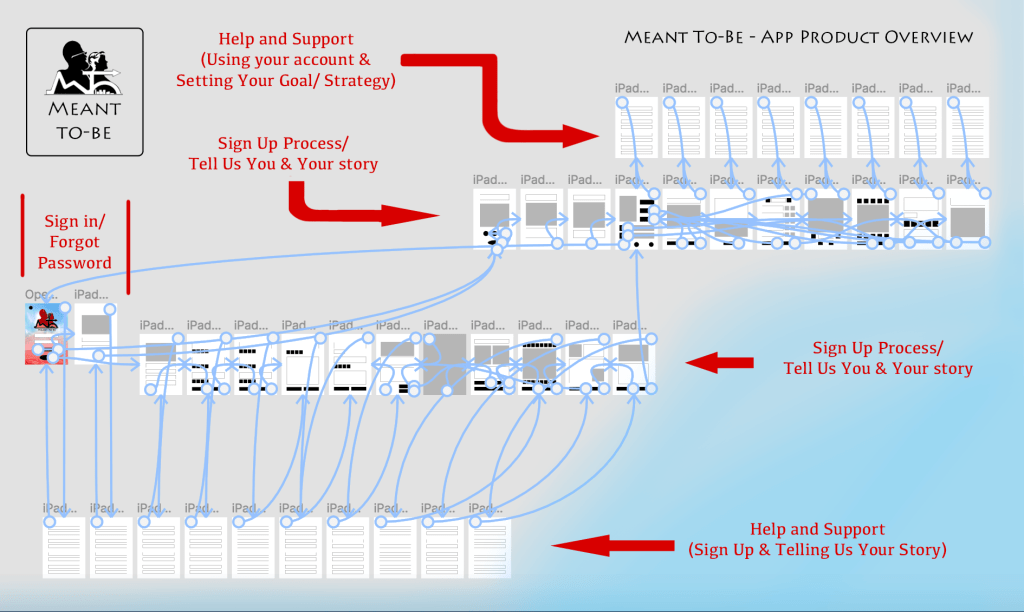
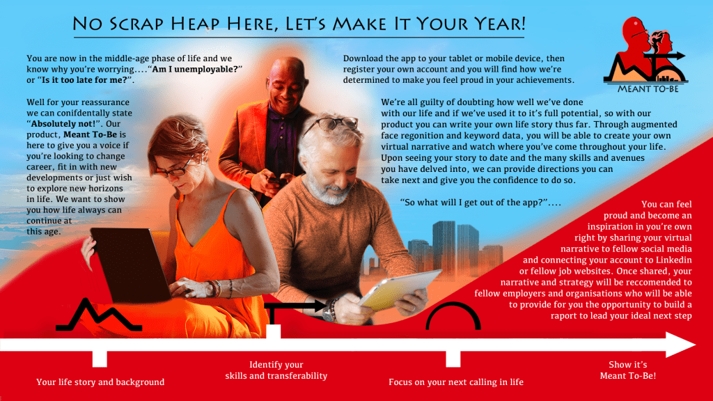
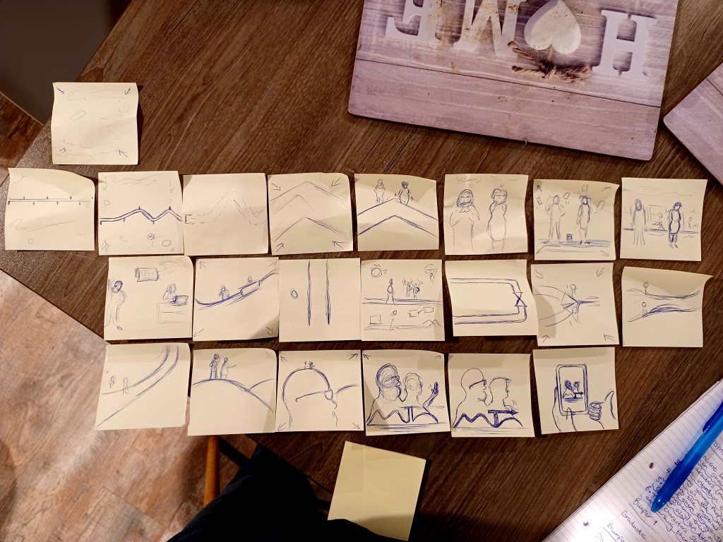
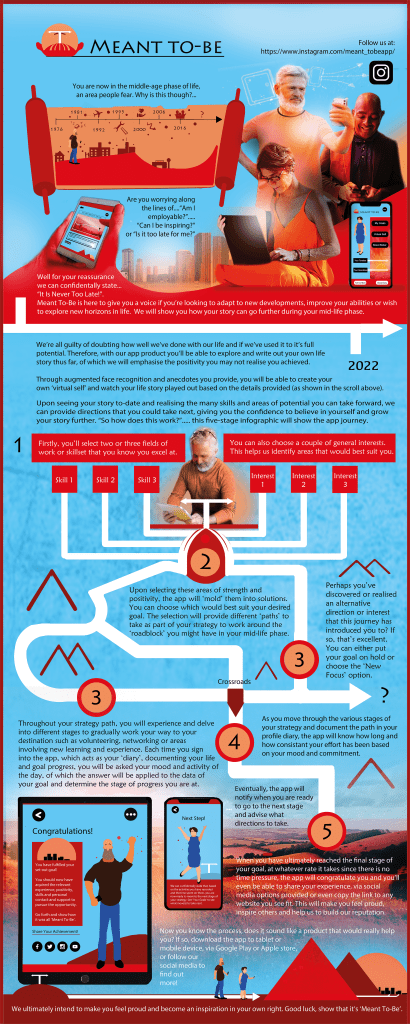
I drafted low-fidelity stages for my brand’s app, reflecting on the considerations collected from the aforementioned competitors. I defined my product as a hybrid of a diary and life coach, which made me realise how a page that strategised a goal for the user was essential, as well as that of a page to show one their life-story or to document their moments of positivity. In addition I remembered how it helps to have a Standard-Transitional Diagram to break down the product from beginning to end (Buxton, 2007, page 254).
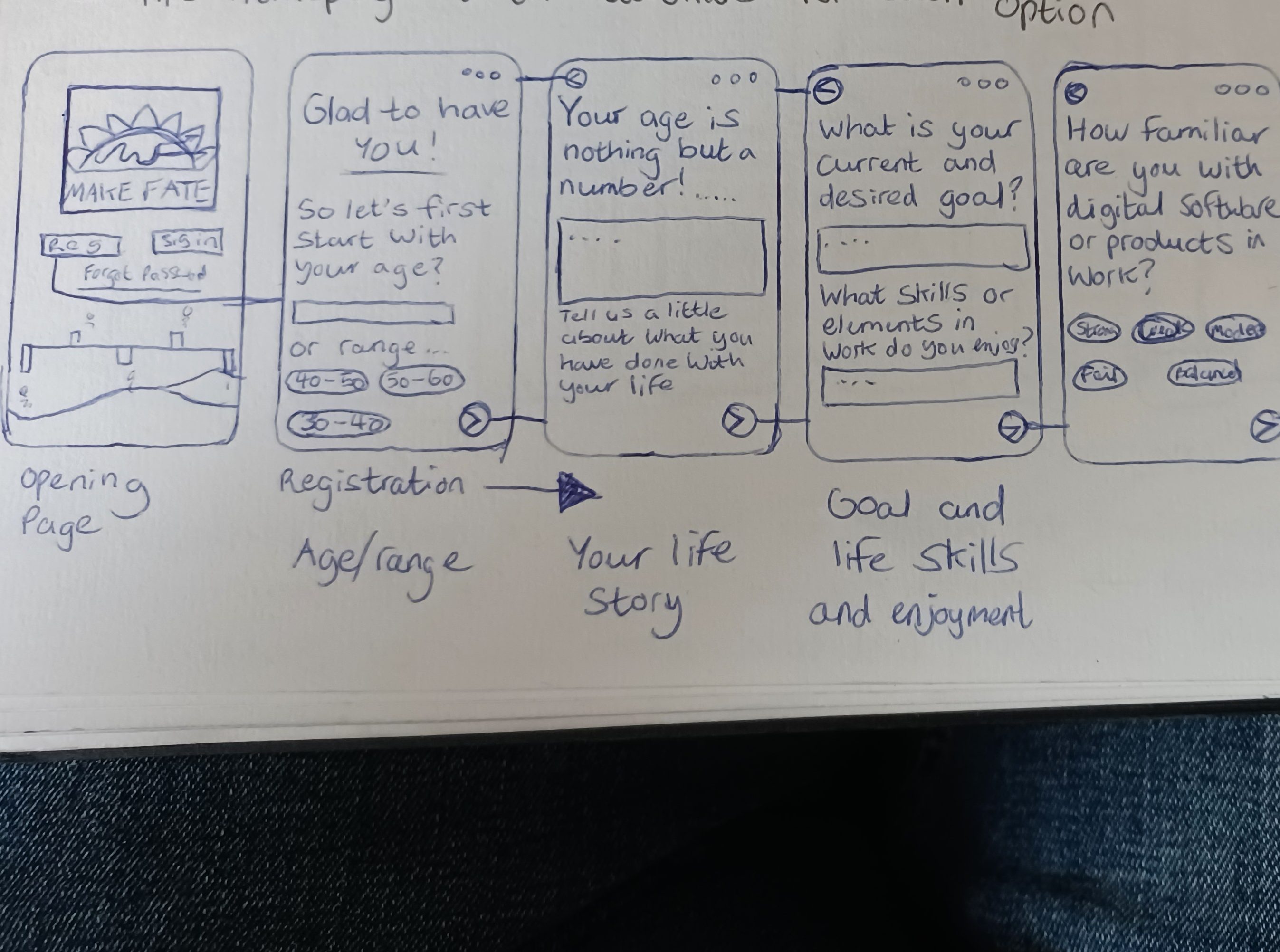
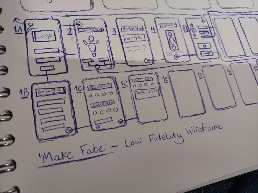
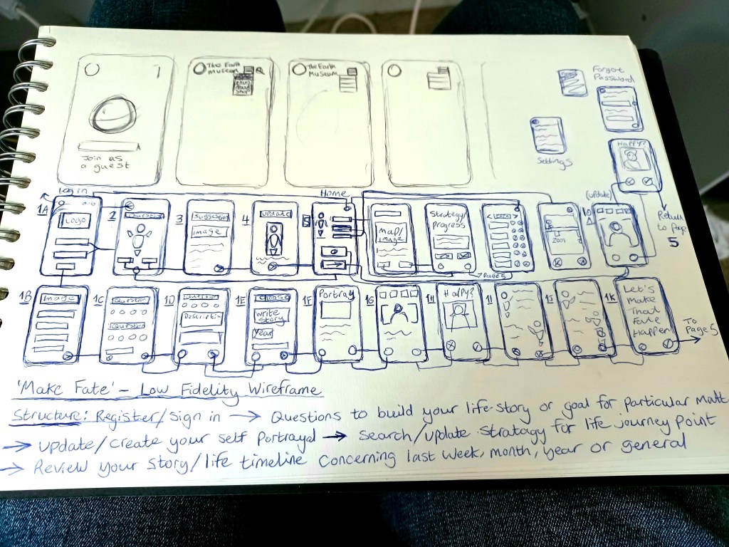
Following various experimentation, I structured the initial diagram as a seven-stage process based on the areas collected in research:
1. Sign-Up Process/ Sign In
2. Question of Your Day/ Mood
3. Solution
4. Diary Update
5. Diary Profile
6. Assess current stage of goal
7. Identify what to work on or continue.
I had considered the possibility of creating a stage in which the user could locate, via a map, the destination to go pursue opportunity. However, the product’s limitations needed to be considered to simplify the practicality of how it would use data. Therefore, the decision was made to keep the product within the realm of being a moral support, as opposed to a navigation tool.
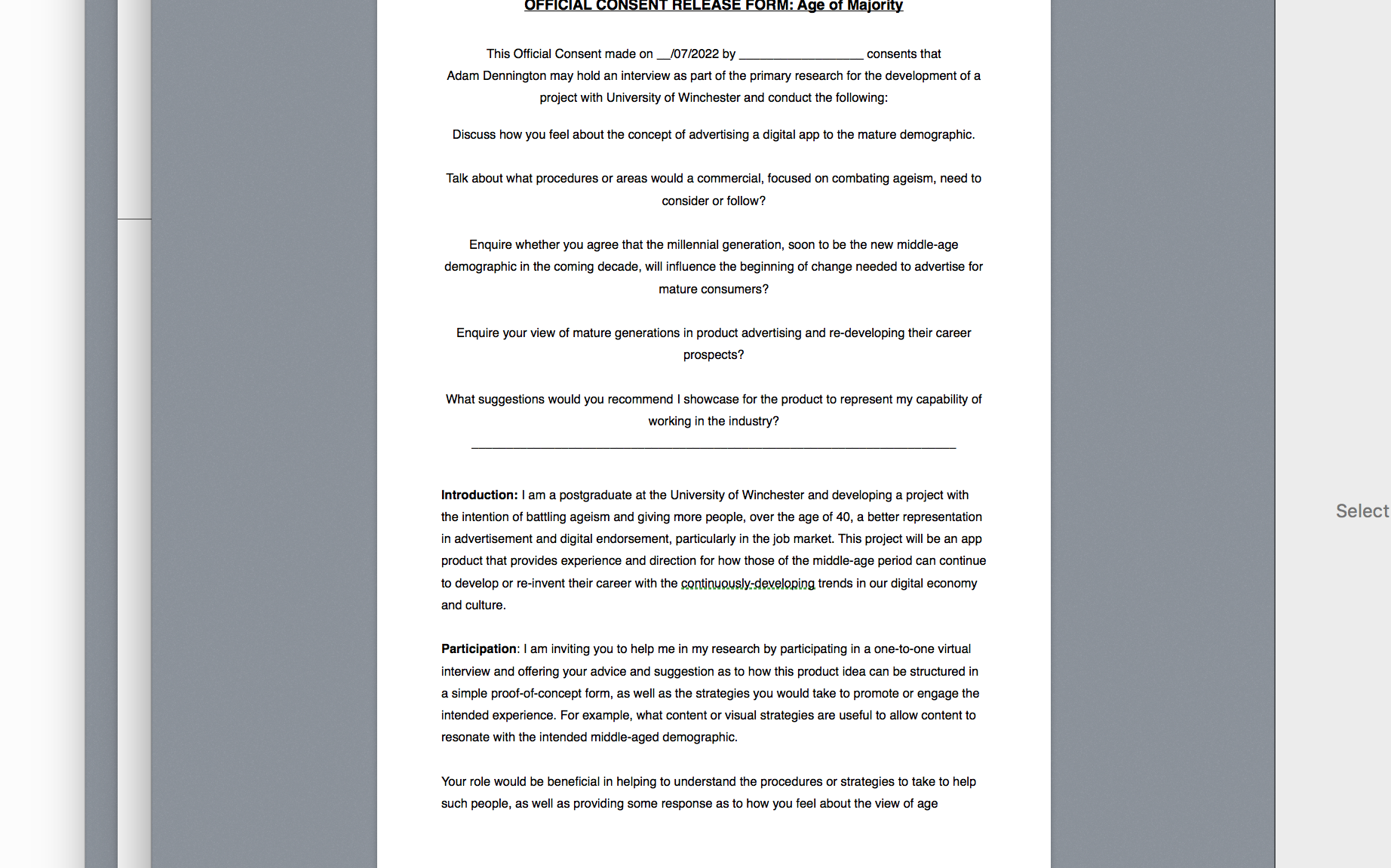
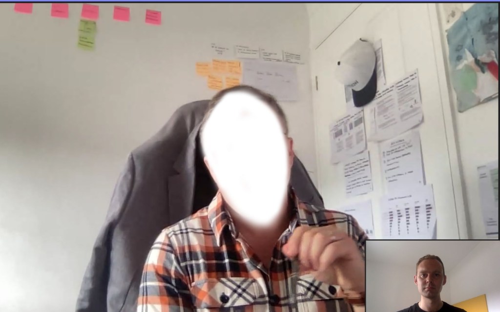
I arranged to speak with a UX professional to provide insight on my wire-framing; upon sharing my intention and plan, the source stated that the name of the brand, Make Fate, didn’t sound entirely appealing and to consider a phrase that describe one’s achievements clearer. I realised that ‘Meant To-Be’ was a term that most people understood and indeed summarised one’s achievements in life positively.
The source praised the mission, structure and features, commenting how they would benefit people by remembering small positives they achieved in life, especially when they may not have a visual documentation as such with the benefit of hindsight. They suggested the product should not forbid young users from the experience; I had drafted a page that would check one’s age to ensure only middle-aged users would use the product, ultimately deeming young users as unsuitable. They stated this could ‘back-fire’ and be regarded ‘agesit’ and should instead resolve this by asking users to provide particular anecdotes throughout the span of a number of years. This would inform younger users that they might feel somewhat limited in it’s advantages, yet not feel excluded.
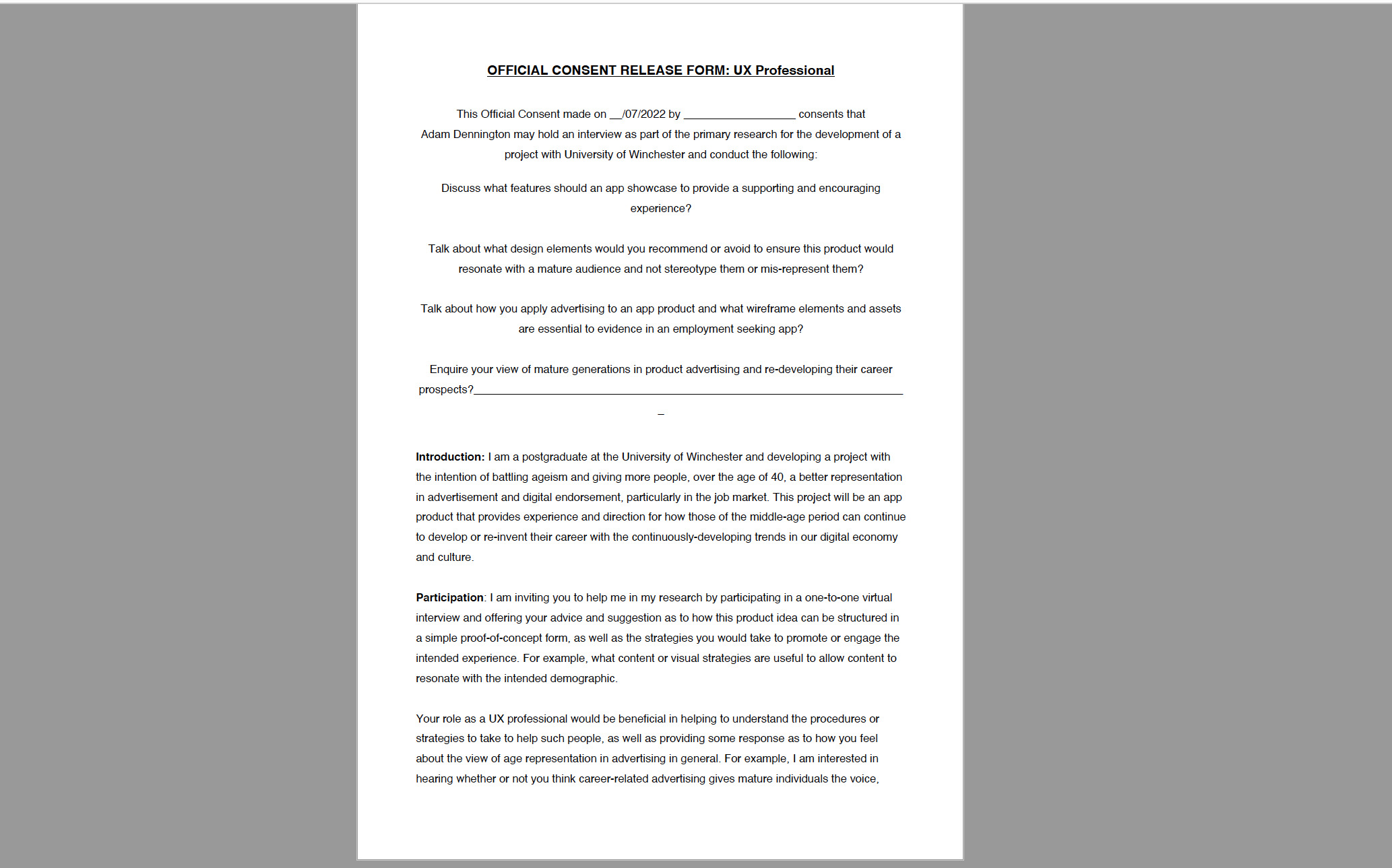
respective consent from I wrote to conduct a meeting.
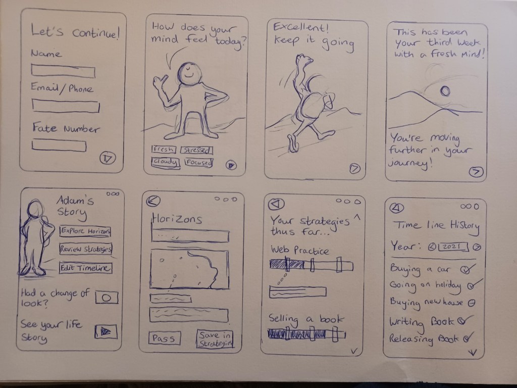
Following this research, I began to adapt the various drafts of the low-fidelity phase into a mid- fidelity that fleshed out the features that the app wold offer to help the user progress on their new direction. A further feature that I applied, keeping with the UX trend of visual data, was a ‘mood meter’ that would measure the user’s welfare based on the answers they give when they sign-in.
The mood meter would help the app identify and guide the user as to how they will progress through their journey; if at any point the app’s data saw a continued negativity and downfall in the meter based on their answers, it would provide suggestion for them to improve their mind to see they can persevere in their goal. Upon stating their mind has eased when signing in, the mood meter will gradually uplift their progress and resume their goal progress.
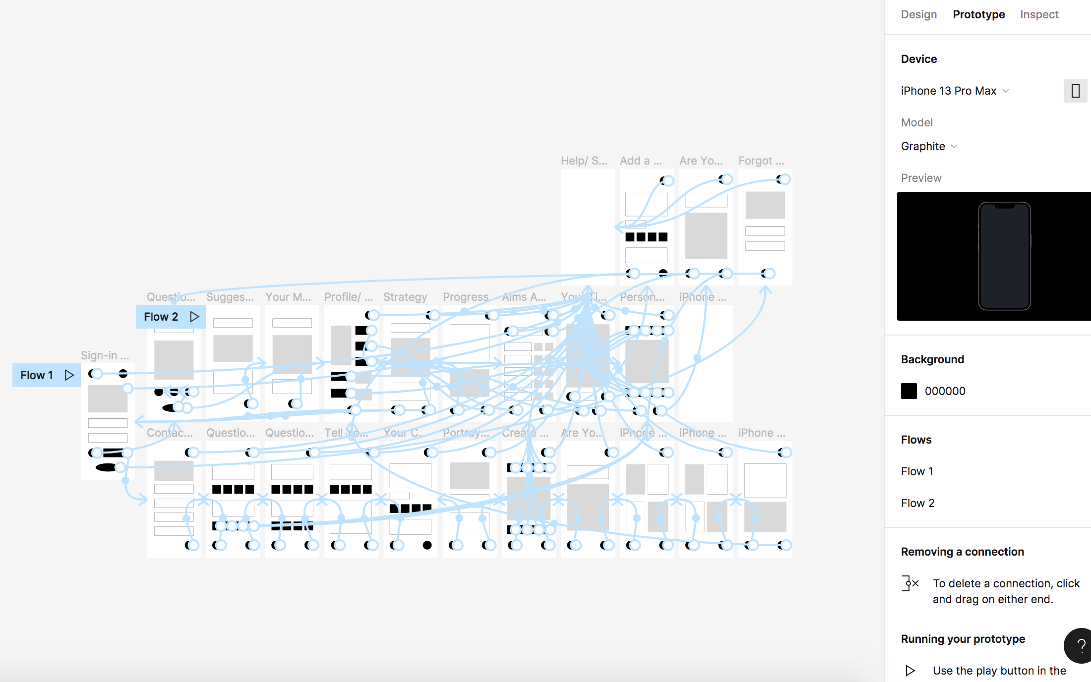
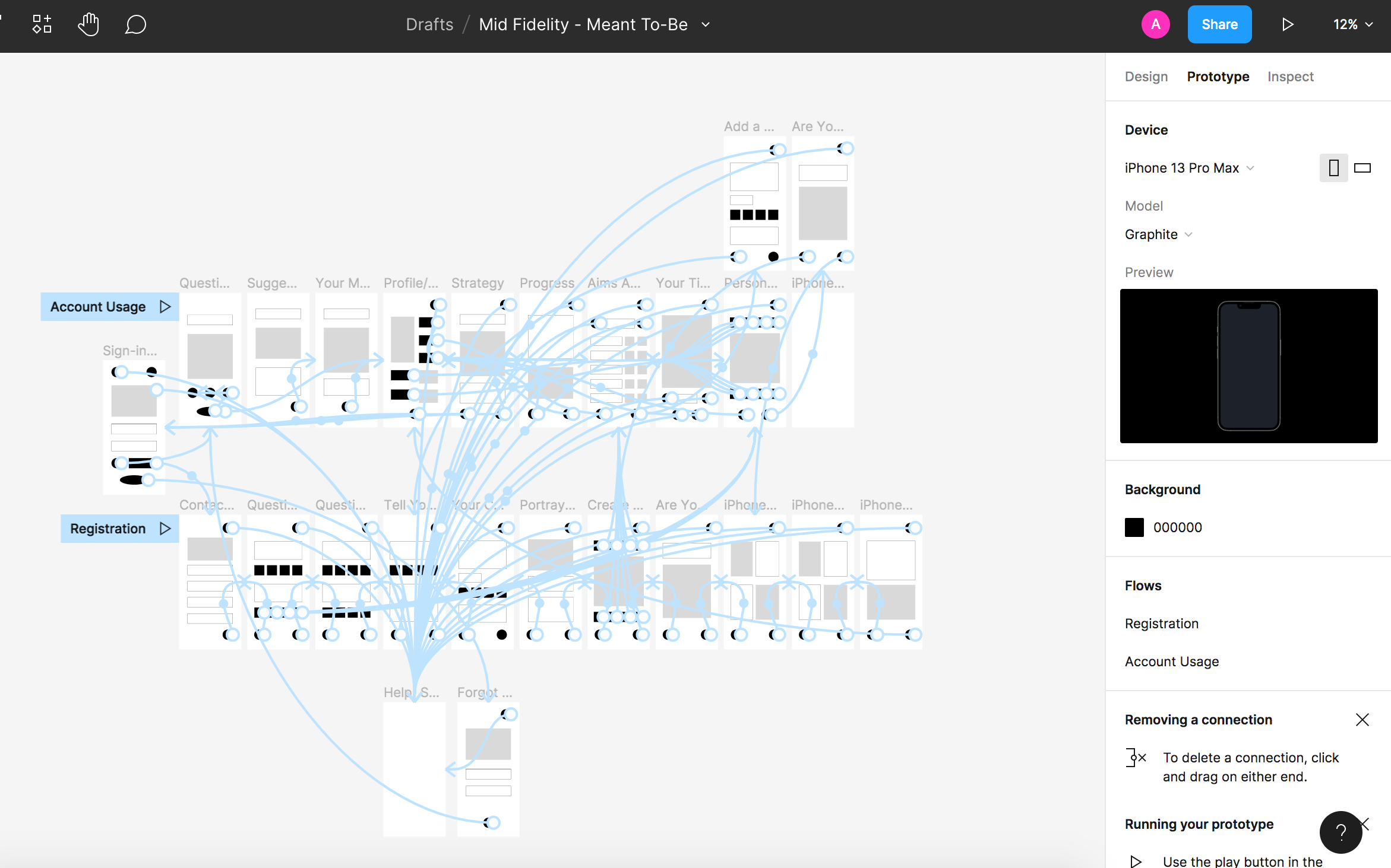
I intended to create the high-fidelity wireframe in Figma, an online UX platform that is becoming extensively used in industry, of which I had begun to use in the mid-fidelity phase. However, I found that I could preview no more than three pages on the platform, since it required me to buy an upgrade package. I moved the design to Adobe XD, which I had previously used in my first semester. It was an opportunity to further my skills with the programme and discover new techniques to build the experience in a more effective method.
The video runs five minutes in length to keep within the boundaries of a product pitch.
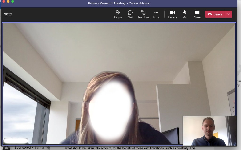
After much assessment of the wireframe, I sent the prototype to a selection of five different sources; two of these individuals included the UX practitioner and Age of Majority CEO, as well as a careers advisor and two individuals in the University’s Mature Student society.
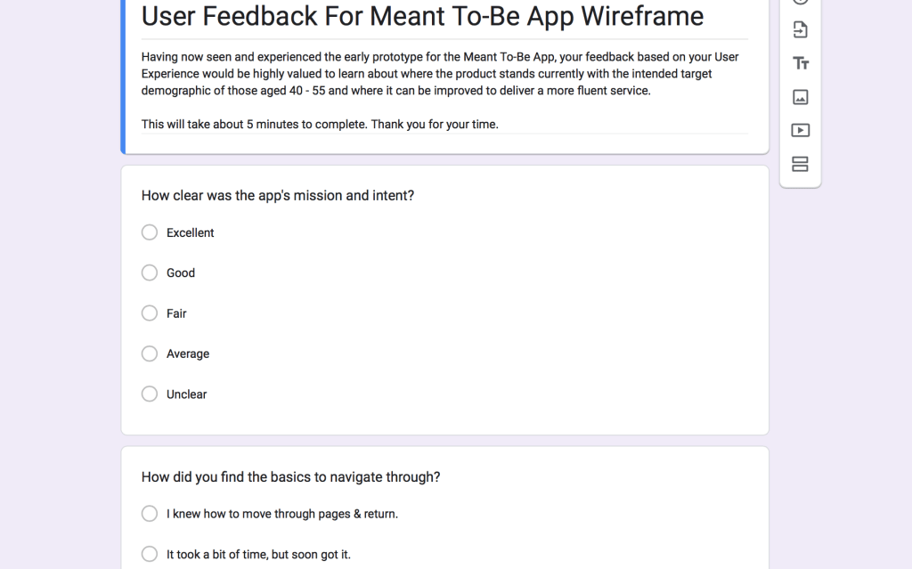
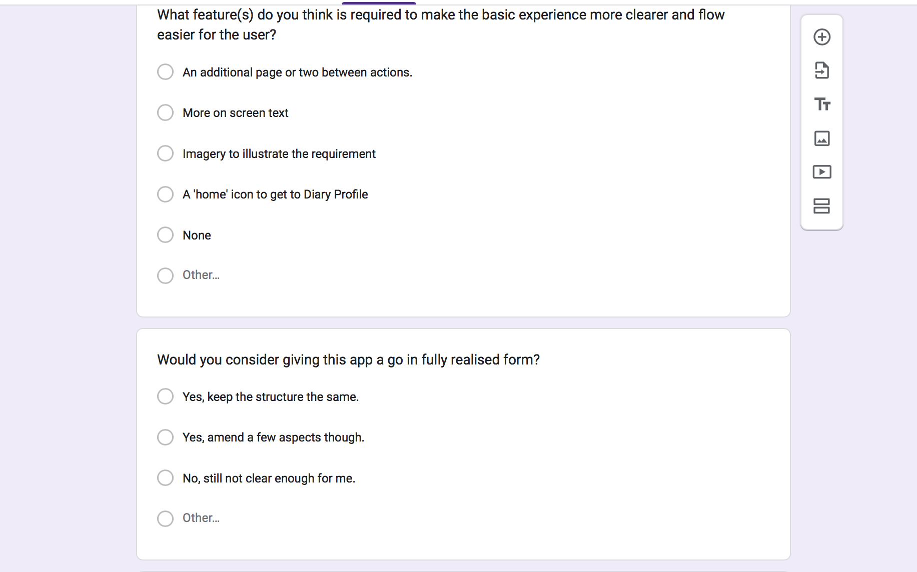
Responses can be found further down the page.
Five candidates was an ideal quantity for User Experience feedback, among them experiencing the product either personally or professionally to determine how accessible, relevant and relatable the product is for general use (Budiu, 2021).
Final Design and Advertising Campaign
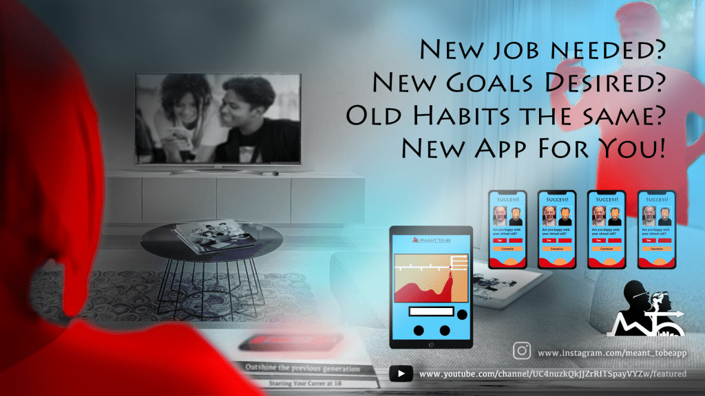
I was moving to the stage where the product could be promoted through the appropriate platform for the suited-stakeholders and began to construct posters in Adobe Illustrator and Photoshop that would communicate the appeal and importance of the product. In addition to researching effective billboard posters with powerful phrasing, I realised social media marketing would be also be a feasible method to promote the brand.
Age of Majority already informed me how Twitter, Facebook and Youtube had the highest margin of users over the age of 40, Twitter particularly being an effective platform for business marketing (Baron, 2022).
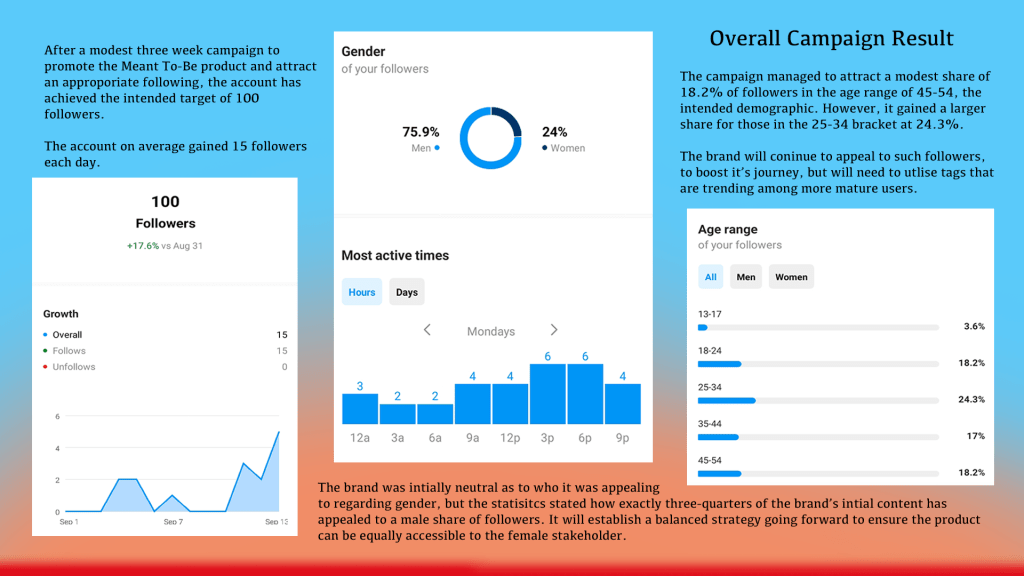
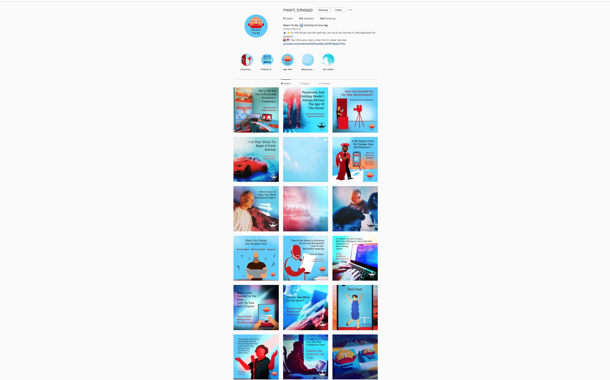
However, since my product was currently functioning as a micro or small brand, I was intent to strategise my campaign on a personal level. Therefore Facebook was the initial intention, but a conscious decision was made that the product could not be entirely focused on the range of 45- 60 year olds in 2022. It also needed to apply an additional method to gradually ‘traffic’ in the succeeding millennial generation, who are the catalyst to ensure sustainability in the brand. Therefore, I set up an Instagram account to experiment and test the appeal with the strategy to promote the brand over a three-week period, intending to attract around 100 followers. The product had initially been neutral regarding the gender I was targeting, so the Instagram campaign would be utilised as an experiment to determine who it appeals to the most regarding persona and attitude.
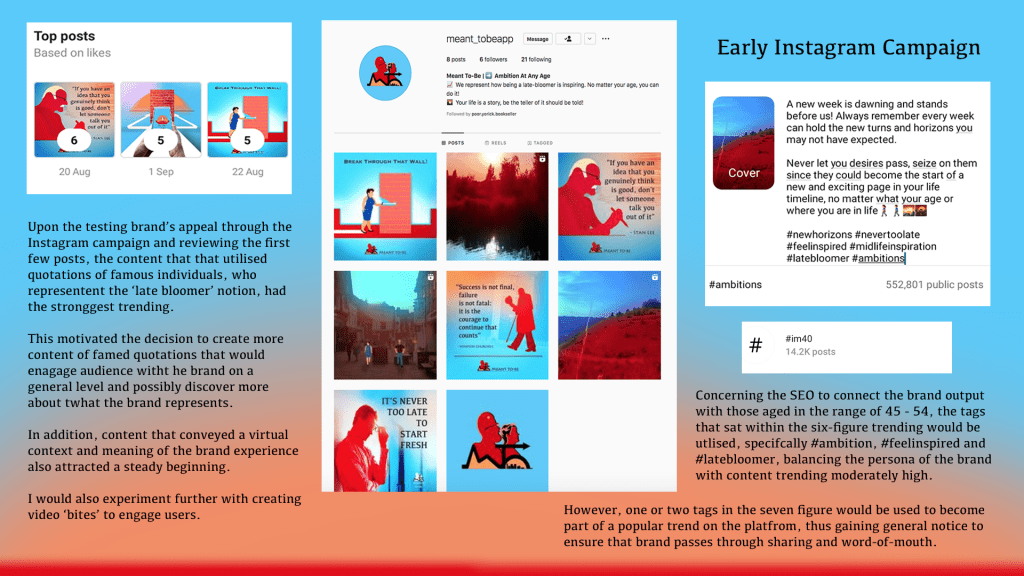
I also set up a Facebook group to possibly traffic followers from the Instagram account and engage further with the cause that Meant To-be is setting out for itself. However, this would be a element that would be more future-inclined given the short campaign period. Nevertheless, I was determined to utilise the search-engine-optimisation to attract a relevant following; I explored various tags related to the brand mission, trending either in the six or seven figure margin. It was a challenge to balance the idealism of what the brand represented, along with the social media reality, particularly given how Instagram has a user share of around 8% aged over 45 years-old in 2022. Nevertheless, it helped provide a clue as to what themes could be applied that engaged the millennial consumers who were in the greater share of around 47% between those aged 25 – 44 (McLachlan, 2022).
Following careful analysation, I implemented the SEO: #nevertoolate, #ageisjustanumber, #midlifeinfluence and #yourstory which sat in a six-figure trending, along with #inspiration, #ambition and #newchapter in the seven-figures. I was intent on maintaining no more than ten tags for each post; allowing around three additional tags concerning the context. These tags maintained a healthy balance in keeping within relevant trends, yet conveying the brand persona.
Storyboarding began on the brand’s online advert; I intended to use multimedia in the advertisement; motion graphics to portray character and typography assets, which would be crucial to utilise within the narrative-storytelling trend I set out to showcase. I was also intent to utilise photographic imagery or video where possible to help the audience understand how to use the product, as well as showcasing FOMO scenarios in creating promotional posters.
Advertising Standards Authority, Non-broadcast Code Codes and Ruling, Official Website, 2016 (Sixth Edition). Available at: https://www.asa.org.uk/codes-and-rulings/advertising-codes/non-broadcast-code.html (Accessed July 7th 2022)
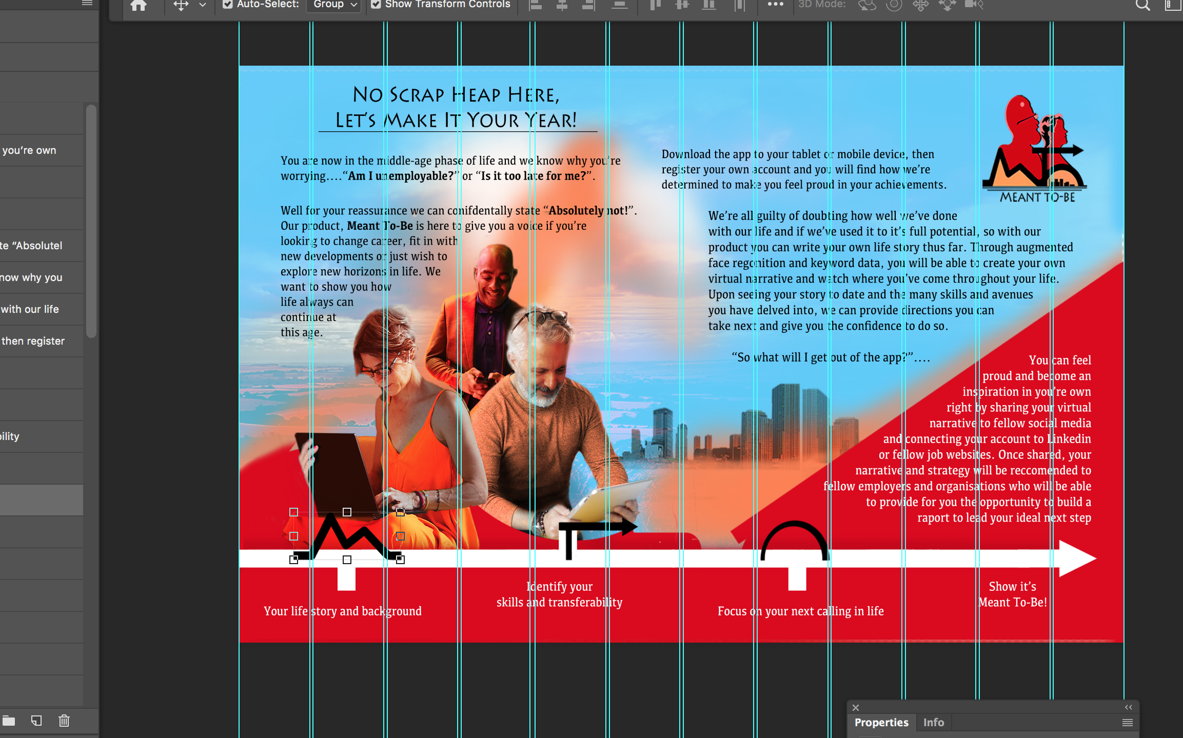
Taking on the role of an advertiser, I cited industry rules relating to the Code of Advertising Practice. My intended commercial fell under the category of non-broadcast media; I took note to ensure that the content would not address areas of political context or indeed was devoid of personal details. In addition, the content would provide a truthfulness and decency in not providing information that was either not currently accurate and took responsibility in not causing offence or being unsuitable for young viewing, considering how it would be promoted through website and streaming platforms. I realised the ironic headline of ‘No Scrap Heap Here’, used in one of the posters previously showcased, would not be appropriate for the marketing.
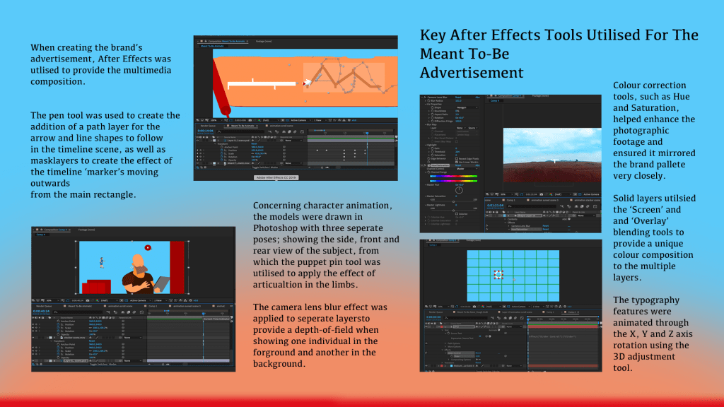
The advert would instead address the brand mission on a subject that could reflect a person or situation on a relatable level. The context would showcase the target demographic through subjects that could be interpreted as the target consumers, yet make no reference to age and allow for interpretation to recognise who the product would benefit predominantly. I used After Effects to compose the various multimedia assets for the advert and utilised various techniques to blend the various sources together.
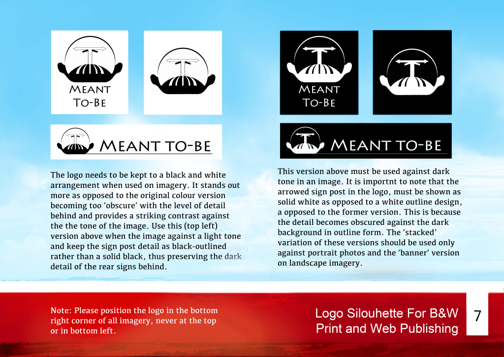
In a belated issue for the project, the logo presented some problems, specifically when adapting it into different variations for web, print or social media in my brand guidelines. It had too much detail and was difficult to identify the main focal point, thus depriving it from appearing recognisable when adapted to different colours.
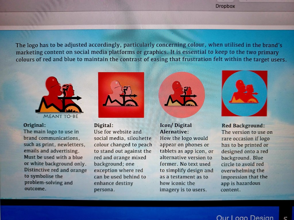
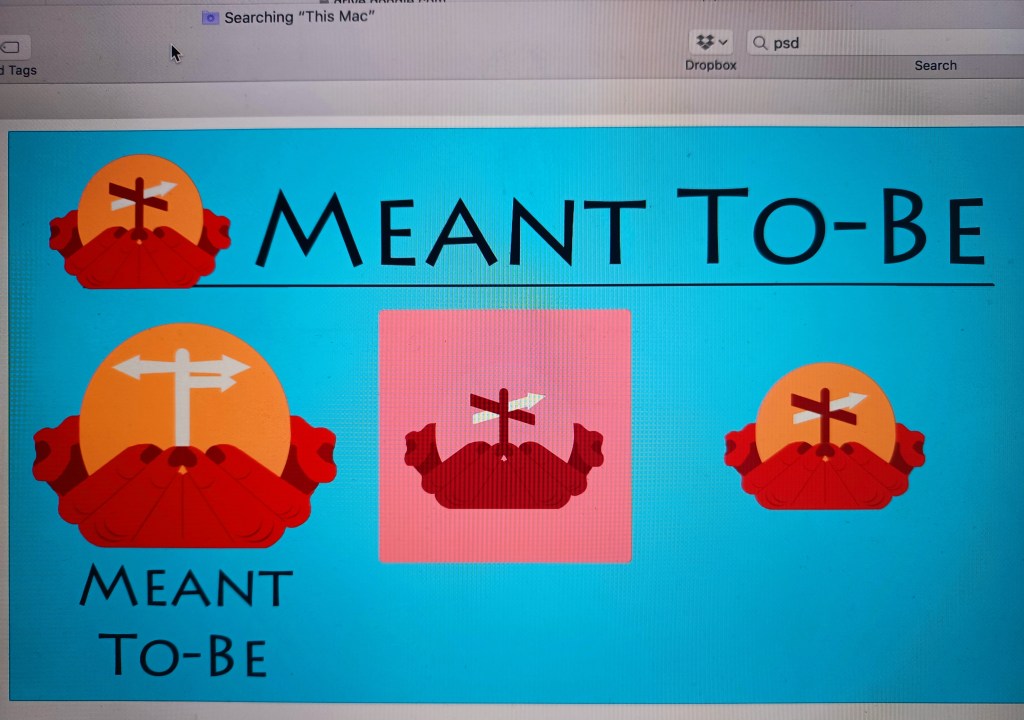
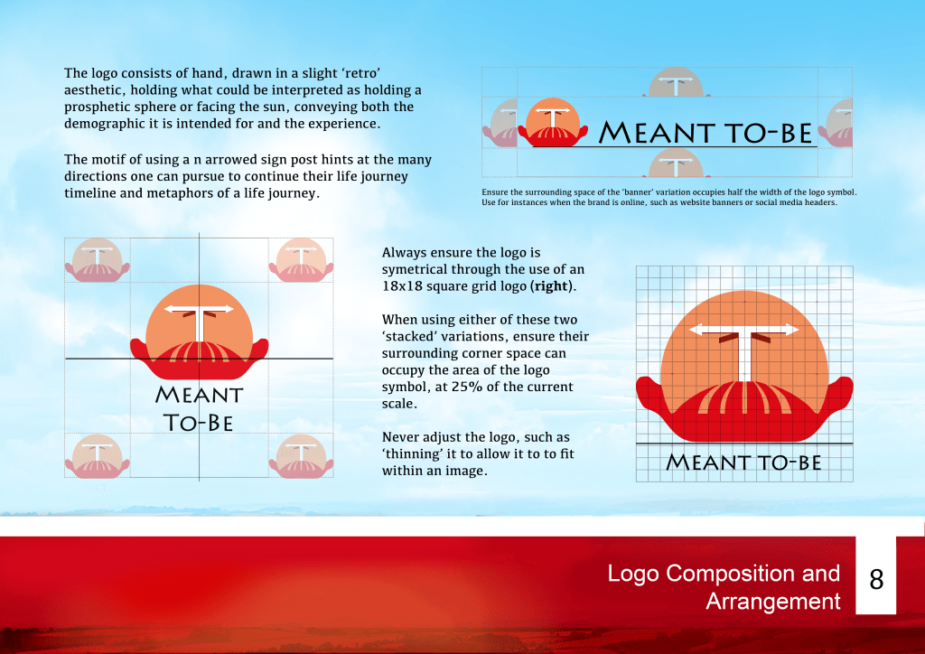
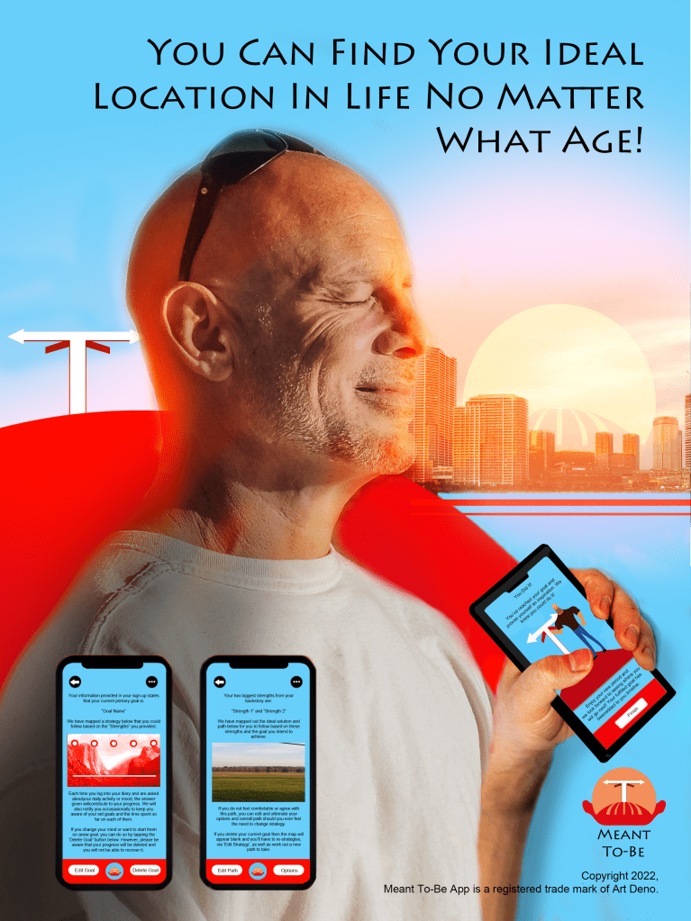
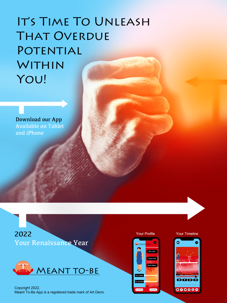
I eliminated the silhouettes of the intended consumers and focused on the experience. Since this product is a guide that users can hold in their hands and discover where their destiny lays, the decision was made to show a pair of hands holding a sphere that represents one’s future. I decided to reduce the brand initials to simply the ’T’ letter, resembling a sign post that symbolises the multiple directions one could take. This juxtaposition also created the illusion of a sun behind a hill, thus maintaining the original motif of the ‘dawning’ of a new chapter.
Available at: https://www.digitalartsonline.co.uk/features/graphic-design/why-logos-are-going-retro-update/ (Accessed 8th August 2022)
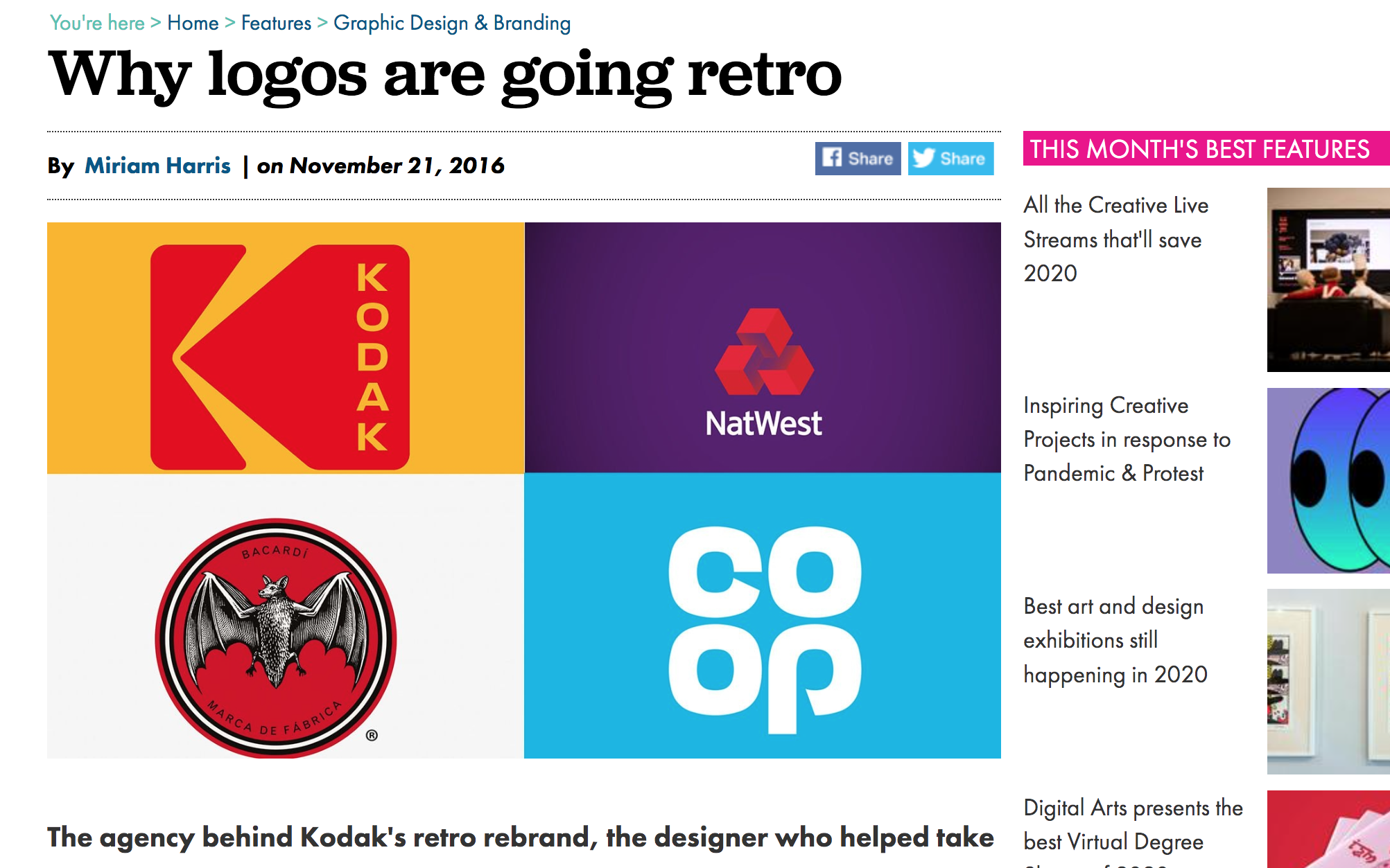
To convey a recognition for middle-aged consumers, I found in research that logos of a retro aesthetic, such as that of Kodak (Figure 25), are gradually enjoying a comeback in a bid to remind the consumers of what their respective brands represent. I realised that the notion of presenting the logo with ‘retro’ assets would not only make the brand unique, but resonate with the middle-aged demographic through the feeling of nostalgia. The bold choice of orange and red with the fingers of the ‘hand’ element presented in a repetitive line detail, certainly conveys a homage to retro designs of the past.
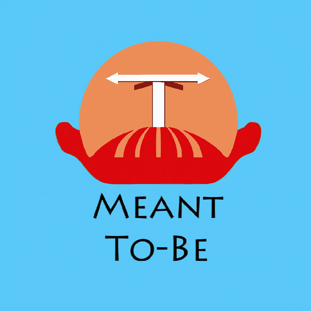
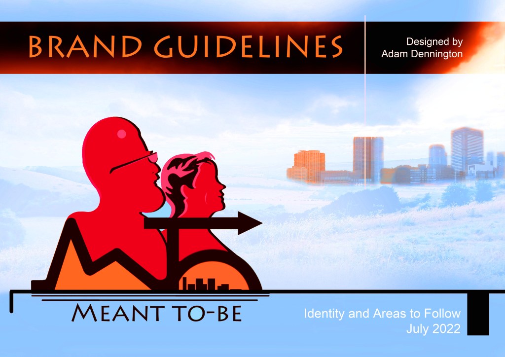
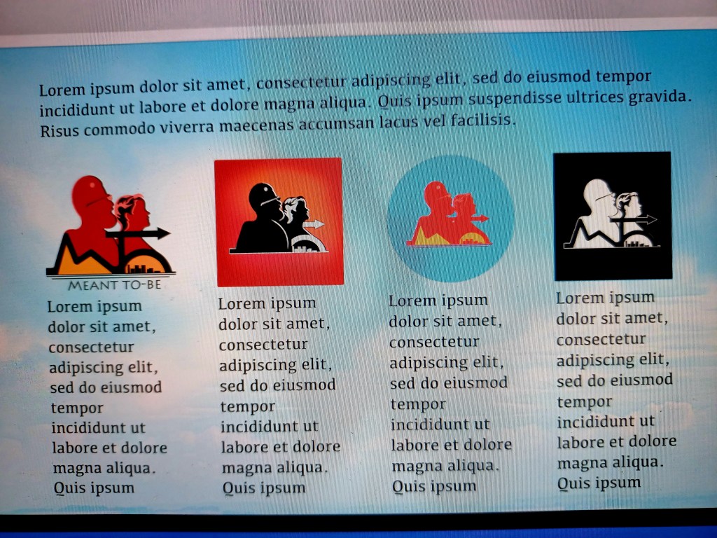
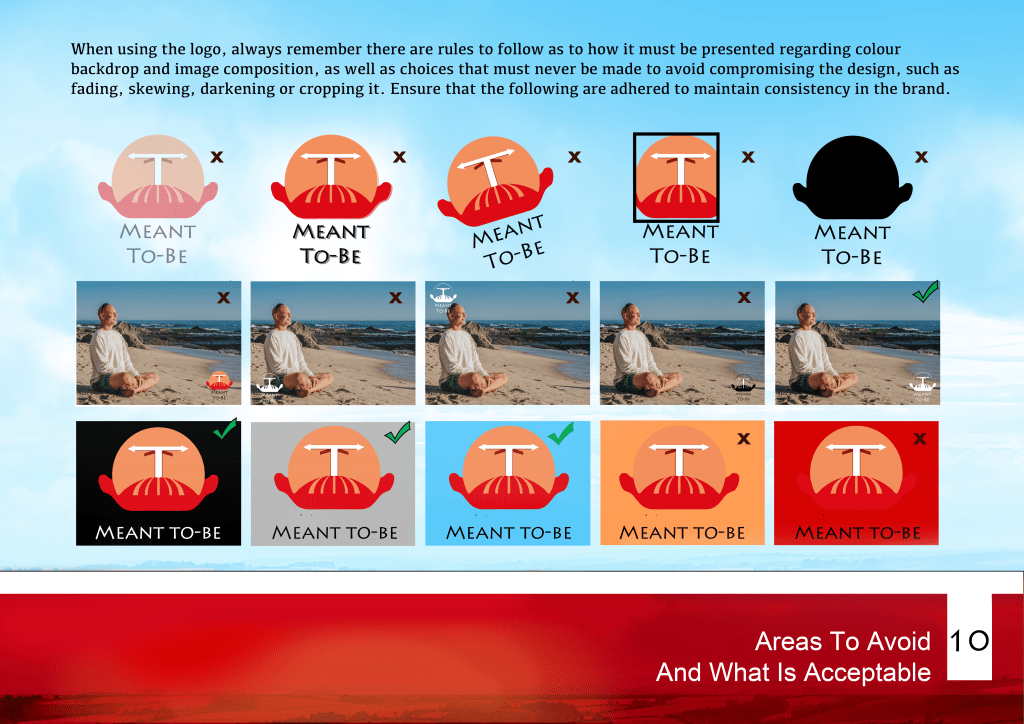
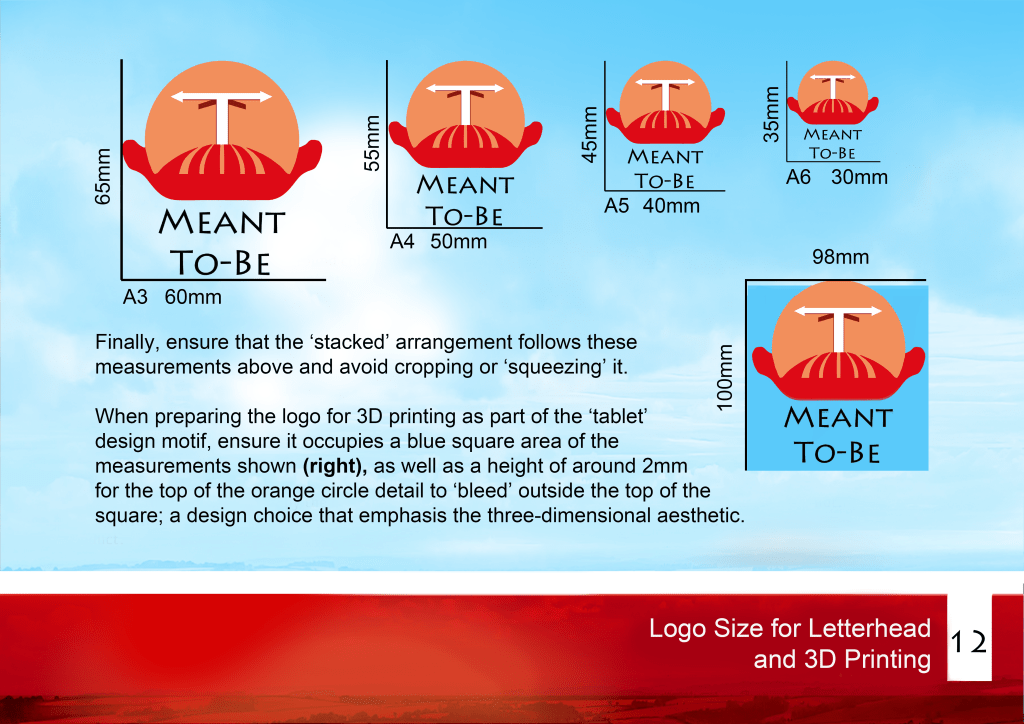
The final logo fulfilled my desired intentions; it conveys an optimistic tone and showcases my intention of subtly conveying the persona; the sphere, red hill and trailing orange paths provide the illusion of a middle-aged man’s face. I utilised this final logo in the creation of posters and the brand guidelines of my product, demonstrating the relevant typography, colour, composition, measurements and rules to follow to maintain the identity and consistency of the brand’s communication (Gallery 20).
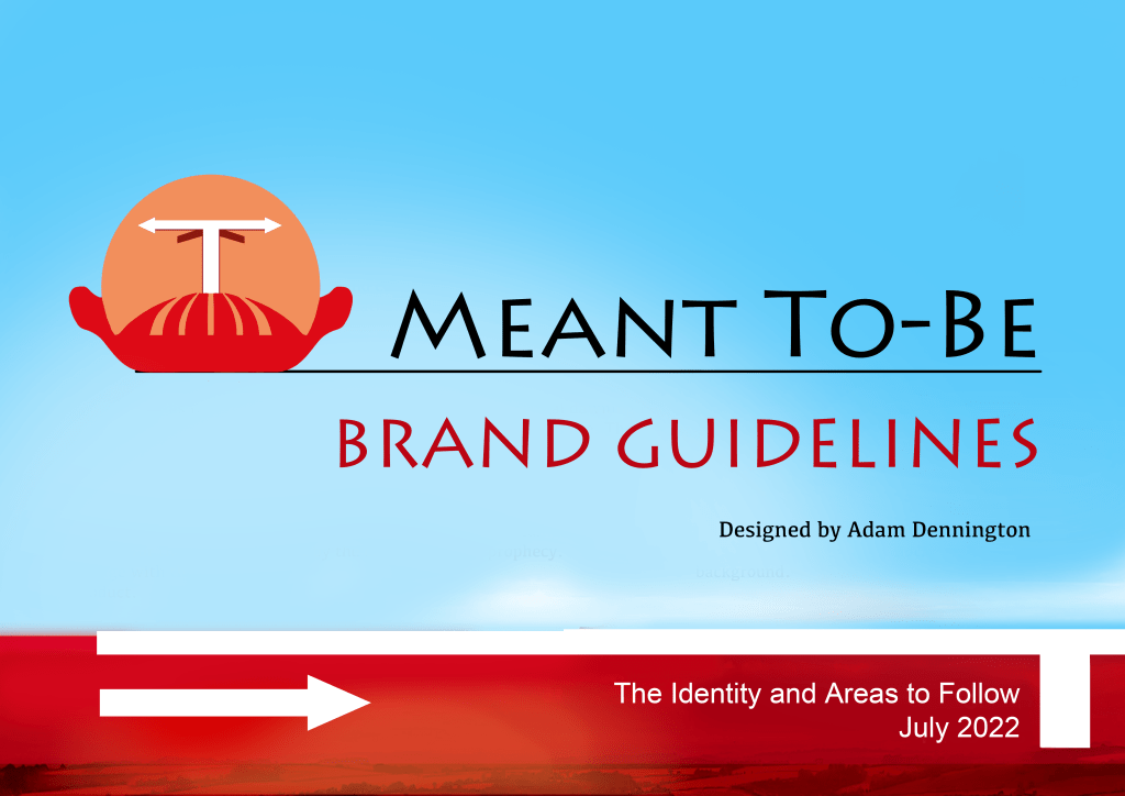
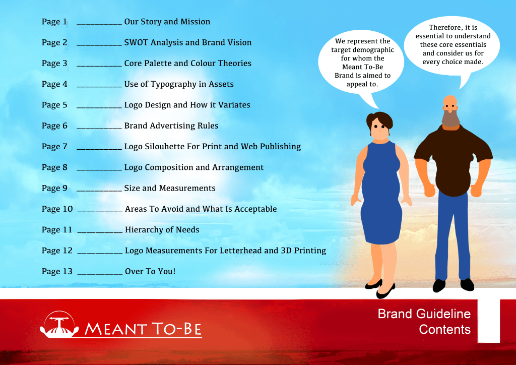
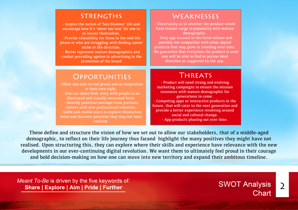

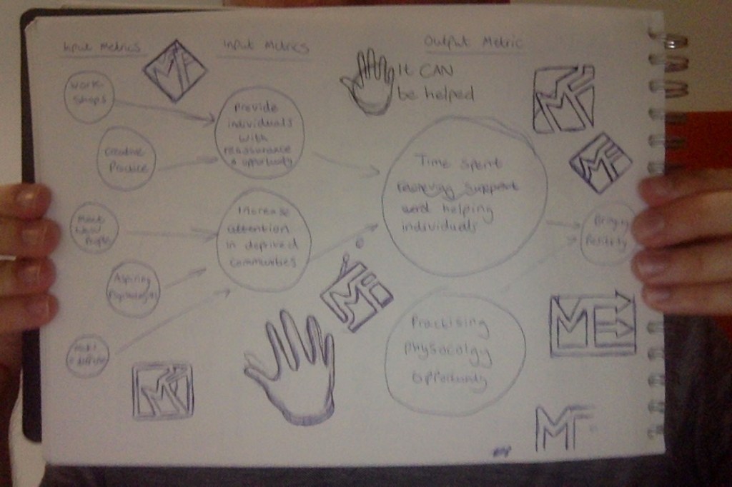
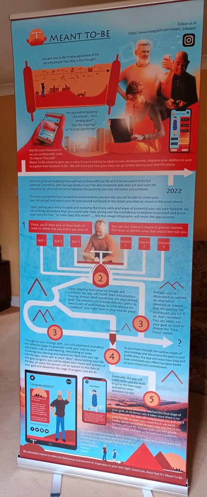
I also provided a SWOT analysis in the guideline to define the niche of Meant To-Be and the areas for one to consider that could strengthen, threaten or compromise its potential and competition. In addition, I produced two infographics; one provided an overview of the metrics instrumental in strategising the brand’s success and demonstrating its relevance. The second piece provided an insight as to how the app experience performs to the user, specifically the feature of strategising their goal and how they will progress through the five-stage journey. Seeing the potential to showcase my product at an investor’s pitch, I decided to invest in having my brand guidelines and the latter infographic printed professionally as a brochure and pull-up banner, thus fulfilling the employer feedback of demonstrating my work in print.
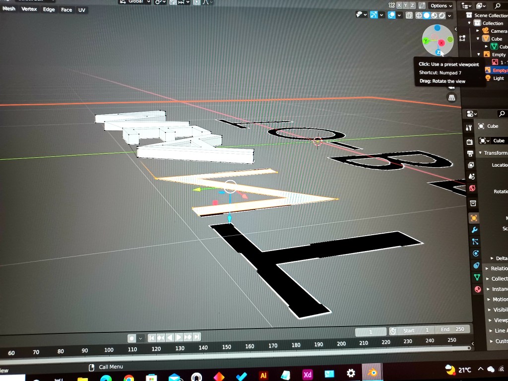
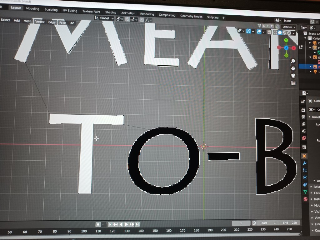
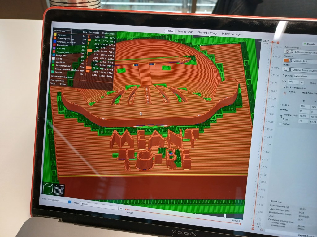
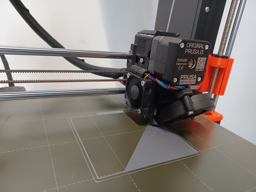
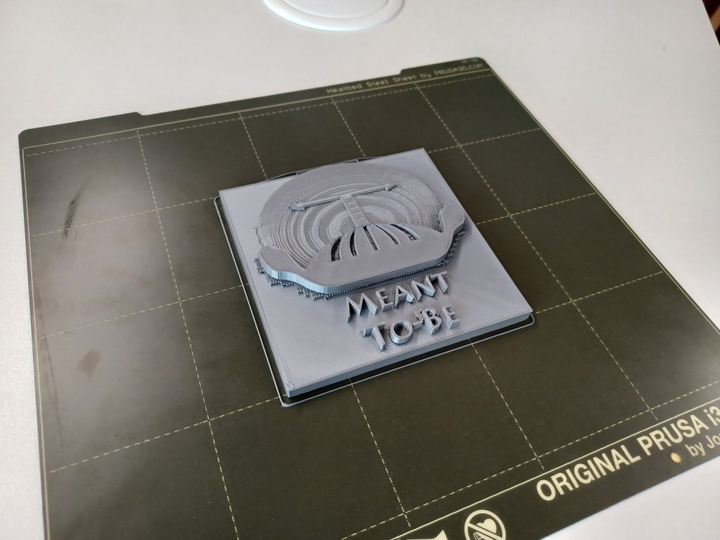
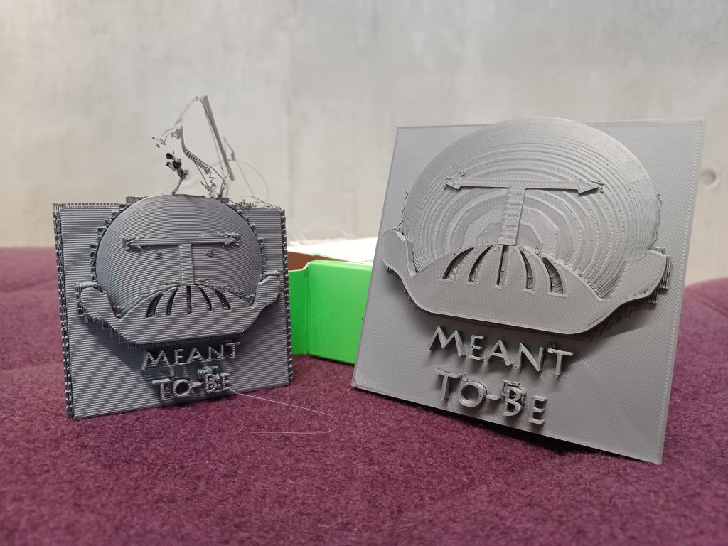
To enhance the campaign I considered creating a three-dimensional interpretation of the logo’s context, adding tangible appeal. However, following a test print, this result appeared inconsistent with the brand-image. My tutor suggested that I should instead create an extruded object of the original design, which made more sense; I figured that not only would this maintain a consistency, but I could print the design onto a ‘slab’ or ‘tablet’, keeping with the brand’s theme of prophecy.

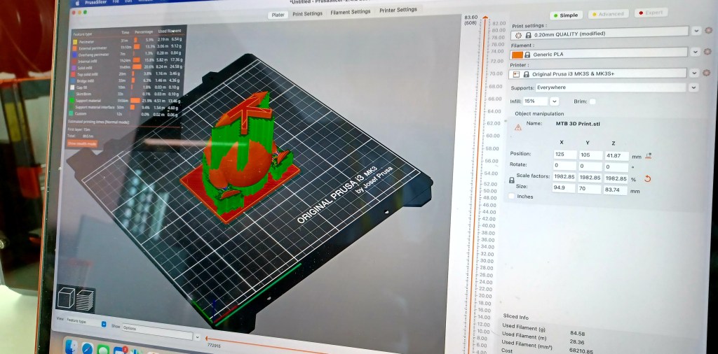
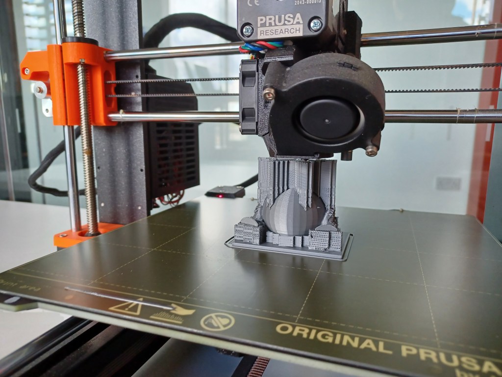
This enabled me to challenge myself further; learning how to ‘draw’ and extrude a 3D object, as well as transferring the file into PrusaSlicer. I managed to produce two versions of the logo, one which would stand at an angle, while another featured a flat under-surface, resembling an ancient slab, both of which proudly evidence my achievements.
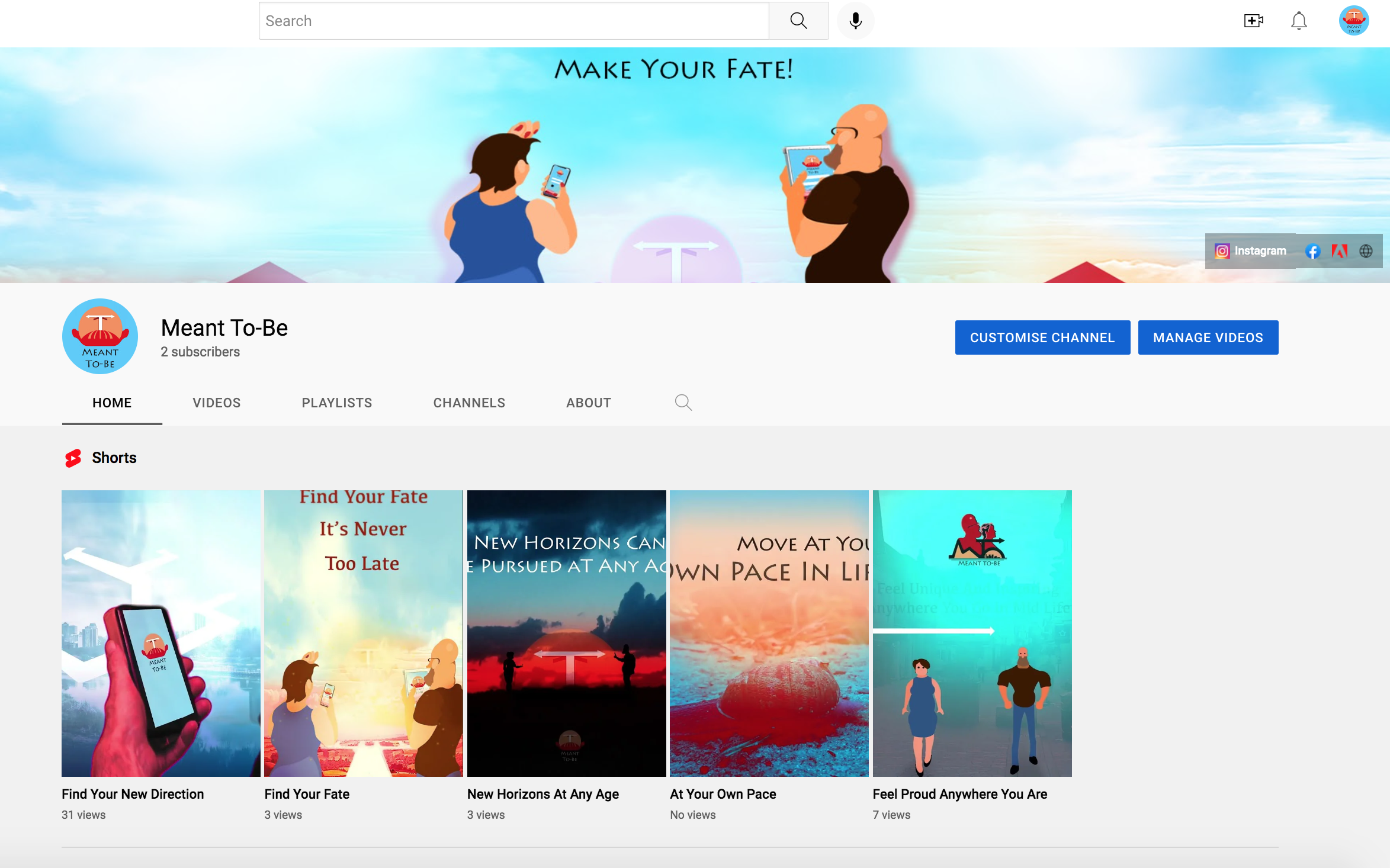
After creating posters to promote the product and finalising the advertisement, I reviewed the statistics to identify the ideal time or day to post the advertisement to the youtube account I had set up for the brand. The third and final week of the Instagram campaign showed how the account was viewed most thoroughly on a weekend afternoon, so I choose to post the full advert and promotional social media piece at this time.
Consumer Feedback and Conclusion
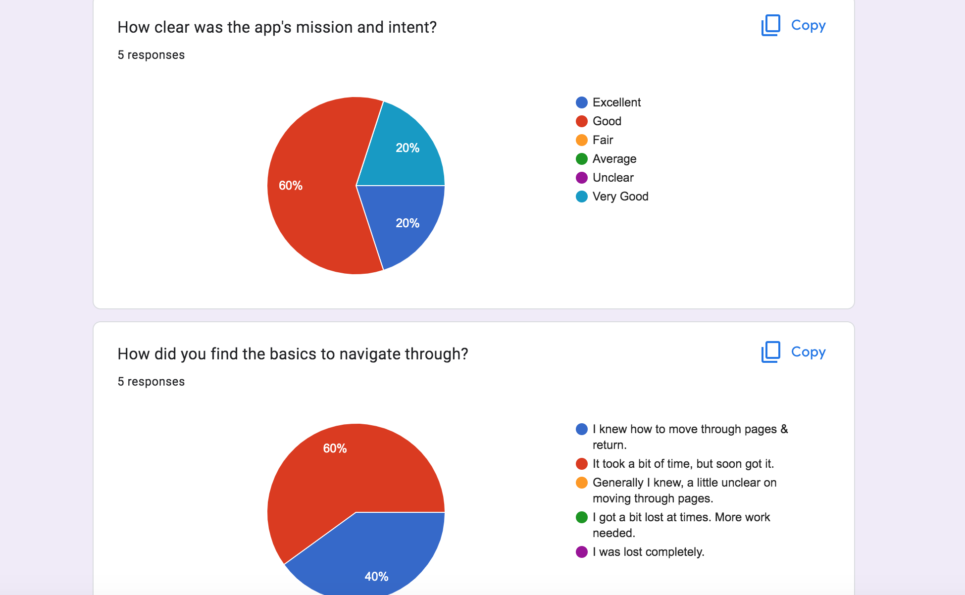
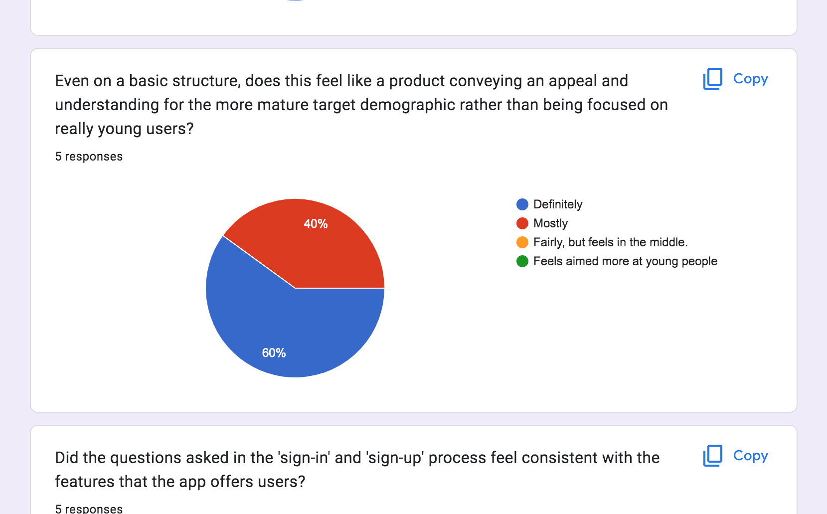
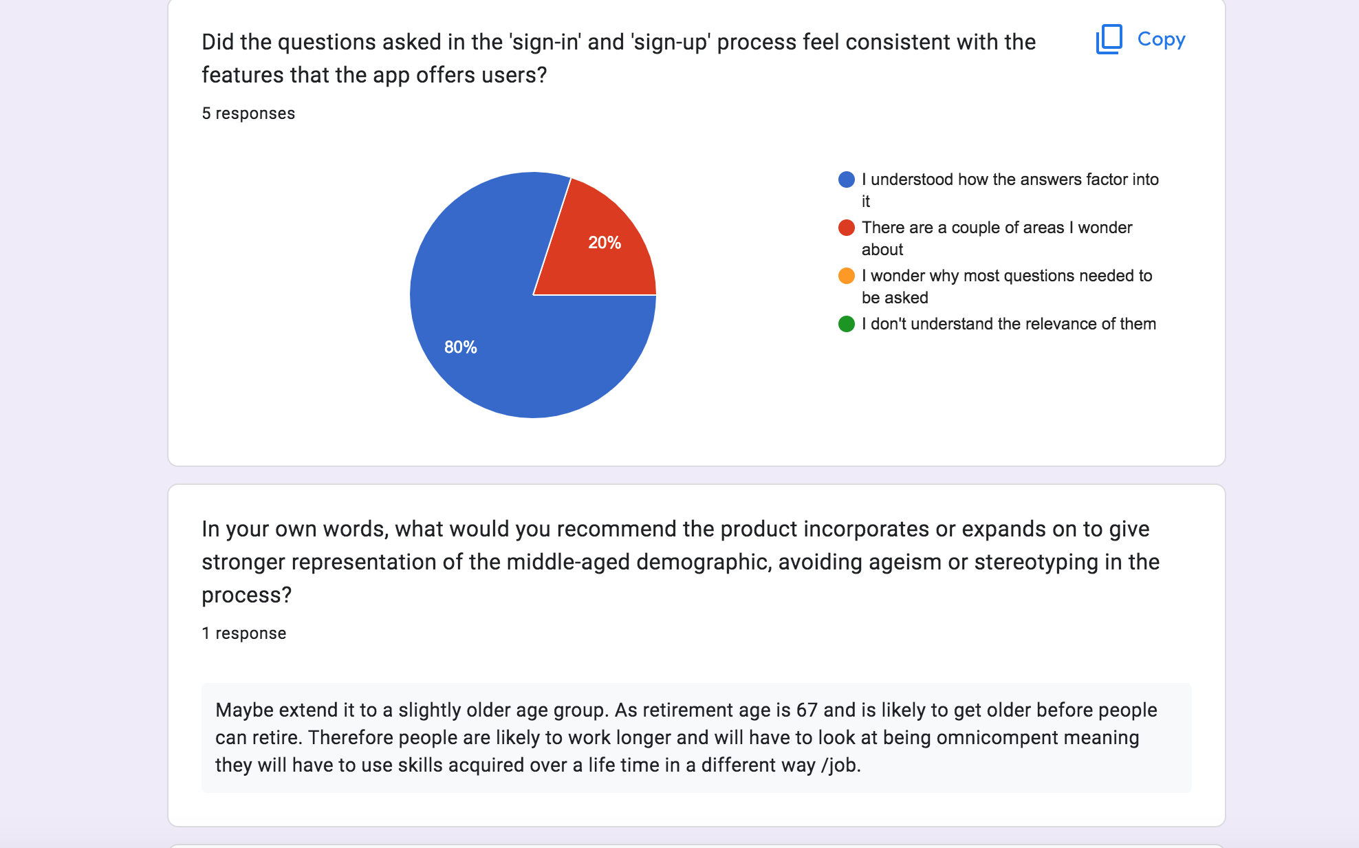
Concluding the qualitative research of my wireframe, the product and mission was received on a positive level. However, it was stated the navigation of pages was a process that required somewhat adjusting to through continuous usage, but respondents felt convinced that the product was recognising them in their own interest as opposed to a younger audience.
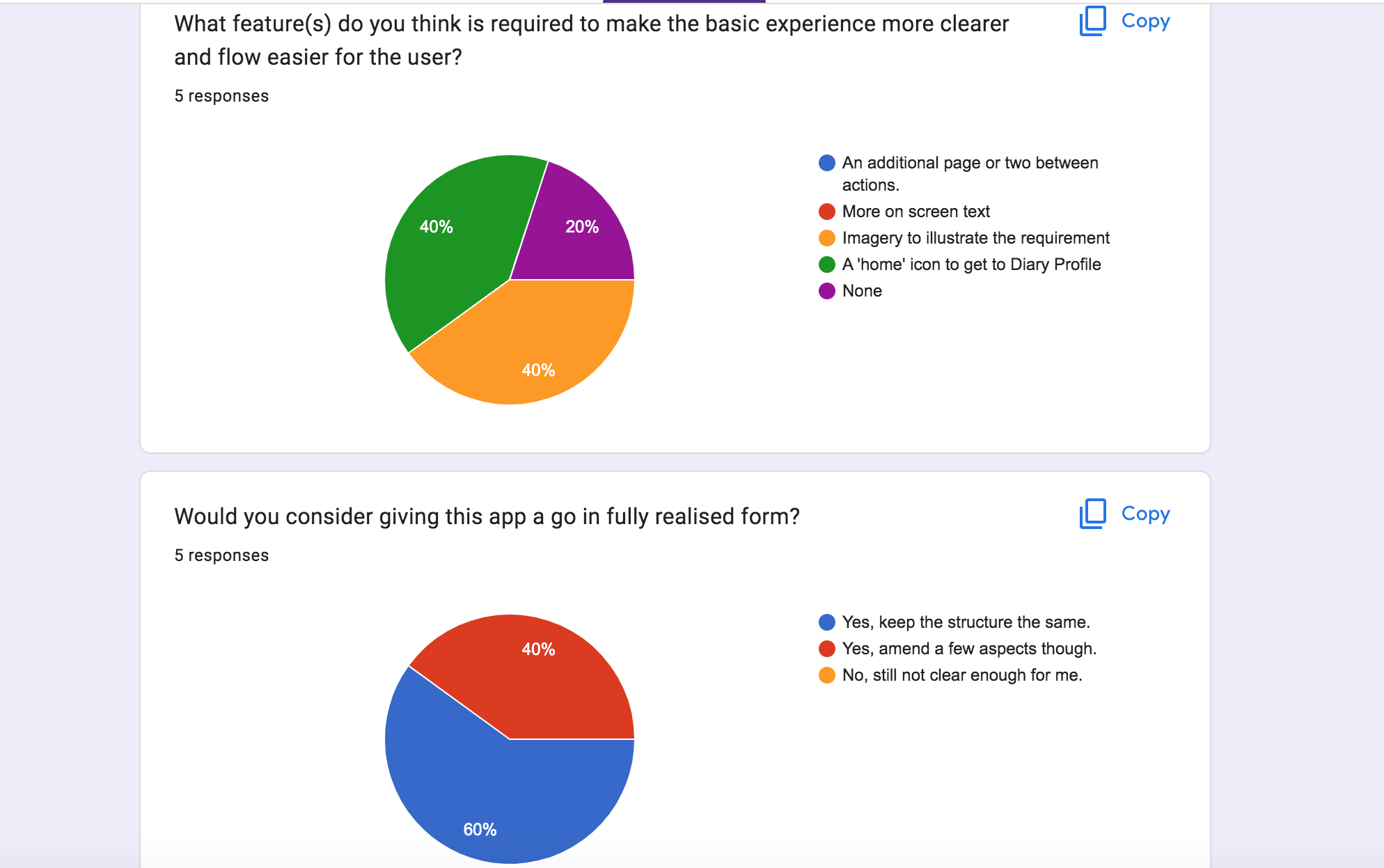
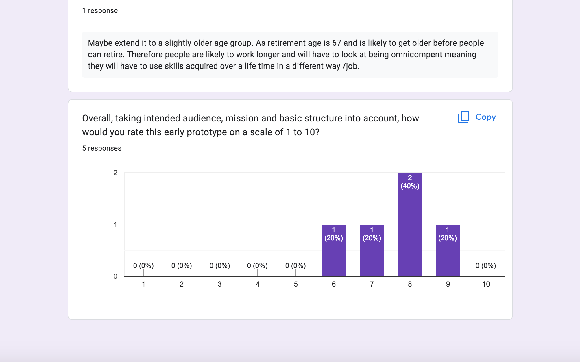
A more polarised response came in the form of how the experience could be clearer; 40% stating a home screen icon would be essential since it was hard to return to the diary profile screen, while another 40% stated imagery would help identity the pages clearer. However, on a whole I was certain that the experience was appealing enough considering how the majority understood how the app functioned and ranked it on a scale 8 out of 10.
One final area of reflective research was speaking to the careers advisor who was among the candidates, to collect their opinion on the wireframe and what to consider for future designs or reassessments. They stated how it appeared simple in layout, but it could be more beneficial to apply a feature that utilised sound to help those mature individuals in the world who have visual impairment, giving a wider voice to the middl-aged stakeholders of the future.
Overall, I have strongly showcased an alliance of the skills gained in the MA course with this project and having followed industry strategies, both in design and marketing, it is a solid example to present to potential employers. I stressed in my proposal that my ideal employer was Media Agency group, a leading organisation in Manchester: attempting to emulate their formula in my project, such as designing a relevant campaign promoted over a three-week period with an effective strategy. This demonstrates how I am industry-aware and suitable to pursue a career with such an organisation.
Had I been given more time and additional resources I would create a televised advert for the product using real-life individuals of an appropriate age and showcasing their emotive responses. In addition, the wireframe would possibly need a final assessment before being designed on an interface level. Although having provided visuals in the social media for how the product would appear, UI design is an area that may be something to consider in future, or collaborate with a professional practitioner who would be able to build the fully-functional app.
The social media would need to be promoted further to attract a more mature following in the brand. However, I would want to see that it acts a community from which the Instagram followers can engage further with and share their thoughts or experience through Facebook, hopefully building a personal endorsement for the release of the product.
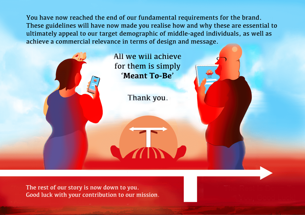
I am proud of my project; it was a personal one as I am approaching thirty and determined to show how one can achieve their first break in a desired field regardless of age. Being passionately driven, the brand has a sustainable message that will indeed benefit the SDG4 by showing how continued learning in middle-age is valued highly to strengthen one’s abilities to contribute to society. The millennial generation, for which I represent, are moving into this phase in the coming decade and will embrace the app product; seeing how essential it is in helping them to grow and discover where they can go further in their life.
Incredibly optimistic for my future and having listened to the feedback given from employers, I have a solid portfolio piece that fulfils the standard and trends currently utilised in industry. Having shown how effective and suitable my work is for print and online assets, I will continue to volunteer my skills and potential with the Hampshire Constabulary and Heritage Trust; demonstrating that I am capable of working with professional team members. My learning path will continue beyond this degree through further practising and development of my digital skillset and this degree has propelled me into the exciting possibilities to come.
Bibliography
Advertising Standards Authority, Non-broadcast Code Codes and Ruling, Official Website, 2016 (Sixth Edition). Available at: https://www.asa.org.uk/codes-and-rulings/advertising-codes/non-broadcast-code.html (Accessed July 7th 2022)
Baron, C, 2022, Reach of leading social networking sites used by those aged 46 to 55 in the United Kingdom (UK) as of 3rd quarter 2020, Statista. Available at: https://www.statista.com/statistics/1059483/social-media-usage-uk-age/ (Accessed 10th August 2022)
Black Mixture, 2021, Simple Kinetic Typography in After Effects – Motion Graphics Basics Tutorial (No Plugins), Youtube. Available at: https://www.youtube.com/watch?v=3f9zD0LGG4Q (Accessed 4th August 2022)
Brooks, A.C, 2022, The Two Choices That Keep a Midlife Crisis at Bay, The Atlantic. Available at: https://www.theatlantic.com/family/archive/2022/05/midlife-crisis-choices-opportunities/638427/ (Accessed 26th May 2022)
Budiu, R, 2021, Why 5 Participants Are Okay in a Qualitative Study, but Not in a Quantitative One, Nielsen Norman Group. Available at: https://www.nngroup.com/articles/5-test-users-qual-quant/?fbclid=IwAR1b-YquQQKGyCAVg65-I6lyUvi0Ps9pd_qEsIGhttEMJ5kqCb3irIzdEjU (Accessed 20th August 2022)
Buxton, W, 2007, Sketching User Experiences: Getting The Design Right and Right Design Morgan Kaufmann, 500 Sansome Street, San Francisco, CA. Page 284
Campaign UK, 2014, Official Website. Available at: https://www.campaignlive.co.uk/article/history-advertising-no-90-labour-isnt-working-poster/1281255 (Accessed 15th August 2022)
Centre-For-Ageing-Better, 2020, A mid-life employment crisis: how COVID-19 will affect the job prospects of older workers, Official Site. Available at: https://ageing-better.org.uk/resources/mid-life-employment-crisis-how-covid-19-will-affect-job-prospects-older (Accessed 28th May 2022)
Coggan, G , 2021, Designer gives your favourite logos a joyful retro makeover, Creative Bloq.
Available at: https://www.creativebloq.com/news/retro-logo-project (Accessed 23rd June 2022)
Davies, M, 2007, Pets At Home Gallery, Guardian Business, Guardian.co.uk, Guardianhttps://www.theguardian.com/business/gallery/2007/nov/07/retail.pets
Government Office For Science, 2016, Future of Ageing Population, GOV.UK, Accessed: https://assets.publishing.service.gov.uk/government/uploads/system/uploads/attachment_data/file/816458/future-of-an-ageing-population.pdf (Accessed 16th April 2022)
Harris, M, 2021, Why logos are going retro, Digital Arts Online.
Available at: https://www.digitalartsonline.co.uk/features/graphic-design/why-logos-are-going-retro-update/ (Accessed 22nd July 2022)
Harrison, S, 2021, The tyranny of life milestones, BBC Worklife. Available at: https://www.bbc.com/worklife/article/20210315-the-tyranny-of-life-milestones (Accessed 25th May 2022)
Hickok, H, 2021, More than ever, people are succeeding at different ages. Why do we hold onto the notion of ‘late bloomers’?, BBCWorklife. Available at: https://www.bbc.com/worklife/article/20211007-why-saying-late-bloomer-is-wrong (Accessed 25th May 2022)
HR Voices, 2018, The Rise of the Portfolio Career, Spiceworks. Available at: https://www.spiceworks.com/hr/recruitment-onboarding/articles/the-rise-of-the-portfolio-career/ (Accessed 19th May 2022)
Jacobs, J, 2016, The Six Second Billboard Rule, Wheelhouse Creative. Available at: http://wheelhousecreativellc.com/the-six-second-billboard-rule/ (Accessed 17th July 2022)
Kalbach, J, 2020, The Jobs To Be Done Playbook
Align Your Markets, Organization, and Strategy Around Customer Need, (Page 6). Available at: https://www.google.co.uk/books/edition/The_Jobs_To_Be_Done_Playbook/1vHRDwAAQBAJ?hl=en&gbpv=1 (Accessed 26th May 2022)
Kurtcu, E, 2019, Initiatives and obstacles to reaching SDG4, Social Innovation and Inclusion of Sustainable Development Goals Available at: http://socisdg.com/en/blog/initiatives-and-obstacles-to-reaching-sdg4/ (Accessed 26th May 2022).
London School of Economics and Political Science, 2017, Digital Communications
Social Media Platforms and Demographics. Available at: https://info.lse.ac.uk/staff/divisions/communications-division/digital-communications-team/assets/documents/guides/A-Guide-To-Social-Media-Platforms-and-Demographics.pdf (Accessed 29th August 2022)
Mayne, P, 2017, Available: https://medium.com/day-one/day-one-goes-premium-424492fd0a5b (Accessed 2nd June 2022)
McLachlan, S, 2022, Instagram Demographics in 2022: Most Important User Stats for Marketers, Hootsuite.blog. Available at: https://blog.hootsuite.com/instagram-demographics/ (Accessed 13th August 2022)
Quilliam, E, 2022, WHY ARE MOBILE APPS SO POPULAR AND BENEFICIAL FOR BRANDS, IT Enterprise. Available at: https://itenterprise.co.uk/mobile-application-benefits/ (Accessed 30th May 2022).
Rodin, R, 2015, The Psychology of Color: A Designer’s Guide to Color Association & Meaning, Zevendesign. Available at: https://zevendesign.com/color-association/ (Accessed 10th July 2022)
Rosalina, A, Wireframing Case Study: Halo Self Care Diary Journal, a dissection and imitation of the app, Medium.com.
Available at: https://medium.com/@arantjarosalina/wireframing-halo-self-care-diary-journal-9a603bc933b6 (Accessed 4th July 2022).
Wall’s Ice Cream Brochure, 2022, Consort Frozen Foods. Available at: https://consortfrozenfoods.co.uk/download/walls-ice-cream-brochure-2022/ (Accessed 12h July 2022).
Wong, H, 2021, Fox’s Glacier Mints update Peppy the polar bear in “retro-progressive” rebrand, DesignWeek. Available at: https://www.designweek.co.uk/issues/17-23-may-2021/foxs-glacier-mints-rebrand/ (Accessed 21st July 2022).
UX.org, 2022, The Top 7 UX Design Trends for 2022, Official Site. Available at: https://uxplanet.org/the-top-7-ux-design-trends-for-2022-1c1ad67b2bdb
(Accessed 26th May 2022)
