Additional Research and Content: https://adenningtonbrandingstrategy.tumblr.com/
Narrative Word Count: 5415
The reflection of my second semester at the University of Winchester. My project focused on developing a brand campaign for Obsessive-Compulsive Disorder, specifically a vision of more awareness and action to support one with the condition. The important element was to give the campaign a striking name and one that would explain to the target audience what they needed to know from the brand, hence why I chose:
“It Can Be Helped”
I am aware of the seriousness of mental health; it is becoming more talked about and a point of focus regarding the aftermath of Covid19. The outbreak certainly brought uneasiness for many people in regards to what they touch, the cleanliness of their hands and even down to the most trivial of worries, causing a great deal of anxiety and self-consciousness. Those who suffer from Obsessive-Compulsive Disorder should be given more attention, since the pandemic surely has made things a struggle regarding mental health. We can do more to help soften that struggle and give these people a path of reassurance in themselves and for others in the future.
While we all have fussy moments, some have conditions that exceed far beyond this matter. Two particular people I knew had symptoms and received no support from their parents, who instead wrongly colluded with it, such as uttering phrases or doing acts that their loved-one demanded at a young age. This causes complications for the individual and those around them in life. People like this believe, “It can’t be helped!”, so I wanted to create a brand that champions the cause to bring more attention to OCD and highlight serious manifestation that it can become for some. I aim to show the condition is not simply a common myth of fussy people and that it can ‘be helped’.
Brainstorming and Early Research
The first challenge was to identify the most common occurrence of OCD in age, as a means to understand who my target demographic were and how the brand would be tailored to them.
I was determined from the start to show that this was a brand that people could trust and feel as if it is an ‘extension’ of their social circle, eliminating all sense of patronisation, which I knew would be an early worry for consumers, who are ultimately the stake-holders to determine its success.
In the early research stages, I sought to explore where and how people felt in state of mind, regarding the outcome and continually uncertain future of our post-covid world. This was going to prove a considerable challenge, one of a sensitive topic, since I could not simply approach people I had never met before and enquire about their personal feelings. This is an area which is hard to talk about for anyone, let alone to a stranger, so I looked to secondary sources for the time being.
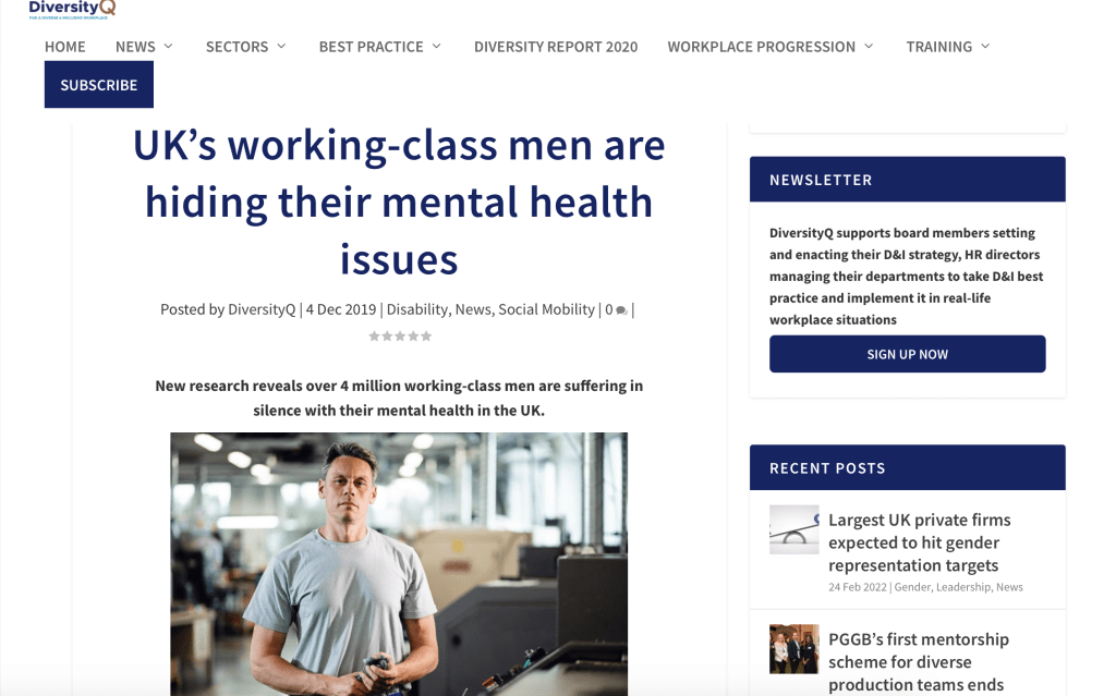
A source published by DiversityQ, stated how a finding in 2019 revealed that a majority of working-class men have more levels of mental health than one might expect. I was most intrigued by this perspective and it occurred to me how there may be cases of individual people in working-class communities, who may feel they can’t reach out or find the courage to share their feelings or welfare. While this source did not specify that OCD was the primary occurrence, it nevertheless widened thoughts as to how I could target and strategise my campaign.
Exploring charity logos for ideas of how to use shape, colour and layout for my brand design, I was intrigued by a majority of the logos having a style or shape that made them easily distinguishable, such as Mind’s squiggle shape and the Royal Legion’s poppy (Figure 4). These particular logos are recognisable even without accompanying text, which inspired me to develop a logo that utilised this angle. This approach would identify the brand through the simple use of a shape and its position or style, enabling one to recognise it immediately. The logos appear clear on a white background which ensures that they will be presented well on paper for printing purposes, with a balance of two colours for the most part, I took note of this when moving forward with my logo.
https://nfpsynergy.net/blog/charity-logos-and-rebranding
One must be aware that each colour has different meanings and must be used carefully when considering the voice or cause of what a brand represents (Figure 5). I considered the possibility of blue, since it represents a sense of depth, a word I had brainstormed for the brand. However, blue lacked vitality and optimism, which are key outcomes for what I wanted to invoke for consumers, thus knowing they can trust the service.
I decided on orange; it symbolises uniqueness, creativity and motivation which I want all consumers to feel when using the service, since they’ve nothing to feel ashamed about and we value their mindset. I would want to see them use their creativity in allowing us to work with them and find a balance as to how we can help them to evolve in their journey of managing OCD. In addition, there would be the opportunity for them to use exclusive equipment, either virtual or augmented reality-driven, that would allow their creativity to flourish and even possibly become more instrumental with future prospects.

https://www.huffpost.com/entry/is-color-theory-an-effective-marketing-tool_b_5a0dae19e4b03fe7403f8399 (Accessed 8th February 2021)
Yellow has a vibrant tone and would perfectly convey a sense of joy in what we provide for individuals. It also felt appropriate since they can feel part of the group and share their thoughts with others of a similar condition, no longer feeling socially isolated. In addition, it would represent a sense of hope in what they’re doing with their life.
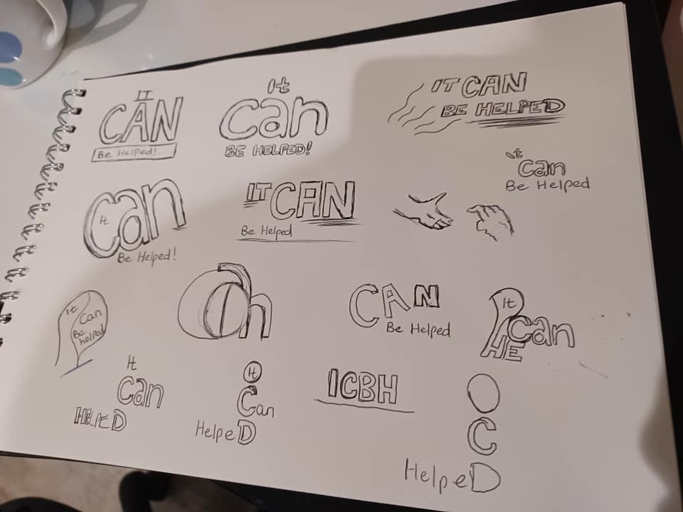
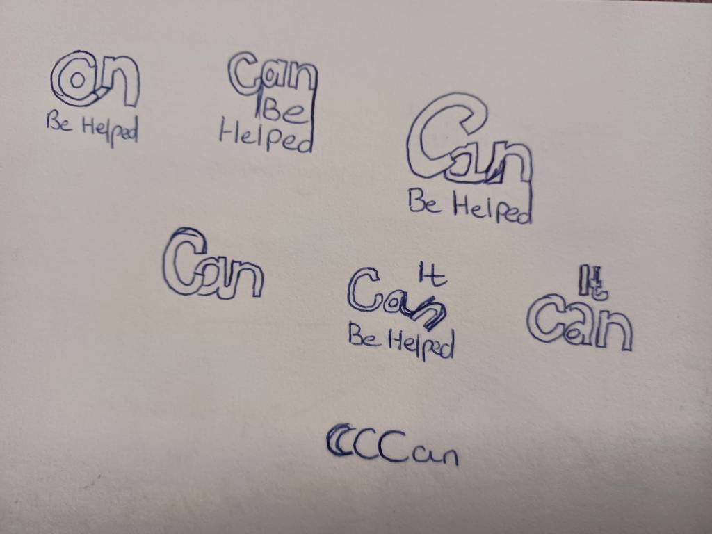
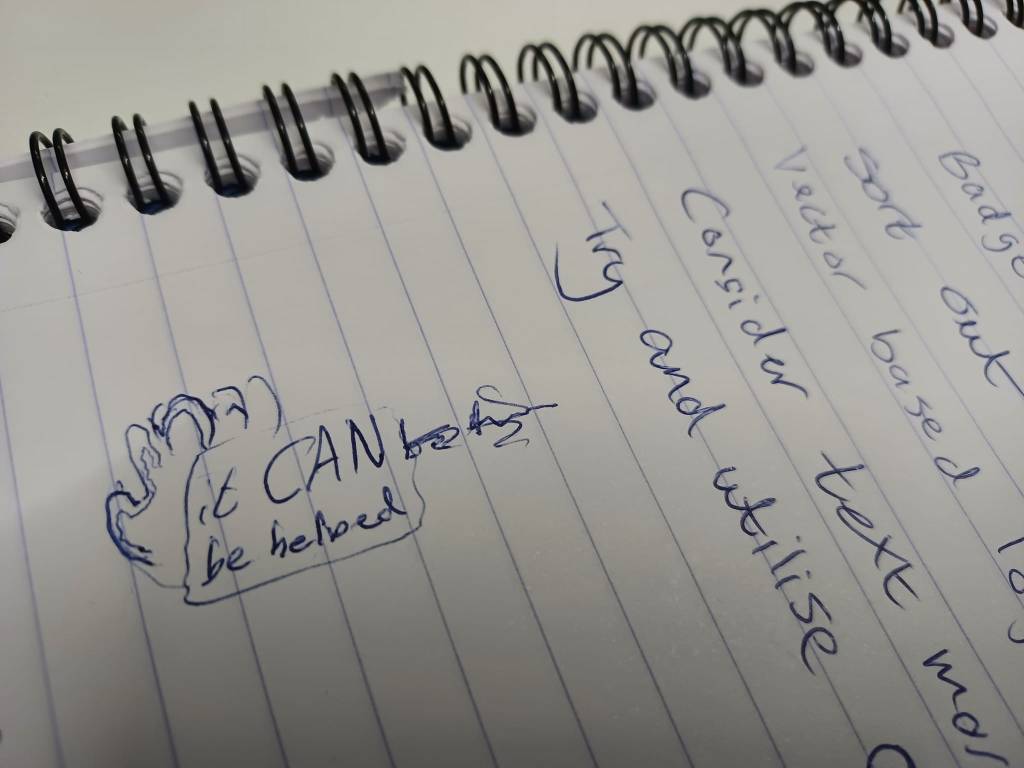
I sketched out some rough ideas of how the logo could appear; I wanted to emphasise the word ‘CAN’ as the focal point since that was the verb that summarised the goal. In addition, adding some subtly of the logo being ‘off’ would symbolise how nobody is perfect in life. Many different suggestions were sketched out, but it would take colour and further experimentation to move further on the logo.
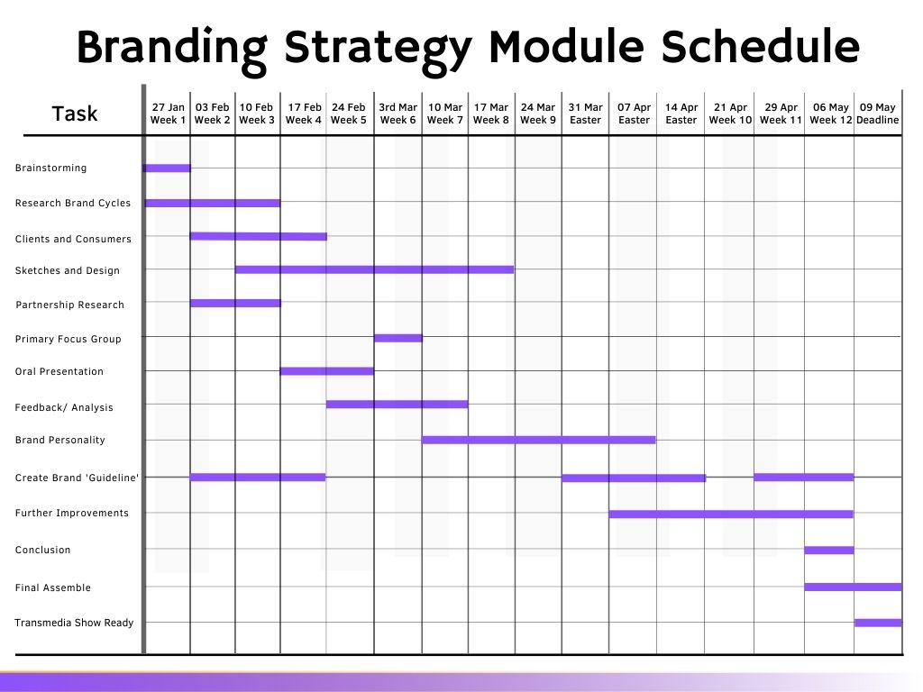
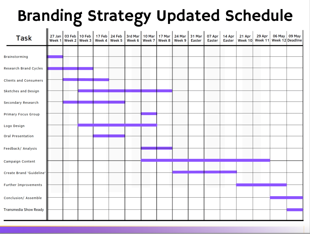
Creating a Gantt chart for my schedule in the semester, I was determined to prioritise my planning, research and design processing carefully to craft a consistent flow. I had covered roughly three weeks of the module; making a start on the colour research and meeting my schedule concerning the brainstorming. However, I still felt I needed a little more research regarding the audience demographic and how it would work to my advantage with the strategy I would choose.
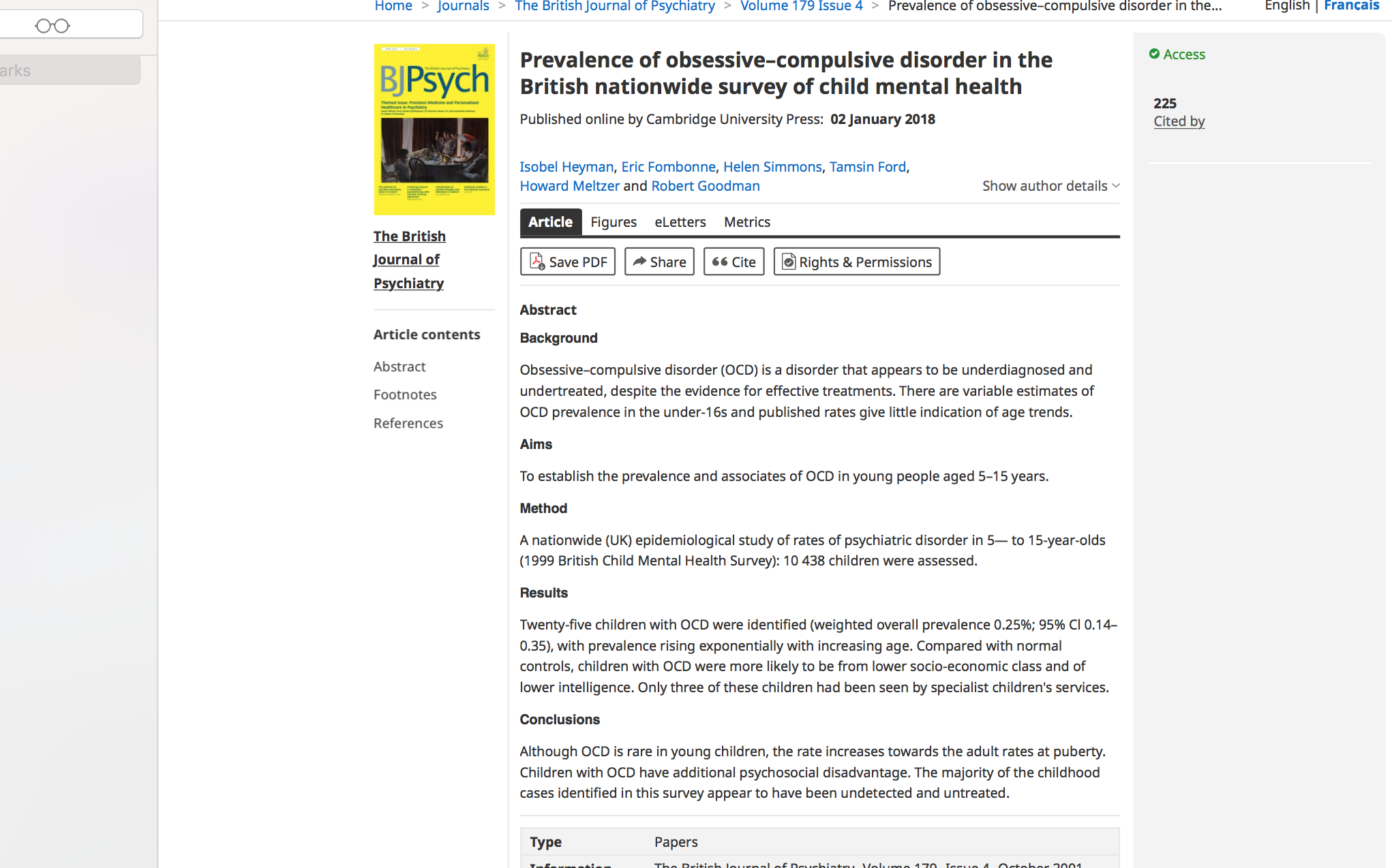
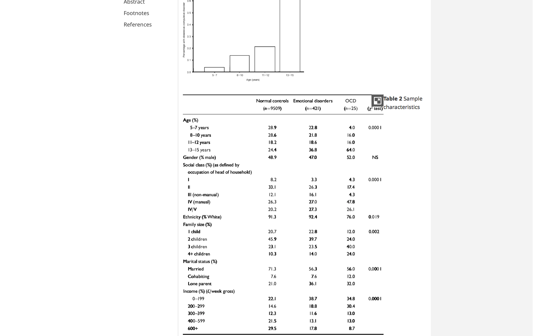
An article on Cambridge Core (Figure 8) identified OCD as under-treated and showed that the majority of individuals who develop serious traits, came from the age range of 12 – 15. It stated how this age period is where most cases cases begin to excel, as well as the fact that these minors had a higher likelihood of coming from lower socio-economic communities, thus deprived of ideal treatment and support.
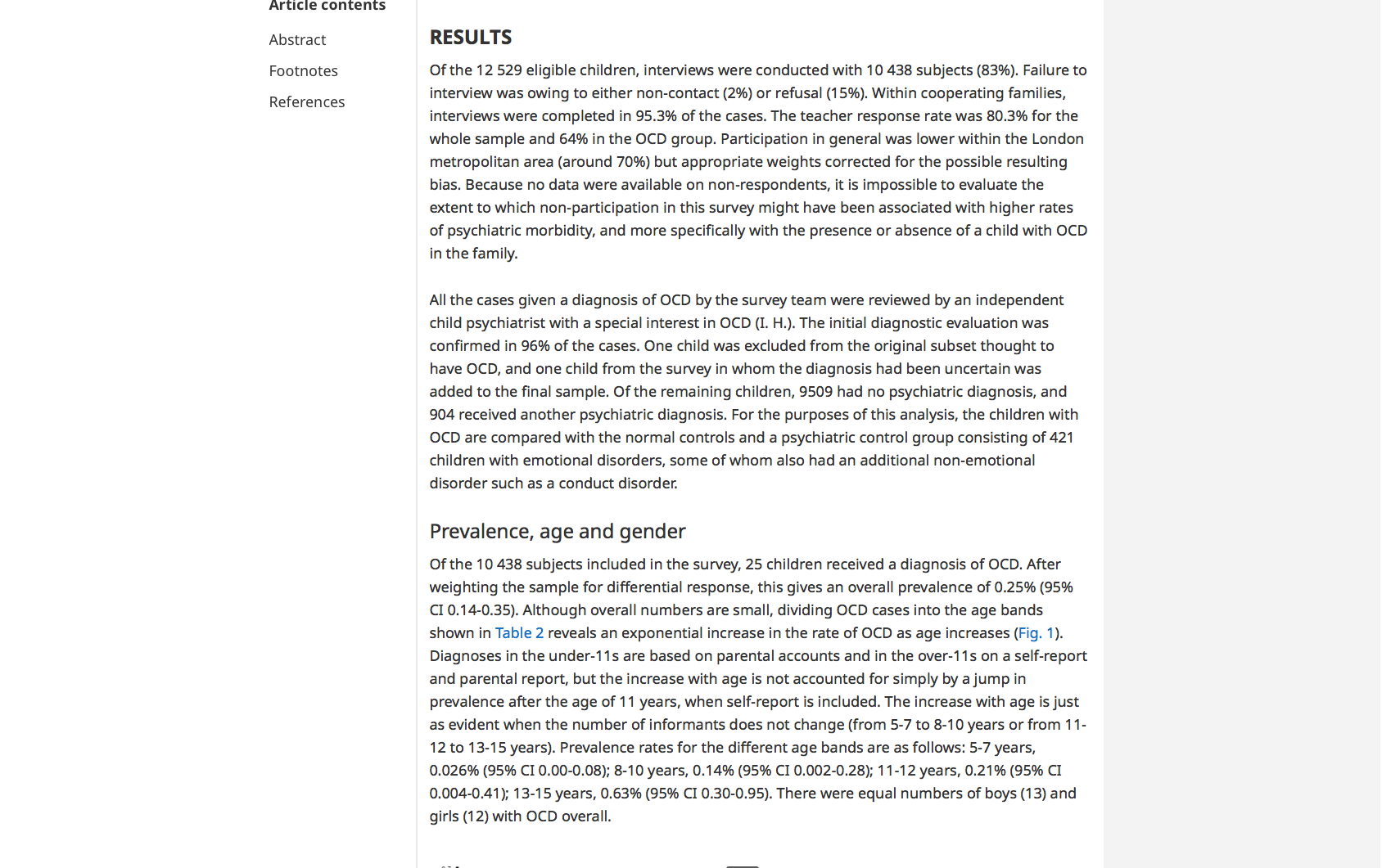
I sought articles that specified areas of the United Kingdom that were on this ‘low socio-economic spectrum’, to have an idea where these young people reside and how the campaign could strategise its service. Through analytics provided by database team, Exasol, The Independent tabloid provided a map that gave a striking fact (Figure 9); it showed areas on the highest spectrum (highlighted in red) of people prescribed medication to aid mental health. Interestingly, my home county of Suffolk, where the individuals from personal experience reside, is among the highest areas. More needs to be done in these communities to give these people the attention, treatment and support to overcome their condition.
I reached the decision that my primary target audience would be young people ranging from 12 – 16, since this way we could treat the condition earlier before it would worsen in their life. However, we would also promote the brand as being welcoming for adults with extreme OCD, as everyone in a community would matter.
Design and Competitive Analysis
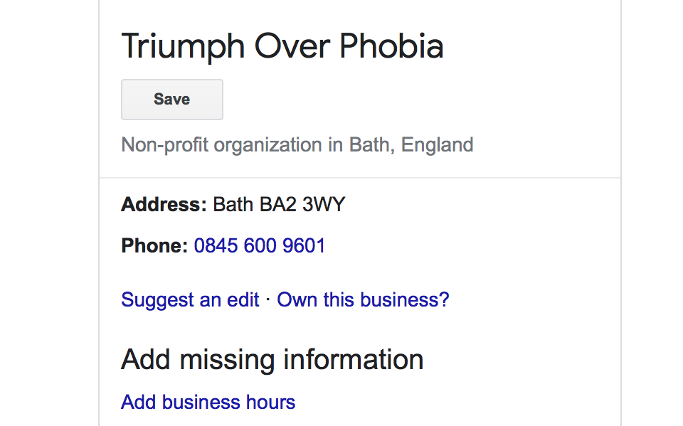
Regarding competitors, the prevalent groups established in the field of OCD are the organisations of OCD UK, OCD Action and TOP UK (Triumph Over Phobia), who have popularity in raising awareness of the condition. Despite viewing their websites and seeing the noble cause they do, one thing I noted was how I could not find any examples of when they have visited these particular areas on the map. They may not be aware of people with OCD living in these low-socio economic communities and they operate in the cities of London and Bath, both of which have low levels of people on prescribed medication for mental health, as stated by the Independent article.
They do hold group sessions on the internet and indeed encourage people of the condition to speak out and share stories to feel they matter. However, as someone who comes from a community that is shown to be high on mental health numbers, I can say state just how different London’s social dynamic is compared to these deprived areas.
Hypothetically, I want the brand to go to these communities, rather than operating online and having people ‘come to them’. While communities have their counselling and welfare sources, they tend to be utilised when there is already a serious stage occurring, as opposed to an option to help it before worsening. My campaign strategy would be to recruit a team of trained and skilled psychologists, researchers and coordinators who would show compassion, determination and integrity of companies like the competitors, but to actually travel the nation annually and visit these areas. They would work with local communities there and get to know how the individuals live, thus becoming more a friend rather than an intimidation in life.
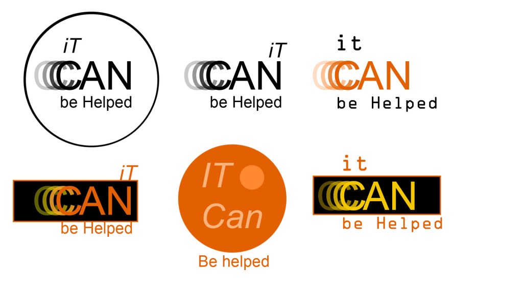
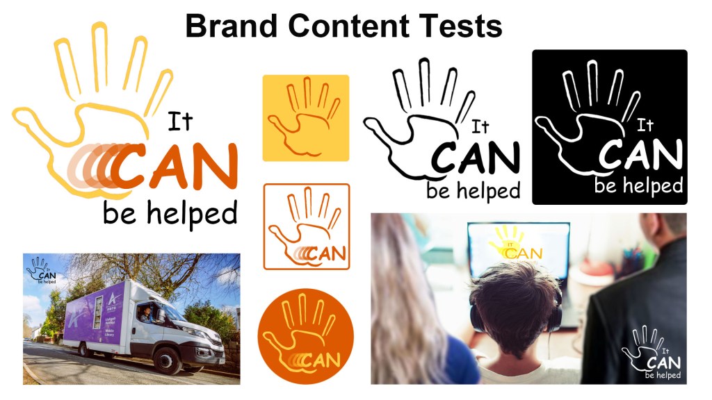
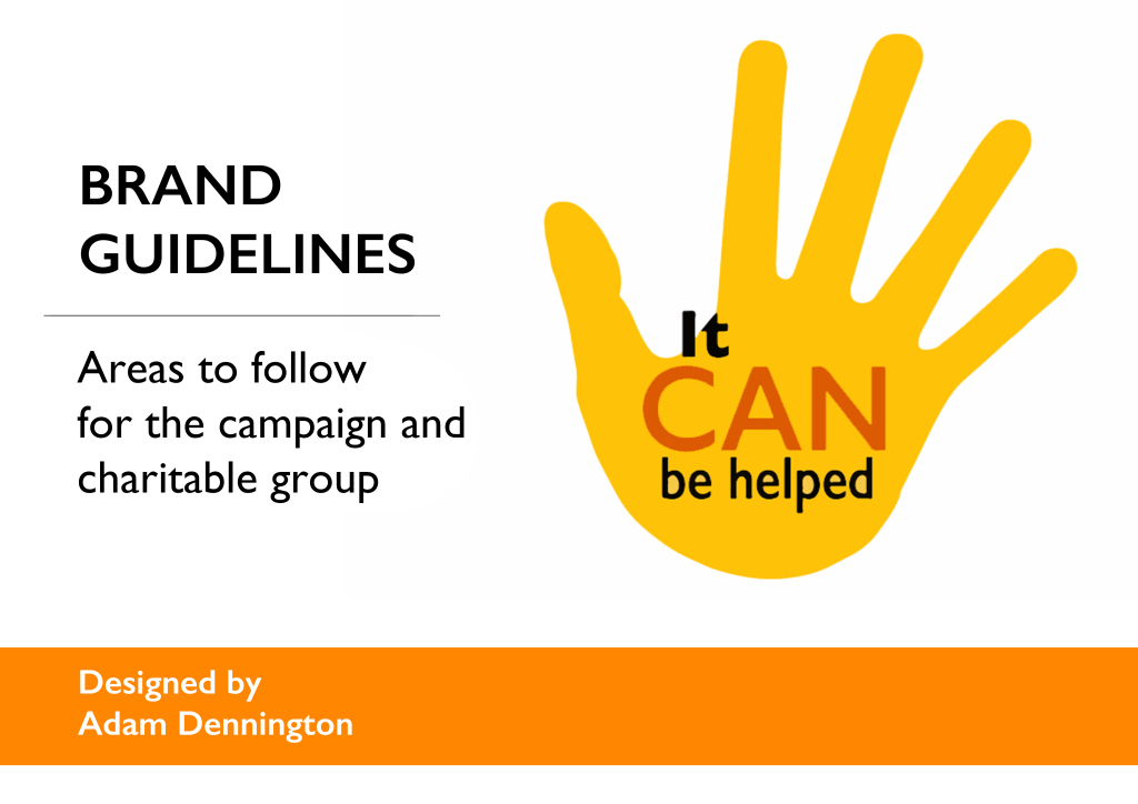
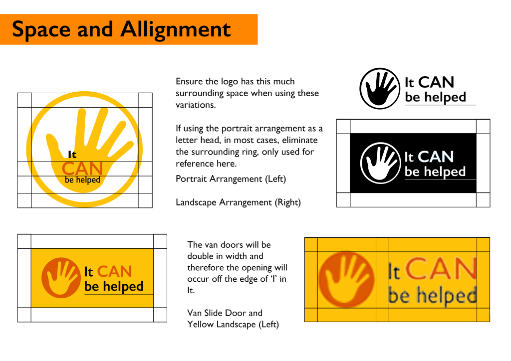
I used Adobe Illustrator and Photoshop to simplify the logo, emphasising the word ‘CAN’ and writinh it with Arial text in solid capitals, as well as adding the effect of the letter C gradually fading to symbolise a sense of nerve, of which individuals would have when coming forward and finding courage to seek support. The use of the word “It” had been experimented with continuously and even the idea of having the lower case letter precede a capital t, as a way of symbolising how the brand was about accepting imperfection.
I eventually discarded these ideas; despite the intent, the logo had to maintain a streamlined approach, such as keeping the word “It” on the left of the image to avoid averting the gaze in the wrong place. The decision was made to have “CAN” be presented in the intended orange and to keep the text black to distinguish the verb more thoroughly. I had considered making the text a yellow colour, but found that it would be difficult for people to read against a white background.
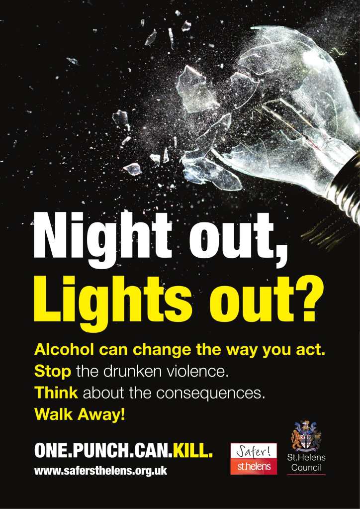
This powerful campaign called One Punch Can Kill, which despite its extreme comparison, had been one of my influences for It Can Be Helped. The title perfectly sums up the message awareness it is trying to promote and perfectly uses colour, text and imagery to metaphorically state its mission. The motif of using a lightbulb to symbolise the deep message of taking care on a night out, whilst stating how one can lose their life if in the wrong place, inspired me to consider using an object in the same vein for my campaign as metaphorical fashion.
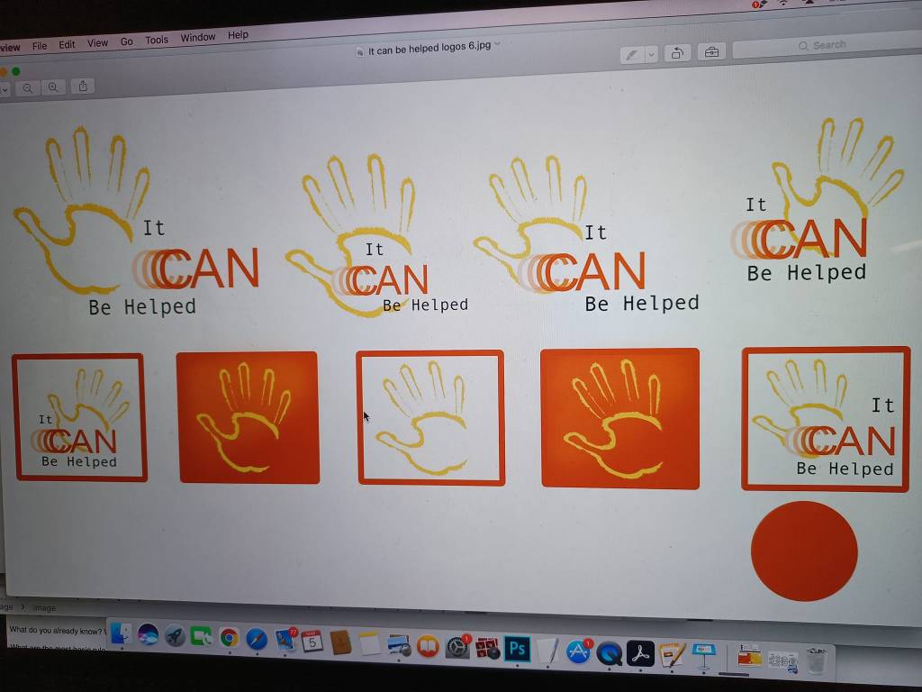
I experimented with a hand shape; the reason being was how the human sense of touch can be quite integral to OCD and a hand can convey many suggestions and expression, thus bringing an element of humanity to the brand. I created different interpretations of how the hand could appear in position and colour, whilst in conjunction with established text. However, the shape was becoming distracting from the word “CAN”, so I compromised the text and let the hand take the main focal point.
I moved forward with the current design and focused on layout for the time being and experimented with how the logo would variate in presentation, such as when it’s used on a digital icon. I found that the hand motif worked much better than the use of the word “CAN” and I wondered whether the hand should become the sole detail when the logo is used in iconography.
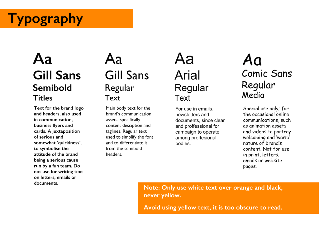
I decided that I would keep the text as an Arial or Sans-related font; not only would it read easier for consumers, but it was important that despite the light-hearted nature of the brand, it should maintain an under-lining sense of a serious and important message.
I also experimented with how the brand may alternate depending on colour, imagery and sizing; in particular, demonstrating how one would view it on photography for promotional purposes. The logo must be properly positioned in the corner in a horizontal alignment, where the text would be positioned beside the hand symbol as opposed to remaining in the same positioning for every usage, since the logo may sometimes need to be kept within a certain space.
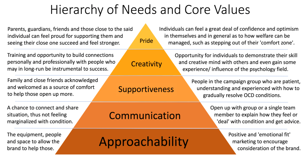
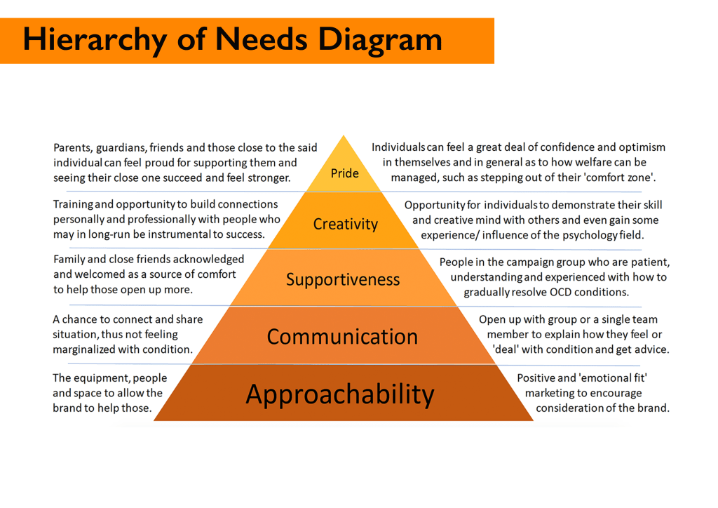
Nearing the midway point of the semester, I set about taking all the research and the principles of what made my brand unique into the form of a Hierarchy of Needs pyramid. Coined by American psychologist Abraham Maslow, it is a useful method for defining one’s brand definition and representation. I strategised the hierarchy from both the perspective of the consumer and desired fulfilment of the team, who would run the service.
Source Inspiration: Jackson, H, 2021, How Brands Are Using Emotional Connections to Create Stronger Customer Bonds, Latana.
Available at: https://latana.com/post/emotional-connections-to-create-stronger-customer-bonds/ (Accessed 17th February 2022)
This chart would provide the summarisation for all concerned as to what the mission is for It Can Be Helped.
Strategy and Oral Presentation
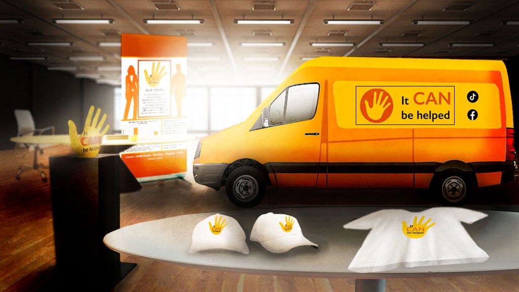
It would be an excellent opportunity to add further credibility to the cause by giving the brand it’s very own promotional mode of transport. This idea came to fruition from the memory I have in my previous job in the printing industry, in which a training service called Learn2print would travel around the country to many printing houses and facilities in their own van, equipped for the purposes of training and monitoring progress of apprentice printers.
This example by the Foodbank group in Cobham, Surrey provided the ideal template for how to design my brand’s van, such as how the colour will be utilised in tangible form and incidentally the social media and contact details for how one can get in touch with the group.
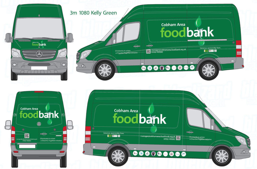
https://cobhamarea.foodbank.org.uk/2019/02/14/news-from-cobham-area-foodbank-february-2019/ (Accessed 24th February 2022)
I discovered sources stating how Psychology was proving to be a difficult job for many aspiring people to pursue, due in part to lack of opportunity and mental health services being deprived of funding. I realised how my brand could also be beneficial and appealing to a secondary group of consumers, specifically those aspiring individuals in the psychology field who seek the opportunity to make a difference in society or improve the aid of mental health support.
(Accessed 24th February 2022)
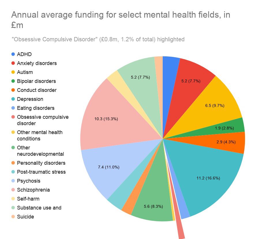
I was staggered by how little funding there was for OCD; 2020 research found that funding for the cause was as little as 1.2% of the average millions (Figure 20). This made me more determined to see that “It Can Be Helped” pushed the word that this is something that shouldn’t be relegated to an area of least concern.
The United Nation’s Sustainable Development Goals, a set of plans to benefit the planet by 2030, can drive the sustainability of the brand’s vision; goal seventeen carries intent of strengthening implementation of global partnership (Figure 21). This aim would be beneficial for the brand’s sustainability; it would essentially require funding from global bodies to implement the virtual technology for the consumer’s management of their condition.
The brand also falls under goal three: ensuring global improvement on supporting mental wellbeing; for this to be realised it needs to be credible enough to receive funding from domestic groups. When it reaches substantial success from these parties, it would approach global partners to strengthen the cause. The seventeenth goal encourages volunteers schemes and I would certainly push those aspiring individuals to get involved in local communities. Since the group depends on funding from the communities of the areas it would visit, the stakeholders of local consumers would drive the relevance for the brand and these volunteers would be crucial in guiding those people (https://youtube.com/watch?v=BNA-85BrPjE&feature=share).

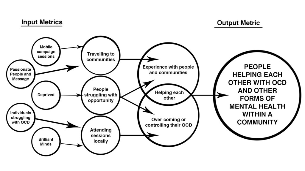
Analysing the metrics diagram of Spotify (Figure 22), a brand that excels in targeting young demographic, it made sense to summarise my brand in this manner and identify how and why consumers would use the service. I noted how Spotify’s primary output was to see that people spent time listening to music, but it lacked input-metrics regarding why consumers come to the app for it to succeed. Spotify only identified what the app offers in the way of features, such as discovering songs and creating playlists. I had to define the feelings and attitudes of consumers before they used the brand to summarise the output much more effectively. This would justify why “It Can Be Helped” is a trustable service that succeeds in it’s aims.

How to reach your business goals by focusing on your customer behaviour, Analytics Vidhya,
https://medium.com/analytics-vi8dhya/if-you-want-results-give-me-some-actions-909a2fa41266 (Accessed 28th February 2022)
The input concerns two groups: the consumers and the aspiring. I worked a pattern of how the two come together through the metric process and merge into one, which ultimately leads to the sole output of mutual support. The system begins with inputs of personal and opportunistic nature; people looking for the chance to help make a difference in mental health support and those who long for a voice of their condition. Both groups have creative, determined and dynamic minds, allowing the brand to provide sessions from both a consumer and service perspective. The passionate team members would come to these deprived communities and meet these people who would then have the opportunity to help them and give the individuals a path to gradually move forward in life.
On the sixth week, I presented my work to the class based on the research and development thus far, covering the basic essentials and outcomes for the brand’s success. I presented the idea, persona and strategy to the class within the time span of 5 – 10 minutes and channelled a great sense of energy, as if I was selling this brand in a pitch meeting. I conveyed the importance of why it is relevant and how its vision is a passionate cause.
I justified my colour theories for the brand and went a step further in explaining that the charity campaign would offer consumer endorsements, such as caps, shirts and accessories to feel proud of their involvement in the cause.

Regarding feedback, I received a couple of further suggestions for how to improve the logo, such as giving it a sharp and vectorised edge as opposed to the charcoal brush that I had experimented within the second drafts. My peers stated how this design choice not popular in corporate groups and should become more refined in style, plus it was also suggested that the “IT” in the logo should be changed to”It” to avoid confusion with the word appearing to be the initials for Information Technology.
As far as the research conducted to that point and what the brand’s goal was, these received praise. However, I acknowledged how there would have to be a little further research conducted as to how the brand would operate.
The hand identity of my brand could easily enhance and resonate with consumers’ interest in the service, since it represents comfort and support as I previously stated. I knew that this would make for an effective characterisation to represent the brand’s personality and reputation. It would provide a great sense of assurance to ease the consumer’s possible apprehension, which they may possibly have before using the service.
I updated my Gantt chart to reflect my process completed so far and to re-prioritise what components needed attention or re-scheduling, owing to delays in primary research or creative hurdles. I managed to successfully maintain the research and design elements of the project within my desired time span of the first few weeks. However, I had to extend my period of creating content for the campaign by bringing it earlier to accommodate the time I would use to create infographics, 3D printing and visualisation for the brand service. I considered possibly a 3D rendered van and podium to visualise how the campaign brand would appear in promotion at a conference or stall for the benefit of possible investors.
The brand’s logo was shaping into final phase of design, settling on a hand-shape utilising a block yellow colour, as it allowed people to simply identify with the warm and optimistic personification of the brand. Pursuing feedback suggestion of re-working the hand into a sharp and vectorised approach, it showcased a contemporary feel, removing the impression of being a handprint. Regarding the typography, I kept the Ariel font to showcase the name of the brand, but utilised a comic sans font for the potential use of the word “CAN” to add a sense of ease to the serious tone of the accompanying words. The “CAN” would be a terracotta orange with the accompanying words in black, subtly demonstrating the contrast between the brand’s warmth and the serious nature of the subject matter.
(All accessed 18th March 2022)
Looking at various blogs on Reddit, I took note of exercises that could be explained, through the use of infographics, how the brand’s sessions would function for consumers. Many people stated how they eased their mind by focusing on particular objects or indeed conducting their own meditation session to loosen the mind of impulses that dictate them. In addition, one further person noted how they kept a sketchbook close on hand to draw or write down their ‘desires’, which the condition pushed them into believing they should do so. This was an effective way to gradually ease the need for these internal struggles, so I added these coping mechanisms to the structure of how I would design my brand service through infographics.
Brand Guideline, Infographics and Exhibition Prep
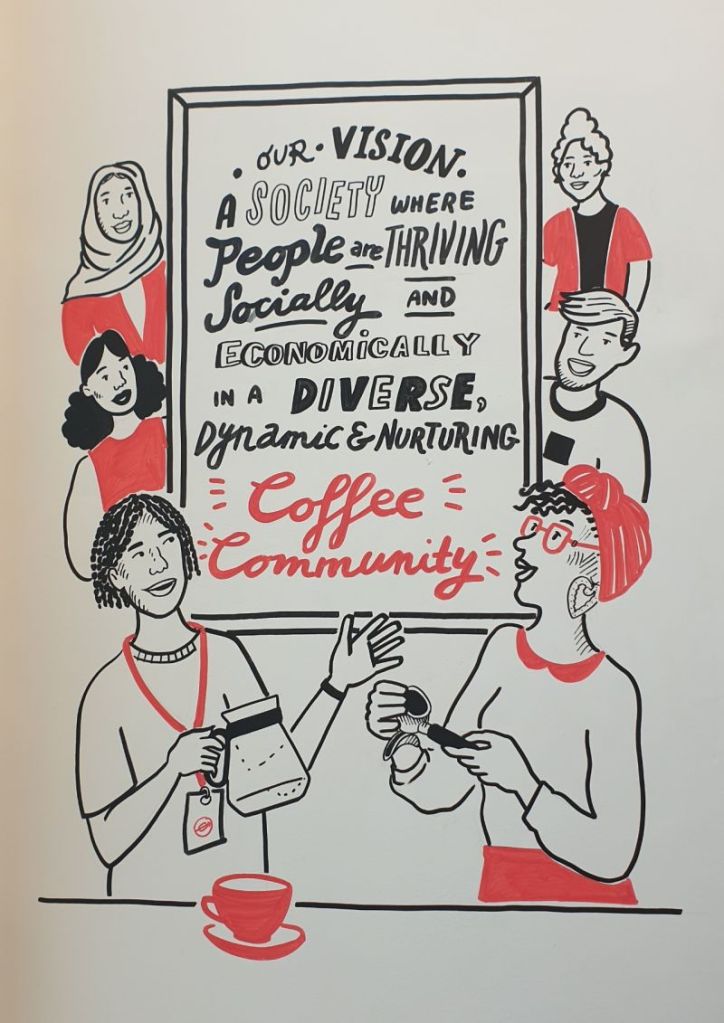
This beautiful piece, created for London-based beverage group, Well-Grounded CIC, illustrates a sense of humanity with individuals from different backgrounds, as well as fun, happiness and socialisation, thus encouraging consumers to visit the cafe. The typography motif of a stylistic aesthetic, specifically the juxtaposition of varying fonts and hand-written styles, adds to the sense of the brand identity being a service to make customers feel home-comforted, of which handwritten text is synonymous with, more so than a corporate business.
I was inspired by the example in using a board at the centre of the piece, but I kept consistent with using no more than three types of font for the brand’s communications. I used an Arial font which I decided would be the style used for the brand’s body text in email, letters and communication. Concerning headings, I considered using a Sans font, since it shows subtle character while keeping concise with straight message. I also made the decision to create silhouetted figures, adding a human touch to the brand and engaging consumers with the people they would expect to meet and connect with at the sessions.
Looking at brand guidelines for Hampshire History Trust and Slack, I took note of how the group used HEX codes when colour is required and state the desired font choices for typography purposes. I took notes from this regarding the various areas I needed to apply to my own guideline, for example: showing how the logo would be used and designed on imagery, where to position it on landscape or portrait content, providing a brand story and what decisions to avoid in presenting assets.
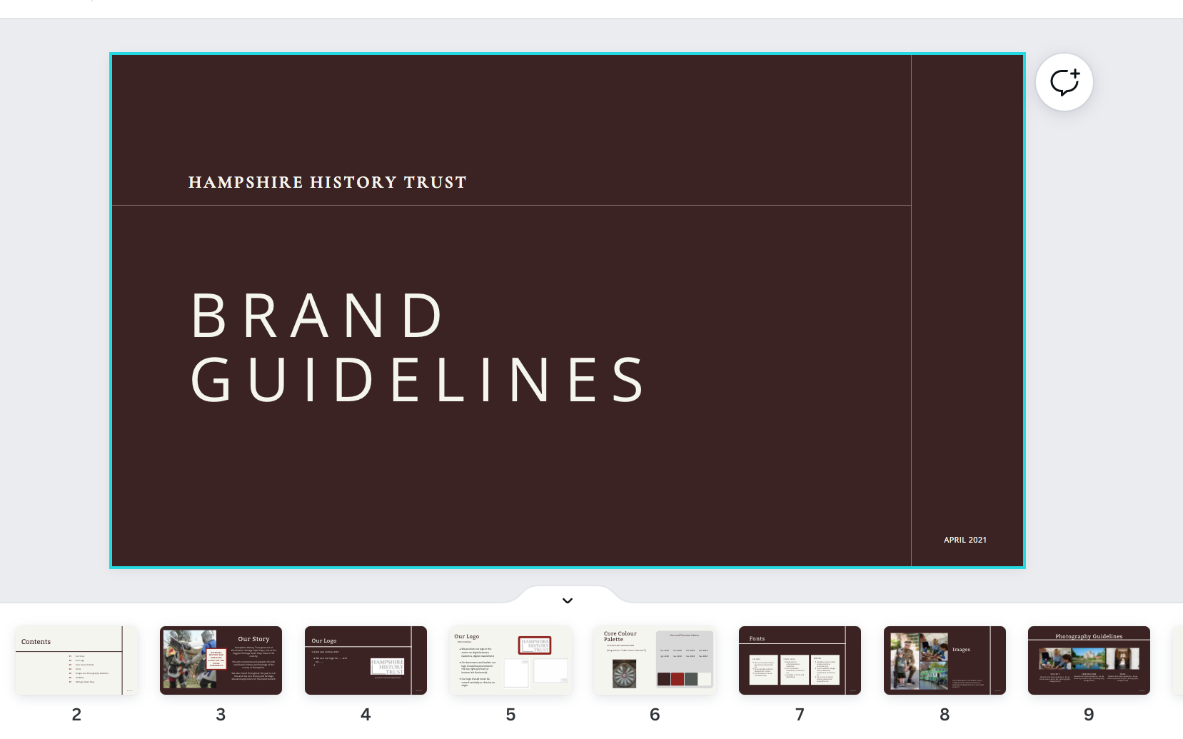

Available at: https://www.canva.com/design/DAEdnD3iNfQ/kw-EIUbWHgytgCVr8iruGw/edit (Accessed 25th March 2022)
Figure 33: Slack Media Kit, official website. Available at: https://slack.com/intl/en-gb/media-kit
I settled on: ‘bc3e00’ (orange) to create headers, borders and background detail in the brand’s communication assets and ‘dc5901’ (Terracotta) would be used for the “CAN” on the logo, as well as shapes where light text was required to overlay. One particular issue I encountered was the yellow colour used up to this point; the HEX code of ‘fece48’, proved rather obscure against a white background and difficult to identify. To resolve this, I cited the logo for fast-food brand, McDonald’s; it used a HEX code of ‘fec208’, making for a subtle and clearer shade of yellow, this colour reference was used for the hand symbol and any objects that would overlay terracotta.
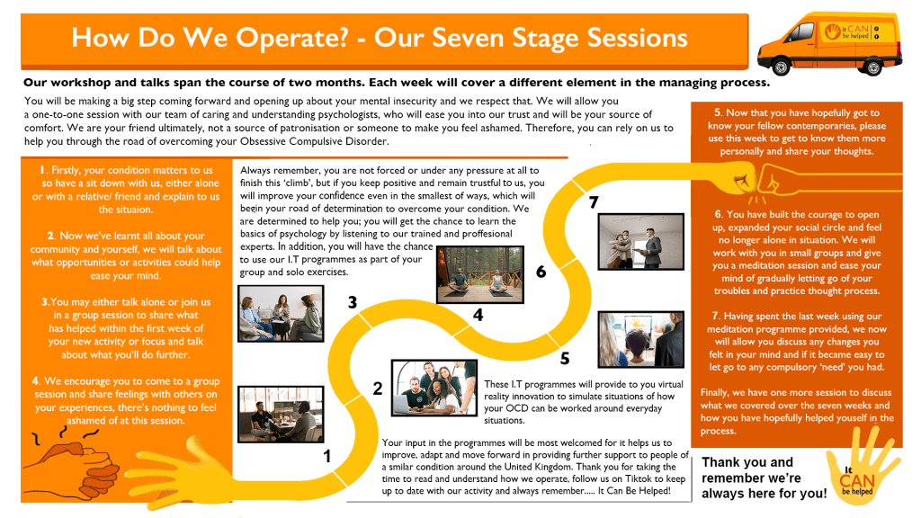
I developed a seven-stage process, lasting the span of two months, in which the consumers would attend the first session of the group’s service; talking about themselves with a team member and allow them to develop a strategy, based on their interests or insecurities. This would be followed up with sessions of engaging with fellow individuals in groups; sharing experiences, opening up and easing into a sense of security. The group will then have meditation sessions and touch/speech exercises to gradually bring them into confrontation of their compulsive nerves. As the final session approaches, we would ensure that those close to the individuals join them as a source of moral support and see that they take these sessions into account; it will be down to them to ensure that their close one practises or maintains what they have covered.
All images used in the design were of stock value and royalty-free. Available at: https://www.pexels.com/ (Accessed 1st April 2022)
Utilising the hand identity for the brand’s personification, one can see that the object represents the warm and aiding reputation of the service in acting as a guide for the targeted individuals to navigate through their struggles. We want to see the individual ultimately ‘climb’ their way to the top of managing their condition, which this infographic illustrates as how the service operates with an encouraging persona. I was deliberate in the yellow hand palm acting as the source of support at the start of the ‘snake trail’ and ending with a casual ‘fist bump’ to emphasise the fact that we are intent on being a social comfort.
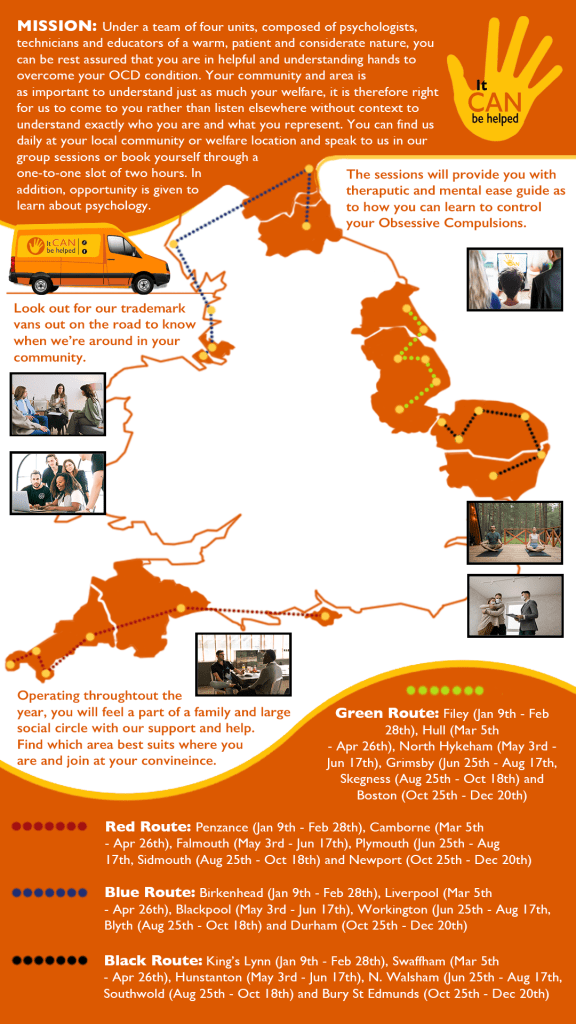
I needed to produce an infographic to show investors and consumers how the team would visit these areas and how accessible the brand would be, so I established that it would travel the country annually and visit communities through four respective teams. These teams would use vans to commute between areas to port equipment and as a method of promoting the brand on the road with its iconic colours. Each of the vans operate on colour-coded routes consisting of six community locations which would span a period of two months in duration, perfectly covering the annual year.
All images used in the design were of stock value and royalty free. Available at: https://www.pexels.com/
(Accessed 1st April 2022)
I referred to the map source earlier in this narrative when pinpointing the communities that the group would operate within and was particularly intent on each of the communities being of considerable population and within reasonable travelling distance of surrounding areas.
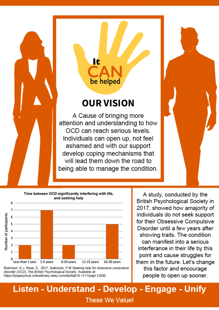
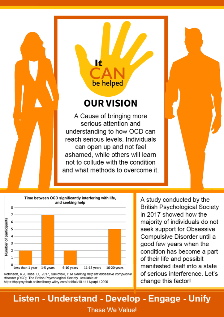
I discovered a graph through reading an article on the British Psychological Society, which itself sourced from Cambridge Core. I decided to apply this figure to the vision statement to add further clarity and relevance, regarding the reason why this charitable campaign matters. The graph states how a majority of individuals do not actually seek support until a few years after developing traits of the condition, thus demonstrating why my brand exists to see that more is done to help people open up and receive support quicker, avoiding long-term difficulties.

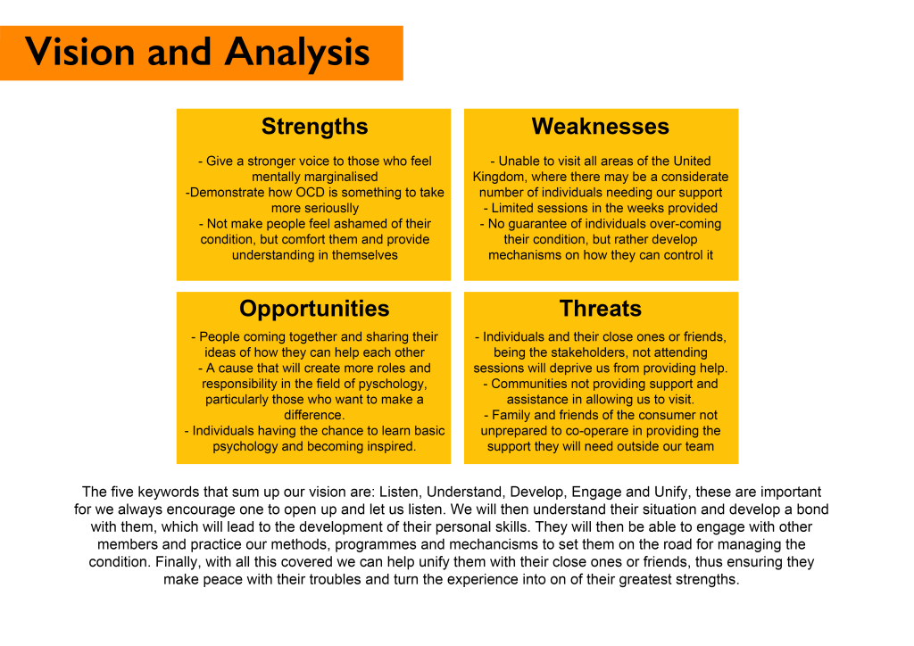
As a final touch, I summarised in five words what the brand values are and how it aims to achieve its ultimate goal. We need to listen to how individuals feel and what triggers their condition, then understand from their perspective how they live. When these are met, developing a process with the individual and those close to them is important, as well as feeding thoughts through engagement with other individuals attending sessions. After showing a bond with the consumers, we ultimately aim to unify the individuals with their friends and family, as well as their prospects to move forward.
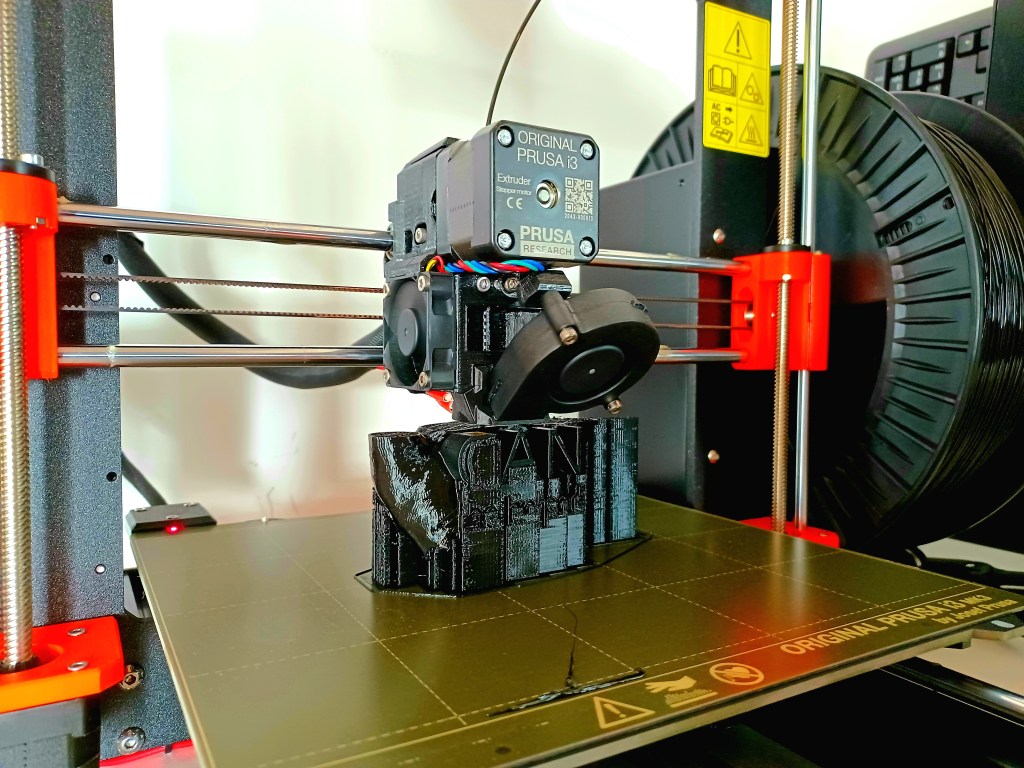
I used this period simultaneously to practice implementing a 3D printed element into the construction of the campaign, enhancing appeal and persona of the brand. Since the persona was that of a youthful, energetic and dynamic person who was full of creativity and solutions of how to work around obstacles, I figured that the use of a 3D version of the logo would channel this nature vigorously. Learning the bare basics of setting up a model for printing, the hand was sourced from the online store, Thingiverse. I was able to use the 3D printing software, PrusaSlicer (Figure 37) to edit the model to my brand’s consistency; applying the appropriate font, that of Arial and Gills Sans.
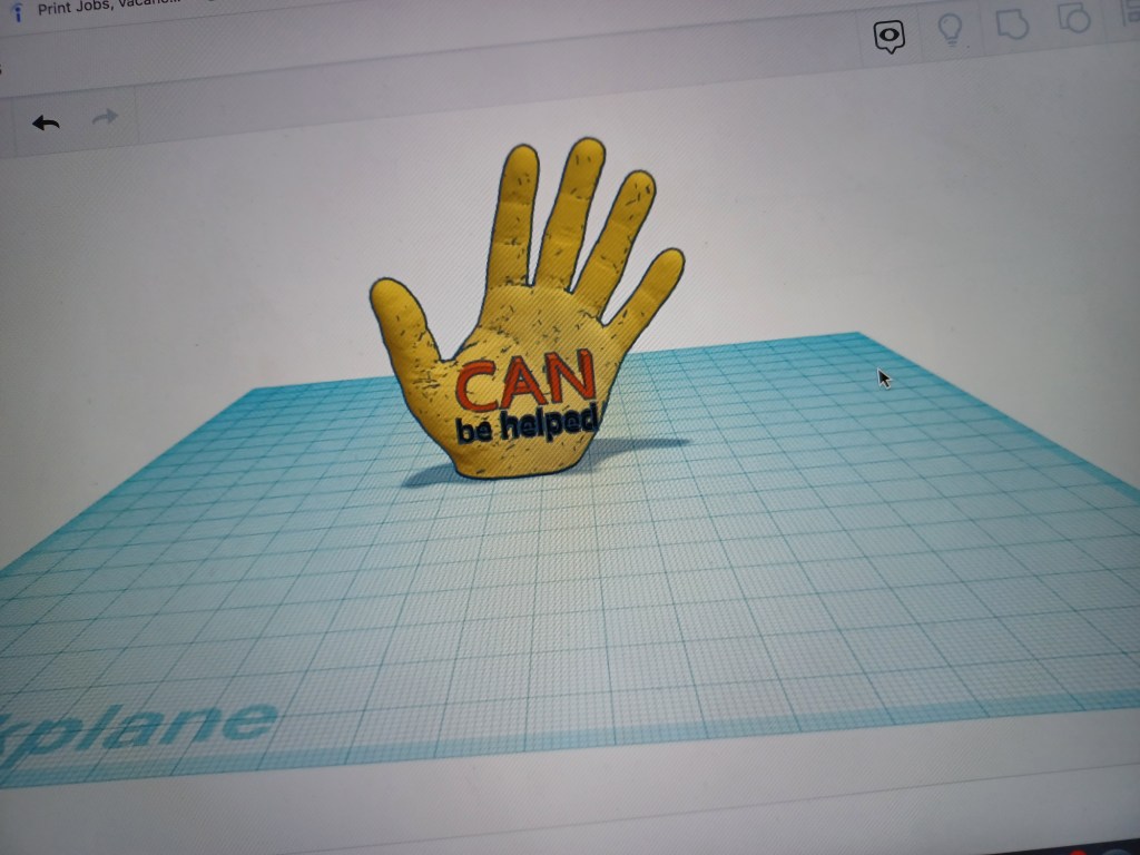
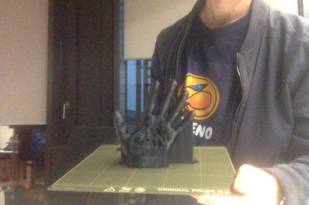
The model took roughly twelve hours to print from the Prusa printer onto black plastic material. This phase of the module was certainly rewarding; I felt I had worked considerably hard to get the brand to where it was in its final development phase. Indeed this model would be the icing on the cake and an ideal element to showcase in my transmedia exhibition. It was satisfactory to feel that I fulfilled my pledge to use 3D printing in my project and push my digital media skills further into an area that was becoming prevalent in industry.
Following the process, excess plastic was carefully removed and the spray paint colours were close to the colour codes of fec208 for the yellowness of the hand and dc5901 for the terracotta orange of the “CAN” lettering. Consistency mattered most to me regarding my brand and I was adamant that this was kept during the development of my brand guideline.
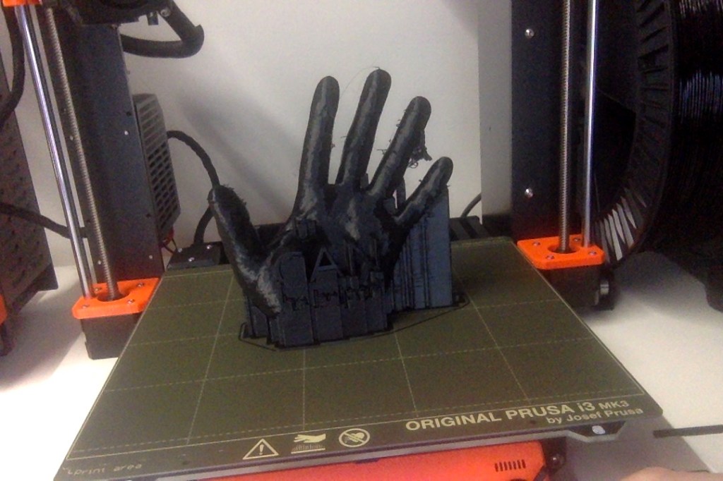
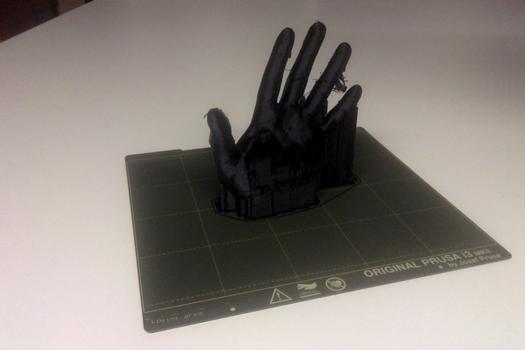
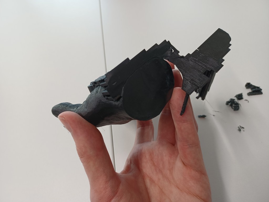
In future, I will ensure that if I print lettering within a model, I shall use a larger font size or provide more considerable spacing between the words. The trickiest aspect was peeling the excess plastic from around the lettering, which required a very precise and steady hand to ensure no letters would be damaged.

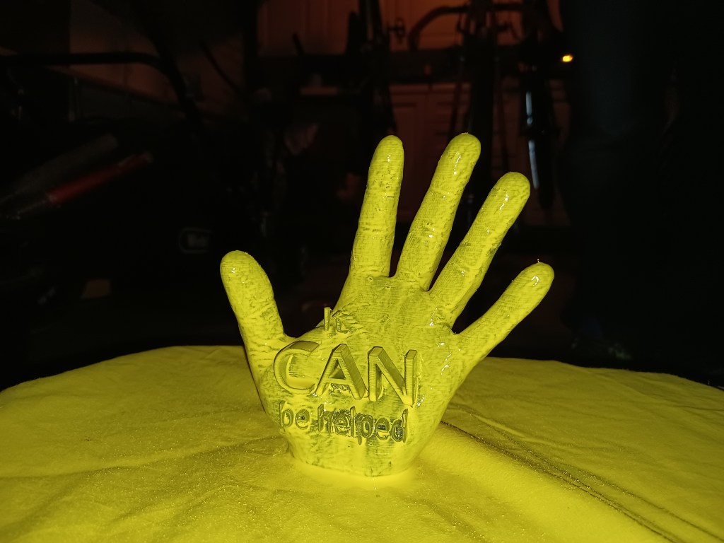

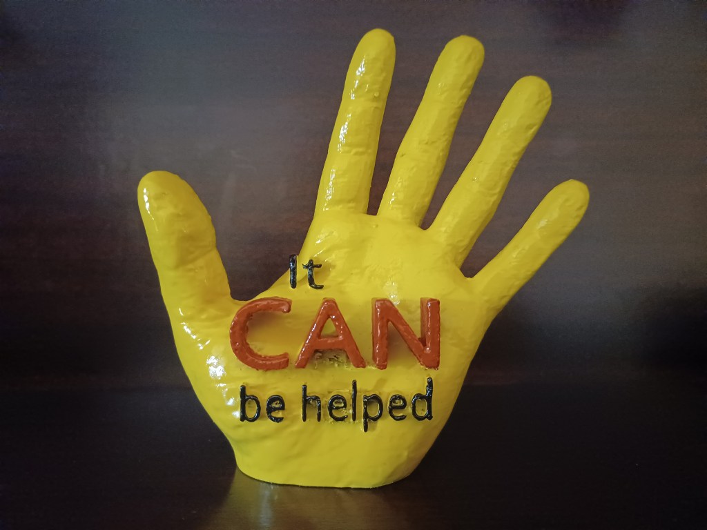
After spraying it yellow, as well as painting it black and terracotta for the lettering, the hand was coated with a layer of lacquer to strengthen it and apply a finishing touch. Considering this was my first experience at 3D printing, I was satisfied with the result and I will be looking to experiment on future occasions.
The tangible aspect completed and with the visual information clear and explanatory on accompanying infographics, I put together my brand guideline, which covered each area of priority in showcasing the brand’s layout and design. The guideline has a column-approach to its layout, thus ensuring a clear and spacious presentation that makes it industry appropriate.


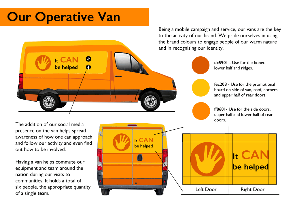

As previously specified, I ensured the colour was consistent and I utilised the hand shape as its own identity by communicating gestures which would be conveyed in the advertising for the brand. In addition, I produced a page that demonstrated how the commuting vans for the brand’s mobility would be presented among people and how the logo should be presented when used on the van’s yellow background by creating a version of the hand against the terracotta orange.
Conclusion
This has been an exciting and joyous experience; I successfully produced a brand that provides a service reflecting an ongoing situation and one that deserves more attention and funding. I used my time very wisely regarding research and presented valid justification as to why this topic resonates emotionally and economically.
I presented an open space argument as to where my brand can benefit consumers, yet where established competitors, such as OCD UK and Top, have not done so. A unique and fun identity regarding colour, personality and service of how the brand will be accessible to individuals, is exactly what this area of focus needs to be. It will help the brand stand out and reach its mission, providing the target consumers with the learning and inspiration for how to benefit themselves.
Tremendous amount of thought put into the decision of my colour theories, typography, design choices and how I plotted the strategy of my brand regarding metrics and design thinking, greatly contributed to the finished brand guideline.
Tiktok link: https://www.tiktok.com/@itcanbehelped
Had I more time, I would create 3D animation graphics consisting of a few ‘bumpers’, around a few seconds in length, or a single promo that would bring the hand icon ‘to life’ and further promote the brand in the form of online advertising. The hand would convey gestures of understanding, comfort and warmth to resonate with the consumers and push our message thoroughly in helping those in low socio-economic communities with OCD.
However, with the vision, mission statement, infographics, brand guideline, strategy and promotional model in place, I can confidently say that this has been a successful project. Considering how it was a sensitive and deep topic, I managed to develop a fresh direction considering I had limited resources and I look forward to the many possibilities of where it could go next.
